Data Analysis Projects in Gauteng
Data Analysis Projects in Gauteng
Sign Up
Post a job
Sign Up
Log In
Filters
2
Projects
People
Message
0
Usamah W Maphumulo
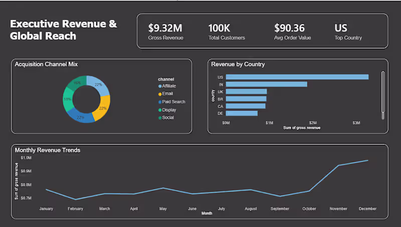
Should you always double down on your #1 market? 🌍 While building this Executive Revenue dashboard, the data told a different story. Instead of pouring more into the US market, we identified a massive opportunity to make countries 2-4 (India, UK, and Brazil) more competitive. The Tech Stack: ETL: Pandas (Python) Database: MySQL Viz: Power BI Moving from 5 scattered CSVs to a centralized SQL-backed dashboard allowed us to see a $9.32M revenue stream clearly for the first time.
0
30
Message
0
Joshua Bell
1000 Young Voices Report
0
5
Message
1
Benjamin van der Merwe
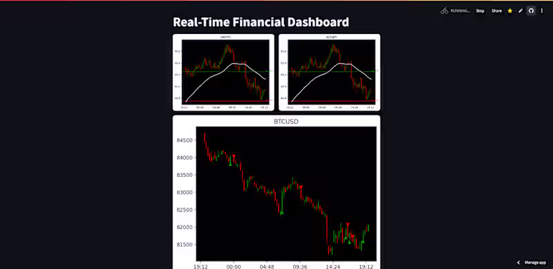
Forex Dashboard Web Application
1
10
Message
0
Thabo Mailula
Customer & Marketing Insights Dashboard | Power BI Project This Power BI project analyzes customer behavior, sales performance, promotions, and product cross-sell opportunities using sample data. The dashboard provides interactive insights in four areas: KPI Scorecards – New customers, repeat purchase rate, average basket size, and customer lifetime value (CLV). Promotion Effectiveness – Revenue trends and comparison charts showing how discounts impact sales and profit. Product Affinity / Cross-Sell – Heatmaps reveal commonly purchased product combinations. Customer Retention & Cohorts – Tracks returning customers and retention patterns.
0
22
Message
0
Xolani Mazibuko
Sales Register
0
10
Message
0
Buhle Biyela
Analyzed monthly product sales data to identify trends and performance across multiple product categories. Created clear visualisations to highlight sales patterns, peak periods and product comparisons, enabling better understanding of business performance. This project demonstrates my ability to transform raw data into meaningful insights using Excel.
0
21
Message
0
Neo Tshili
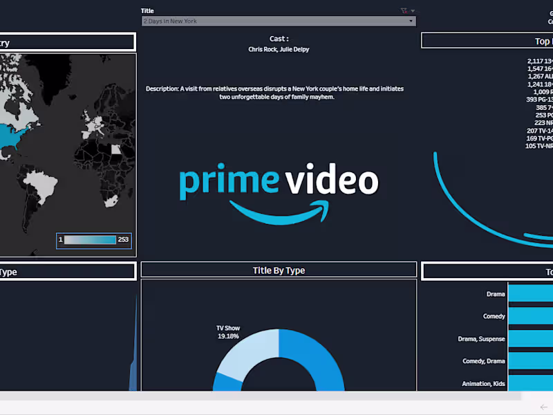
Amazon Prime Dashboard
0
26
Message
0
Pako Kole
Sentry Safe Solutions
0
4
Message
0
Tumisang Kalagobe
Sales process optimisation
0
12
Message
1
Christelle kalanda
Custom Dashboard
1
8
Message
0
Anja Brits
Platos Pizza Sales - Power BI Project
0
0
Message
0
Cassandra Mzola
Financial Analysis Project
0
1
Message
2
Usamah W Maphumulo
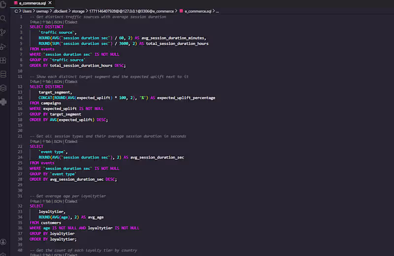
Behind every great dashboard is a clean query. I’m currently using SQL to transform raw event logs into actionable intelligence for an e-commerce build. Key Metrics Extracted: Traffic Quality: Identifying high-intent sources via avg_session_duration. Campaign ROI: Using expected_uplift to pinpoint winning customer segments. Behavioral Trends: Mapping friction points in the checkout funnel. Moving from "gut feelings" to real-time data in Power BI, Tableau, and Looker Studio.
1
2
71
Message
0
Joshua Bell
Business Issues Report: Insights for Education Development
0
7
Message
1
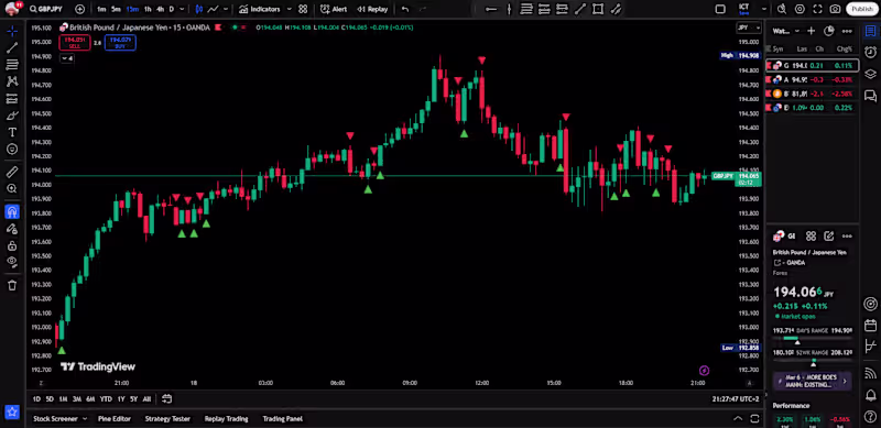
Benjamin van der Merwe
Tradingview Custom Indicator Development
1
24
Message
0
Thabo Mailula
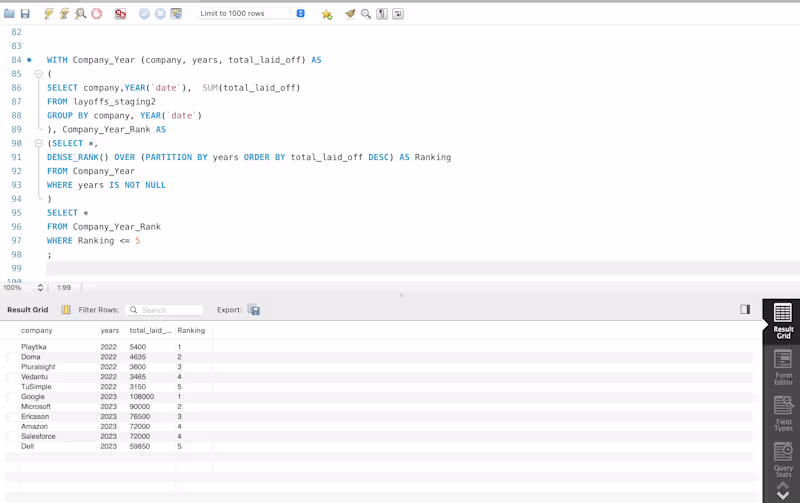
Maji Ndogo Water Project – Part 2 | Data Analysis & Insights In Part 2 of the Maji Ndogo Water Project, I focused on cleaning and analyzing employee and water source data to understand access, detect patterns, and prioritize interventions. Key Activities: Employee Data Cleaning – Standardized emails, converted to lowercase, and updated phone numbers. Employee Performance – Counted visits per employee and identified top surveyors. Water Source Distribution – Analyzed records by town and province, calculated rural percentages, and total people served. Water Source Usage – Calculated average and total users per source type. Prioritizing Repairs – Ranked water sources by people served to guide repair priorities. This workflow highlights water access, employee activity, and priority areas for intervention.
0
14
Explore projects