Data Visualization Projects in GandhinagarData Visualization Projects in GandhinagarSAP Business One (HANA) Native Dashboards & KPIs
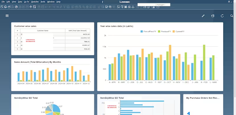
Built native SAP Business One HANA dashboards directly inside the SAP B1 client real-time KPI widgets running on live HANA data, with no separate BI tool required. This gives users instant visual insight the moment they log into SAP B1, right on their home screen.
What the dashboard delivers:
Customer-wise sales KPI : a ranked table of top customers by total sales amount, pulled live from SAP B1 sales data
Year-over-year comparison chart : Current FY vs. Previous FY vs. Prev-of-Previous FY, broken down by month, so trend analysis is available without exporting to Excel
Monthly sales bifurcation : a bar chart tracking total sales amount by month across the fiscal year for quick pattern spotting
Item-group-wise Sales Order totals : both a pie chart (proportional share by item group) and a horizontal bar chart (absolute SO totals), giving two views of the same data for different reporting needs
Purchase order tracking widget : a live count of "My Purchase Orders Not Received," turning a report that used to require manual checking into an always-visible alert
Built entirely on HANA calculation views : meaning the dashboards refresh against live transactional data with strong performance, not batch-refreshed extracts
Why this matters to a client:
Most SAP B1 users only see this kind of visibility if they buy and connect a separate BI tool. I build the same KPI/dashboard experience natively inside SAP B1 using HANA views and the built-in dashboard framework so there's no extra license, no separate login, and no data-sync lag. It's the fastest way for a SAP B1 HANA client to get real-time visual reporting without adding another system.
Suggested tags: SAP Business One SAP HANA HANA Calculation Views KPI Dashboard Native Dashboard Development Sales Analytics
One-line hook for the service card (under 100 chars):
Native SAP B1 HANA dashboards - real-time KPIs with no separate BI tool needed.
One more thing worth doing now that you have 4 solid samples (ELN/pharma, manufacturing job card, Power BI sales dashboard, also work with different industries, and this HANA dashboard): they span your 3 services nicely, this one and the Power BI one go under Service 1 (Reporting & Power BI Dashboards), and it's worth explicitly adding "native HANA dashboard development" to that service's tags/description too, since it's a distinct enough skill that clients may search for it specifically. Power BI Sales Dashboard | Multi-Year Day-Range Analysis
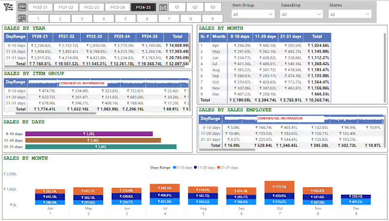
Built a fully interactive Power BI sales dashboard that breaks down revenue not just by the usual year/month/product view, but by a custom "day-range" pattern (0–10, 11–20, 21–31 days) giving management visibility into when within the month sales actually happen, which is critical for cash flow and production planning in trading/manufacturing businesses.
What the dashboard delivers:
5-year trend view : one-click tabs to switch between FY20-21 through FY24-25, with a running "Total" row and column so leadership sees both period and cumulative performance instantly
Quarter and month drill-down: Q1/Q2/Q3 buttons plus a 1–9 month strip let users move from annual to monthly granularity without leaving the page
Day-range breakdown by month : a dedicated matrix showing 0–10/11–20/21–31-day sales split for every month of the year, so seasonal and mid-month sales patterns are visible at a glance
Multi-dimensional filtering : global slicers for Item Group, Sales Employee, and State, so any table or chart on the page can be sliced by product line, individual salesperson, or region in real time
Item Group and Sales Employee performance matrices : day-range sales broken out per product category and per salesperson, useful for both inventory planning and sales incentive tracking
Visual summary charts : a horizontal bar chart totaling sales by day-range, and a color-coded combo chart showing the month-by-month day-range split side by side, so non-technical stakeholders get the story without reading tables
Consistent, presentation-ready formatting : currency in lakhs (₹L), color-coded day-range categories, and a clean header/navigation bar that makes the report feel like a finished product, not a raw data dump
Why this matters to a client:
This isn't just a report that shows totals : it's built to answer a specific business question (when in the month are we actually making money, and who/what is driving it) that standard "sales by month" dashboards miss. I design Power BI dashboards this way: starting from the business question a client actually needs answered, not just wiring up default visuals.