The network for creativity
Join 1.25M professional creatives like you
Connect with clients, get discovered, and run your business 100% commission-free
Creatives on Contra have earned over $150M and we are just getting started
Back to feedPost

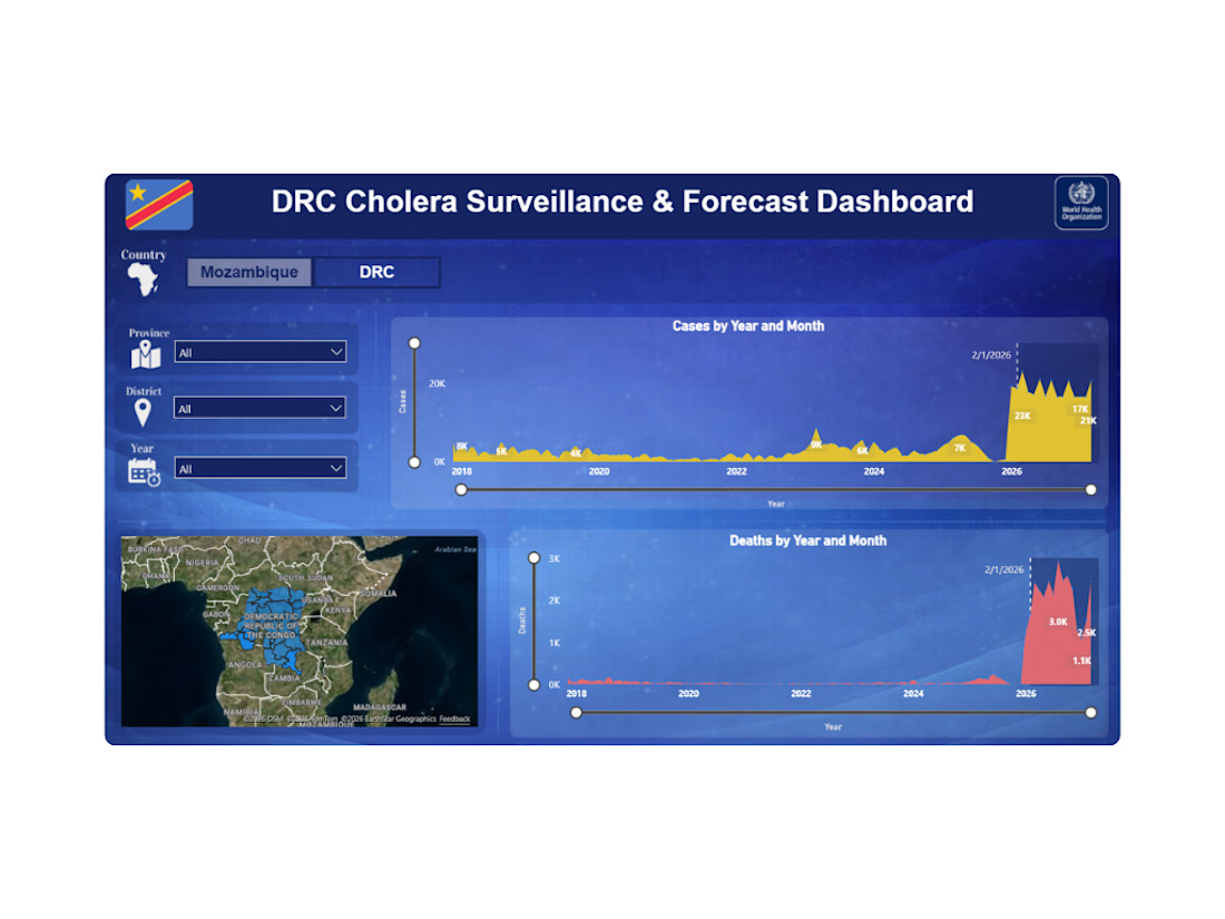
Forecasting Power BI Dashboard | Python | Power BI


The network for creativity
Join 1.25M professional creatives like you
Connect with clients, get discovered, and run your business 100% commission-free
Creatives on Contra have earned over $150M and we are just getting started





Related posts

Building AI for healthcare leaves zero room for error.
I’m currently collaborating with an incredible team on Raphald AI, a medical detection application. Building the systems for a project with stakes this high is a massive reminder that the underlying backend architecture matters just as much as the machine learning model itself.
When integrating diagnostic AI, your API endpoints cannot drop requests, and your database workflows demand absolute integrity. You aren't just passing JSON payloads; you are handling critical, real-time workflows where stability is non-negotiable.
Engineering these systems continues to shape my approach to building robust Python backends. If you are developing a product that requires reliable AI integration or rock-solid FastAPI infrastructure, check out the newly updated services on my profile. Let's build something that works when it counts.



Created an interactive Power BI dashboard to analyze mobile sales, customer trends, product performance, and sales metrics using data visualization and DAX.
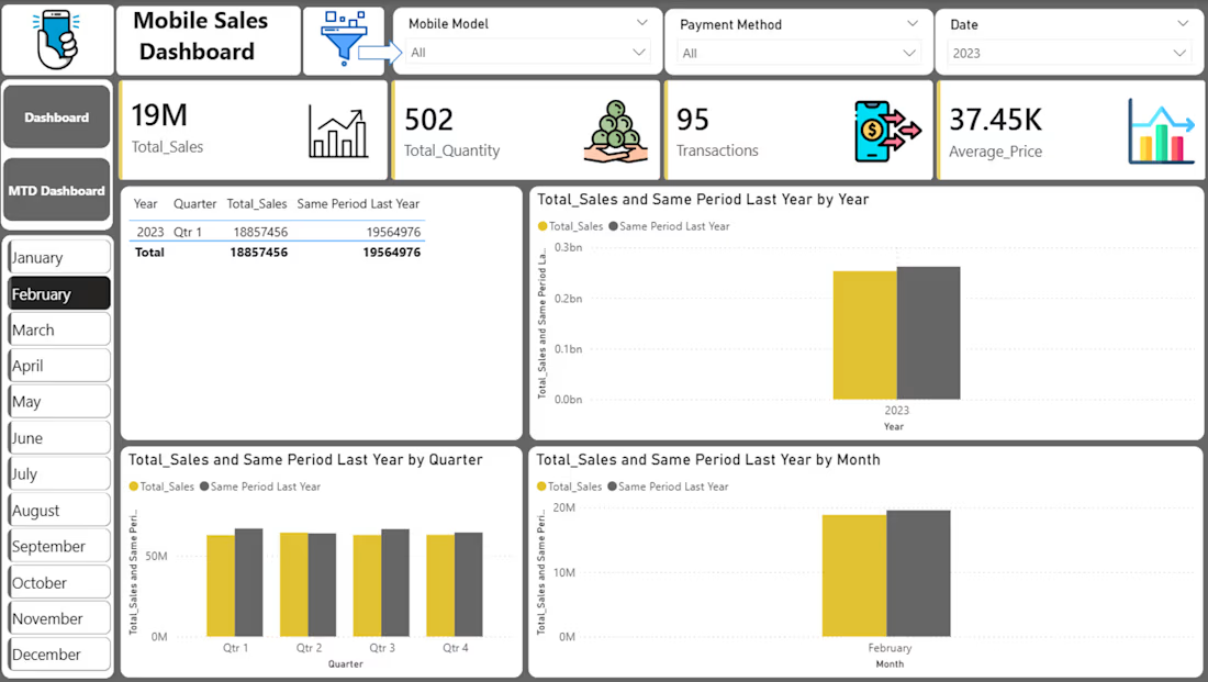


3 mistakes that will eventually make this board useless. 📉
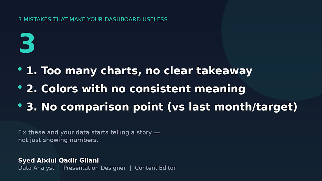
I've reviewed several client dashboards over the years, and the same 3 problems show up over and over:
1️⃣ Too many charts, no clear takeaway — if I can't tell what to do after looking at it, it's decoration, not a dashboard.
2️⃣ Colors with no consistent meaning — red means "unacceptable" on one chart and "category 3" on the next. Pick a system and stick with it.
3️⃣ No comparison point — a number alone means nothing. "Revenue: $12,480" tells you nothing. "Revenue: $12,480 (+18% vs last month)" tells you everything.
Fix these three, and your data stops being numbers on a page — it starts being something people actually use to decide.
What's the most common dashboard mistake you've seen? 👇