The network for creativity
Join 1.25M professional creatives like you
Connect with clients, get discovered, and run your business 100% commission-free
Creatives on Contra have earned over $150M and we are just getting started
Back to feedPost


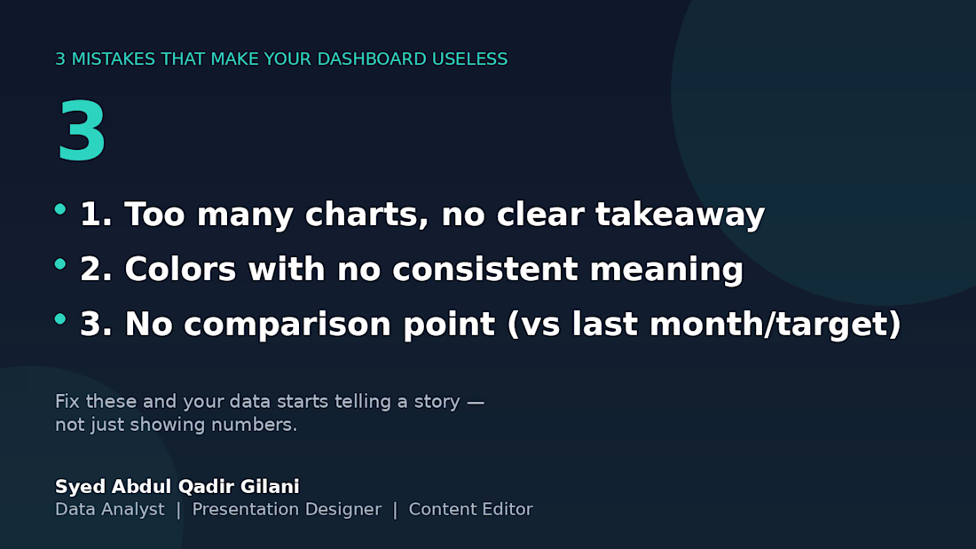
3 mistakes that will eventually make this board useless. 📉
I've reviewed several client dashboards over the years, and the same 3 problems show up over and over:
1️⃣ Too many charts, no clear takeaway — if I can't tell what to do after looking at it, it's decoration, not a dashboard.
2️⃣ Colors with no consistent meaning — red means "unacceptable" on one chart and "category 3" on the next. Pick a system and stick with it.
3️⃣ No comparison point — a number alone means nothing. "Revenue: $12,480" tells you nothing. "Revenue: $12,480 (+18% vs last month)" tells you everything.
Fix these three, and your data stops being numbers on a page — it starts being something people actually use to decide.
What's the most common dashboard mistake you've seen? 👇


The network for creativity
Join 1.25M professional creatives like you
Connect with clients, get discovered, and run your business 100% commission-free
Creatives on Contra have earned over $150M and we are just getting started






Related posts

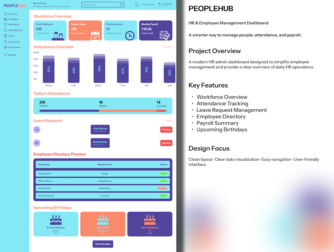
PEOPLEHUB — HR & Employee Management Dashboard UI/UX Design
Introducing PEOPLEHUB, a modern HR management dashboard designed to simplify workforce management and daily HR operations.
✨ Key Features
Workforce overview and employee statistics
Weekly attendance analytics
Leave request management
Employee directory
Payroll summary
Upcoming birthdays
Designed with a clean interface, intuitive navigation, and clear data visualization to make HR tasks easier and more efficient.
Role: UI/UX Designer
Platform: Web Dashboard
Tool: Figma
#UIUXDesign #DashboardDesign #HRDashboard #WebDesign #Figma


Upcoming birthdays on an HR dashboard is a nice human touch next to all the payroll and leave data.

RouteMind — Independent RAG Benchmark Audit
Independent Retrieval Quality Audit | October 2026
The Challenge
RouteMind is an open-source project comparing traditional RAG retrieval, reranking, and document-routing approaches.
Its benchmark produced reproducible metrics, but different evaluation paths were applying different definitions of success.
Retrieval counted a query as successful when any expected document appeared in the top results. Some routing evaluations required all specified documents, including accepted alternatives.
This created an inconsistent comparison between approaches.
My Contribution
I performed an independent technical audit of the project's public evaluation artifacts.
The investigation covered 700 questions and 1,400 retrieval query/arm results, including scoring semantics, expected evidence, and reproducibility checks.
I identified 15 scoring discrepancies and delivered a public evidence package containing the affected cases, methodology, frozen input checksums, and limitations.
Verified Results
The RouteMind maintainer independently reproduced all 15 discrepancies and confirmed that the inconsistency was previously unknown and unintentional.
The findings led to a corrective commit that aligned the benchmark's main comparison and introduced additional verification checks.
The maintainer stated:
"Yes, this was real value beyond our own evaluations. We had looked at these files many times and not seen it."
Deliverables
Independent benchmark investigation
Query-level discrepancy evidence
Reproducible methodology and input checksums
Technical findings and recommendations
Public maintainer validation
This was a public beta audit, not a paid client engagement. The maintainer implemented the project corrections.
Maintainer confirmation: https://github.com/CSP911/routemind/issues/2#issuecomment-6096856584



Reading a document is easy. Understanding its meaning is the real challenge.
While building AI-powered medical document intelligence systems, I’ve been learning that extracting words is only one part of the problem.
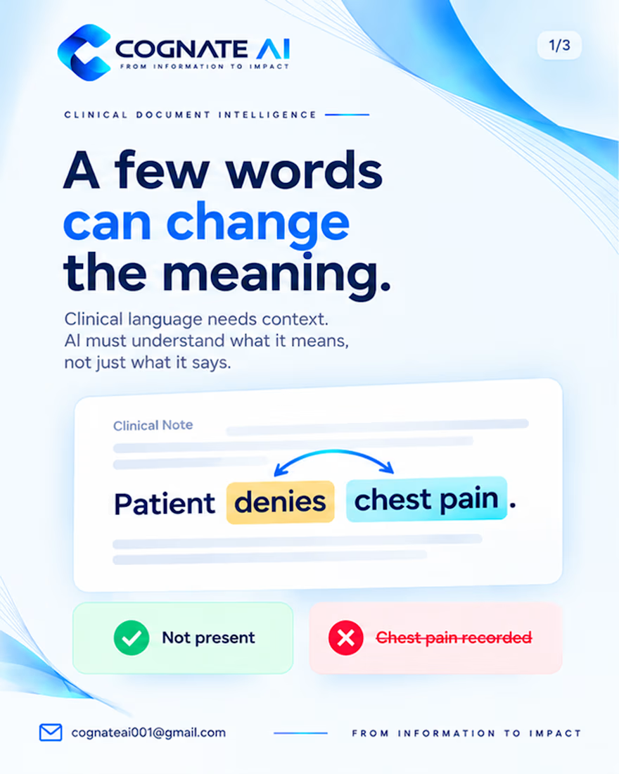
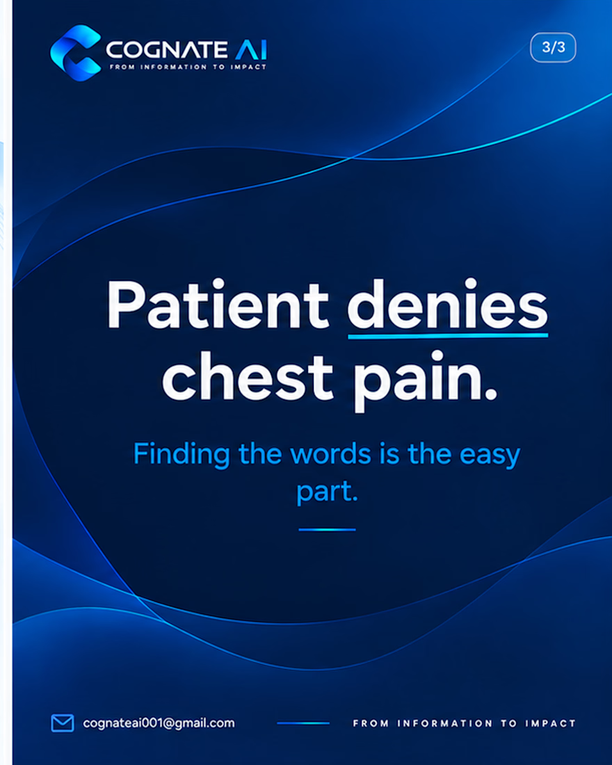
Consider this sentence:
“Patient denies chest pain.”
A system might recognize the words correctly but still extract the wrong information if it ignores the word “denies.”
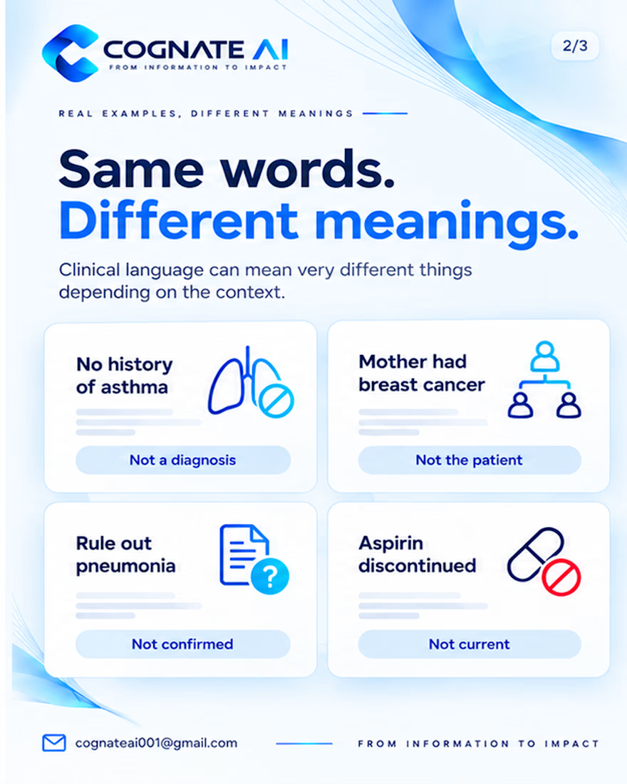
The same challenge appears in phrases like:
“No history of asthma”
“Mother had breast cancer”
“Rule out pneumonia”
“Aspirin discontinued”
Each sentence requires more than text recognition. It requires understanding context, negation, uncertainty, relationships, and whether information is current.
This is one of the challenges I’m exploring while building MDIS (Medical Document Intelligence System) at Cognate AI.
My focus is on developing systems that go beyond extracting information—toward structured outputs, validation, evidence traceability, and human review.
Because in healthcare AI, extracting the right words is not enough. The system must preserve what those words actually mean.
I’m continuing to learn, build, test, and improve this system one step at a time.
What do you think is the biggest challenge in making AI understand clinical language accurately?
#AIEngineering #HealthcareAI #MedicalAI #DocumentIntelligence #BuildingInPublic


negation like that is exactly where naive extraction falls apart, great example