The network for creativity
Join 1.25M professional creatives like you
Connect with clients, get discovered, and run your business 100% commission-free
Creatives on Contra have earned over $150M and we are just getting started
Back to feedPost
PEOPLEHUB — HR & Employee Management Dashboard UI/UX Design
Introducing PEOPLEHUB, a modern HR management dashboard designed to simplify workforce management and daily HR operations.
✨ Key Features
Workforce overview and employee statistics
Weekly attendance analytics
Leave request management
Employee directory
Payroll summary
Upcoming birthdays
Designed with a clean interface, intuitive navigation, and clear data visualization to make HR tasks easier and more efficient.
Role: UI/UX Designer
Platform: Web Dashboard
Tool: Figma
#UIUXDesign #DashboardDesign #HRDashboard #WebDesign #Figma

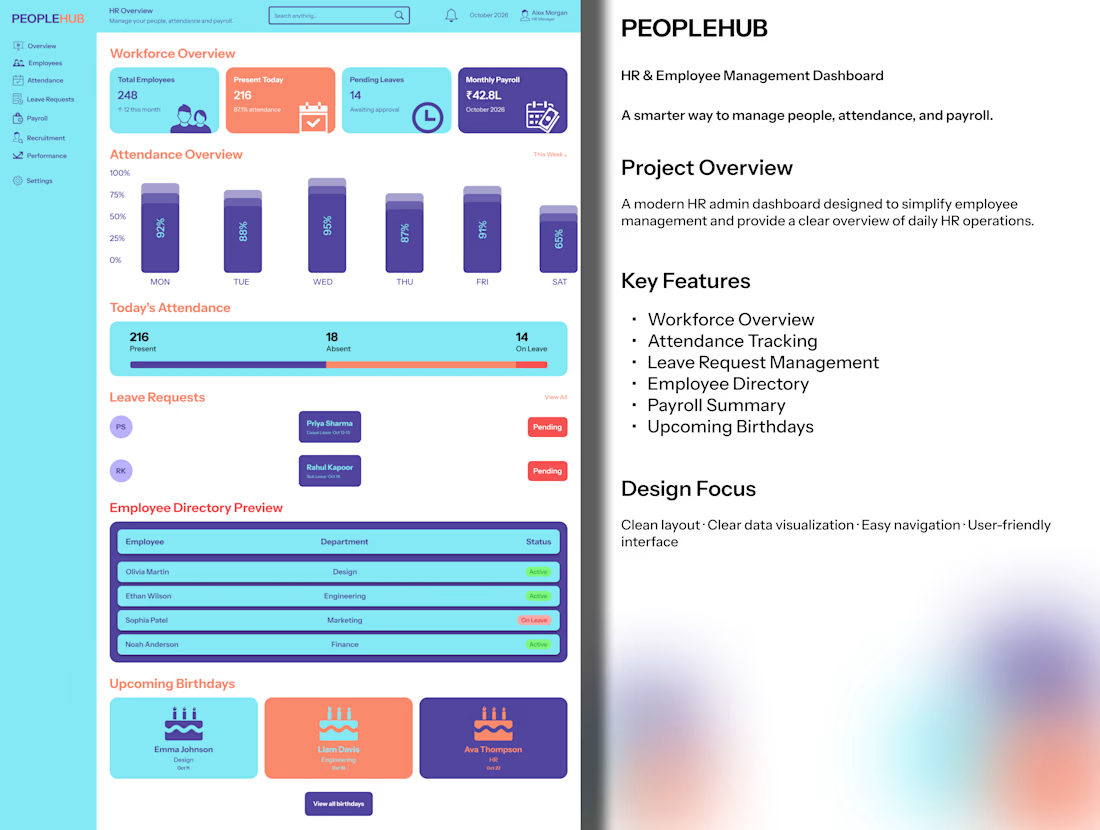

Upcoming birthdays on an HR dashboard is a nice human touch next to all the payroll and leave data.

Thank you! 😊 I wanted to make the dashboard feel more people-focused, not just data-driven.

Usually, people check attendance first for daily updates, while payroll summaries get more attention around salary time. Both are important, depending on the user's needs! 😊
The network for creativity
Join 1.25M professional creatives like you
Connect with clients, get discovered, and run your business 100% commission-free
Creatives on Contra have earned over $150M and we are just getting started
Related posts

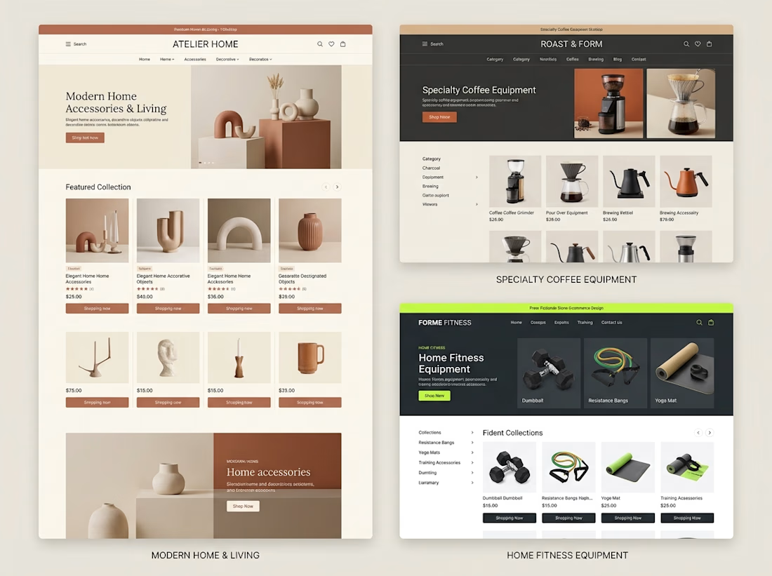
Different products need different shopping experiences.
When exploring Shopify store design, I like thinking about how the brand, product category, and customer journey should influence the final layout.
For example:
→ A home decor store needs strong visual presentation and an editorial feel.
→ A coffee equipment store needs clear categories and product information that helps customers compare options.
→ A fitness store needs organized collections and a straightforward path to the right equipment.
The goal isn't to use the same design for every business.
It's to understand what each store needs and build an experience around it.
These concepts explore three different directions, but they share one principle:
Good e-commerce design should make products easier to understand and easier to shop.
Which of these three store styles would you be most interested in exploring?



Great point. I’d pick the home decor one, editorial layouts really sell the vibe. 🔥

From static footer to motion.
It's crazy how adding motion can take something from OK to premium in an instant.


Great work

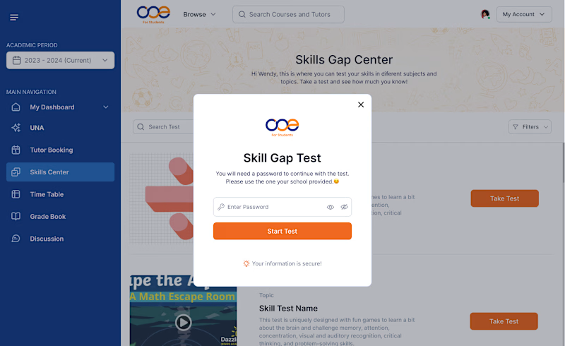
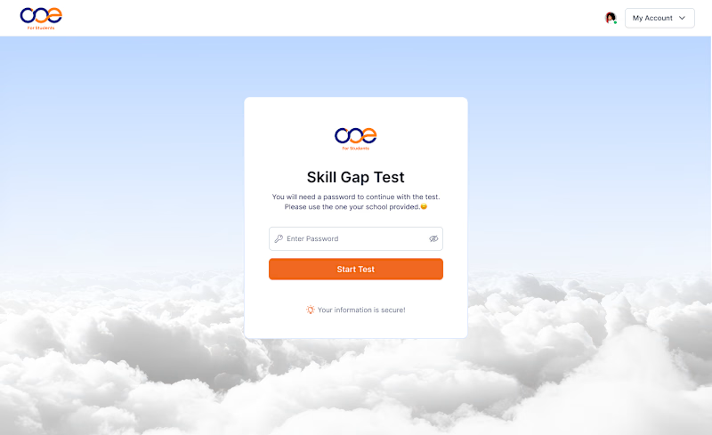
Which Skill Gap Test experience would you choose? 👀
I designed two different experiences for the same Skill Gap Test.
Option A: A modal inside the dashboard — users stay in context.
Option B: A dedicated page — a cleaner, distraction-free experience.
If you were using this platform as a student, which experience would you prefer?
A or B? Why? 👇
#UIDesign #UXDesign #ProductDesign
4 voted
36%
7 voted
64%
11 votes
Closed

Dedecated Page is more professional and minimalistic ❤️