The network for creativity
Join 1.25M professional creatives like you
Connect with clients, get discovered, and run your business 100% commission-free
Creatives on Contra have earned over $150M and we are just getting started
Back to feedPost

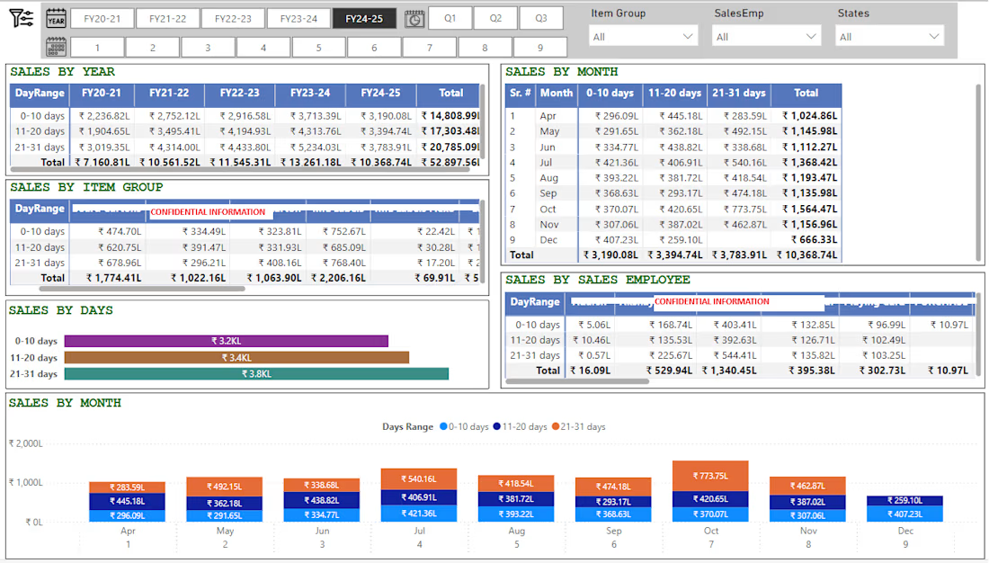
Power BI Sales Dashboard | Multi-Year Day-Range Analysis
Built a fully interactive Power BI sales dashboard that breaks down revenue not just by the usual year/month/product view, but by a custom "day-range" pattern (0–10, 11–20, 21–31 days) giving management visibility into when within the month sales actually happen, which is critical for cash flow and production planning in trading/manufacturing businesses.
What the dashboard delivers:
5-year trend view : one-click tabs to switch between FY20-21 through FY24-25, with a running "Total" row and column so leadership sees both period and cumulative performance instantly
Quarter and month drill-down: Q1/Q2/Q3 buttons plus a 1–9 month strip let users move from annual to monthly granularity without leaving the page
Day-range breakdown by month : a dedicated matrix showing 0–10/11–20/21–31-day sales split for every month of the year, so seasonal and mid-month sales patterns are visible at a glance
Multi-dimensional filtering : global slicers for Item Group, Sales Employee, and State, so any table or chart on the page can be sliced by product line, individual salesperson, or region in real time
Item Group and Sales Employee performance matrices : day-range sales broken out per product category and per salesperson, useful for both inventory planning and sales incentive tracking
Visual summary charts : a horizontal bar chart totaling sales by day-range, and a color-coded combo chart showing the month-by-month day-range split side by side, so non-technical stakeholders get the story without reading tables
Consistent, presentation-ready formatting : currency in lakhs (₹L), color-coded day-range categories, and a clean header/navigation bar that makes the report feel like a finished product, not a raw data dump
Why this matters to a client:
This isn't just a report that shows totals : it's built to answer a specific business question (when in the month are we actually making money, and who/what is driving it) that standard "sales by month" dashboards miss. I design Power BI dashboards this way: starting from the business question a client actually needs answered, not just wiring up default visuals.


The network for creativity
Join 1.25M professional creatives like you
Connect with clients, get discovered, and run your business 100% commission-free
Creatives on Contra have earned over $150M and we are just getting started

Challenges
View all


Related posts

🚨 𝗦𝘁𝗶𝗹𝗹 𝘄𝗮𝗶𝘁𝗶𝗻𝗴 𝗱𝗮𝘆𝘀 𝗳𝗼𝗿 𝘆𝗼𝘂𝗿 𝗳𝗶𝗻𝗮𝗻𝗰𝗲 𝘁𝗲𝗮𝗺 𝘁𝗼 𝗰𝗼𝗻𝘀𝗼𝗹𝗶𝗱𝗮𝘁𝗲 𝘀𝗽𝗿𝗲𝗮𝗱𝘀𝗵𝗲𝗲𝘁𝘀?
If you are making strategic decisions on delayed P&L reports, you are operating with blind spots.
When managing 𝟴-𝗳𝗶𝗴𝘂𝗿𝗲 𝗿𝗲𝘃𝗲𝗻𝘂𝗲 (€𝟭𝟳.𝟳𝟳𝗠+), static spreadsheets fail to provide the real-time cost visibility needed to protect profit margins.
Here is an executive-grade 𝗣𝗼𝘄𝗲𝗿 𝗕𝗜 𝗙𝗶𝗻𝗮𝗻𝗰𝗶𝗮𝗹 & 𝗣&𝗟 𝗦𝘁𝗮𝘁𝗲𝗺𝗲𝗻𝘁 𝗗𝗮𝘀𝗵𝗯𝗼𝗮𝗿𝗱 designed for leadership to monitor profitability, control operating expenses, and optimize cash flow in seconds.
📊 𝗞𝗘𝗬 𝗙𝗜𝗡𝗔𝗡𝗖𝗜𝗔𝗟 𝗜𝗡𝗦𝗜𝗚𝗛𝗧𝗦 & 𝗜𝗠𝗣𝗔𝗖𝗧
🔹 𝗥𝗲𝘃𝗲𝗻𝘂𝗲 𝗦𝘁𝗿𝗲𝗮𝗺 𝗩𝗶𝘀𝗶𝗯𝗶𝗹𝗶𝘁𝘆: Analyzed €𝟭𝟳.𝟳𝟳𝗠 in total top-line revenue, isolating core product sales (€𝟭𝟭.𝟳𝟳𝗠) vs. consulting services (€𝟲.𝟬𝟬𝗠).
🔹 𝗠𝗮𝗿𝗴𝗶𝗻 𝗢𝗽𝘁𝗶𝗺𝗶𝘇𝗮𝘁𝗶𝗼𝗻: Automated tracking for €𝟭𝟬.𝟱𝟵𝗠 𝗚𝗿𝗼𝘀𝘀 𝗣𝗿𝗼𝗳𝗶𝘁 (𝟱𝟵.𝟲% 𝗠𝗮𝗿𝗴𝗶𝗻) and €𝟱.𝟱𝟬𝗠 𝗡𝗲𝘁 𝗣𝗿𝗼𝗳𝗶𝘁 (𝟯𝟬.𝟵% 𝗡𝗲𝘁 𝗠𝗮𝗿𝗴𝗶𝗻).
🔹 𝗖𝗼𝘀𝘁 𝗖𝗲𝗻𝘁𝗲𝗿 𝗖𝗼𝗻𝘁𝗿𝗼𝗹: Uncovered Raw Materials (€𝟲.𝟰𝟱𝗠) as 𝟴𝟵.𝟵% of total COGS, unlocking direct vendor renegotiation targets.
🔹 𝗢𝗽𝗲𝗿𝗮𝘁𝗶𝗻𝗴 𝗘𝘴𝗽𝗲𝗻𝘀𝗲 𝗧𝗿𝗮𝗰𝗸𝗶𝗻𝗴: Monitored €𝟰.𝟱𝟳𝗠 in Opex, detailing consulting overhead (€𝟮.𝟲𝟮𝗠) and R&D spend (€𝟭.𝟰𝟯𝗠).
🔹 𝗗𝘆𝗻𝗮𝗺𝗶𝗰 𝗧𝗶𝗺𝗲 𝗜𝗻𝘁𝗲𝗹𝗹𝗶𝗴𝗲𝗻𝗰𝗲: Enabled instant drill-down across Quarters, Months, and Product Lines without relying on external paid visuals.
⚡ Automating P&L reporting eliminates manual errors, cuts review prep from days to seconds, and gives C-suite stakeholders total control over their bottom line.
💬 𝗟𝗼𝗼𝗸𝗶𝗻𝗴 𝘁𝗼 𝗮𝘂𝘁𝗼𝗺𝗮𝘁𝗲 𝘆𝗼𝘂𝗿 𝗳𝗶𝗻𝗮𝗻𝗰𝗶𝗮𝗹 𝗿𝗲𝗽𝗼𝗿𝘁𝗶𝗻𝗴 𝗼𝗿 𝗻𝗲𝗲𝗱 𝗮 𝗰𝘂𝘀𝘁𝗼𝗺 𝗣𝗼𝘄𝗲𝗿 𝗕𝗜 𝗱𝗮𝘀𝗵𝗯𝗼𝗮𝗿𝗱?
📩 𝗛𝗶𝗿𝗶𝗻𝗴 𝗮 𝗗𝗮𝘁𝗮 𝗔𝗻𝗮𝗹𝘆𝘀𝘁 / 𝗕𝗜 𝗗𝗲𝘃𝗲𝗹𝗼𝗽𝗲𝗿 for your team or project?
Send me a DM or let’s connect!
#PowerBI #FinancialAnalytics #BusinessIntelligence #ProfitAndLoss #ExecutiveDashboard #DataVisualization #FinancialModeling #DAX #CFOInsights #CorporateFinance
#BangladeshBusiness #CorporateBD #DhakaJobs #DataAnalystBD #TechBangladesh #BIFreelancer #DhakaStartups #BangladeshTech


Interactive Sales Analysis Dashboard built in Microsoft Power BI to track sales, profit, profit margin, orders, and overall business performance. I used DAX measures for KPI calculations and Power Query for data cleaning and transformation. The dashboard includes dynamic filters for product, region, payment method, salesperson, store location, and date range for interactive analysis.

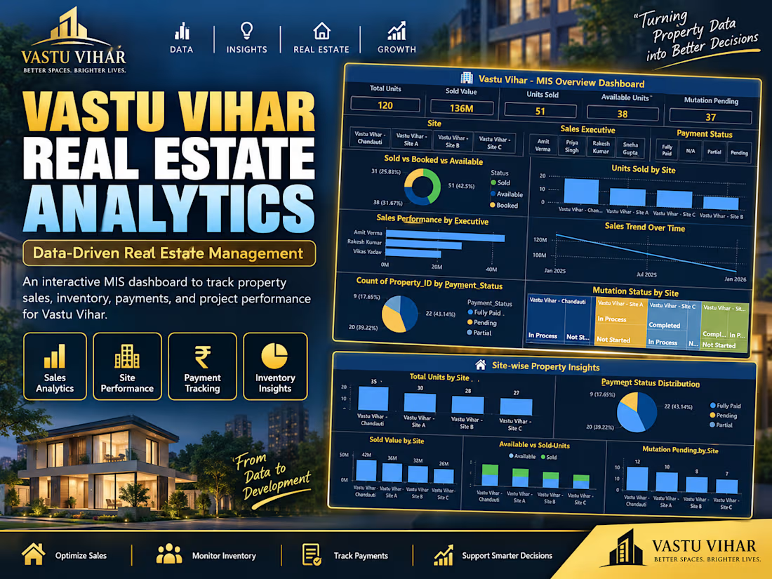
Turning property data into better decisions 🏠📊 Built a full MIS dashboard for a real estate business — tracking 120 units across 4 sites, ₹13.6Cr in sales, payment status, and mutation progress, all in one Power BI view. Excel + Power BI + data modeling. #DataAnalytics #PowerBI #RealEstateAnalytics #Excel #DashboardDesign