Freelance Brand Designers in Eindhoven
Sign Up
Post a job
Sign Up
Log In
Filters
2
Projects
People
Lucia Diaz
pro
Tilburg, Netherlands
Brand identity with structure, strategy, and soul 🌶️
$25k+
Earned
23x
Hired
5.0
Rating
249
Followers
Follow
Message
Brand identity with structure, strategy, and soul 🌶️
0
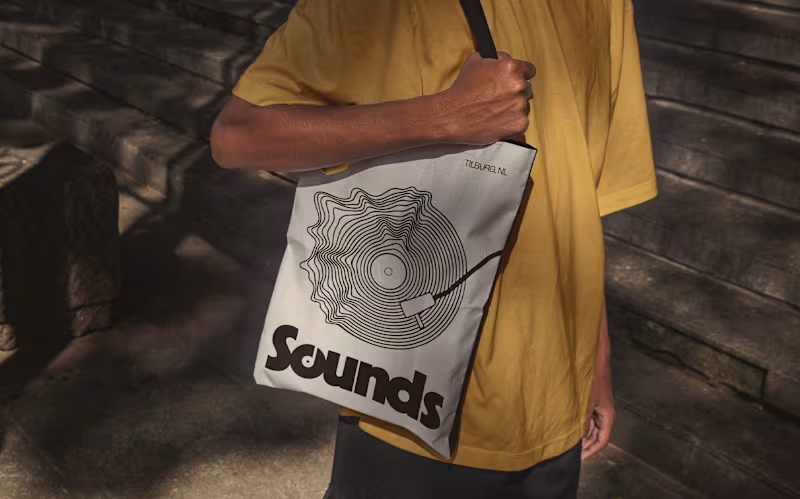
Sounds | Brand Identity
0
45
1
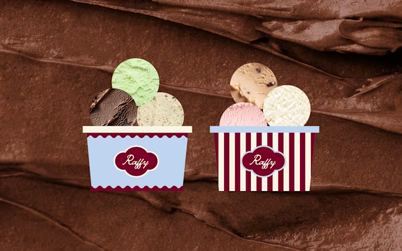
Raffy | Brand Identity
1
26
9
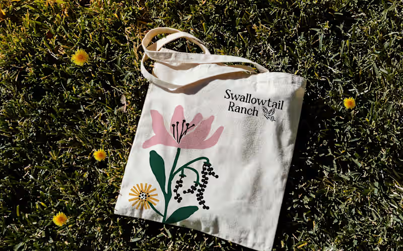
Swallowtail Ranch | Brand Identity
9
127
7
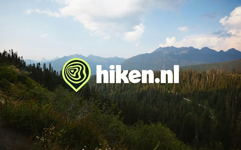
Hiken | Brand Identity
7
214
Brand Designer
(16)
Follow
Message
Nina Kerkhof
Waalwijk, Netherlands
Graphic Designer – visual identities, music artwork & social
44
Followers
Follow
Message
Graphic Designer – visual identities, music artwork & social
0
Pirate-Themed Brand Identity for Van Breemen Music
0
10
0
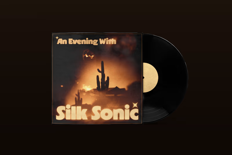
A visual tribute to Silk Sonic
0
7
5
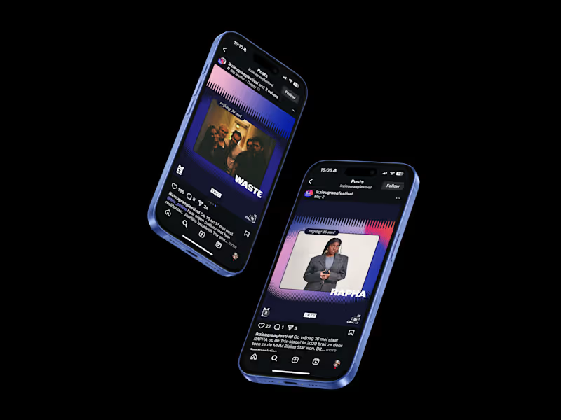
Ik Zie U Graag – Festival Visual Identity
5
71
0
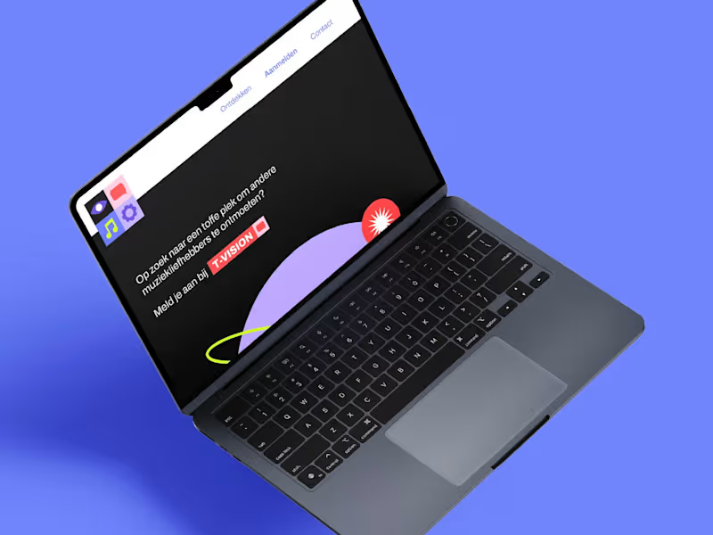
T-Vision: A Bold Visual Language for Young Creators
0
12
Brand Designer
(4)
Follow
Message
Thomas van der Heiden
Helmond, Netherlands
Award Winning Brand Creative
Follow
Message
Award Winning Brand Creative
0
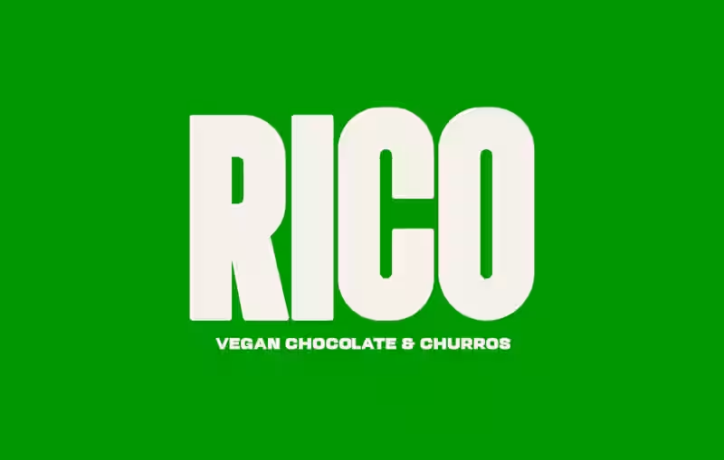
RICO (Vegan Chocolate & Churros) - Visual Identity
0
14
0
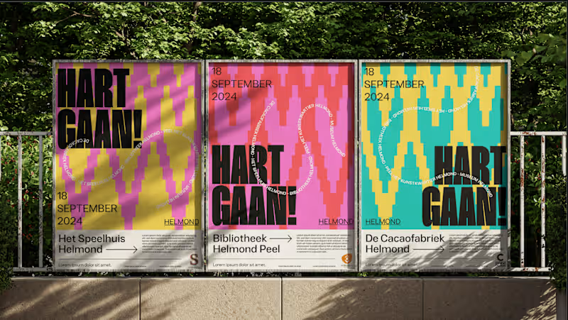
HART gaan visual identity
0
14
0
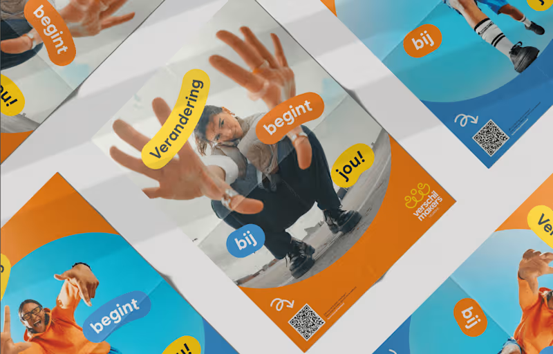
Visual identity De Verschilmakers
0
9
0
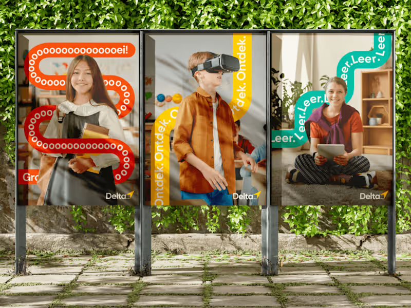
DELTA vmbo Visual identity
0
24
Brand Designer
(4)
Follow
Message
Kai Rennenberg
Best, Netherlands
Visual Storyteller ✦
$1k+
Earned
1x
Hired
26
Followers
Follow
Message
Visual Storyteller ✦
2
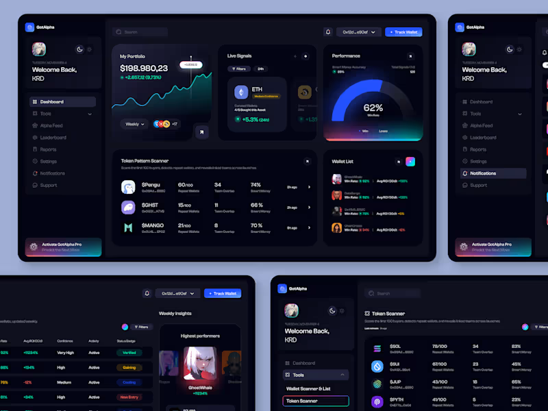
GotAlpha, Trading dashboard
2
141
1
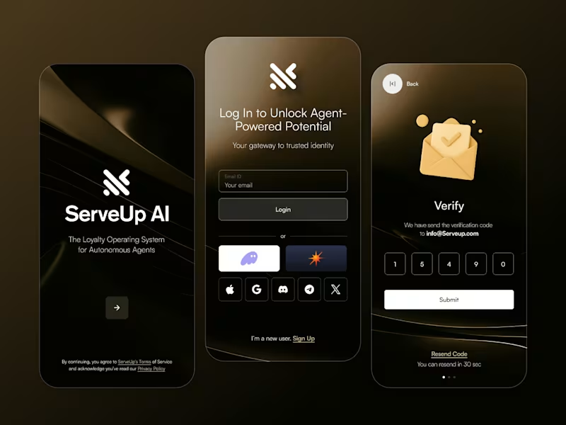
Serveup.AI
1
72
1
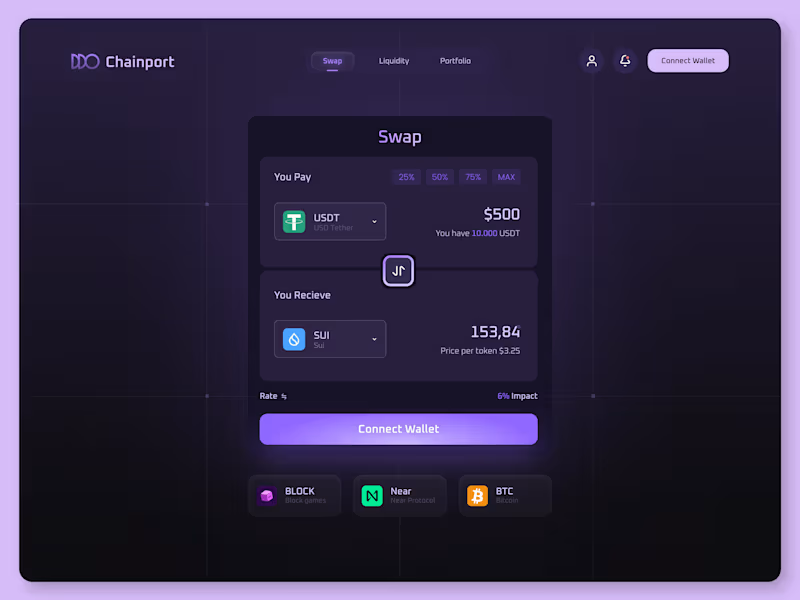
Chainport
1
7
2
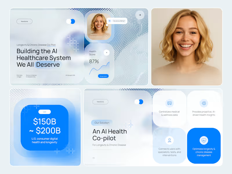
Visual Identity and Investor Pitch Deck for Newsoma
2
26
Brand Designer
(29)
Follow
Message
Get Sparked Studio
Eindhoven, Netherlands
Visual & Motion Brand Designer
New to Contra
Follow
Message
Visual & Motion Brand Designer
1
ProFusion is a high-end padel clinic concept that positions sport as a strategic instrument for professional growth. Operating at the intersection of athletic performance and business development, ProFusion designs curated padel experiences for technology-driven organizations, with a deliberate focus on collaboration, leadership and connection across hierarchical levels. Strategic Foundation and Brand Essence At its core, ProFusion is built on the belief that sustainable performance is never purely individual. In both sport and business, excellence emerges through alignment, trust and shared strategy. The brand name itself reflects this philosophy: a fusion of professional ambition and collective energy, translating the dynamics of padel into a business-relevant context. Rather than positioning its clinics as recreational off-sites, ProFusion frames them as transformative environments. Participants are temporarily removed from the rigidity of the office setting and immersed in an experience where anticipation, communication and adaptability become tangible. The clinics are designed to strengthen interpersonal dynamics, stimulate strategic thinking and ultimately enable teams to perform at a higher level together. Target Audience ProFusion primarily addresses organizations within the technology sector, where innovation, speed and collaboration are essential to success. The clinics are intentionally structured around mixed seniority participation: each company is represented by both junior and senior professionals. This dual-level approach serves a strategic purpose. Juniors bring fresh perspectives, agility and curiosity, while seniors contribute experience, decision-making authority and long-term vision. Through shared physical activity and informal interaction, traditional hierarchies soften, enabling authentic dialogue and mutual understanding. Value Proposition and Key Differentiators ProFusion distinguishes itself through a carefully curated, high-end experience that extends beyond the court. Key brand pillars include: Premium padel clinics with a strong focus on quality and professionalism Structured networking moments that facilitate meaningful B2B connections Thought-provoking speakers who bridge sport and business strategy A deliberate mix of junior and senior participants to stimulate cross-level interaction Together, these elements position ProFusion as both a learning environment and a networking platform, where performance, play and professional development converge. Market Analysis and Positioning An exploratory analysis of existing padel clubs, clinics and related events revealed a highly saturated visual landscape. Most competitors rely on literal, illustrative identities featuring direct representations of padel rackets and balls. While functional, these identities often appear dated, interchangeable and lacking in professional credibility. Given padel’s rapid growth and contemporary appeal, this visual conservatism presents a clear opportunity. For ProFusion, the strategic choice was to avoid illustrative clichés and instead develop a refined, abstract visual language that aligns with the expectations of a corporate, technology-oriented audience. Concept Development and Moodboard Phase As part of the brand strategy process, a dedicated moodboard phase was conducted to align vision and expectations. Two distinct stylistic directions were presented to the founders. The first explored a more abstract interpretation of connection and play, while the second maintained a clearer reference to padel without resorting to literal imagery. This phase functioned not only as a visual exploration, but also as a strategic dialogue. It created space to articulate preferences, boundaries and long-term ambition. Ultimately, the founders selected the direction that subtly references padel while preserving a strong sense of professionalism and clarity. Logo Design & Symbolism The Costa del Son logo is constructed from four conceptual pillars: Spain, festival culture, Gaudí and chique refinement. Typography and illustration merge into a single system, with custom-drawn letterforms reinforcing the handcrafted quality of the identity. Visual elements within the logo include a semi-circular form referencing a Spanish fan or the sun; a flowing underline that represents music and festival movement; a salamander or dragon symbolising Gaudí’s architectural motifs; and a typographic ligature that conveys elegance and cohesion. The logo system was delivered in three variations: a primary illustrated logo, a secondary wordmark and a tertiary sticker-style version for flexible application. Graphic Language and Structure The final visual identity is highly graphic and built from fundamental geometric shapes. Both the wordmark and symbol are derived from circles and modular forms inspired by the ball and racket, abstracted to avoid direct illustration. The coming together of four forms symbolizes the dynamics of padel as well as collaboration, exchange and shared momentum. Network structures and directional elements are integrated throughout the system to prevent visual stagnation and to reflect speed, interaction and progression. The colour palette reinforces the balance between professionalism and energy. Deep, grounded tones establish authority and trust, while vibrant accents inject movement and vitality. Together, they mirror the dual nature of ProFusion: strategic and composed, yet dynamic and competitive. Each colour is contributing to a hierarchy that supports both clarity and contrast across applications. Typography plays a central role in reinforcing coherence and tone. The primary typeface is rooted in geometric construction, closely aligning with the modular logic of the logo. Its balanced proportions and open forms ensure legibility across both digital and print contexts, making it highly suitable for body text and functional communication. The secondary typeface introduces a refined layer of character. Its bold, geometric, rounded structure, creates a controlled sense of playfulness without compromising professionalism. This typeface is primarily deployed in headlines and accent elements, reinforcing distinction and hierarchy within the visual system. The logo is composed of four circular forms arranged in a square configuration. Each circle is extended with a triangular element, abstractly referencing padel rackets while simultaneously symbolizing interaction and convergence. The use of multiple colours within the symbol reinforces diversity, collaboration and movement. Within the wordmark, several typographic interventions add conceptual depth. The modified tail of the letter P subtly resembles a speech bubble, referencing dialogue and networking. The adapted F introduces curved segments that emphasize speed and flow. The vivid green dot on the I stands apart from the otherwise restrained wordmark, functioning as a visual metaphor for the ball and a focal point within the composition. Brand Extensions and Applications To ensure consistency and scalability, the identity was extended across a comprehensive range of assets. These include graphic patterns, modular visual elements, social media templates, flags, branded cups and custom padel rackets. Each application reinforces the core system while allowing for variation and adaptability across physical and digital touch points. Outcome The ProFusion brand identity translates an abstract strategic concept into a coherent visual system. By avoiding literal sports symbolism and focusing instead on structure, rhythm and interaction, the identity positions ProFusion as a credible, future-oriented platform for professional connection through sport.
1
33
0
Born from a passion for interior design and inspired by the great pioneers of the field, MisterDesign specializes in high-quality custom interiors. Their curated collection features the most innovative and iconic furniture, lighting, and design accessories from leading global brands. For the rebranding of MisterDesign, the process was both creative and strategic, grounded in the company’s three defining brand markers: “We breathe design,” “Iconic pieces come together,” and “For now and forever.” The goal was to establish an identity that captures the richness of their heritage while positioning the brand as timeless and future-ready. Inspiration & Concept Development The conceptual foundation for the rebranding was drawn from MisterDesign’s extensive historical furniture collection, ranging from the 1960s through the 1990s. These decades stand out for their distinct visual languages; each defined by iconic furniture movements, aesthetic innovations, and design philosophies. The central challenge was to craft a modern corporate identity that could cohesively embrace this breadth of styles, allowing the brand to communicate unity without losing the character of these individual design eras. Research and Analysis After an in-depth exploration of each style period, examining characteristic patterns, color palettes, typographic tendencies, photographic styles, and material aesthetics; a clear understanding emerged of how each decade contributed to the broader design landscape. This research phase centered on identifying conceptual and visual commonalities that could form a strong structural basis for the new identity. By distilling the defining elements of each era, a coherent visual system could be shaped. One that feels both historically informed and distinctly contemporary. Design Synthesis From the research insights, I distilled the most iconic and representative elements from the 60s, 70s, 80s, and 90s. These components were reinterpreted and merged into a unified visual pattern created specifically for MisterDesign. This pattern functions as a visual metaphor for the brand: an environment where iconic pieces from different eras literally converge. It also forms the structural foundation for the custom logo I designed; bringing together influences from multiple decades into a single, modern expression. Final Identity System The resulting logo and pattern integrate recognizable motifs and color harmonies from the brand’s key style periods, creating a corporate identity that feels contemporary yet deeply rooted in design history. The new identity not only showcases the significance of MisterDesign’s heritage but also frames the brand as enduring, relevant, and future-driven. By building a visual world in which iconic design eras seamlessly meet, the rebranding embodies MisterDesign’s commitment to excellence, continuity, and innovation.
0
30
0
Unifortis, a trusted expert in optimizing social legislation. Navigating the complexities of ever-changing social regulations, Unifortis helps organizations avoid unnecessary financial burdens and seize opportunities for subsidies and incentives. Their work demands precision, authority, and long-term reliability; qualities that needed to be reflected in their new visual identity. Bonjourney invited me to collaborate on the rebranding trajectory, with my role centered on developing a renewed brand identity that respects Unifortis’ classical roots while elevating the visual system to a contemporary standard. Project Scope The brief required the creation of a new brand identity, with a strong emphasis on preserving the iconic lion-and-ball symbol; an emblem representing oversight, authority, and control. The new logo therefore needed to embody both the legacy of the brand and the functional nature of their core products, which are primarily digital applications. Before initiating the visual exploration, I conducted a thorough assessment of the brand’s values, market positioning, and internal identity. This strategic foundation shaped all subsequent creative decisions. Brand Values & Strategic Framework Trust The reassurance of expertise built over decades. Control Oversight and structure in an increasingly complex regulatory environment. Longevity A stable, enduring presence that adapts while remaining dependable. From the brand evaluation, these three core attributes emerged. The visual identity needed to encapsulate these qualities through form, colour, and typography. The resulting palette balances human warmth with technical precision, reflecting both the consultancy’s personable approach and their deep regulatory expertise. Visual Identity Development Typography To connect Unifortis’ heritage with its future, I selected a typeface that merges the nostalgic familiarity and trust of a typewriter aesthetic with a subtle digital sharpness. This creates a bridge between tradition and modernity, echoing the evolution of the brand itself. Symbol Design The lion: Unifortis’ long-standing icon, was completely re-illustrated to achieve structural harmony, clarity, and modern relevance. Built meticulously with circular geometry, the lion’s form now aligns seamlessly with the ball it holds, creating a unified composition that expresses stability and control. Colour System The colour palette balances the human dimension of Unifortis’ work with the technical, expert-driven nature of their services. Muted, trustworthy tones are paired with sharper, more authoritative accents to ensure clarity and distinction. Outcome The new identity positions Unifortis as both timeless and forward-thinking, respecting its historical roots while enhancing its relevance in an increasingly digital environment. Once the visual identity was completed, Bonjourney proceeded with platform development, integrating the brand system into the renewed digital experience and further shaping Unifortis’ future direction.
0
37
0
Remedica is a health-education organization dedicated to delivering scientifically grounded, accessible and empathetic guidance across a diverse healthcare landscape. Following an in-depth strategic session with the founders, I was commissioned to develop a renewed brand identity, a certification mark, and an extensive suite of communication assets. This included materials for digital channels, print applications and a dedicated event campaign celebrating Remedica’s 40-year anniversary. The new identity needed to express reliability, clarity and warmth; while establishing a distinctive presence within an increasingly homogenized healthcare sector. Strategic Foundation Audience and value mapping revealed five core brand pillars. Together they form the brand’s narrative, its visual language and its behavioral cues. - Guidance Helping people navigate an increasingly complex healthcare system. - Inspiration Across Generations Encouraging informed decision-making for all ages. - Operational Relief Supporting healthcare professionals by taking over the educational burden. - Reliable Product Recommendations Transparent, evidence-based curation supported by a proprietary certification mark. - Scientific Integrity Every piece of communication is validated by domain experts and current research. Audience Architecture Remedica serves three interconnected audiences: commissioning parties (B2B), intermediary professionals (B2P), and the general public (B2C). A comprehensive audience architecture was developed to understand the full spectrum of Remedica’s stakeholders. Through qualitative analysis, behavioral mapping and value-based segmentation, each audience group was examined in detail: their motivations, expectations, pain points, and communication preferences. This included healthcare professionals, patients and caregivers, corporate partners, and the broader public seeking trustworthy medical information. By identifying what resonates with each group — and equally, what disengages them — clear behavioral patterns and emotional drivers emerged. From this, I distilled the shared denominators across all segments: a need for clarity without oversimplification, authority without arrogance, accessibility without losing scientific rigour, and emotional reassurance grounded in factual accuracy. This cross-audience overlap formed the strategic backbone of the identity. It ensured that the visual and verbal system could flex across diverse contexts while maintaining a consistent sense of trust, empathy and expertise. Market Positioning The healthcare communication sector is dominated by rounded forms, soft pastels and predictable blue–pink palettes. While accessible, these styles often blend into one another, making visual distinction increasingly difficult. Recognizing this saturation created a strategic opening for Remedica: an identity that preserves the trustworthiness expected within healthcare, yet advances it through a more contemporary and human-centered expression. The resulting positioning balances scientific rigour with empathy, allowing the brand to stand apart without stepping outside the boundaries of credibility within the healthcare industry. Visual identity System The final colour palette was constructed around a refreshed version of Remedica’s existing skin-tone hue, previously too muted to stand out. This updated Human Tint became the emotional cornerstone of the palette: warm, inclusive and grounded in Remedica’s personal approach. Around this tint, I developed a set of interlocking colors with distinct functional and symbolic roles. The photography framework is built around three complementary pillars that together express Remedica’s human-centered philosophy. Imagery of healthcare specialists is captured in authentic working environments, using clean compositions and gentle depth of field to convey warmth, expertise and approachability. A second pillar focuses on workshops, emphasising participation and real interaction through dynamic angles and atmospheric depth, resulting in visuals that feel lived-in rather than staged. The product-focused imagery situates certified items in realistic, human contexts, using soft lighting and warm tones to communicate care, quality and trust across audiences. The typographic system pairs a modern, highly legible sans serif for body copy with a bold, contemporary display type for titles and statements. The primary typeface offers clarity, balance and a subtly human warmth, ensuring readability across both digital and printed educational materials. The secondary typeface introduces confident geometry softened by rounded details, projecting authority without harshness. Together, they form a cohesive hierarchy that reinforces Remedica’s commitment to professionalism, accessibility and human-centered communication. Behavioral & Psychological Foundations The redesign is grounded in behavioral and psychological principles that influence how audiences process healthcare information. By establishing consistency in tone, form and narrative structure, the identity creates a stable cognitive environment—one in which users can intuitively recognize expertise and feel supported by it. Drawing on research into patient perception, professional trust-building and educational communication, the system employs deliberate sensory cues: softened geometric forms to reduce perceived rigidity, human-centered colour values to signal empathy, and documentary-style photography to reinforce authenticity and credibility. Together, these elements construct a visual language that is not only aesthetically cohesive but psychologically attuned—evoking reliability, warmth and professional assurance across all audience groups. Outcome The resulting rebrand positions Remedica as a credible, contemporary and empathetic authority within the healthcare education landscape. The identity reinforces confidence among major pharmaceutical partners, supports healthcare professionals in their day-to-day practice, and makes health information more accessible for the general public; without compromising scientific integrity.
0
42
Brand Designer
(9)
Follow
Message
Leah Koenders
Eindhoven, Netherlands
Designing effective branding for bold brands!
Follow
Message
Designing effective branding for bold brands!
0
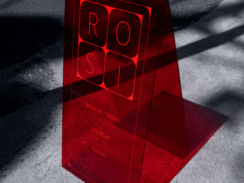
Branding for ROSI flowers & events
0
8
0
Branding for a real estate project in Tilburg
0
6
0
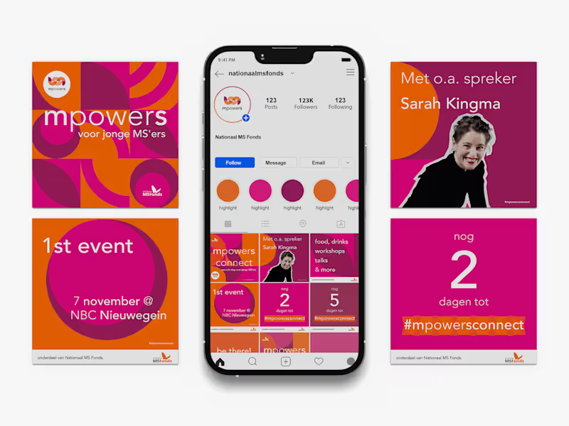
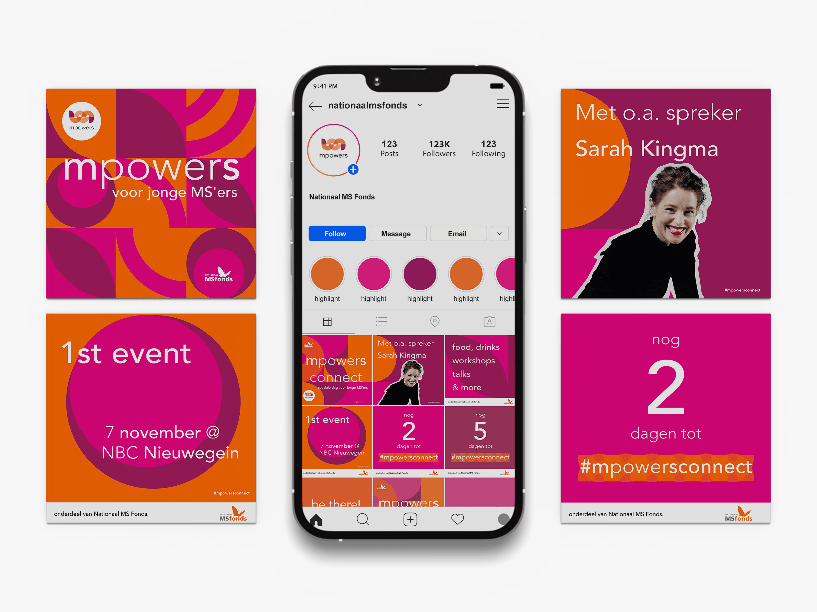
Non-Profit Organization's Campaign for young people with MS
0
11
View more →
Brand Designer
(3)
Follow
Message
Fleur de Jong
Venray, Netherlands
Crafting your ideal brand designs together
Follow
Message
Crafting your ideal brand designs together
0
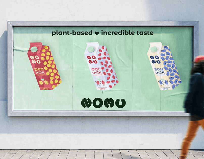
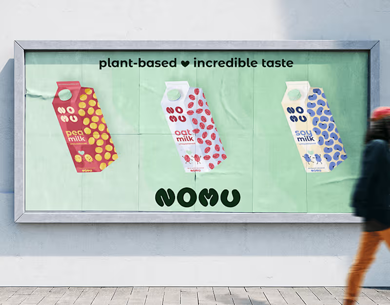
Brand Identity: Nomu
0
1
0
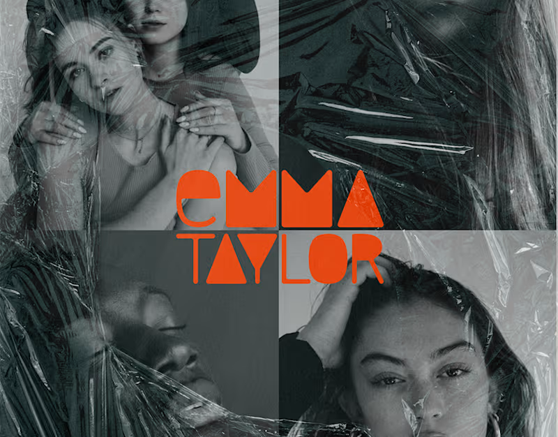
Brand Identity: Photographer - Emma Taylor
0
3
0
Logo Design: Copywriter
0
6
View more →
Brand Designer
(3)
Follow
Message
Juriaan Design
Tilburg, Netherlands
Crafting Unique Visual Narratives that fit your brands story
Follow
Message
Crafting Unique Visual Narratives that fit your brands story
0
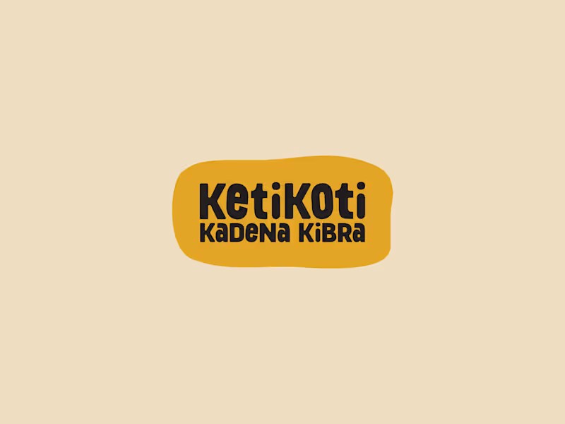
"KETIKOTI040" - Playfull Branding for a historical event.
0
8
0
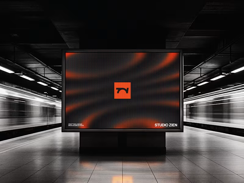
"ZIEN" - Modern branding for a Berlin design agency.
0
5
0
"LiquidBeans" - Authentic Branding for a Coffee Extract.
0
6
View more →
Brand Designer
(2)
Follow
Message
Explore people