Logo Design Projects in EdwardsvilleLogo Design Projects in EdwardsvilleBranding is a feeling....its not just the logo. It's everything you see, hear, and read.
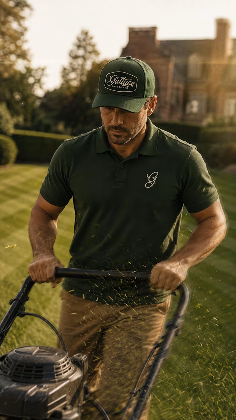
Everything you see here communicates a feeling of high-quality service, luxury, and a sense that not only will these guys will keep your property pristine, but will go above and beyond.
This is exactly the task I was assigned to help Gattuso with, originally called "Lawn & Order". They wanted to land bigger clients, nicer neighborhoods, add all-season service packages, and break into the commercial space as well. Their name was holding them back. It didn't communicate the right feeling.
We workshoped dozens of names and landed on the owner's family name...so they can build trust and recognition in the their local market by putting their name on the line.
We then developed an elegant wordmark, brandmark, language, and a brand system that solidifies client expectation and elevates them as a serious and trusted partner.
A client of mine came to me with a name problem....
He runs an interior design studio for real estate investors — flippers, new builds, STRs. Good work. Steady clients. One issue: the name. "Ivory Home."
Problem #1: there's a national homebuilder called Ivory Homes. Every Google search sent people to a company he had nothing to do with.
Problem #2: the name said nothing about who it was for. Nothing said "investor." Nothing said "return on your renovation." It just said... home decor.
So we started over.
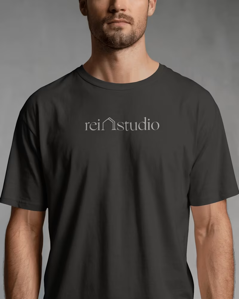
Naming: We landed on REI Studio. Clear. Searchable. Says exactly who it's for — real estate investors — in three letters.
Positioning: Not a traditional interior designer. Not a home builder. A design systems partner that helps investors move faster, make better decisions, and increase returns. That's the whole pitch.
Voice: Short sentences. No luxury-boutique fluff. No jargon. Sound like an operator talking to another operator, because that's who's reading it.
Visual identity: A minimal house mark with a "double line" — forward motion, transformation. Warm neutrals instead of cold luxury tones. A serif logotype that reads studio-grade without reading pretentious.
Deployment: Full system, not just a logo: business cards, brochures, apparel, trade show booth, website, email templates — all speaking the same language.
The result wasn't just a prettier brand. It was a brand that finally said the right thing to the right person, the first time someone saw it.
That's the job. Not decoration. Clarity.