The network for creativity
Join 1.25M professional creatives like you
Connect with clients, get discovered, and run your business 100% commission-free
Creatives on Contra have earned over $150M and we are just getting started
Back to feedPost

A client of mine came to me with a name problem....
He runs an interior design studio for real estate investors — flippers, new builds, STRs. Good work. Steady clients. One issue: the name. "Ivory Home."
Problem #1: there's a national homebuilder called Ivory Homes. Every Google search sent people to a company he had nothing to do with.
Problem #2: the name said nothing about who it was for. Nothing said "investor." Nothing said "return on your renovation." It just said... home decor.
So we started over.
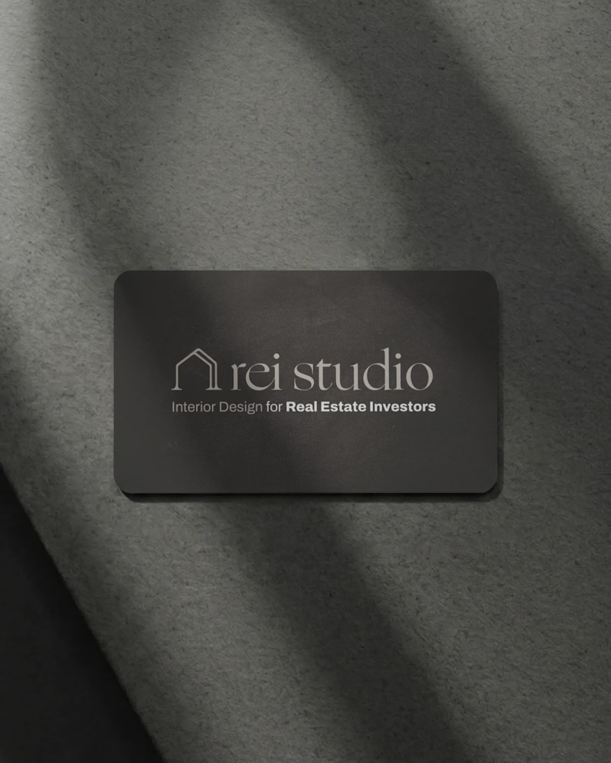
Naming: We landed on REI Studio. Clear. Searchable. Says exactly who it's for — real estate investors — in three letters.
Positioning: Not a traditional interior designer. Not a home builder. A design systems partner that helps investors move faster, make better decisions, and increase returns. That's the whole pitch.
Voice: Short sentences. No luxury-boutique fluff. No jargon. Sound like an operator talking to another operator, because that's who's reading it.
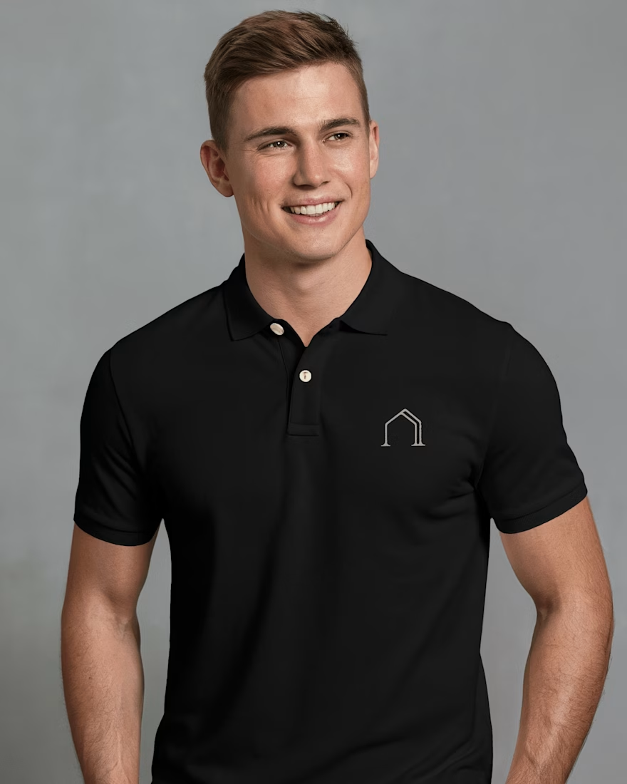
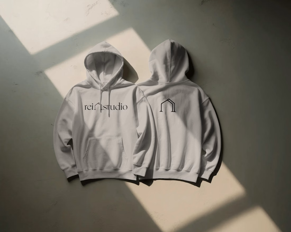
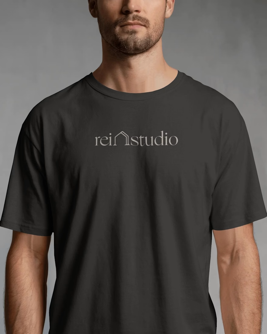
Visual identity: A minimal house mark with a "double line" — forward motion, transformation. Warm neutrals instead of cold luxury tones. A serif logotype that reads studio-grade without reading pretentious.
Deployment: Full system, not just a logo: business cards, brochures, apparel, trade show booth, website, email templates — all speaking the same language.
The result wasn't just a prettier brand. It was a brand that finally said the right thing to the right person, the first time someone saw it.
That's the job. Not decoration. Clarity.

The network for creativity
Join 1.25M professional creatives like you
Connect with clients, get discovered, and run your business 100% commission-free
Creatives on Contra have earned over $150M and we are just getting started

Challenges
View all


Related posts

Client’s choice vs. Designer’s choice 👀
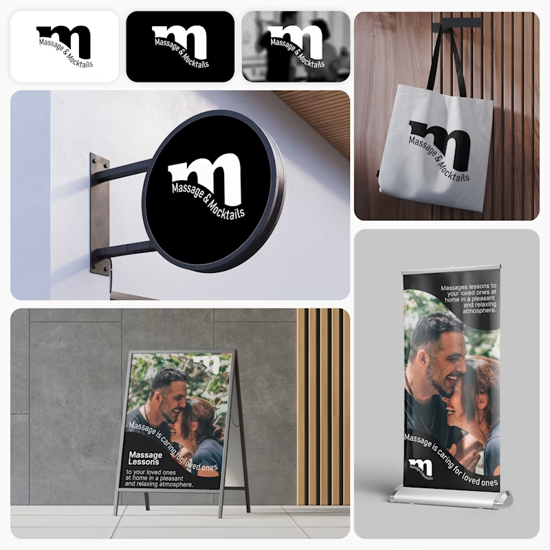
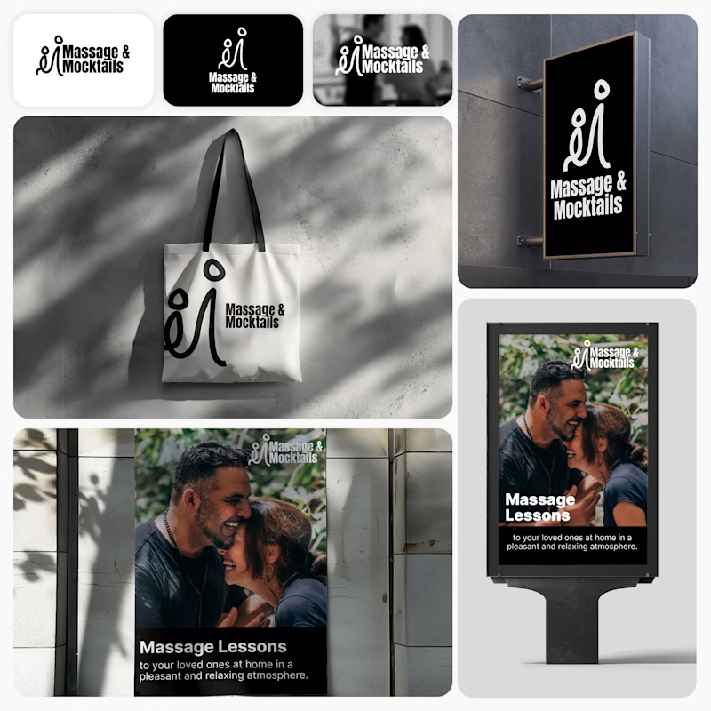
I’m currently working on a branding project for Massage & Mocktails — a concept built around couples learning massage together in a relaxed, social atmosphere.
These are two early, black & white directions from Stage 2 of my branding process, before moving into color, typography, and the full visual system.
The interesting part?
My client chose Concept 1. I chose Concept 2.
Now I’m curious what other creatives think.
Which direction would you choose — 1 or 2? And why?
Sometimes the most interesting part of branding is seeing how differently a client and a designer respond to the same brief.
21 voted
44%
27 voted
56%
48 votes
Closed

Concept 2 for me. That interlocking figure mark reads as two people meeting, which is the actual brief here, so it gives you more to build a system on. Concept 1 is the safer, more literal pick, which is usually why clients reach for it.


Marigold is a one day concept for envato's human by design challenge. i set the direction in real photography first then generated against that standard.


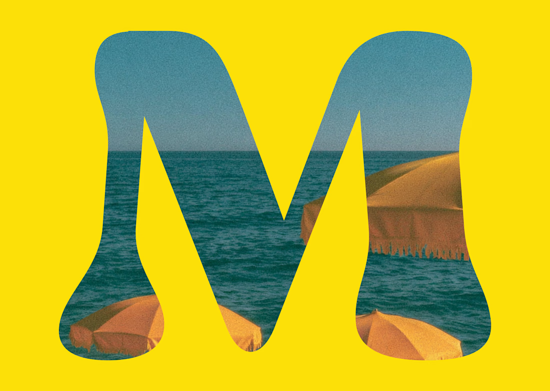

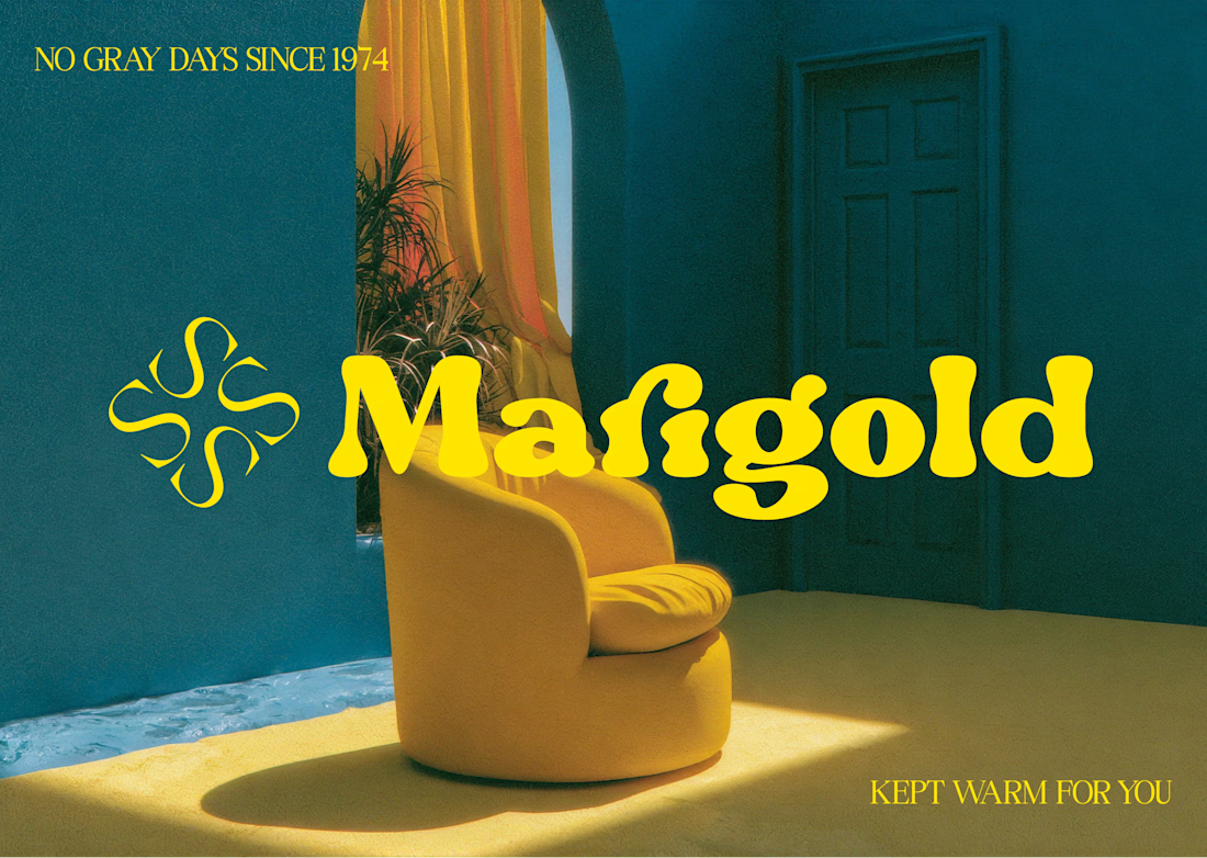


One idea, held all the way through: name, object, photography, palette, motion.
That's the whole pitch for how I work.
AQUILIFER — a brand I built around this: jewelry as something carried, not worn.
The name comes from Roman military rank. The aquilifer carried the standard, the one thing the legion couldn't afford to drop.