
Video Editor | Reels, Shorts & YouTube | 15M+ Views
Video Editor | Reels, Shorts & YouTube | 15M+ Views
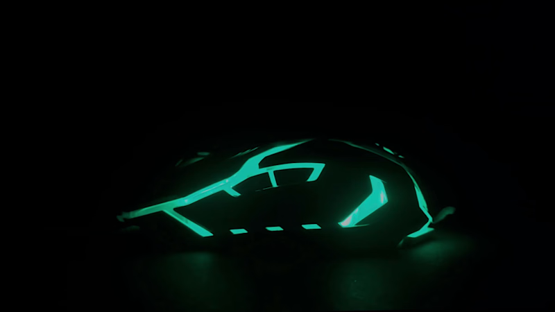
Where It Started: A Product Video I Never Posted
In 2023, for a class project, I made this 30-second video for a gaming mouse I owned. I set it up in the dark, let the lights do the talking, and cut it around the color shifts.
Then I never posted it.
Instead, my work took me into travel content. I spent time making reels for travel brands, and a few of those videos reached millions of views. I learned what holds attention, how to open a video, and how to keep people watching.
But this video stayed on my drive, and I kept coming back to it. It’s still the kind of work I enjoy most: taking an object, finding its mood, and making someone feel something about it in a few seconds.
So I’m posting it now, three years late, as a starting point for the product and brand videos I want to make more of. I’d cut it differently today, with a sharper opening and a clearer story, but I wanted to show where it began.
*Independent concept made during my studies, not affiliated with or commissioned by Zebronics.
0
23
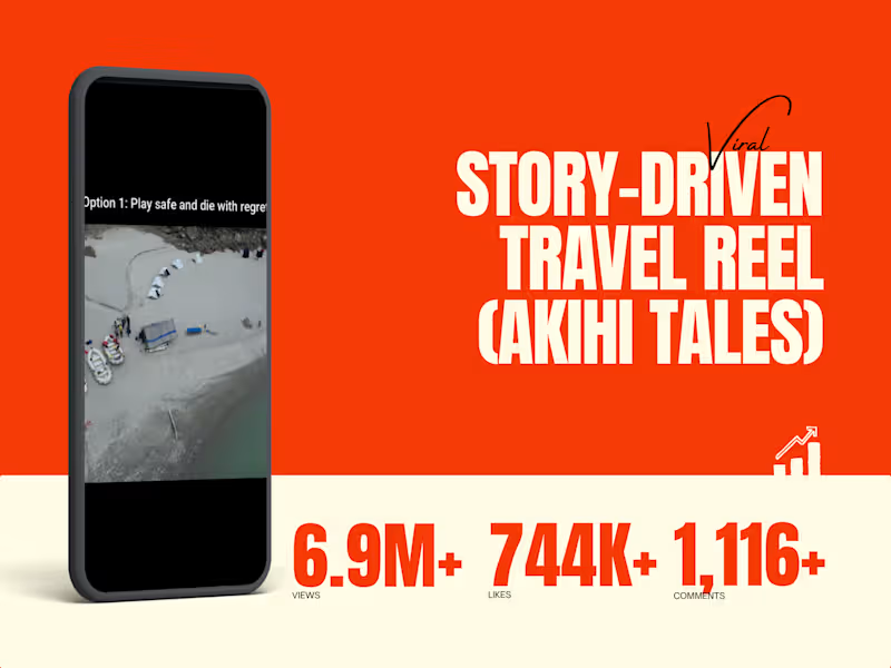
Story-Driven Travel Reel (Akihi Tales)
Role: Travel Video Editor
The Goal: Drive massive emotional engagement and bookings for Akihi Tales' 70km Ganga rafting expeditions by positioning adventure as the ultimate escape from routine life.
The Execution: Crafted a cinematic, emotion-led short-form edit using DaVinci Resolve. Built a highly relatable visual hook to stop the scroll, relying on rhythmic pacing, natural landscapes, and minimal text to let the destination sell itself.
The Result: 6.2M+ views, 698K+ likes, and 1K+ comments. Absolute proof that clean, emotion-driven storytelling consistently outperforms over-edited, flashy transitions in the travel niche.
1
181
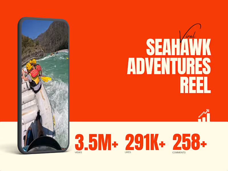
Seahawk Adventures Viral Reel
Role: Travel Video Editor
The Goal: Maximize reach and capture immediate attention for Seahawk Adventures' river rafting and kayaking packages in Rishikesh.
The Execution: Edited a high-energy, fast-paced Reel designed for instant scroll-stopping appeal. Utilized bold typography, striking color contrast, and a trend-driven structure to retain viewer attention. The edit prioritized rhythm and visual hooks in the opening frames to appeal to a broad, non-niche audience.
The Result: 3.4M+ views and 297K+ likes. Demonstrated that high-energy visuals and trend-aware execution can drive massive organic reach for adventure travel content.
1
152
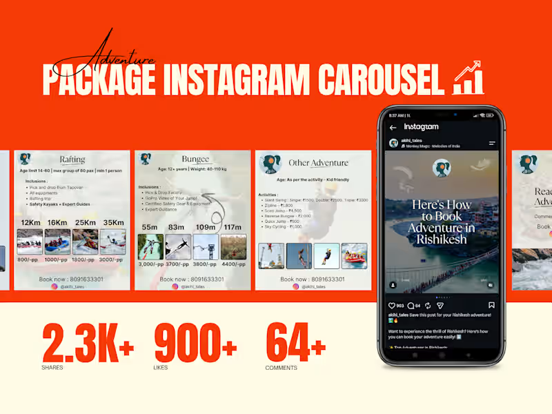
Adventure Package Instagram Carousel
Role: Travel Content Designer (Canva)
The Goal: Drive organic shares and bookings for Rishikesh adventure packages (rafting/bungee) without overwhelming users with heavy pricing text.
The Execution: Designed a clean, visual-first Instagram carousel entirely in Canva. Structured the swipe-flow to hook viewers with destination imagery, transition smoothly into scannable pricing, and end with a high-conversion call-to-action.
The Result: 2,381 shares, 900+ likes, and 92 comments. Proof that trend-aware design combined with clear pricing drives massive organic action for travel brands.
1
174

Revolutionize Your Marketing: The Future of Digita


Detail-Oriented Community Assistant
Detail-Oriented Community Assistant


View more →

Designing scroll-stopping creatives for product brands.

I edited this trailer for a dashcam for one of the clients. I'm Looking for some suggestion from fellow designer/editor.... Your suggestions are welcome😊
1
82
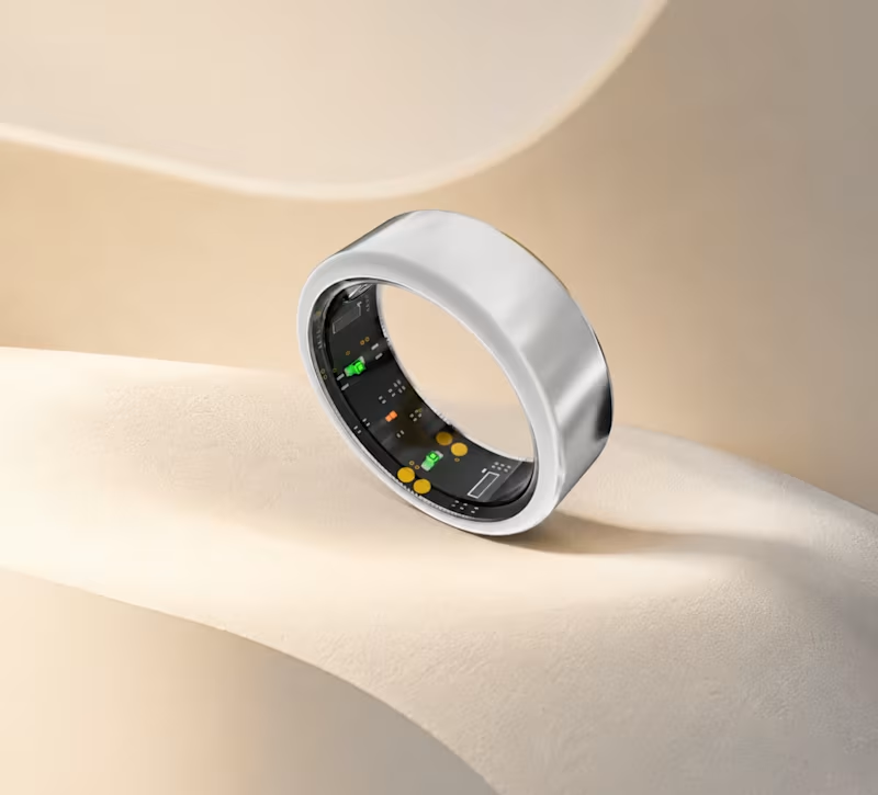
What if a smart ring could feel as premium as a luxury accessory?
That was the direction behind these visuals — minimal, refined, and designed to make technology feel desirable.
0
99
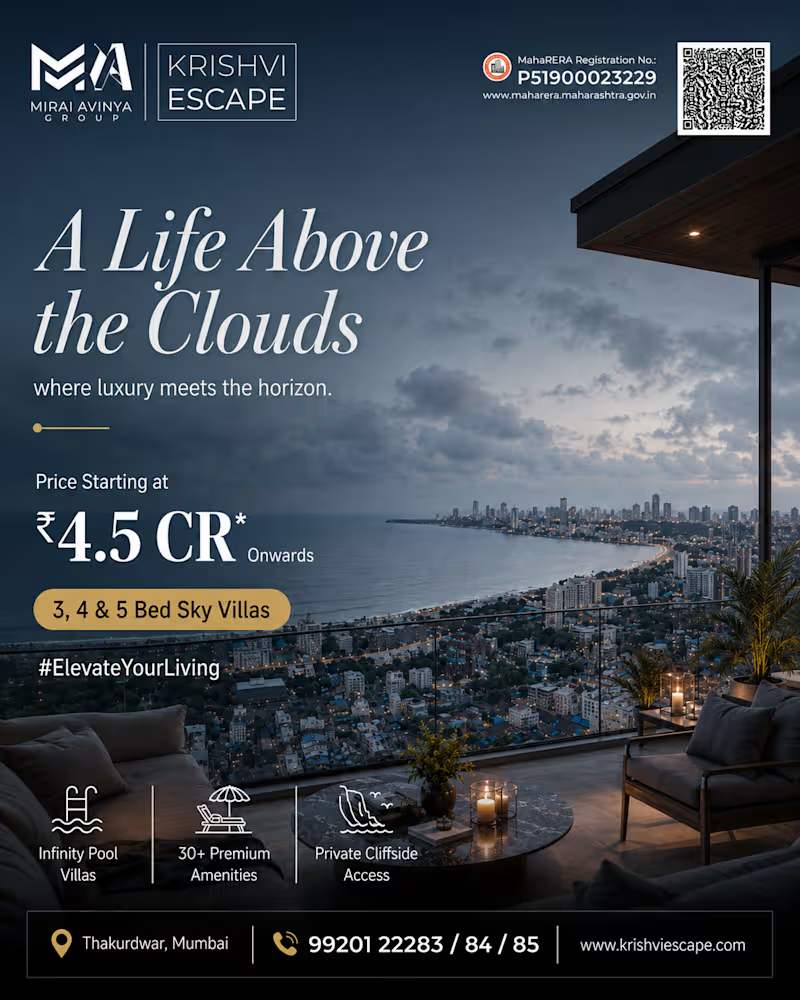
Skyline views, luxury living, premium branding ✨
Recent ad creatives for high-end real estate campaigns — Krishvi Escape & Skyline Estates.
#DesignPortfolio #RealEstateAds #VisualDesign
0
74
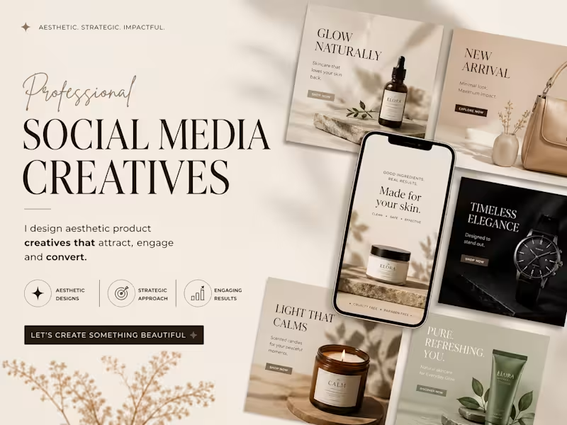
This project showcases a premium presentation layout highlighting a series of high-conversion Social Media Creatives. The design approach is engineered for direct-to-consumer (DTC) e-commerce brands in the wellness, beauty, and luxury lifestyle sectors, focusing on a seamless blend of elevated aesthetics and strategic marketing.
Design Strategy & Layout Highlights
Typography Hierarchy: The main presentation utilizes an elegant, high-contrast serif typeface for the headers ("SOCIAL MEDIA CREATIVES"), paired with a fluid, organic script accent for a touch of luxury. The ad creatives use clean, accessible sans-serif typography designed for maximum readability on mobile feeds.
Color Story & Tone: A deeply cohesive, warm neutral color palette dominates the canvas—utilizing soft cream, warm beige, muted sage green, and striking contrast accents of deep charcoal and rich espresso brown.
Multi-Product Mockup Integration: As showcased in the image, the composition features an array of modular square grid layouts alongside a central smartphone UI mockup. This setup effectively demonstrates how the campaign assets transition seamlessly from Instagram grid posts to high-impact mobile stories or reels.
Visual Styling: The entire layout leverages soft, natural leaf and window-pane shadow overlays, raw stone styling elements, and warm, minimalist photography to communicate a sense of "quiet luxury" and organic purity.
1
112