Projects using Adobe Photoshop in Dhaka Division
Projects using Adobe Photoshop in Dhaka Division
Sign Up
Post a job
Sign Up
Log In
Filters
2
Projects
People
Message
8
Zerin Zaker
pro
I almost didn't post this. Not because it's bad. Because it's personal. There's no client name attached. No brand guidelines I followed. No Slack thread with 47 rounds of feedback. Just me, a blank canvas, and a feeling I couldn't explain in words. So I designed it instead. Here's something nobody warns you about when you become a designer: the more client work you take on, the further you drift from the reason you started. You get good at solving other people's problems. You forget what your own creative voice sounds like. This piece brought it back. I sat down with zero expectations. No moodboard. No Pinterest tab with 200 pins. I just started moving shapes, pulling colors, trusting my gut. And somewhere between the third iteration and the fifth coffee, something clicked. It felt like the first time I ever opened a design tool and thought, "I could do this forever." If you're a creative who hasn't made something purely for yourself in a while, this is your sign. Not for your portfolio. Not for the algorithm. Not for a client. For you. What's the last thing you created just because you wanted to? Drop it below. I genuinely want to see it.
2
8
262
Message
1
Jerin Nusrat
pro
Shipping Box packaging Design and Mockup
1
1
Message
4
Orbix Studio
max
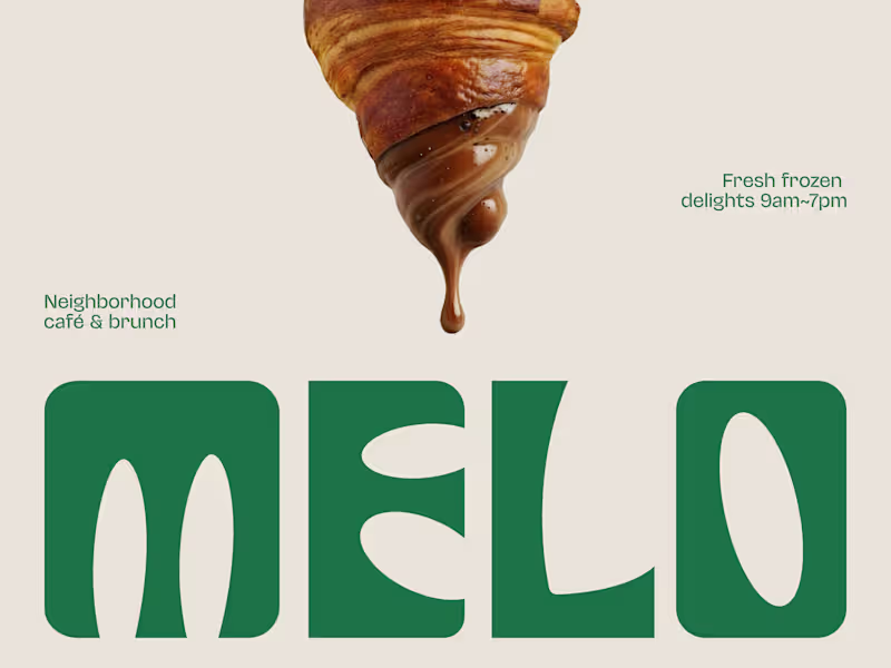
The best café brands don't introduce themselves. They just feel familiar from day one. Most neighborhood café brands hide behind generic coffee cup icons, overused script fonts, and a color palette that could belong to a yoga studio or a juice bar or literally anything else. The logo promises character. The brand delivers nothing you'd remember by the time you reach the door. Melo made familiarity the whole brief. A custom palm tree emblem encircled in a clean oval, organic, architectural, impossible to mistake for anything else. Deep forest green across three environments: cream, burnt green, and dark olive, each one feeling as considered as the last. A rounded wordmark so confident it can fill an entire poster at display scale and still feel warm rather than loud. And right there on the campaign visual, a caramel-dripping croissant melted into the letterforms, like the food and the brand were always the same thing. That's not just a logo system. That's a place people recognize before they even read the name. Because a neighborhood spot that earns a place in someone's morning deserves a brand that feels just as inevitable. What makes a café logo feel like it actually belongs to a place? 👇
2
4
297
Message
0
Mehedi Islam
ROODY | Wooden Furniture Branding
0
0
Message
0
Mir Ashfaque
pro
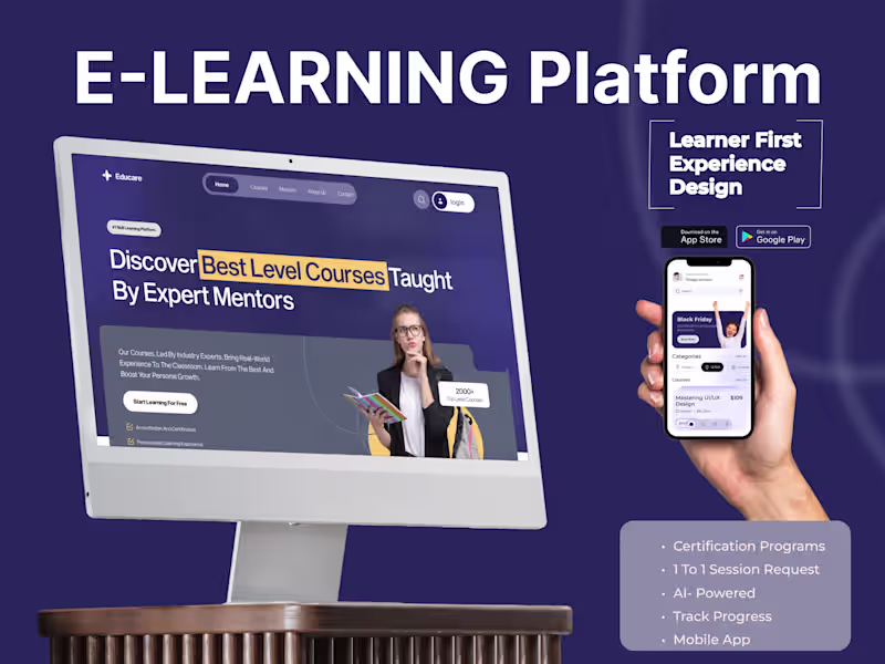
Educare- E- Learning Platform UIUX Design
0
2
Message
11
MD Rafee Alam
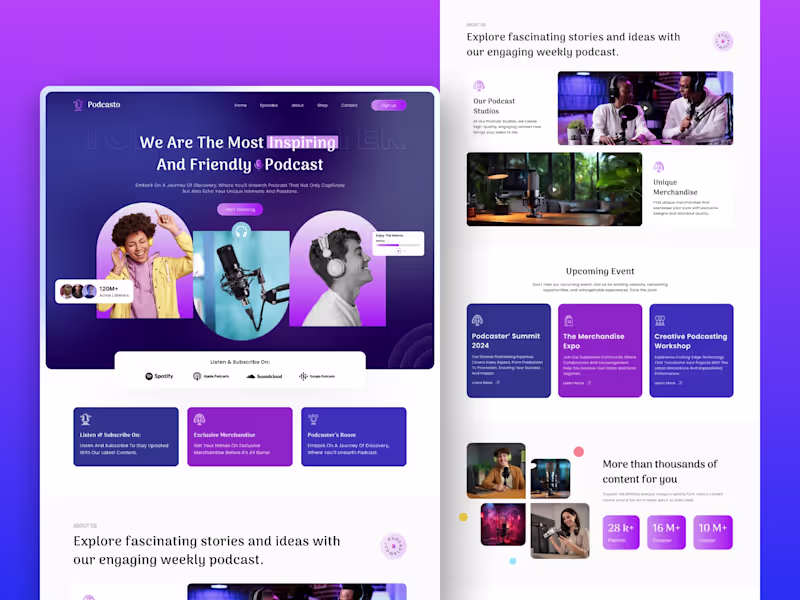
A Premium Podcast Website Experience Built for Growth 🎙️🚀 What this design achieves: -Clear homepage structure for faster understanding -Strong content hierarchy to improve engagement -Conversion-focused CTAs for subscriptions & sign-ups -Responsive layout designed for real-world scaling -A consistent visual system for future pages Need a website UI/UX that feels premium and converts? 👉 DM me — available for website, mobile, and product design projects.
2
11
1K
Message
0
Mh Thithas
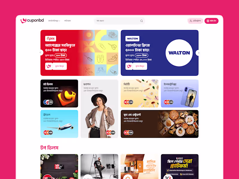
Cuponbd | Web App Design
0
20
Message
0
Samsuzzoha Nion
3D Realistic Packaging Design
0
2
Message
0
Tanvir Hasan
pro
Branding | Logo Design | Brand Identity
0
13
Message
1
Rakibul Hasan
Logo design for Noahr
1
65
Message
3
Arifa Zanom
pro
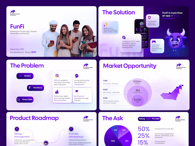
Really excited to share my latest fintech pitch deck project! 💡 I had a great time working on this one — from crafting a clear investment story to designing visuals that make data easy to understand. Fintech decks are always a fun challenge, and seeing everything come together visually was super rewarding. Can’t wait to share more of my recent design work soon!😊
1
3
123
Message
1
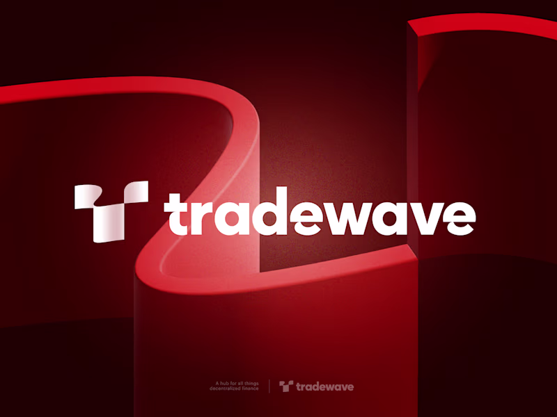
Milon Ahmed
pro
Tradewave - Logo Design
1
2
Message
19
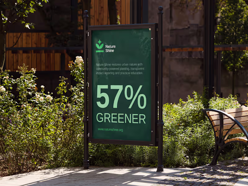
Maruf Ahmed
Nature Shine | Logo & Brand Identity Design
19
40
Message
7
Taqwah - SaaS Product Design
pro
Healthcare products often focus on functionality first. But trust is built through experience. Nurein’s branding motion was designed to make healthcare communication feel calmer, clearer, and more human through structured motion storytelling. The system combines: • Bento-inspired identity motion • Logo animation • Real-time doctor suggestion visuals • Minimal healthcare aesthetics • Precision-focused transitions Every movement was designed to reinforce clarity, accessibility, and emotional reassurance - not just visual polish. Because strong healthcare branding should help users feel confident before they even interact with the product. Building a healthcare, SaaS, or AI product? We help brands create motion systems, visual identities, and scalable digital experiences that convert trust into engagement. 🌐 taqwah.agency (http://taqwah.agency) | 📩 hello@taqwah.agency (mailto:hello@taqwah.agency)
4
7
163
Message
2
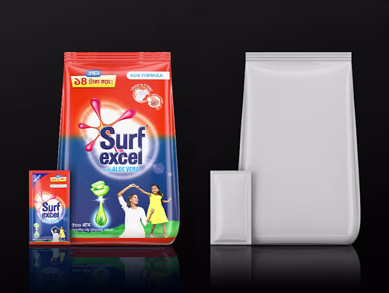
Anik Poddar
Here’s a recent 3D project we crafted from scratch for Surf excel from modeling to lighting and material development. My main goal was to capture the premium brand vibe through realistic lighting and clean surface detail. The challenge was balancing subtle reflections with soft shadows to achieve a studio-quality cinematic render. Always exciting to bring brand aesthetics to life through 3D design!
2
2
170
Message
1
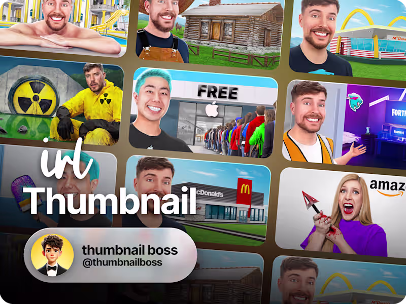
Thumbnail Boss
YouTube IRL Thumbnails
1
148
Explore projects