Freelance Webflow Developers in DhakaFreelance Webflow Developers in Dhaka
No-Code Web Designer With Framer Expert & Webflow
$25k+
Earned
43x
Hired
4.4
Rating
151
Followers
No-Code Web Designer With Framer Expert & Webflow
Front-end developer and certified Webflow partner
UX-led product design & dev agency for b2b saas and AI
$10k+
Earned
101
Followers
UX-led product design & dev agency for b2b saas and AI
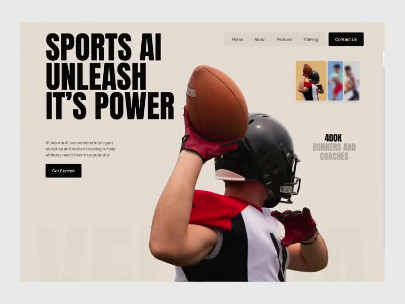
Cover image for Speed is more than motion.
Speed is more than motion. It's intelligence in action. That wasn't just the brand line it was the entire design brief. That was the thinking behind Veloxia an AI-powered sports performance platform designed to make intelligent analytics and motion tracking feel as powerful on screen as the athletes it was built to serve. Most sports tech websites look like they were designed for investors, not athletes. Dense copy, generic stock photography, and a visual language that communicates nothing about the performance edge the product actually delivers. Veloxia built the intensity into every section. A hero that opens with "Sports AI Unleash Its Power" in heavy condensed black type no soft entry, no gentle introduction, just the product promise delivered at full force. Full-bleed athlete photography from football to sprinting to football training. Social proof that speaks the athlete's language Championships Own, customized programs for every sport and skill level. The about section shifts the tone without losing the energy cream background to deep black, bold white type carrying the philosophy: "Speed Is More Than Motion. It Is Intelligence In Action." Real training photography anchors the message in physical reality. The Discover section, the numbers, the Viktoria Series every scroll earns the next one without ever breaking the athletic momentum the design built from the opening frame. Because a platform built for peak performance should feel like it's already running at full speed before the first click. What's the one design decision that makes a sports brand feel credible to a serious athlete?
1
338
Cover image for AVANO |  E-commerce Shopping
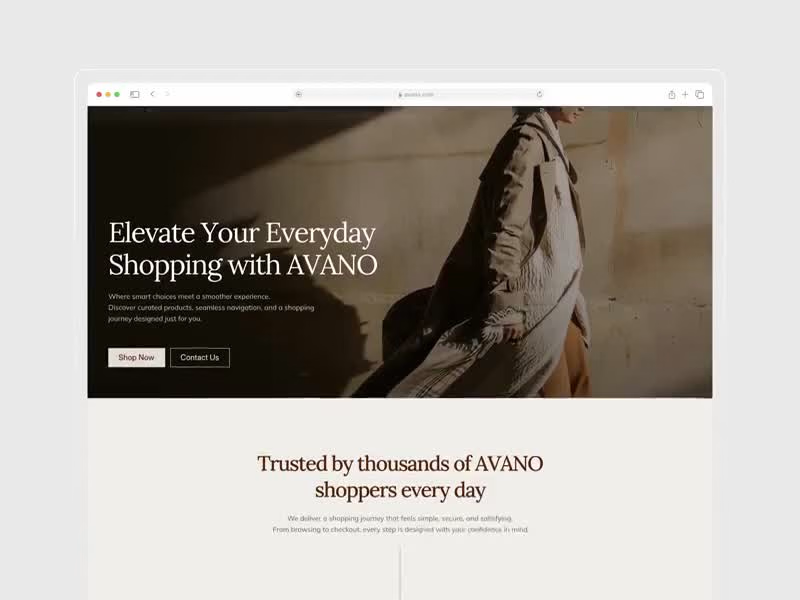
AVANO | E-commerce Shopping Web Design Most online stores feel transactional: a product grid, a price tag, and a cart icon with nothing in between that makes browsing feel intentional or curated. Shoppers who want a premium experience end up buying from brands that just happened to have better photography, not better design. We designed AVANO, a warm-toned lifestyle e-commerce website built for multi-category retail brands who want product curation, trust signals, and a seamless shopping journey without the cold, clinical feel of a standard Shopify template. 𝗪𝗵𝗮𝘁 𝘄𝗲 𝗳𝗼𝗰𝘂𝘀𝗲𝗱 𝗼𝗻: Hero Section: Full-bleed editorial fashion photography with "Elevate Your Everyday Shopping with AVANO" lifestyle positioning established before a single product price is shown. Product Grid with Discount Flags: Modern Fit Top $24 · Terra Stone Table Lamp $49 · Natural Care Set $29 Sale ribbons on corner badges draw the eye without disrupting the premium aesthetic. Trust Block: "Trusted by thousands of AVANO shoppers every day" with 50K+ Happy Shoppers · 45+ Cities Served · 98% Customer: three numbers that answer every new visitor's biggest unspoken question. Product Detail Card: Nourish Body Care Set at $32 with a clean carousel and bold "Add To Cart" CTA; purchase decision reduced to one confident tap. Navigation Architecture: Home · Shop · Exclusive Offers · Best Sellers · Contact: five tabs that cover every buyer intent from discovery to deal-hunting. Built for lifestyle retail brands, DTC product companies, and multi-category e-commerce businesses building confidence-first shopping experiences that convert browsers into repeat buyers. Tools: Figma, Jitter
1
1
286
Cover image for Flowrix | Creative Agency Services
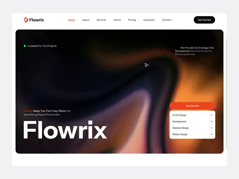
Flowrix | Creative Agency Services Web Design Most agency websites list services in bullet points and call them a brand. Potential clients who want to hire a design partner end up scrolling through generic grids with no personality, no proof, and no reason to trust the team behind the work. We designed Flowrix, a bold dark-mode agency portfolio website built for creative studios and digital agencies who want service clarity, social proof, and editorial presence without looking like a template. 𝗪𝗵𝗮𝘁 𝘄𝗲 𝗳𝗼𝗰𝘂𝘀𝗲𝗱 𝗼𝗻: Hero Section: Fluid gradient mesh background with the "Flowrix Helps You Turn Your Work Into Something People Remember" identity and promise landed in one line before anything else loads. Service Dropdown: UI UX Design · Development · Website Design · Motion Design surfaced directly on the hero; visitors self-select their need without hunting through a nav menu. Availability Signal: A "Available For This Project" green dot live on the hero is one small detail that removes the biggest hesitation a potential client has before reaching out. Social Proof Numbers: 23+ Design Awards · 200+ Project Delivery · 20K Satisfied Clients three stats that answer credibility before the About section is even read. Portfolio Preview: Full-bleed editorial photography with "View" hover overlays work shown as art direction, not just deliverables. Built for creative agencies, design studios, and freelance teams building authority-first portfolio web experiences that convert visitors into clients. Tools: Figma, Jitter Let's build something better. 👋
1
1
272