Built with Framer
Photography Portfolio Website - Built with Framer
Client: Arini Studio
Website: Photography Portfolio
Platform: Framer
Completion Date: September 2024
Role: Designer and Developer
Tools Used: Figma, Framer.
MIKI’S ART OF PHOTO’S
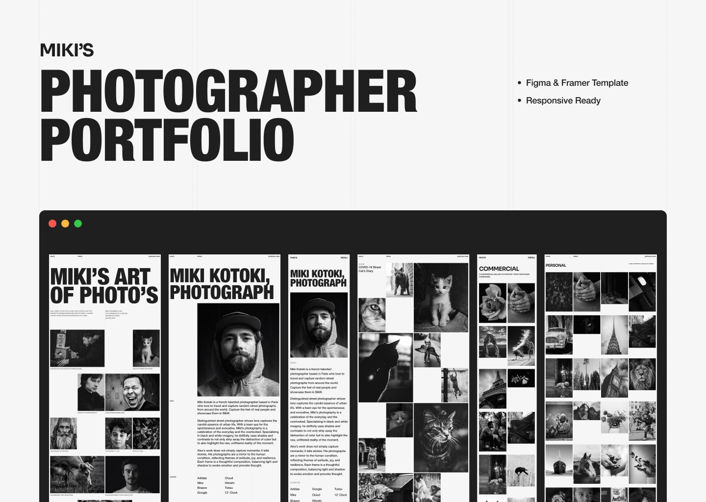
It's cover image.
Miki Kotoki Template Style Guide
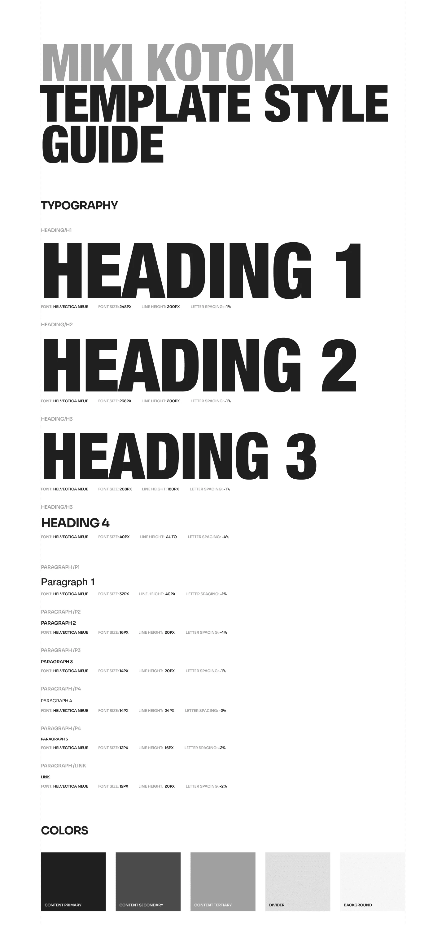
This project involved developing a style guide for the Miki Kotoki template on Framer. The goal was to maintain a cohesive and visually appealing aesthetic across all design elements while providing flexibility for customization.
Key Elements
Typography: Utilized a modern, sans-serif typeface to maintain readability and elegance. Font sizes and line heights were adjusted for different screen breakpoints, ensuring consistency.
Color Palette: A muted, minimalist color scheme was selected, featuring soft tones and contrasting accent colors for calls to action. Framer variables were used to ensure easy updates across the template.
Grid System: A 12-column grid was established, providing structure and balance across layouts. This grid allowed flexibility while maintaining design consistency.
Custom Cursor
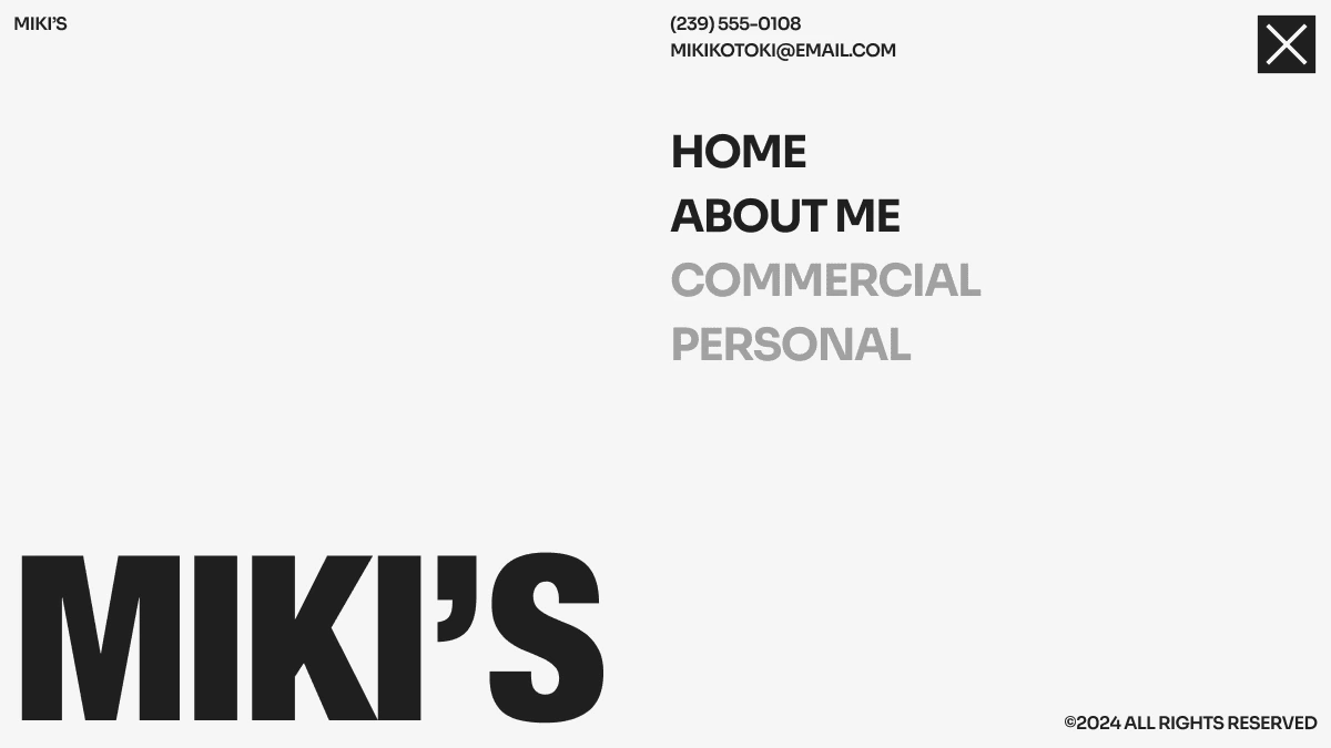
Menu
Menu Hover
Preloder
Home Page

Welcome to My Creative Space
Discover a world where design meets purpose. This portfolio showcases my journey through photography, art, and design. Each project is a reflection of my passion for visual storytelling and creative expression.
Explore my latest works, get inspired, and let’s create something beautiful together.
About Me
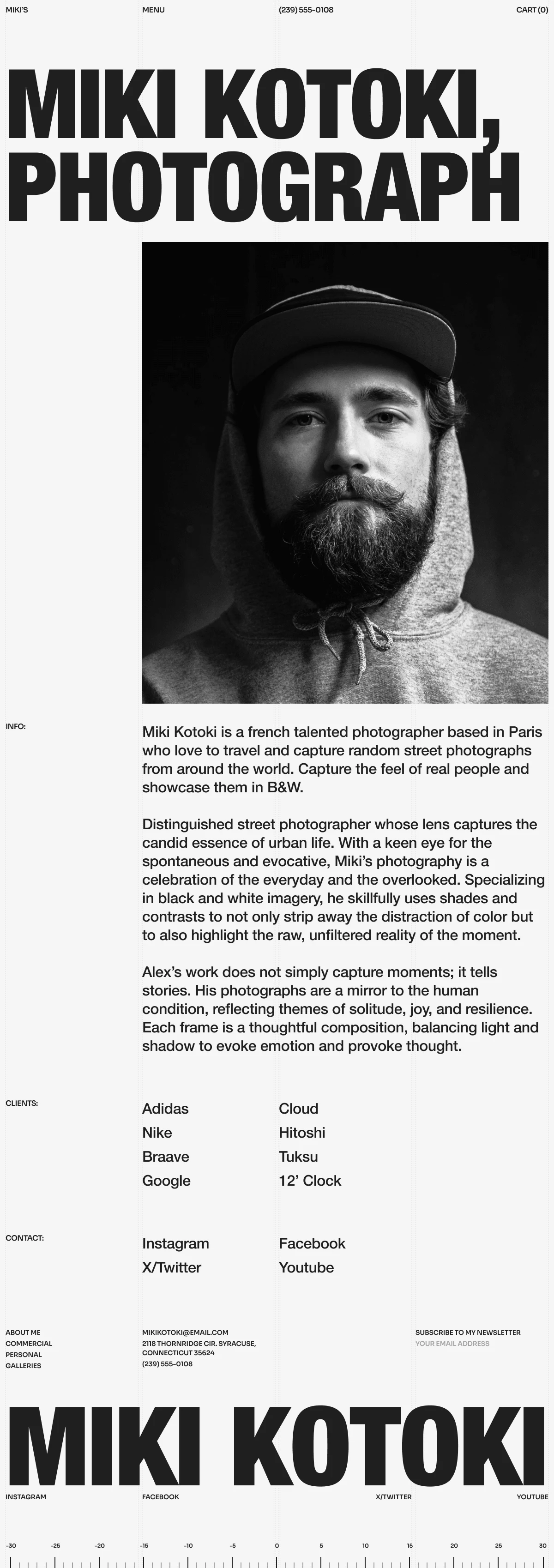
This project focused on creating a minimalist, responsive photography portfolio. Using Framer, I developed a visually striking website that puts the photography front and center. The responsive grid layout adapts seamlessly to all devices, ensuring a smooth user experience. I also implemented lazy loading for high-resolution images, optimizing performance without sacrificing quality.
The result is a clean, modern portfolio that allows the photography to take center stage, with elegant animations and a cohesive design system enhancing user engagement.
Feel free to explore the live site here.
Photography Details Page

Every photograph tells a unique story. My approach to photography is about capturing moments that resonate—whether it’s a fleeting glance, a burst of color, or the play of light and shadow. I aim to create images that evoke emotion and invite the viewer to see the world from a fresh perspective.
From urban explorations to intimate portraits, my work is a reflection of my passion for visual storytelling. Each project showcases a distinct theme, blending technical skill with creative intuition.
Explore the details of my photography projects below and immerse yourself in the stories behind each shot
Commercial Page
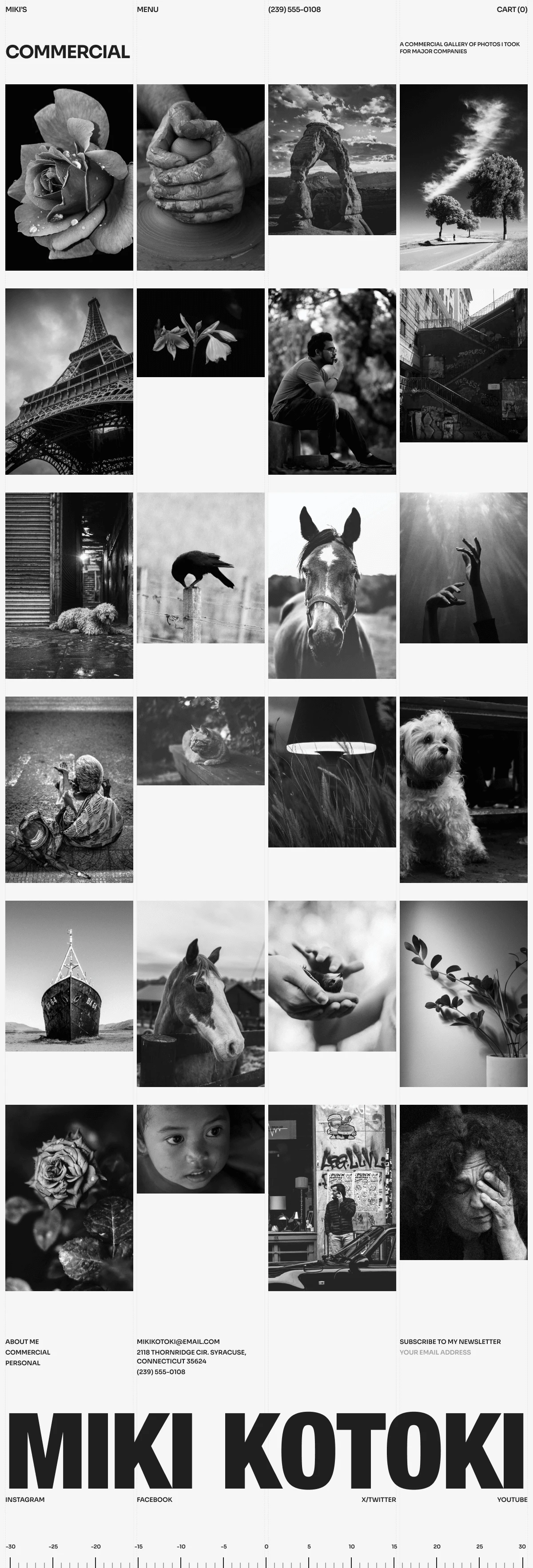
The goal was to create a visually compelling commercial photography portfolio, showcasing a range of professional work in a way that highlights versatility and quality while ensuring a seamless user experience
Design & Development Process:
Minimalist Layout: The site features a clean, grid-based layout, allowing the commercial photography to take center stage. Each project is presented with ample white space, ensuring that the visuals remain the primary focus.
Optimized Performance: Lazy loading and image optimization were used to maintain fast loading times, critical for a portfolio that relies heavily on high-resolution imagery.
Responsiveness: The website was designed to be fully responsive, ensuring that users across mobile, tablet, and desktop devices experience a consistent, high-quality viewing experience.
User Experience: Smooth navigation and intuitive interaction points guide visitors through the portfolio, while subtle animations enhance engagement without detracting from the photography.
404 page
Thank You
Like this project
Posted Oct 5, 2024
Miki's Art is a minimalist Framer Template for photographers. It features a clean, modern, and minimal design that allows photographers to showcase their work.
Likes
1
Views
116

