Projects using Adobe Illustrator in Colombia
Projects using Adobe Illustrator in Colombia
Sign Up
Post a job
Sign Up
Log In
Filters
2
Projects
People
Message
1
Daniel Muller
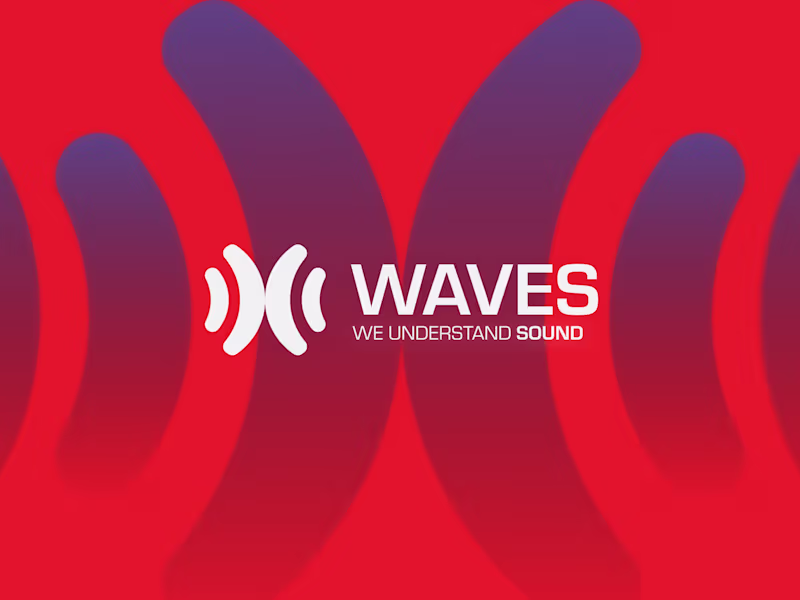
Waves — Brand & Logo Design
1
23
Message
35
Jairo Ruiz
pro
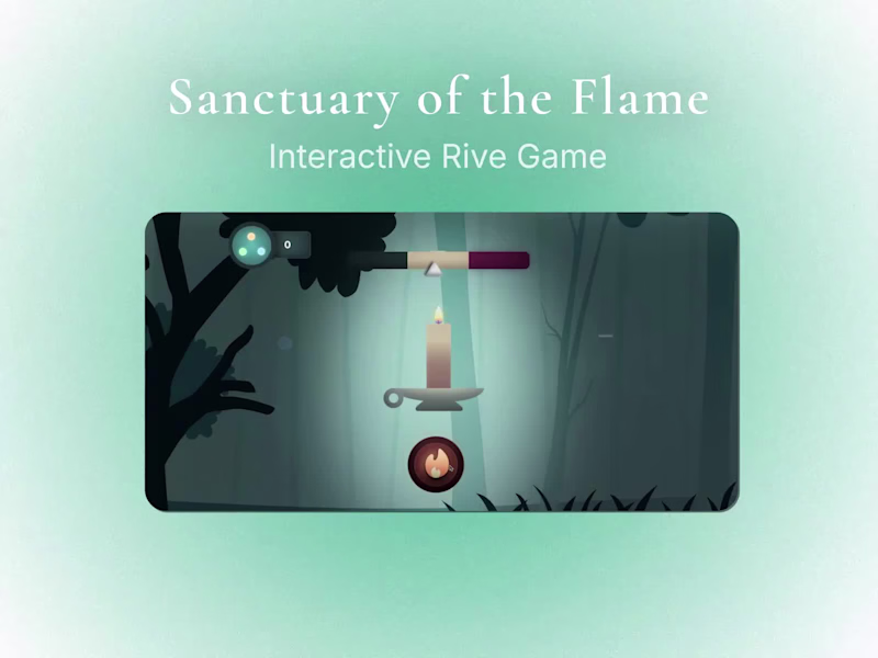
For this @Rive x @Contra HQ Challenge, I wanted to explore an idea that was technically demanding from a data-binding perspective, but still centered around a small story. My goal was for the technical side to become a vehicle—something that supports and amplifies the experience, rather than overshadowing it. I started with something simple: a candle crossing a dark forest, trying not to be consumed by the shadow. The entire piece—animation, interaction, and logic—was built inside Rive, and the narrative emerges from how each variable reacts in real time. I hope you enjoy this little experiment as much as I enjoyed creating it.
6
35
882
Message
8
Keileth Castillo
pro
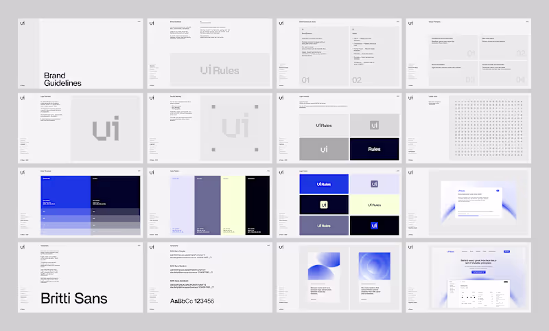
UI Roles - Branding
8
73
Message
3
Daniel Castellanos
pro
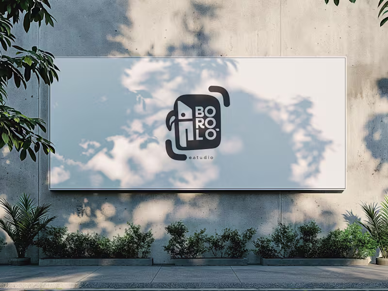
There are design decisions that don't come from the client. They come from within—and sometimes, that is exactly the problem. The previous logo for Boroló Estudio had soul. It had pre-Columbian roots, a hand-drawn stroke, and an indigenous character. It evoked drums, authenticity, and the Chocó—one of the most biodiverse and culturally rich regions in Colombia, a land of jungle, rivers, and a visual identity unlike any other. I loved it. And precisely because of that, I failed to evaluate the challenges the logo would face on real-world platforms: on a website, as an Instagram avatar, or in digital spaces. The redesign wasn't about letting go of the logo. It was about letting go of the attachment. The problem wasn't aesthetic—it was one of coherence. The studio’s brand had evolved, but the logo hadn't. A composition with too many elements in tension made the icon struggle to be memorable; what people saw didn't connect with who Boroló truly is. The new system retains the bird—now geometric, set in negative space within the icon. The inner container references the studio’s actual architectural blueprint: the diagonal of the cyclorama ceiling and the two zones of the space. The brackets refer to photographic framing. No layer imposes itself over the other—they are discovered. The result is a versatile system: imagotype, vertical logo, and wordmark. It works on a sticker, a billboard, an avatar, or a website. It scales without losing its identity. Redesigning doesn't mean the initial design was bad. It means communication needed to evolve. And from that point of view, the change isn't a correction—it’s a decision.
3
95
Message
0
Joseph Cacais
pro
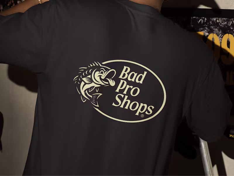
One of the projects I’ve most enjoyed working on: Visual Identity and Merch design for a fishing community.
0
145
Message
1
valentina perez
pro
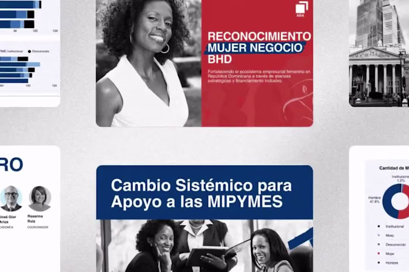
Closing a US$1.7 trillion gap through strategic storytelling. 📈💼 Proud to partner with @bancosrd on the WE Finance Code 2025. My goal was to transform complex financial data into a compelling visual narrative that advocates for inclusive financing and women’s economic empowerment in LatAm. High-impact visuals for a systemic change. #BrandStrategy #VisualIdentity #FinancialInclusion #WomenInBusiness #CreativeDirection
1
270
Message
2
Juan Carmona
pro
Part 2 of the TechFoundersHub logo. Once the mark was defined my goal was to show the client how this logo would live in the real world without creating a full identity. Same logo. Different contexts. That's how you know it works. A brand mark isn't just a pretty shape. It needs to hold up on a website, on social, on a product. If it breaks in any of those places, it's not ready.
2
78
Message
0
Kevin Zapata
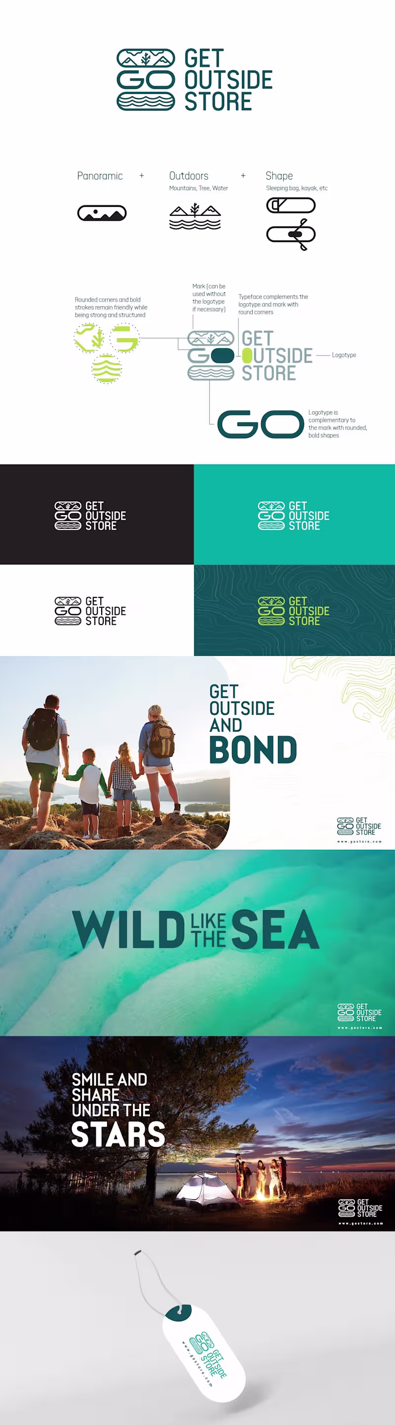
Branding for Get Outside Store
0
2
Message
0
Mariana David
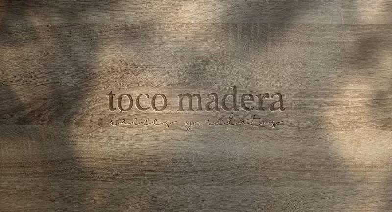
🪵Toco Madera – Crafting Stories in Wood & Design.
0
11
Message
0
Andrea Carolina Osio Amaya
Short film “Copelia de.” (2024) Uni5lab
0
4
Message
0
Emerson Barona
pro
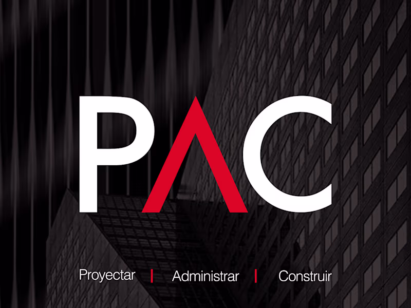
PAC — Brand Identity PAC brings together over 30 years of combined experience in project management, property administration, construction, and maintenance services. The challenge was translating that depth of expertise into a visual identity that could compete on a different level —one that felt clear, modern, and professional in a sector where most players look the same. The project was built from scratch: every visual asset and communication strategy developed with a single goal in mind —differentiation. The result is a brand that reflects the seriousness and scale of what PAC actually delivers, and has since become a recognizable presence in their market.
0
50
Message
0
Jaxanna Martinez
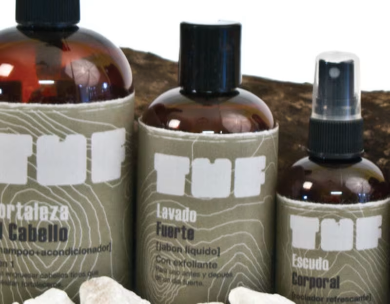
TUF: Men's Body Care Concept Line for South America
0
3
Message
0
David Mejia
Branding for crypto security company - SIMU
0
20
Message
2
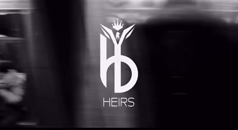
J Mel
Heirs Crafted with Professional Expertise Inspired by the artistry of top stylists, our all‑in‑one, high‑performance formulas transform your hair with every use. With Heirs to Beauty, you get more than exceptional haircare — you experience the performance, care, and attention to detail trusted by professionals worldwide. Each formula was perfected through over a year of rigorous testing and collaboration with beauty experts, ensuring it not only meets expectations but exceeds them, delivering luxury, performance, and transformation worthy of the salon standard.
2
2
95
Message
0
Angie Sánchez Zapata
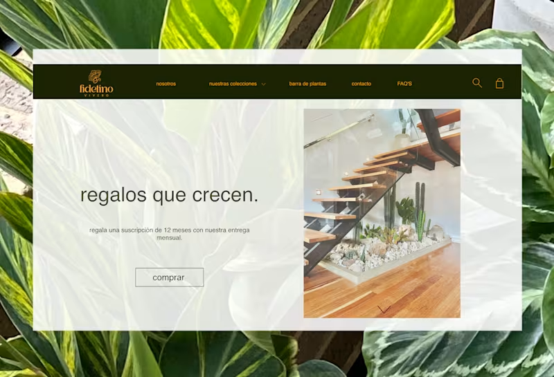
Fidelino Vivero — Brand Identity & E-commerce Web Design Fidelino is a premium plant nursery that needed more than a website — it needed a world, a place where buying a plant felt as intentional and warm as the act of gifting one. The brand's core idea, regalos que crecen (gifts that grow), shaped every design decision from the logo to the checkout experience. The visual identity centres on a hand-drawn botanical illustration mark, paired with a deep forest green and warm amber palette that communicates both sophistication and organic life. The typographic system balances editorial elegance with the approachability of a neighbourhood nursery that knows every plant by name. The e-commerce experience was designed end-to-end for both desktop and mobile: homepage with curated editorial photography, product catalogue with personality-driven copy, individual product pages with size and pot selection, collection pages organised by category (plantas, materas, macramé décó, especiales), a functional shopping cart with shipping calculator, lifestyle gallery, FAQ section, and contact form — all maintaining consistent brand language across every touchpoint. The mobile experience received equal design attention, with a navigation system, product detail drawer, and cart view optimised for touch interactions and conversion.
0
51
Message
1
Miguel Morales
Advertainment Visual Identity Design
1
0
Explore projects