
Web and app designer with both aesthetic and modern style
Web and app designer with both aesthetic and modern style

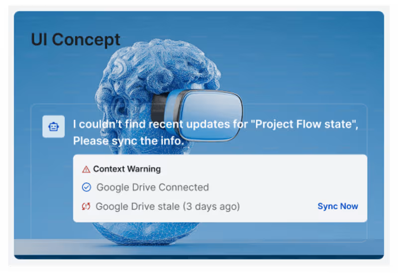
Designed a calming AI-powered landing experience 🌿
This concept focuses on reducing noise and helping users stay in flow with a mindful, minimal interface. From soft gradients and nature-inspired visuals to clean typography and gentle interactions, every element is crafted to feel peaceful and intentional.
✨ Highlights:
• AI agent designed to support personal goals
• Distraction-free, clutter-free workspace
• Personalized yet non-intrusive experience
• Focus on calm, clarity, and flow
Built with a user-first mindset — where productivity meets mental clarity.
Would love to hear your thoughts
0
95

Meesho Redesign Case Study — Simplifying Social Commerce
This case study focuses on redesigning the shopping experience of Meesho with the goal of making it more intuitive, trustworthy, and conversion-friendly — especially for first-time and non-technical users.
Meesho operates in a unique space where buying and reselling intersect, which makes clarity and ease of use even more critical.
🔍 Problem areas identified:
• Cluttered interface and overwhelming product listings
• Confusing navigation for new users
• Lack of trust signals during purchase decisions
• Inconsistent user flow between browsing and checkout
💡 Design approach:
• Simplified UI with clear visual hierarchy
• Improved product discovery and filtering experience
• Strong focus on trust elements (ratings, delivery info, pricing clarity)
• Streamlined checkout flow to reduce drop-offs
• Mobile-first redesign for better accessibility
✨ Key improvements:
• Cleaner, distraction-free product pages
• Faster decision-making with better information structure
• Reduced friction across the user journey
• More engaging and user-friendly interface
🎯 Outcome:
A smoother, more reliable shopping experience that helps users browse, decide, and purchase with confidence — while also supporting Meesho’s social commerce ecosystem.
This redesign reflects my focus on solving real usability problems while balancing business goals and user needs.
Feedback is always welcome 💭
1
55

Shopify Case Study — Designing for Seamless E-commerce Experiences
This case study explores how thoughtful UI/UX design can simplify and elevate the online selling experience using Shopify as the foundation.
The focus was on understanding how users interact with e-commerce platforms — from product discovery to checkout — and identifying opportunities to improve clarity, speed, and conversion.
🔍 What I worked on:
• Analyzing user journey from landing to purchase
• Improving product page structure and hierarchy
• Simplifying navigation and reducing friction
• Enhancing mobile shopping experience
• Creating a clean, conversion-focused UI
💡 Key insights:
• Users value speed and clarity over heavy visuals
• A well-structured layout directly impacts conversion rates
• Mobile-first design is critical for modern e-commerce
• Trust elements (reviews, pricing clarity, CTA) play a major role
🎯 Outcome:
A refined, user-centric shopping experience that feels intuitive, fast, and reliable — helping users make decisions with confidence.
This case study reflects my approach to solving real-world design problems through research, structure, and simplicity.
Open to feedback and opportunities 🚀
1
63

Hyperlocal SaaS Dashboard Design
I design scalable, user-friendly SaaS dashboards tailored for local businesses, delivery platforms, and e-commerce operations. The goal is to simplify complex workflows and help businesses manage everything from one clean, intuitive interface.
💡 What I offer:
• End-to-end SaaS dashboard design (web & responsive)
• Order, inventory, and delivery management interfaces
• User flows & UX strategy for real-world operations
• Data visualization (analytics, sales tracking, performance)
• Clean UI systems built in Figma / Framer
⚙️ Key features included:
• Real-time order tracking & status management
• Inventory and product management dashboards
• Delivery partner coordination interfaces
• Insights & analytics for better decision-making
• Role-based dashboards (admin / seller views)
🎯 What you get:
• A scalable and structured dashboard design
• Faster workflows for business operations
• Reduced complexity for non-technical users
• A modern SaaS experience ready for development
This service is ideal for startups, founders, and businesses building tools similar to hyperlocal delivery platforms.
Let’s build a system that actually works in the real world 🚀
1
64

Product Designer with a flair for Aesthetics & Usability
Product Designer with a flair for Aesthetics & Usability


UX consultant making products and processes MadeForHumans!
New to Contra
UX consultant making products and processes MadeForHumans!
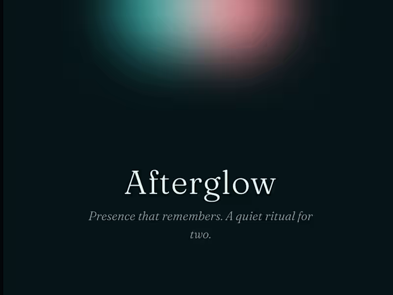
Built Afterglow with stitch by google a two-person ritual app for neurodivergent humans. You share how your day felt as a glow, not words; a hard day is met with a slower, steadier light, never amplified.
Designed every screen in Stitch: imported my portfolio's tokens, generated the screens, and animated the breath, the glow-merge, and an SVG shader with in-place edits. Then shipped it as a working PWA.
Prototype - https://dashing-strudel-880ce8.netlify.app ·
https://www.loom.com/share/c90b979dafc340e99fe7f3a13586cc9e
Calm by default. No streaks, no scores. Presence that remembers.
2
1
108


Master of Web Design

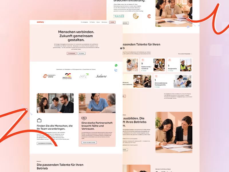
Edstory: Website redesign in Framer
edstory connects employers in Germany with apprentices and skilled workers from Vietnam, and supports partner agencies along the way. Founder Linh Raiser needed a website that speaks to German employers in their own language, explains a complex process simply, and is easy for her to update herself.
What I did:
Redesign and build in Framer: six pages (Home, Für Arbeitgeber, Für Partner, Über edstory, Kontakt, Stories), plus a study sub-page and legal pages
Full German localization: proofread and fixed broken characters from the source documents, so the copy reads natural and consistent
Interactive storytelling: an animated process timeline, a 3D globe flight from Vietnam to Germany, and a "bridge" animation for the partner process
Stories content hub: one CMS collection powering success stories, testimonials, events, news, partnerships, and a consent-protected talent pool
Conversion and trust: Calendly booking, WhatsApp and Zalo contact, a GDPR-friendly cookie banner, Datenschutz and Nutzungsbedingungen pages
Responsive and launch: layouts for desktop, tablet, and mobile, plus the custom domain connected via Strato DNS
Tools: Framer · Framer CMS · Calendly · Strato DNS
Role: Web designer & Framer developer
0
35
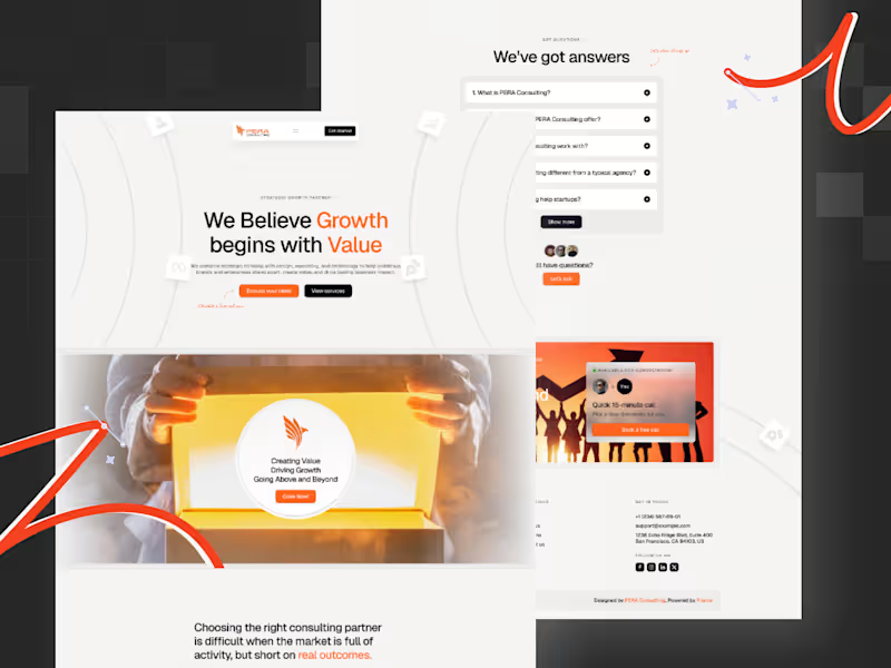
PERA Consulting – Framer Website Design & Development
Client: PERA Consulting
Industry: Business Consulting & Growth Strategy
Role: Framer Designer & Developer
Tools Used: Framer
Website: https://www.peraconsulting.xyz/
Project Overview
I collaborated with PERA Consulting to design and develop a modern, high-conversion website using Framer. The goal was to create a digital presence that clearly communicates their consulting value, simplifies complex service offerings, and positions them as a strategic growth partner.
This was a full Framer build from scratch, focused on combining strong messaging, visual clarity, and conversion-driven structure.
The Challenge
PERA Consulting needed a website that could:
Clearly communicate their value in a crowded consulting space
Avoid generic “we help you grow” messaging
Present multiple services without overwhelming users
Build trust quickly with new visitors
Guide users toward taking action (consultation, contact)
My Role & Approach
1. Strategic Positioning & Messaging
Defined a clear value proposition: “Growth begins with value”
Structured content to focus on user problems before services
Simplified language to improve clarity and relatability
2. UI/UX Design in Framer
Designed a clean, modern layout with strong visual hierarchy
Created structured sections: Hero → Problem → Solution → Proof → CTA
Used whitespace and typography to improve readability
Balanced visuals with content to avoid a “corporate-heavy” feel
3. Framer Development
Built the entire website natively in Framer
Implemented responsive design across all breakpoints
Added smooth interactions and subtle animations
Ensured fast performance with optimized assets
4. Conversion-Focused Execution
Placed clear CTAs throughout the page
Designed sections to guide users toward action
Reduced friction in navigation and content flow
Key Highlights
Framer-First Build
Fully designed and developed in Framer for speed, flexibility, and modern interactions.
Clear Positioning
Strong, simple messaging that differentiates PERA from generic consulting firms.
Structured Storytelling
Each section is intentionally designed to move users closer to conversion.
Modern Visual Identity
Clean layout, warm accents, and minimal clutter to maintain a premium feel.
Conversion-Oriented Design
Strategic CTA placement and content flow to increase engagement.
Outcome
The final website delivers a clear, modern, and conversion-focused experience that aligns with PERA Consulting’s positioning. It helps visitors quickly understand the value offered and encourages them to take the next step.
The Framer build also ensures the site is easy to update, scalable, and ready for future iterations.
What This Project Demonstrates
Expertise in Framer design & development
Ability to build conversion-focused consulting websites
Strong understanding of positioning and messaging strategy
Capability to translate business goals into clear digital experiences
End-to-end execution: strategy → design → development
0
159


Art Director with 5+ years in branding & design
Art Director with 5+ years in branding & design


AI-Powered Product Designer | AI SaaS & Product UX

Multidisciplinary Design Studio
Multidisciplinary Design Studio


View more →

Product Designer | UX, UI & Design Systems | Impact-Driven
Product Designer | UX, UI & Design Systems | Impact-Driven


