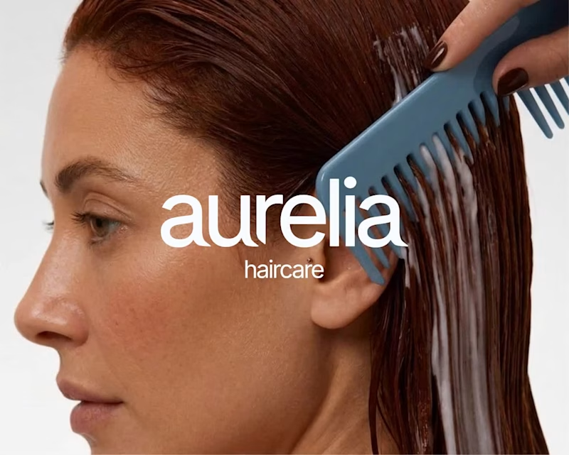
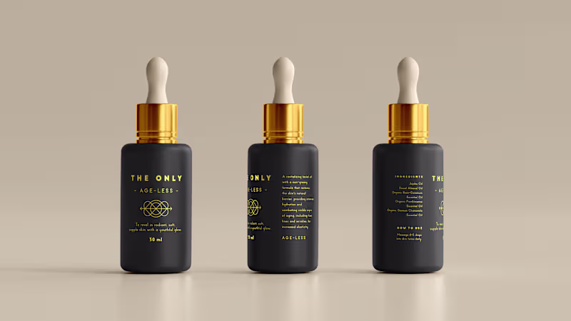
Packaging Design Projects in Cape TownPackaging Design Projects in Cape TownTHE ONLY OIL
The only one you need: brand creation, packaging design and copywriting for a luxury South African skincare oil
Brand creation, product naming, creative direction, packaging design and copywriting across a range of organic handcrafted facial oils.
THE STORY
Luxury skincare is one of the most crowded shelves in the world. Every brand promises transformation. Every brand reaches for the same words. Pure. Radiant. Restore. After a while it all blurs into the same thing.
The Only was built to cut through that quietly.
A South African skincare brand rooted in organic, handcrafted facial oils made from rare local ingredients. Clinically tested. Carefully formulated. The kind of product that doesn't need to shout because it already knows what it can do.
I created the brand from scratch, starting with the name. The Only. Two words that don't hedge, don't qualify, don't ask permission. Everything else followed from that conviction. The product names, Age-Less, Rooted, Ultimate, Calm, Nourish, Soothe, Revitalise, each share a feeling rather than a feature. The kind of names that make sense the moment you read them and stay with you.
The visual identity is deep matte black and gold. Minimal by design, because the product deserved space to breathe. The copy took the same approach: warm and purposeful, never overwrought. Skincare writing has a habit of tipping into the breathless. This couldn't afford to.
When the ingredients are this good and the formulation is this considered, the writing just needs to show up with the same integrity and get out of the way.
WHAT IT TAUGHT ME
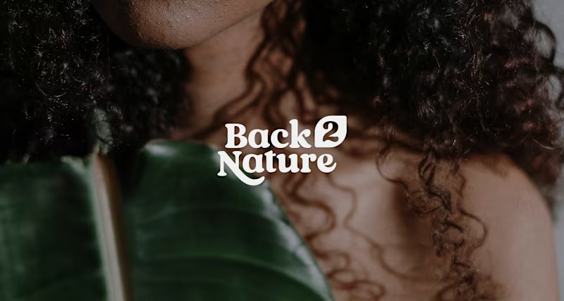
That restraint is its own kind of confidence. The Only doesn't try to convince anyone. It simply presents itself and trusts that the right person will understand immediately. Learning to write like that, to say less and mean more, is a practice that never really ends. A world of herbs and spices: packaging design, naming and copywriting for a travel-inspired spice brand
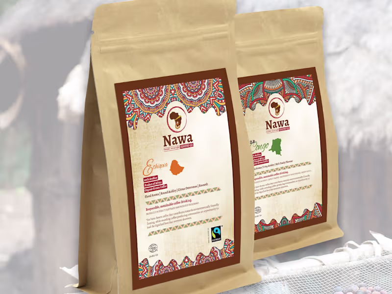
Brand creation, product naming, copywriting and creative direction across a range of internationally inspired spice blends.
THE STORY
Some of the best ideas start with a feeling rather than a brief.
Three friends had spent years travelling together, eating their way through markets and street corners and other people's kitchens. They wanted to bring something back. Not souvenirs. The real thing. The flavours that made them stop mid-bite and ask what on earth was in this.
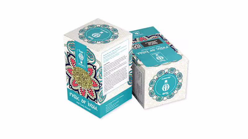
Taste Adventures was built around that feeling. A spice brand organised not by ingredient but by journey. My job was to create the whole world: the name, the products, the visual language, the words on every surface.
The product names came first, because everything else had to follow from them. Mississippi Magic. Pride of India. Mama Africa. Each one needed to evoke a place without reducing it, to feel like a destination rather than a description. Get those wrong and the whole range falls flat.
The design gave each SKU its own cultural visual language: Mardi Gras tilework, Indian mandala patterning, West African textile motifs. Distinct enough to stand alone. Connected enough to belong to the same story. The hot air balloon in the brand mark tied it all together quietly, a symbol of curiosity and movement that didn't need to shout.
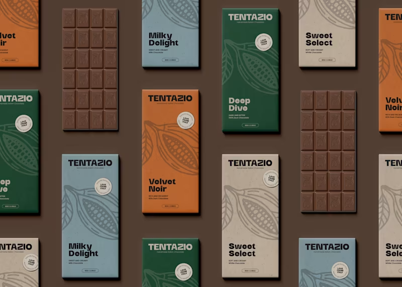
The copy on each pack had one job: make someone feel something before they even open it. Like they're already halfway there.
WHAT IT TAUGHT ME
That a range is only as strong as its internal logic. The moment one product feels like it slipped in from somewhere else, the whole idea loses its nerve. Here, consistency wasn't a creative constraint. It was the whole point.