Projects using Adobe Illustrator in Buenos Aires Province
Projects using Adobe Illustrator in Buenos Aires Province
Sign Up
Post a job
Sign Up
Log In
Filters
2
Projects
People
Message
4
Emanuel Miño
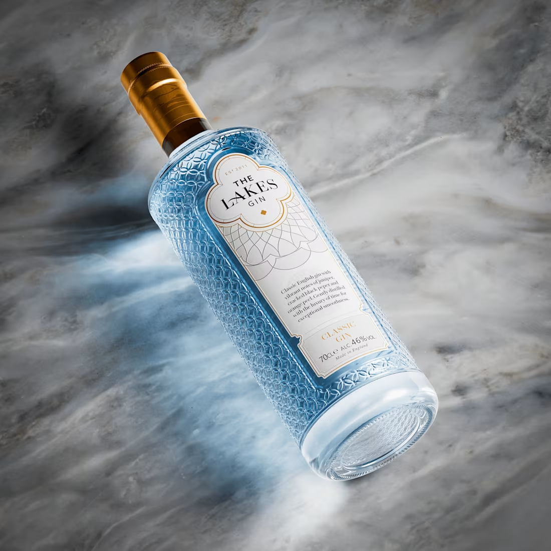
The Lakes Gin | Product Rendering
4
61
Message
9
Juan Ignacio Padin
Leni - Promo Video
9
82
Message
0
Matias Zapata
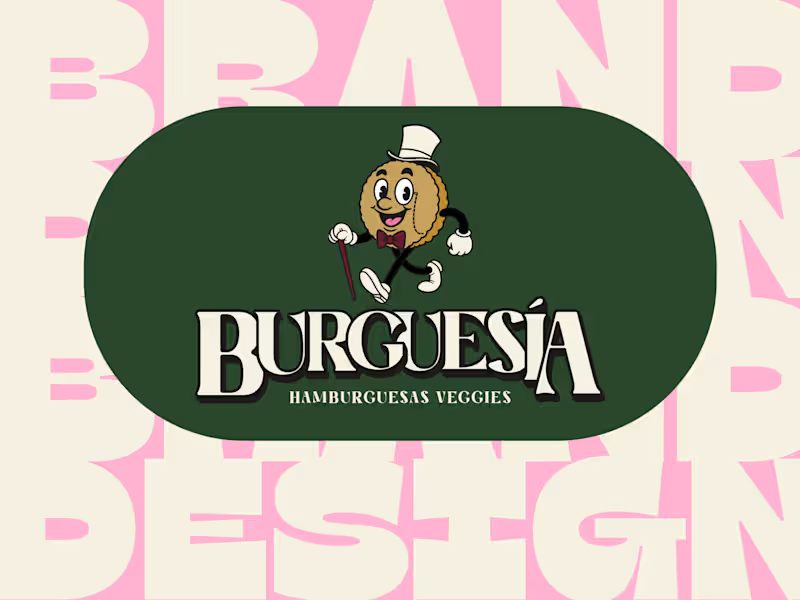
Brand Design for Burguesía: Gourmet Veggie Burgers
0
19
Message
0
Federico Mercante
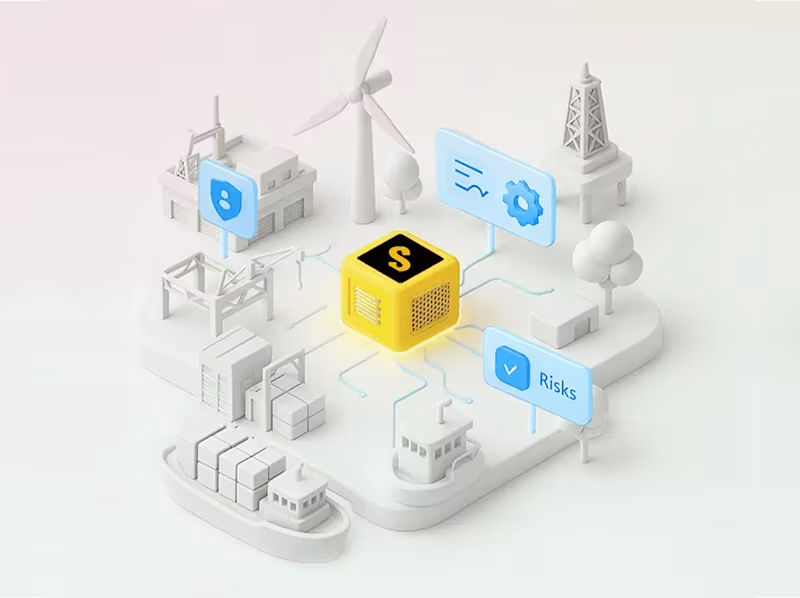
Salus Brand Redesign and Suite Expansion
0
11
Message
0
Federico Gabriel Martinez
Spot Publicitario para Whatsapp y redes sociales
0
9
Message
20
Creative Capital
pro
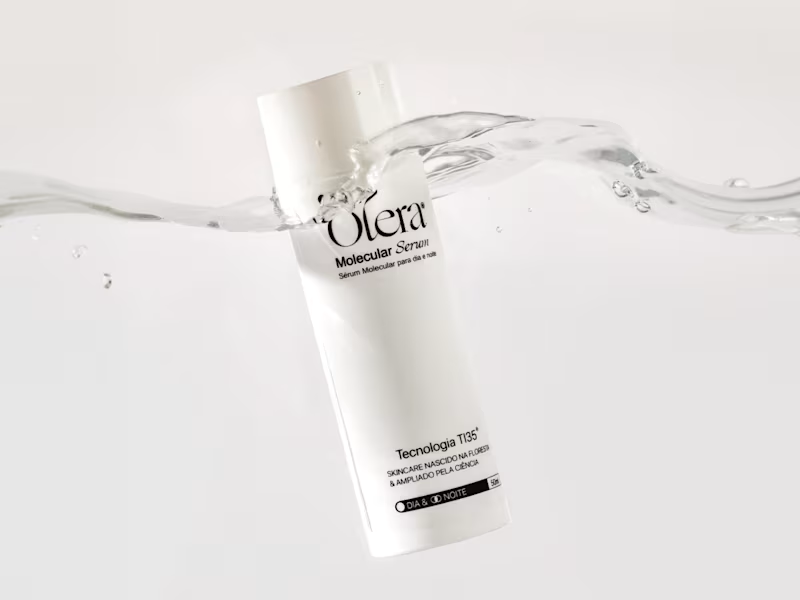
Olera · Packaging Design We designed Olera's first product, the Molecular Serum, both bottle and pack. The bottle stays deliberately minimal, a clean cylindrical form that lets the serif wordmark and TI35 mark do the talking without any extra noise. The pack carries that same restraint but picks up an accent color pulled straight from the brand palette, giving the line a way to differentiate future products without breaking the system. Every spec on the redlines, from type sizes to icon placement, was built to meet regulatory requirements for the skincare industry and market Olera launches in, so the minimalism is functional as much as it is aesthetic. See more at https://www.instagram.com/oleraskincare/
3
2
20
538
Message
0
Joaquin Cardelli
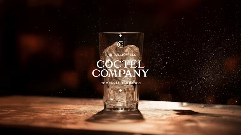
Coctel Company | Strategy & Timeless Identity
0
11
Message
19
María Agostina Scrinzi
pro
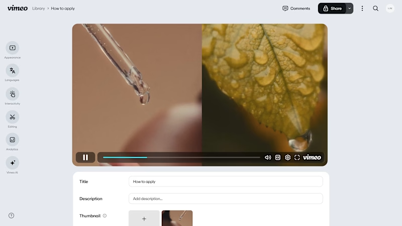
Saas Video for Vimeo.
2
19
483
Message
0
Fervor Studio
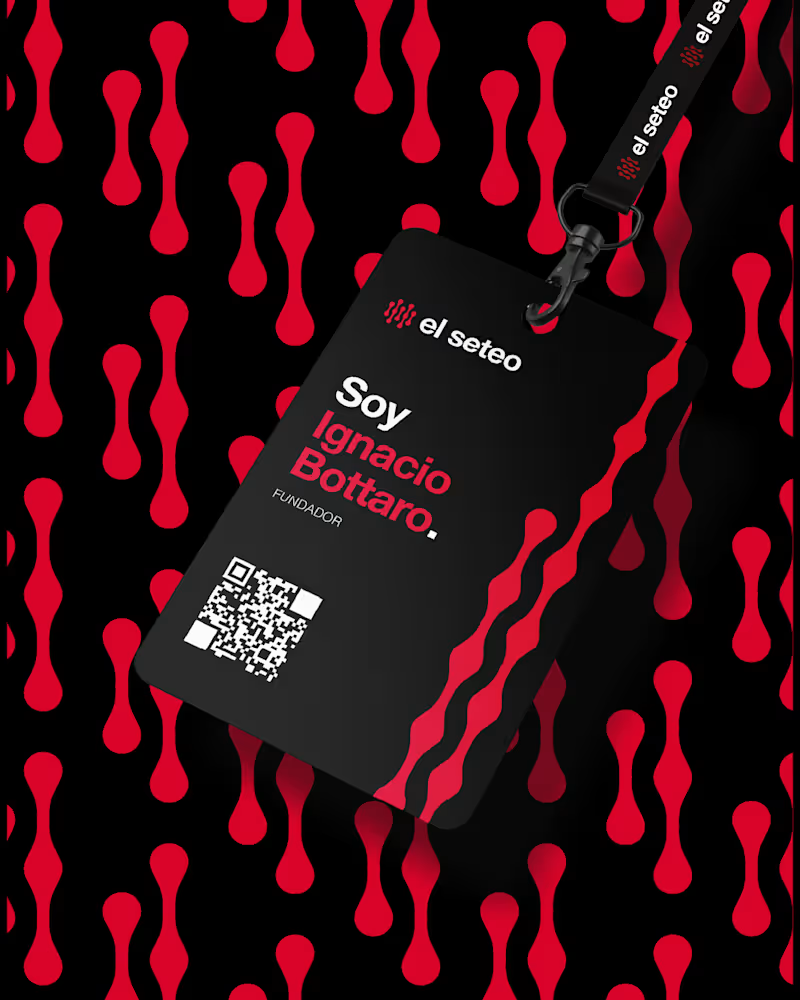
BRANDING: El Seteo
0
10
Message
0
Rocio Bulzomi
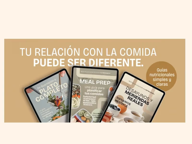
Before and after — Online shop home section design for a nutrition-focused business.
0
238
Message
1
Leiito Bakkan
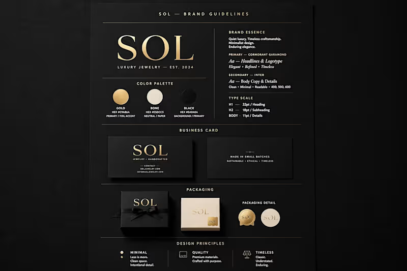
SOL — Luxury Jewelry Brand System
1
136
Message
1
Rodrigo Perez
Album Design
1
14
Message
5
Cristian Zibecchi
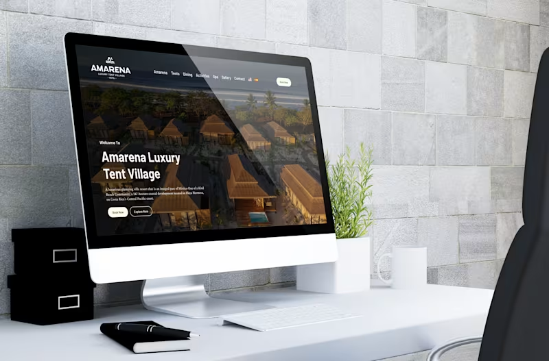
Redesigning Amarena’s digital experience ✨ We moved away from a long-scroll landing and restructured the experience into clearer, focused interfaces, improving navigation, readability, and overall flow. The goal was simple: let the visuals breathe and make every section feel intentional. Key improvements: · Stronger visual hierarchy and spacing · Full-width imagery for a more immersive feel · Cleaner, more intuitive navigation · Refined microcopy and section naming · Better structured content across villas, spa, and experiences A more editorial, elevated approach that aligns with the brand and enhances how users explore the space. Design is not just how it looks. It’s how it guides you. Portfolio: https://cristianzibecchi.myportfolio.com/
1
5
118
Message
0
Karim Fij
Hi everyone! I have openings for new graphic design projects. If you have a startup, a business, or a brand and want to improve your visual communication, please get in touch. I specialize in: Logo design and visual identity Brand redesign Product packaging and labels Social media design (posts, stories, and ads) Posters, signage, large-format prints, banners, and storefront graphics Editorial design I am also interested in working with studios, agencies, or print shops that need freelance support. Feel free to message me with any questions—no obligation! ✉️ karim.fij6@gmail.com (mailto:karim.fij6@gmail.com)📷 Instagram: @karimfij.dg 📱 WhatsApp: https://wa.me/542477346490?text=%C2%A1Hola!%20Quiero%20cotizar%20un%20proyecto
0
15
Message
1
Faustino Fontanet
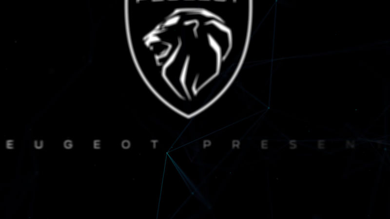
Developed and produced motion graphics for the launch presentation of the new Peugeot 208. The visual design was conceptually based on the aesthetics of the vehicle's internal interface, specifically highlighting the innovative 3D i-Cockpit dashboard.
1
68
Message
2
Ileana Pietragalli
Bubblelicious - The Bubble Tea Shop in Sweden Illustration and Logo Design for Tea Bar, and for the Bubble Tea and Donuts shop.
2
37
Explore projects