The network for creativity
Join 1.25M professional creatives like you
Connect with clients, get discovered, and run your business 100% commission-free
Creatives on Contra have earned over $150M and we are just getting started
Back to feedPost


Olera · Packaging Design
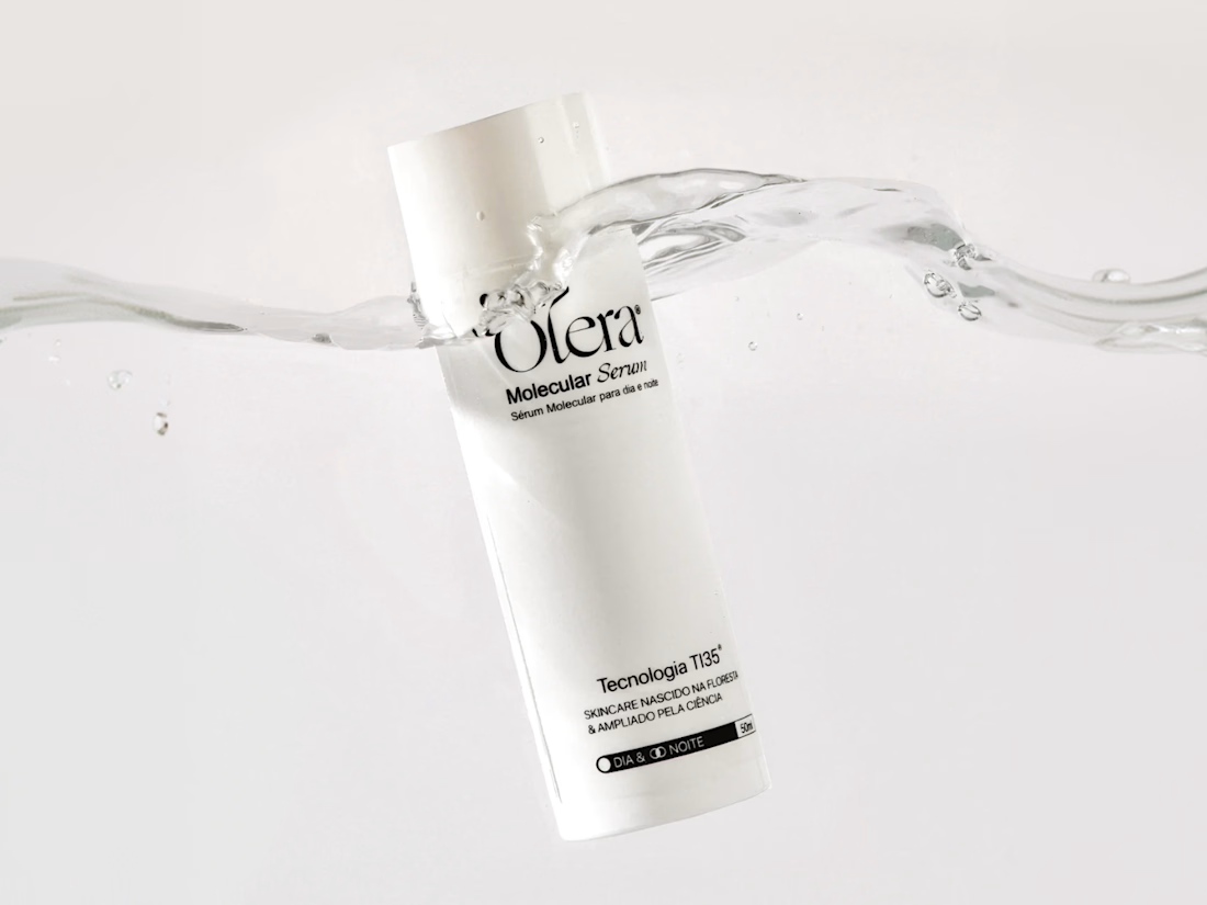
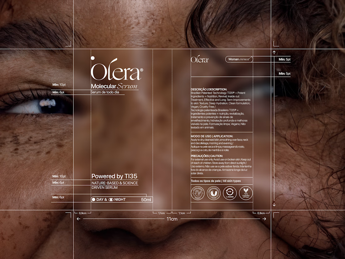
We designed Olera's first product, the Molecular Serum, both bottle and pack. The bottle stays deliberately minimal, a clean cylindrical form that lets the serif wordmark and TI35 mark do the talking without any extra noise. The pack carries that same restraint but picks up an accent color pulled straight from the brand palette, giving the line a way to differentiate future products without breaking the system. Every spec on the redlines, from type sizes to icon placement, was built to meet regulatory requirements for the skincare industry and market Olera launches in, so the minimalism is functional as much as it is aesthetic.
See more at https://www.instagram.com/oleraskincare/




So good!

An absolute masterpiece of functional minimalism! Love that you highlighted the importance of redlines and regulatory compliance in the description — it truly shows a mature, production-ready approach to skincare packaging. The layout is incredibly crisp and sophisticated.
The network for creativity
Join 1.25M professional creatives like you
Connect with clients, get discovered, and run your business 100% commission-free
Creatives on Contra have earned over $150M and we are just getting started











Related posts


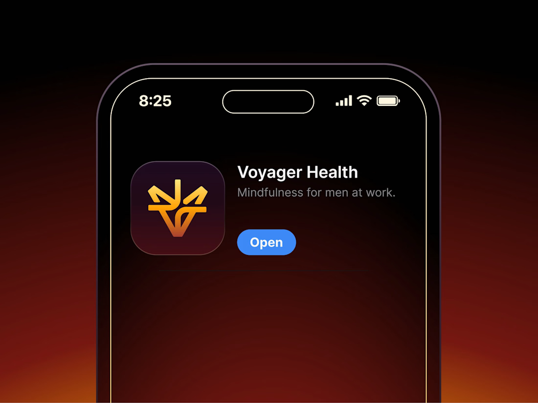

Aryna, that golden symbol pops so nicely against the plum background ✨

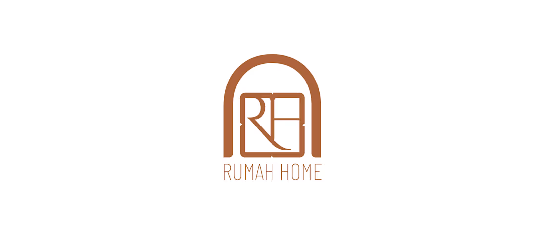
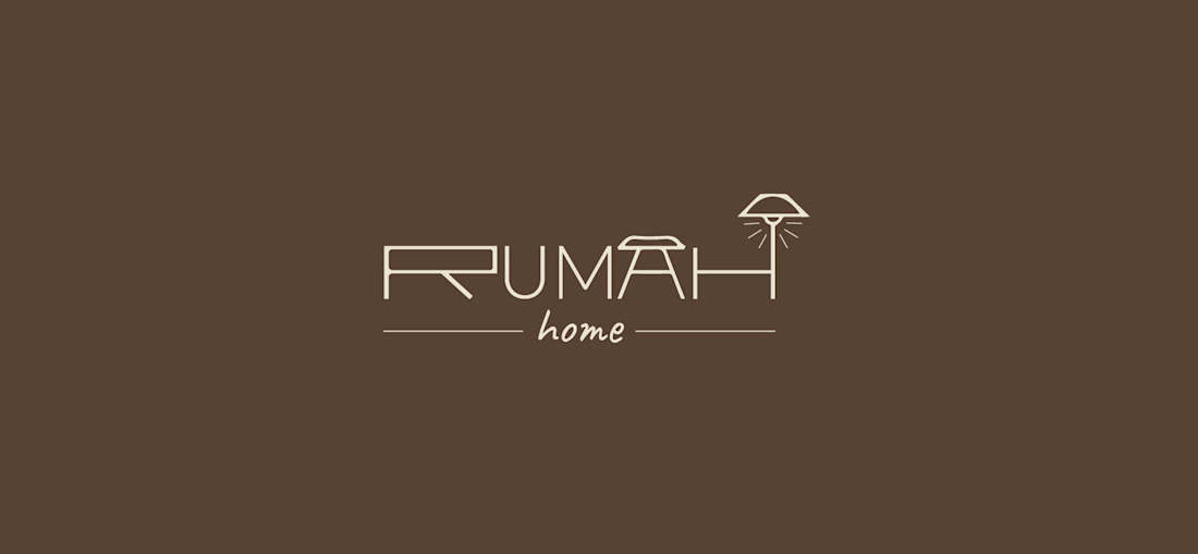
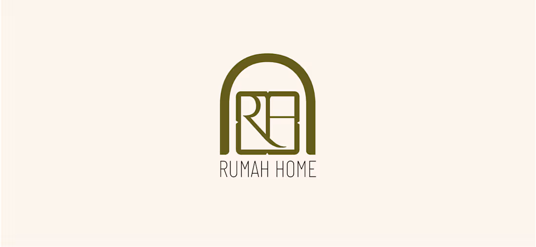
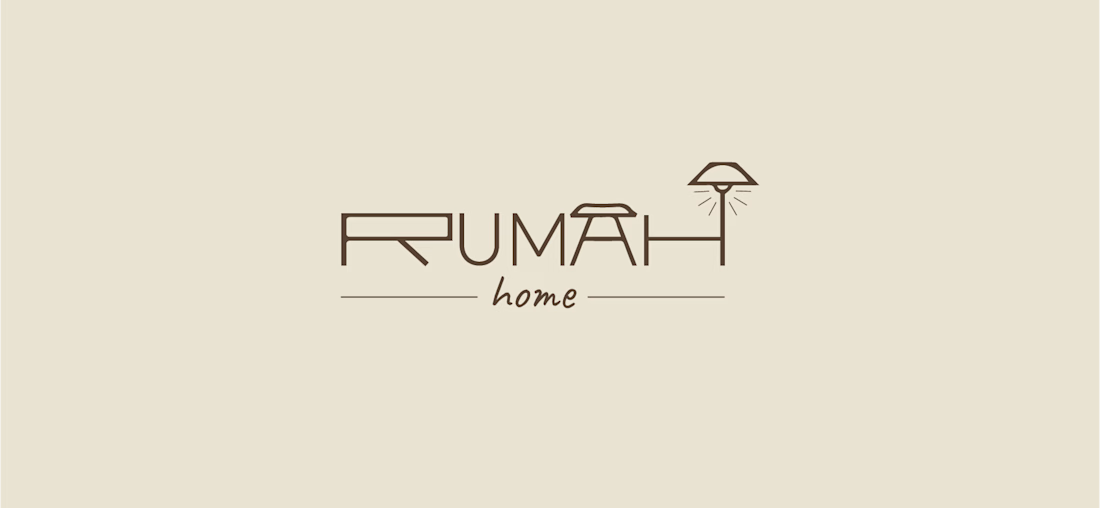
Made these 2 concepts for a furniture shop, Rumah Home, a boutique store specialising in Indonesian-inspired furniture and homewares. “Rumah” means “house” in Indonesian, so the idea was to make the name itself feel like home.
Concept 1: An arched doorway frames an interlocked R and H, with sharp geometric details softened by a rounded shape. The olive and terracotta tones nod to Indonesian timber, clay and handcrafted pieces.
Concept 2: The letters turn into furniture: a bedside table, a seat and a lamp. Fine linework keeps it modern, and the handwritten “home” adds warmth.

Beautiful concept! The arched doorway idea is so clever - it instantly makes the word "Rumah" feel like a home. Concept 1 feels more premium and clean to me, the arch with the monogram is very memorable. Great storytelling behind the logo.

Behind the scenes of the Treal Studio brand film.
Built in one week, from creative direction to sound design.


Love the overall feel, looks amazing 👌🏼