The network for creativity
Join 1.25M professional creatives like you
Connect with clients, get discovered, and run your business 100% commission-free
Creatives on Contra have earned over $150M and we are just getting started
Back to feedPost
Made these 2 concepts for a furniture shop, Rumah Home, a boutique store specialising in Indonesian-inspired furniture and homewares. “Rumah” means “house” in Indonesian, so the idea was to make the name itself feel like home.
Concept 1: An arched doorway frames an interlocked R and H, with sharp geometric details softened by a rounded shape. The olive and terracotta tones nod to Indonesian timber, clay and handcrafted pieces.
Concept 2: The letters turn into furniture: a bedside table, a seat and a lamp. Fine linework keeps it modern, and the handwritten “home” adds warmth.



Concept 2 is the one that stuck with me, with the letters turning into a table, a seat and a lamp. Did that idea come straight from the name meaning house, or did it start from sketching the furniture shapes?

I actually found the a = shape and thought every letter in the alphabet could be a piece of furniture so I made the other two in illustrator!
Treating the alphabet as furniture is a fun constraint, and it probably made the two illustrator marks feel like one family. Was the arch doorway the hardest one to keep legible at small sizes?


the arched doorway r and h is such a tidy little mark
Thanks mate!

The tiny lamp in the lettering is so cute, Mehdi!
tysm! I'm glad you like them!

Beautiful concept! The arched doorway idea is so clever - it instantly makes the word "Rumah" feel like a home. Concept 1 feels more premium and clean to me, the arch with the monogram is very memorable. Great storytelling behind the logo.
Thanks Irfan! I'm glad you like them!!
You're welcome Mehdi! Honestly both are clean, but Concept 1 stuck with me. Did you sketch the arch first and then build the type around it, or did the monogram come first? Would love to see more of your process on this one.

Concept 1 with the arched doorway framing the interlocked R and H is my favorite. The olive and terracotta tones grounding it in Indonesian timber and clay is the kind of detail clients feel before they can name it.
thanks! glad you liked it🙏
The network for creativity
Join 1.25M professional creatives like you
Connect with clients, get discovered, and run your business 100% commission-free
Creatives on Contra have earned over $150M and we are just getting started

Related posts

A brand built on the daily walk.
For Patta, a Brazilian pet-lifestyle brand, the wordmark leans like a pair walking side by side, and dog-tag shapes frame everything from packaging to Barkz, its collectible charms.
Pet brands: cute, or bold enough to wear?


I like it!🔥 Best one since morning.


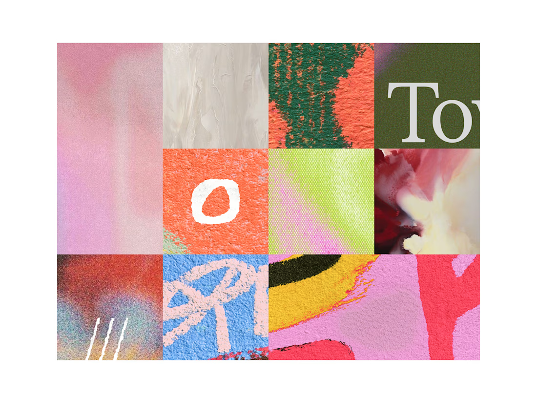

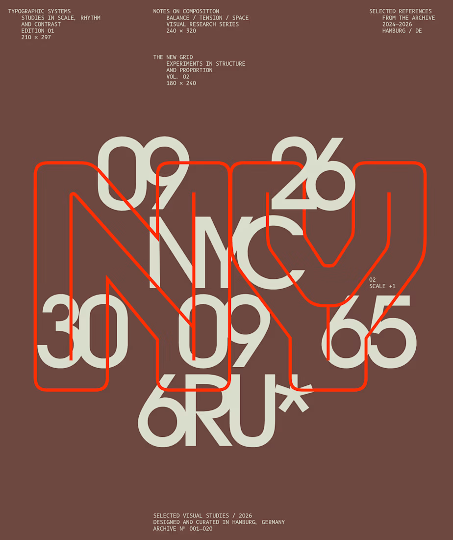
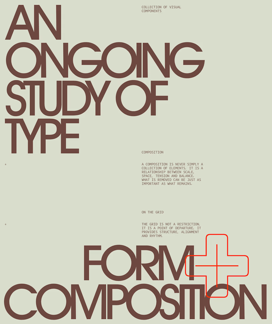
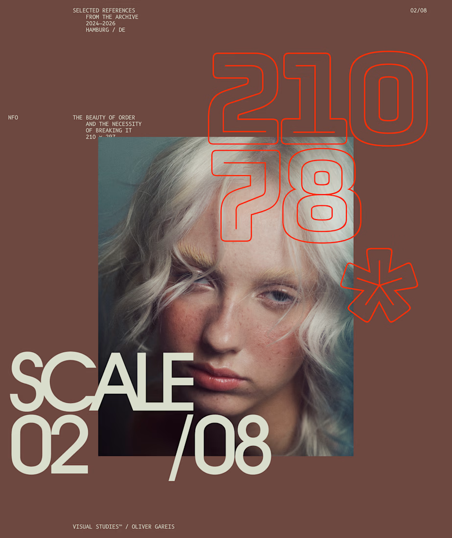
I designed these typographic layouts as part of my ongoing visual series on scale, grid and rhythm
↳ Master typography & layout - The foundation of timeless web design. Join 350+ designers inside my 13-hour online course https://typomonday.com/course

Beautiful wo