Simple is better. Simple is harder.


Web Dev Expert | A/B Testing & CRO
UX/UI Designer Turning Complexity Into Clarity


Art Director at VideoWorks


Art Director & Webflow Expert


View more →
UI/UX & Senior Graphic Designer + Webflow developer


UI & Software Designer


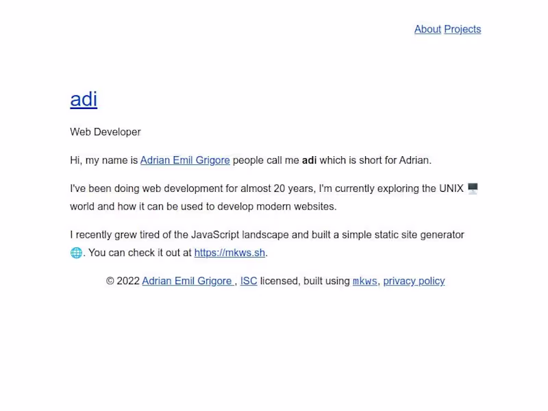
simple web dev
simple web dev