Projects using Adobe Photoshop in Bogota
Projects using Adobe Photoshop in Bogota
Sign Up
Post a job
Sign Up
Log In
Filters
2
Projects
People
Message
4
Marlon Velásquez
Zilverk - Stream Assets
4
16
Message
0
Juan Hoyos
pro
FORDIVINE • Framer Redesign & Framer Build
0
11
Message
2
José Tovar
pro
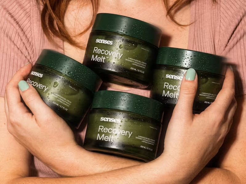
Senses — Brand Identity Redesign
2
20
Message
3
Daniel Castellanos
pro
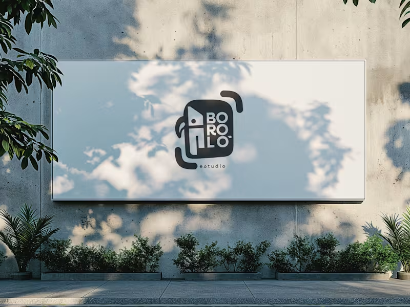
There are design decisions that don't come from the client. They come from within—and sometimes, that is exactly the problem. The previous logo for Boroló Estudio had soul. It had pre-Columbian roots, a hand-drawn stroke, and an indigenous character. It evoked drums, authenticity, and the Chocó—one of the most biodiverse and culturally rich regions in Colombia, a land of jungle, rivers, and a visual identity unlike any other. I loved it. And precisely because of that, I failed to evaluate the challenges the logo would face on real-world platforms: on a website, as an Instagram avatar, or in digital spaces. The redesign wasn't about letting go of the logo. It was about letting go of the attachment. The problem wasn't aesthetic—it was one of coherence. The studio’s brand had evolved, but the logo hadn't. A composition with too many elements in tension made the icon struggle to be memorable; what people saw didn't connect with who Boroló truly is. The new system retains the bird—now geometric, set in negative space within the icon. The inner container references the studio’s actual architectural blueprint: the diagonal of the cyclorama ceiling and the two zones of the space. The brackets refer to photographic framing. No layer imposes itself over the other—they are discovered. The result is a versatile system: imagotype, vertical logo, and wordmark. It works on a sticker, a billboard, an avatar, or a website. It scales without losing its identity. Redesigning doesn't mean the initial design was bad. It means communication needed to evolve. And from that point of view, the change isn't a correction—it’s a decision.
3
220
Message
2
Juan Carmona
pro
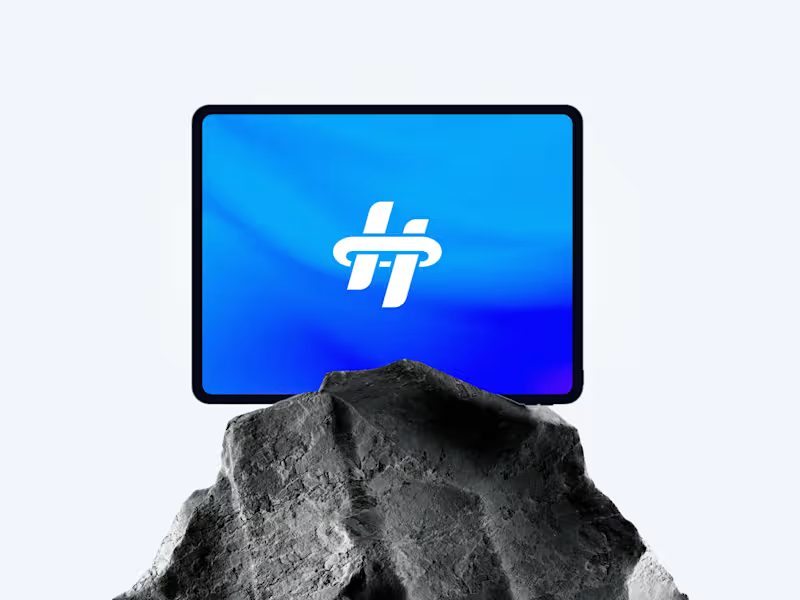
Hyrum Palmero Visual Identity
2
29
Message
0
Andrew Malaver
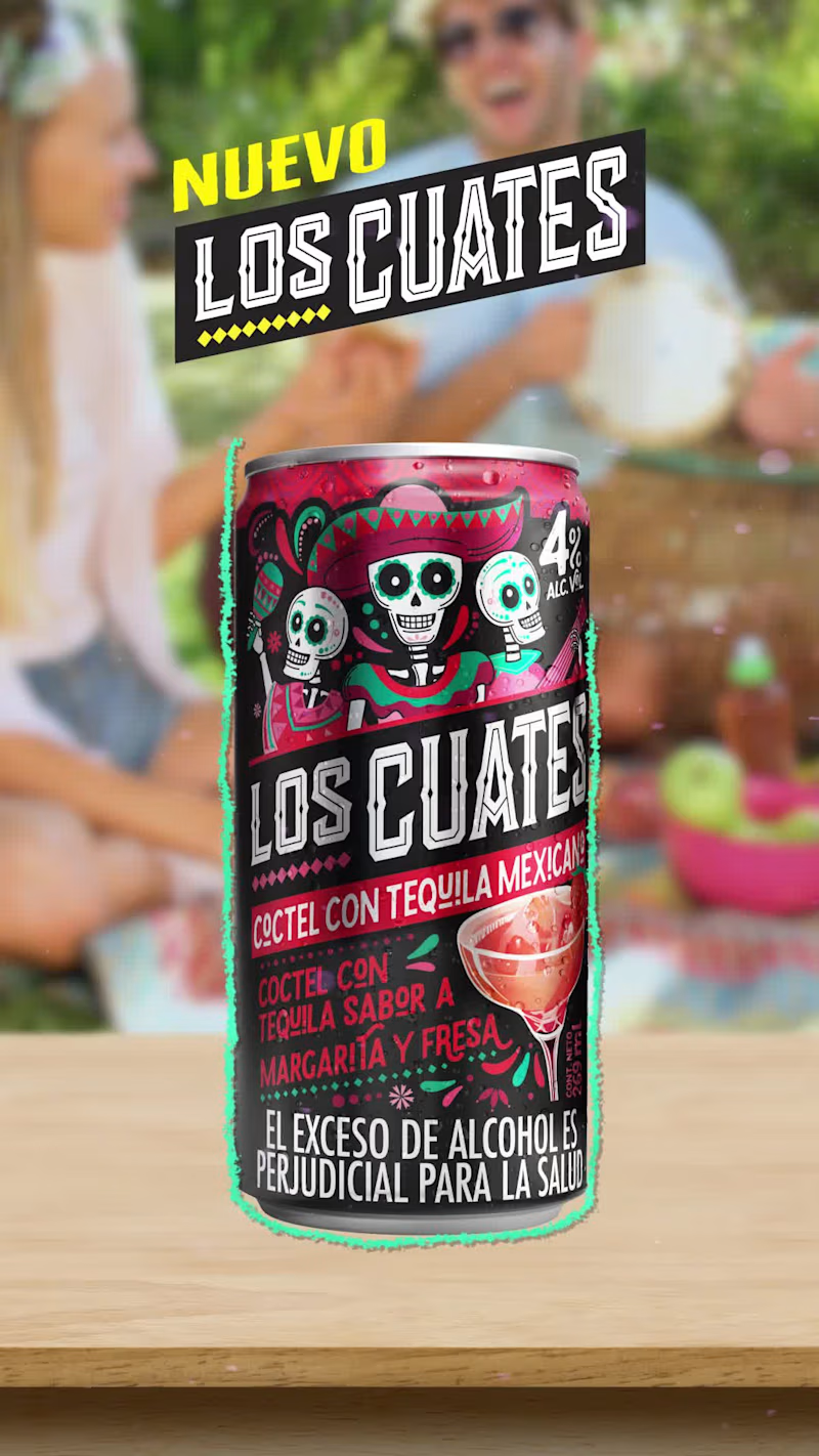
Motion Graphics for Los Cuates social media posts.
0
315
Message
0
Mariana Ordoñez
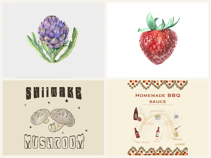
Food and ingredient illustration
0
2
Message
0
Samuel Eastmond
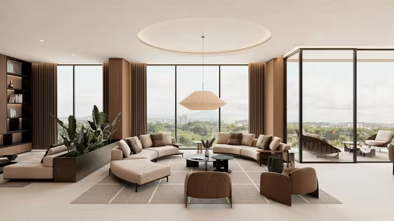
MAIA APARTMENT - INTERIOR DESIGN + 3D RENDERS
0
15
Message
2
Emperatriz Ortegón
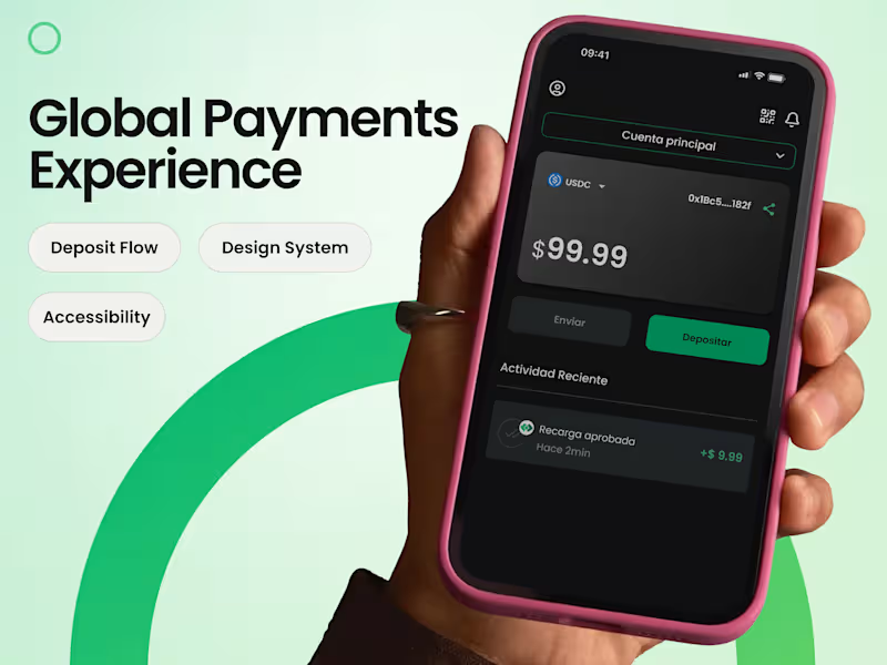
Fintech Wallet Product Design | Deposit Flow & Design System
2
12
Message
0
Miguel Morales
Visual identity | Edu.Tec™
0
7
Message
0
Diovanny Duque
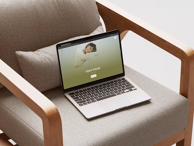
Web design and development for Caatamatista, the personal brand of Catalina Fernández. The project focused on transforming the brand platform into a clear, visually engaging, and easy-to-navigate digital experience, bringing together the brand’s strategic and creative assets in one accessible space.
0
51
Message
2
Anna Selkova
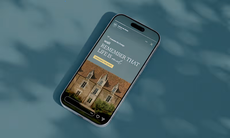
Domaine des Etangs – Hospitality Ad Concept Most luxury hotel ads sell you the same thing: infinity pools, drone shots, and polished staff smiling at reception. I wanted to take the complete opposite route. Built this concept for Domaine des Etangs as a portfolio piece to explore what ultra-luxury travel ads look like when you strip out the corporate five-star noise. Instead of selling amenities, the creatives sell silence and mental space — stone walls, mossy estate grounds, gallery interiors, and that unhurried French "Art de Vivre." The motion piece leans into quiet cinematic pacing, paired with an unexpected casual iMessage overlay hinting at an impulsive romantic escape. Editorial serifs, warm daylight, and generous negative space let the chateau breathe without screaming for attention. Turns out, true quiet luxury doesn’t need a hard sell – the stillness does the heavy lifting.
2
106
Message
1
Angie Sánchez Zapata
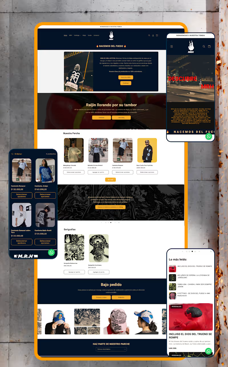
MRH — Website Redesign & Ecommerce Optimisation Project Type: UX/UI Redesign, Shopify Development & SEO Sector: Streetwear & Urban Apparel The context: MRH already had an online store, but it lacked structure, consistency, and a clear customer journey. Rather than redesigning isolated screens, I approached the project as part of a broader brand strategy — identifying friction points across the entire shopping experience and rebuilding the site around usability, storytelling, and scalability. My role: I led the full redesign end to end — from information architecture through custom Shopify development and SEO — working directly within the brand system I had already established for MRH. What I did: Reorganised the site's information architecture, simplifying navigation, menus, and product discovery for a more intuitive purchasing flow Redesigned the homepage — the highest-abandonment section — into a clearer introduction to the brand and its universe Separated storytelling from technical product information across product pages to improve readability and purchase decisions Built a dedicated blog giving each illustrated character its own narrative, connecting editorial content to ecommerce without interrupting the buying experience Developed custom Shopify components using Liquid, including interactive size-chart pop-ups (managed through metafields), dynamic product characteristics with visual icons, FAQs, trust indicators, and automated "Notify Me" functionality for out-of-stock items — all designed for the client to manage without touching code Restructured product categories into a dedicated Products section (previously a single catalogue-all page) and built a custom Collaborations page that auto-groups tagged products by partner brand Ran a complete SEO optimisation pass: restructured product descriptions, built keyword-focused URLs and metadata, and created a scalable metafield system so new products publish following the same optimised structure Set up quick-response templates in WhatsApp Business to streamline customer service Created a dedicated brand page explaining MRH's origins and philosophy, strengthening the connection between visual identity and digital presence The result: A website that isn't just visually stronger — it's easier to manage, more discoverable through search, and built to support MRH's growth long after launch. Full case study on Behance (https://www.behance.net/gallery/253684079/Website-Redesign-Ecommerce-Optimization)Live web (https://mrh-brand.com/)
1
139
Message
1
Jason Giraldo
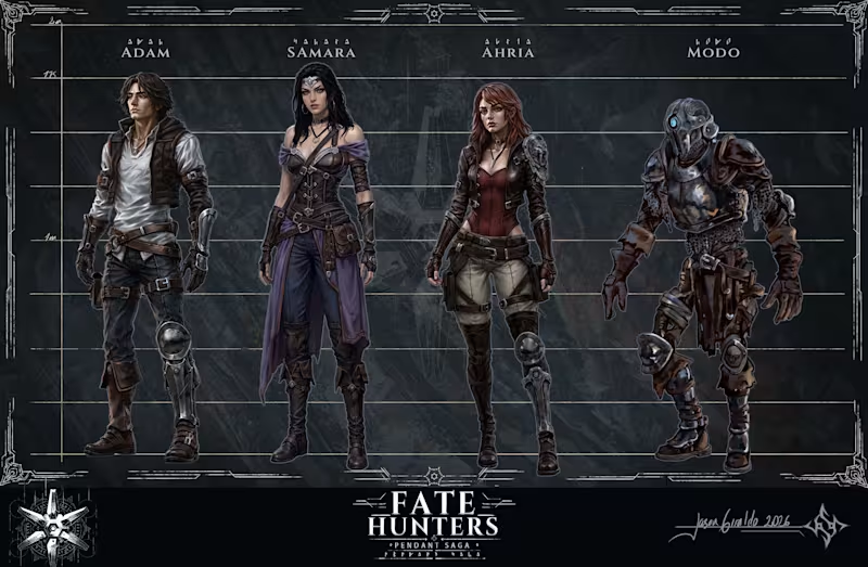
Fate Hunters main characters line up.
1
42
Message
0
Nicole Andrea Lopez Parra
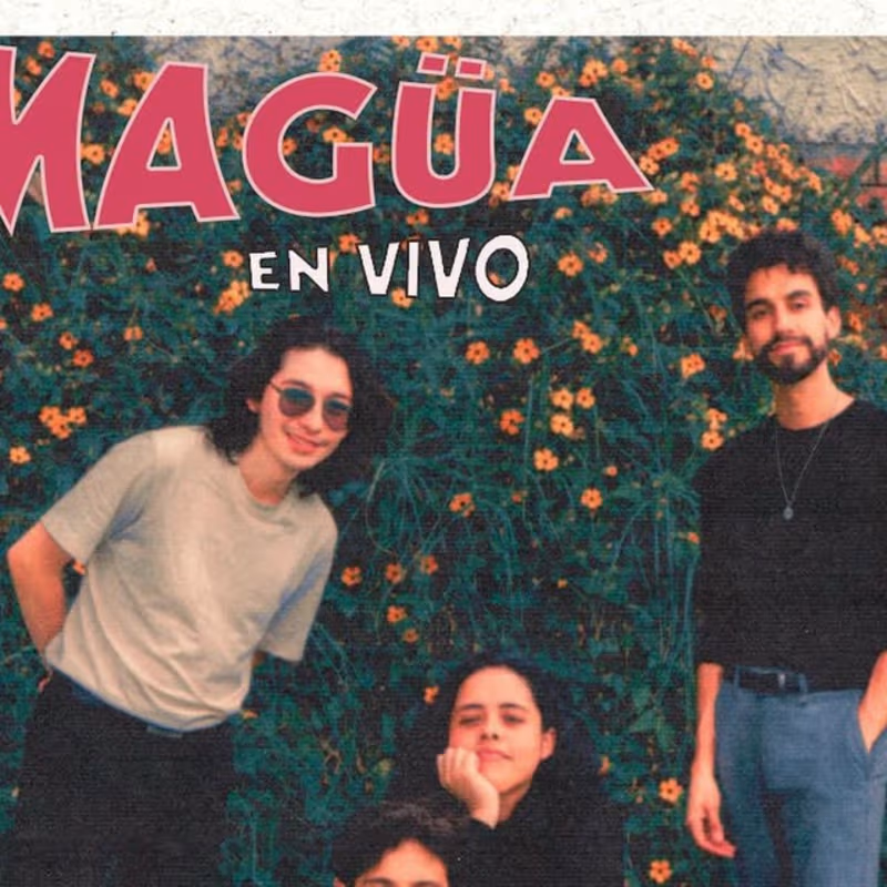
poster making
0
3
Message
1
Jenny Rodríguez
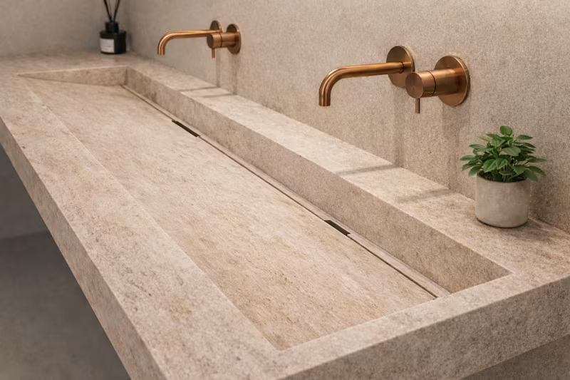
Hyperrealistic 16K Ultra HD render of a close-up of a double vanity in a luxury bathroom. The composition matches the reference angle, scale, and perspective. Two integrated channel basins are carved into the countertop with a monolithic, seamless geometry. The Durasein wood has an aged, matte finish with subtle grain and realistic micro-imperfections. The wall-mounted faucets match the reference with a warm metallic finish. Warm, indirect lighting, realistic shadows, and premium editorial quality complete the scene.
1
61
Explore projects