Projects using Adobe Illustrator in Bogota
Projects using Adobe Illustrator in Bogota
Sign Up
Post a job
Sign Up
Log In
Filters
2
Projects
People
Message
3
José Tovar
pro
Autip — Brand Identity Design
3
16
Message
3
Daniel Castellanos
pro
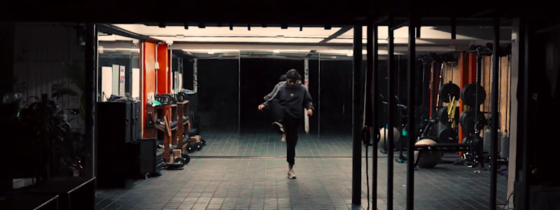
THE FULL PIECE IS HERE. German doesn't talk about climbing the way most people do. For him, it's not a sport you practice — it's a language you learn to speak with your body. That's what we wanted to capture. The first half is deliberate: static wide shots that hold the space, detail cuts that show the work behind the warmup. Intentional restraint before the release. Then the fade to black. What follows is the same athlete — same walls, same hands — but a completely different energy. The low-end of the beat dictates the cut. Movement becomes rhythm. He ends where he started. Sitting on the wall. The logo closes it. Shot and edited at his gym, built around his vision of the sport. Hope you like it !
3
263
Message
2
Juan Carmona
pro
Part 2 of the TechFoundersHub logo. Once the mark was defined my goal was to show the client how this logo would live in the real world without creating a full identity. Same logo. Different contexts. That's how you know it works. A brand mark isn't just a pretty shape. It needs to hold up on a website, on social, on a product. If it breaks in any of those places, it's not ready.
2
139
Message
0
Andrew Malaver
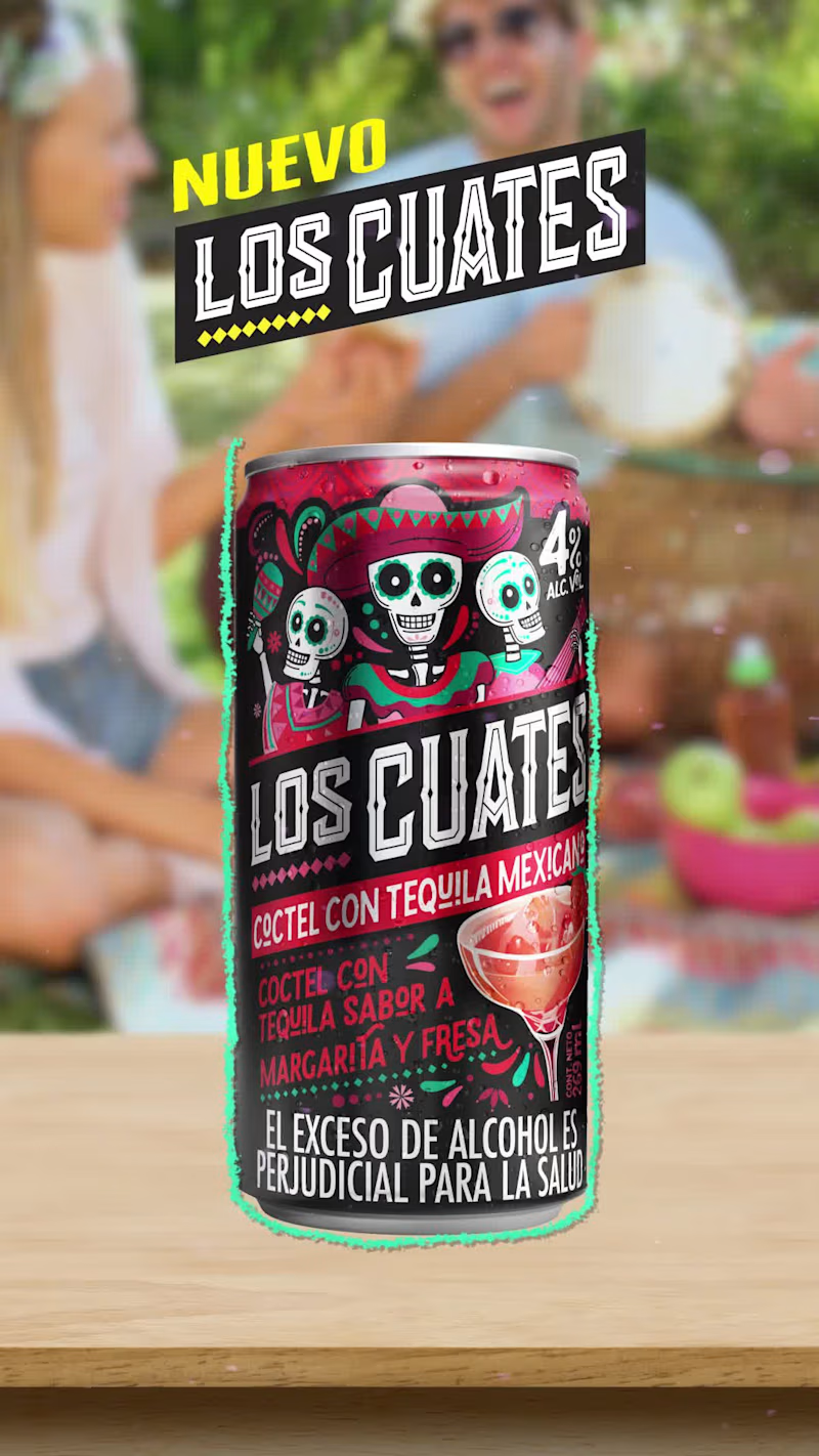
Motion Graphics for Los Cuates social media posts.
0
315
Message
0
Mariana Ordoñez
Ferrero digital shelf on Amazon, Walmart and Kroger
0
3
Message
0
Miguel Morales
Visual identity | Edu.Tec™
0
7
Message
0
Diovanny Duque
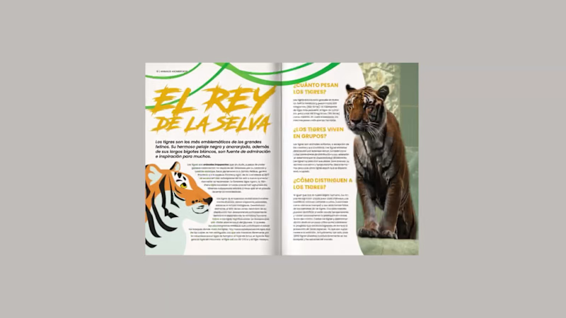
ZOOFERA is an interactive children’s magazine about the animal world, created as an editorial design project. Combining playful layouts, custom photography, and engaging interactive elements, the publication was designed to spark curiosity and create an immersive reading experience for young audiences.
0
48
Message
3
Anna Selkova
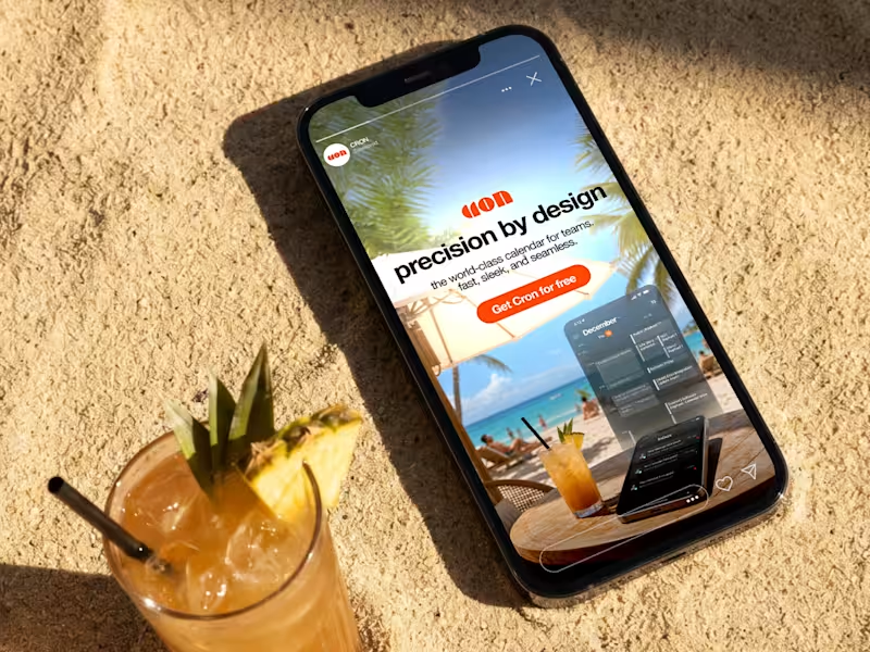
Cron (Notion Calendar) — Performance Ad Concept A speculative ad creative bundle I built for Cron to explore how I'd approach user acquisition for a productivity tool with strong existing design DNA. The challenge is specific: the product is already visually confident, so the ads have to extend the aesthetic without competing with it. The bundle centres on the interface itself — Cron's UI shown in real workplace contexts on laptop and mobile, framing the calendar as something already in someone's day rather than a product being sold. No lifestyle overlays, no stock office shots. Typography stays direct: one problem-hook per frame, tight hierarchy, dark mode against the signature orange. The orange does the work of stopping attention; everything else stays quiet so the message reads in the first second. Three static banner variations and one motion asset, sized for Meta and LinkedIn feed.
3
206
Message
1
Angie Sánchez Zapata
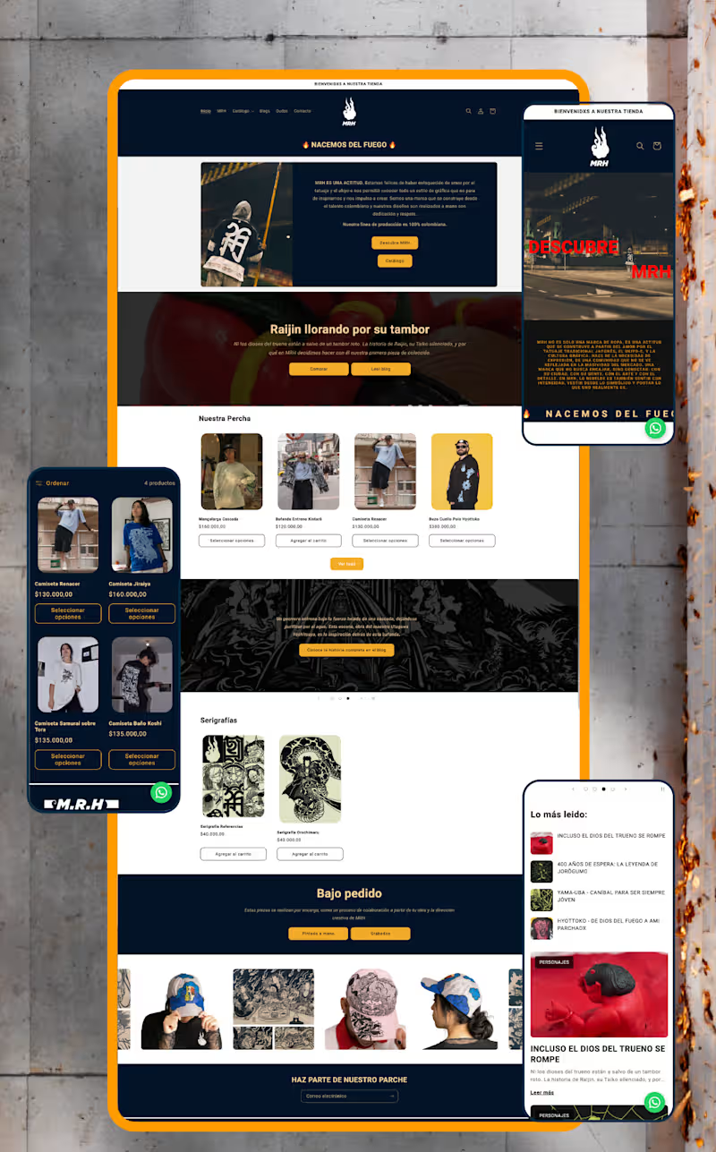
MRH — Website Redesign & Ecommerce Optimisation Project Type: UX/UI Redesign, Shopify Development & SEO Sector: Streetwear & Urban Apparel The context: MRH already had an online store, but it lacked structure, consistency, and a clear customer journey. Rather than redesigning isolated screens, I approached the project as part of a broader brand strategy — identifying friction points across the entire shopping experience and rebuilding the site around usability, storytelling, and scalability. My role: I led the full redesign end to end — from information architecture through custom Shopify development and SEO — working directly within the brand system I had already established for MRH. What I did: Reorganised the site's information architecture, simplifying navigation, menus, and product discovery for a more intuitive purchasing flow Redesigned the homepage — the highest-abandonment section — into a clearer introduction to the brand and its universe Separated storytelling from technical product information across product pages to improve readability and purchase decisions Built a dedicated blog giving each illustrated character its own narrative, connecting editorial content to ecommerce without interrupting the buying experience Developed custom Shopify components using Liquid, including interactive size-chart pop-ups (managed through metafields), dynamic product characteristics with visual icons, FAQs, trust indicators, and automated "Notify Me" functionality for out-of-stock items — all designed for the client to manage without touching code Restructured product categories into a dedicated Products section (previously a single catalogue-all page) and built a custom Collaborations page that auto-groups tagged products by partner brand Ran a complete SEO optimisation pass: restructured product descriptions, built keyword-focused URLs and metadata, and created a scalable metafield system so new products publish following the same optimised structure Set up quick-response templates in WhatsApp Business to streamline customer service Created a dedicated brand page explaining MRH's origins and philosophy, strengthening the connection between visual identity and digital presence The result: A website that isn't just visually stronger — it's easier to manage, more discoverable through search, and built to support MRH's growth long after launch. Full case study on Behance (https://www.behance.net/gallery/253684079/Website-Redesign-Ecommerce-Optimization)Live web (https://mrh-brand.com/)
1
139
Message
0
Miraca Sanchez
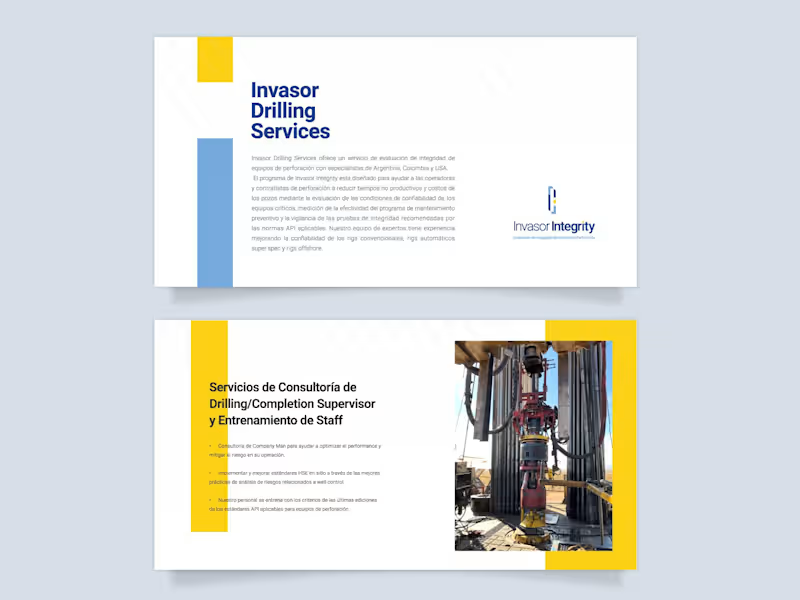
Visual Identity Design, Brochures & Website Design
0
28
Message
0
María José Suesca Zamudio
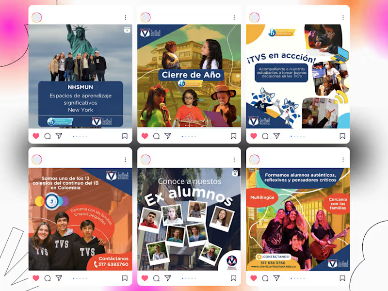
Community Manager School
0
19
Message
0
Nathalia Acosta
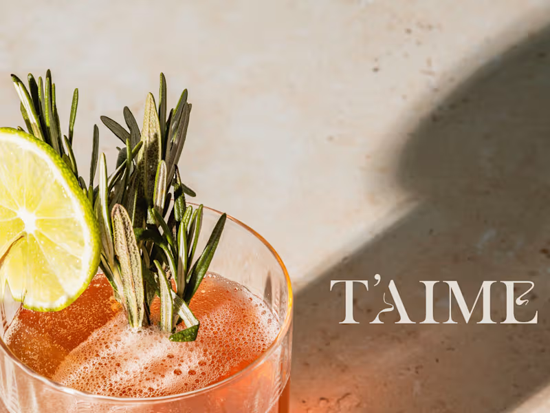
T'aime - Brand Identity
0
11
Message
0
Dandy Torres
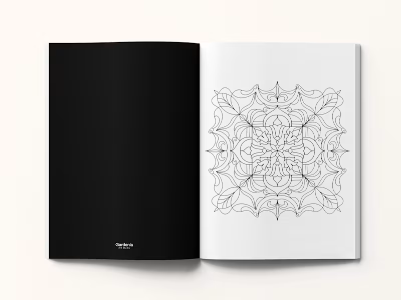
Coloring Book - Editorial Design & Illustration
0
38
Message
0
Qürnovi Nicolás
Rebranding Project for Elena Kether's Coaching Service
0
1
Message
0
OZK ART
Posters & Banners PART ONE
0
3
Message
0
Juan Salazar
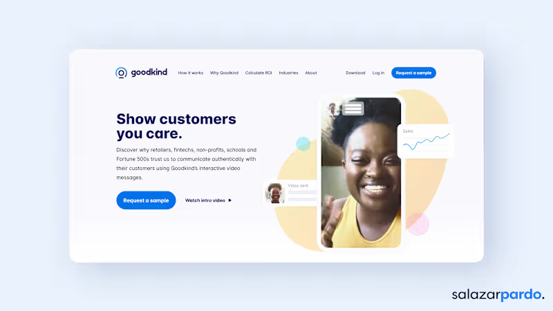
Branding and Webflow Website
0
8
Explore projects