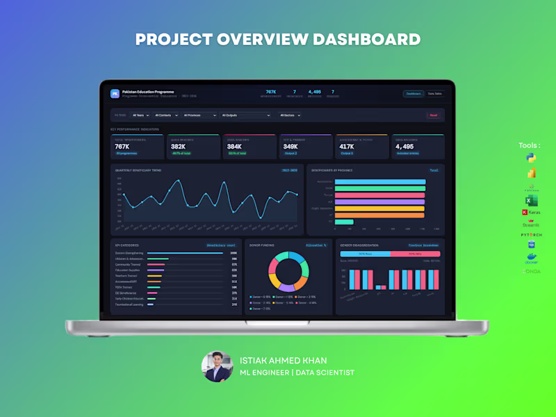
Projects using Tableau in BangladeshProjects using Tableau in BangladeshEducation Program Analytics Dashboard – Data Analytics Solution
Handling large-scale program data without clear visibility can make impact measurement difficult. This dashboard is designed to give organizations a complete, real-time view of program performance, reach, and funding — all in one place.
What You Get :
A powerful, interactive dashboard that helps track beneficiaries, program outputs, regional performance, and donor contributions with clarity and precision.
Key Capabilities:
Monitor total beneficiaries and gender distribution
Track program reach across provinces and sectors
Analyze quarterly trends and growth patterns
Evaluate donor funding allocation and impact
Identify top-performing program categories and outputs
Explore education level distribution and engagement
For NGOs and large programs, data is critical for decision-making and reporting. This dashboard helps you measure impact, improve transparency, and optimize resource allocation — making your data meaningful and actionable.
Perfect For :
NGOs and non-profit organizations
Government programs
International development agencies
Research and policy teams
If you want a professional, insight-driven dashboard that clearly communicates impact and performance, I can create a customized solution tailored to your organization. CarePoint Medical Dashboard
The CarePoint Medical Dashboard is a modern, user-friendly healthcare interface designed to streamline patient management and hospital operations. The UI focuses on clarity, accessibility, and real-time data visibility for medical professionals.
The dashboard features a clean layout with intuitive navigation, allowing users to quickly access key modules such as patients, appointments, doctors, and reports. A soft green color palette enhances readability while aligning with healthcare aesthetics.
Real-time KPI cards for patients, appointments, and revenue
Patient status tracking with visual indicators (Critical, Stable, Moderate)
Monthly admissions trend analysis
Upcoming appointments and recent patient records
Department-wise distribution insights
The interface is designed for efficiency, reducing cognitive load through organized sections and clear visual hierarchy. Interactive elements and minimalistic design ensure smooth navigation and quick decision-making.
This dashboard improves operational efficiency, enhances patient monitoring, and supports healthcare professionals in delivering timely and data-driven care.