Freelance Web Banner Designs in Bangladesh
Sign Up
Post a job
Sign Up
Log In
Filters
2
Projects
People
Orbix Studio
max
Dhaka, Bangladesh
UX-led product design & dev agency for b2b saas and AI
$10k+
Earned
104
Followers
expert
Follow
Message
UX-led product design & dev agency for b2b saas and AI
0
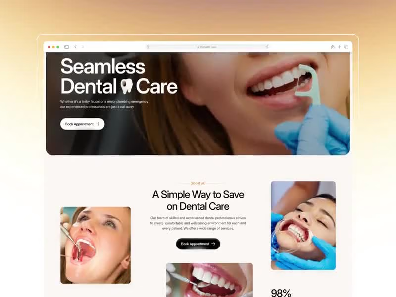
A great dental experience starts long before you sit in the chair. It starts the moment you land on the website. From a complex set of dental platform requirements to a seamless web experience that makes finding a dentist, understanding treatments, and booking an appointment feel completely stress-free. Dental care that puts the patient at ease before they walk through the door. A platform where treatments, specialists, reviews, and appointment booking all live together in one warm, approachable experience designed to remove anxiety, not add to it. We wanted to move away from the sterile, text-heavy layouts of traditional dental websites and build something that actually feels as comfortable as the care it represents. From the first scroll to the booking confirmation, every pixel was designed to replace anxiety with confidence. Curious what you think about the UI direction. 👀 UX Design | Healthcare | Dental | Web Design
0
289
0
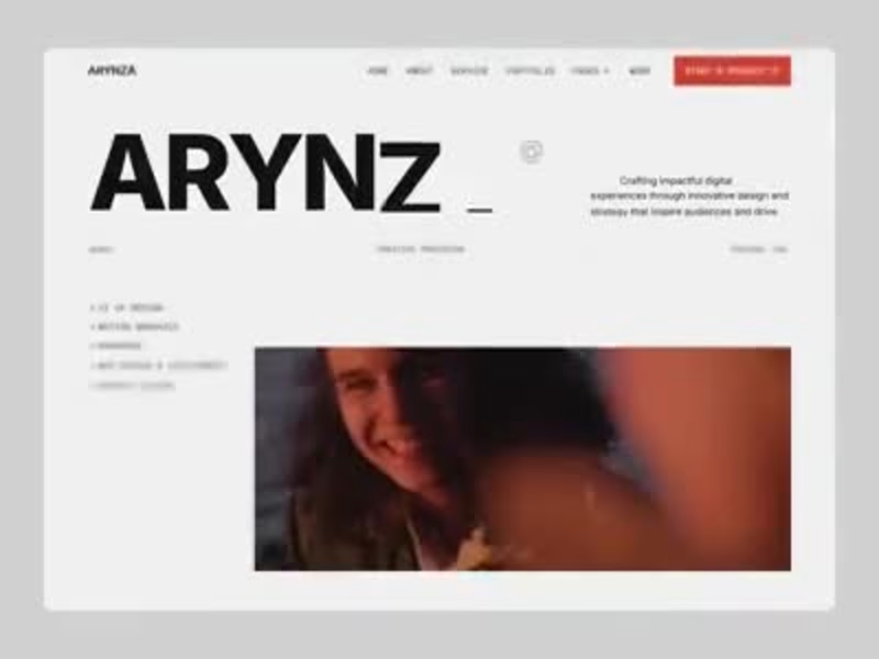
ARYNZA | Creative Studio Portfolio & Brand Strategy Web Design Most freelance portfolio sites feel like a résumé with images attached, no voice, no editorial weight, and no reason to believe the person behind it can actually move a brand forward. Clients looking for a serious creative partner skip past forgettable portfolios in seconds. We designed ARYNZA, a typographic-forward portfolio website built for creative directors, brand strategists, and multidisciplinary designers who want service depth, portfolio confidence, and studio identity without looking like a theme download. 𝗪𝗵𝗮𝘁 𝘄𝗲 𝗳𝗼𝗰𝘂𝘀𝗲𝗱 𝗼𝗻: Hero Typography: ARYNZA in full-viewport bold type with "Creative Precision · Chicago, USA · @2025" location, era, and attitude communicated before a single scroll. Service List: UI UX Design · Motion Graphics · Branding · Web Design & Development · Graphic: five disciplines listed cleanly on the hero so the right clients qualify themselves immediately. Brand Statement: "Crafting impactful digital experiences through innovative design and strategy that inspire audiences and drive brand growth" positioned as a strategic partner, not just a visual executor. Client Logo Strip: Portals · Alt+Shift · Chromatools · Constellation · Codecraft five brand partners on a bold red bar anchoring credibility between hero and portfolio. Graphic Design Panel: Print Design · Digital Assets · Illustrations listed alongside full-bleed editorial imagery specialisms shown in context, not buried in a services page. Portfolio Works: Motion Design, Branding Design, and Editorial Photography Previews Labeled Chicago, USA. Work is shown with geography and discipline, giving each piece professional context. Built for creative directors, brand studios, and multidisciplinary designers building authority-first portfolio experiences that attract serious clients. Tools: Figma, Jitter Let's build something better. 👋
0
276
8
A brand identity isn't finished when the logo is locked. It's finished when it can speak in any tone and still sound like itself. This is the extended motion system for Arcova, a full content series built on the same identity foundation, designed to flex across messaging without ever losing recognition. Environmental and social responsibility frameworks. Architecture and investment imagery. Bold statements like "What we build today is what stands tomorrow." Olive green, deep forest, and clean white surfaces rotate depending on the message, but the house mark and typography system stay constant, the anchor that ties every card back to one brand. This is what a real identity system looks like in motion: consistent enough to be unmistakable, flexible enough to carry a dozen different conversations. Does this feel like a brand that could carry an entire content calendar on its own? 👇 Tools: Figma / Jitter #BrandIdentity #MotionDesign #BrandSystem #VisualIdentity #BrandingDesign #ContraFreelance #CreativeDirection #DesignSystem
1
8
203
1
A great restaurant makes you hungry before you even sit down. The website should do the same. Puredish is a restaurant web design built for Elysian Bistro, an organic dining experience in the heart of Brooklyn where classic French cuisine meets modern American flavors. The design brief was simple: make people want to book a table before they finish scrolling. Deep forest green hero with bold retro typography. Warm cream sections that feel as inviting as the dining room itself. Opening hours, a structured menu with pricing, food photography that earns its placement, and an about section that gives the brand a personality before a guest ever walks through the door. Truffle risotto at $24. The burger is at $28. Every dish is presented with the same care the kitchen gives it. This is what restaurant web design looks like when the food is the hero and the design knows to stay out of its way. Does this make you want to make a reservation? 👇 Tools: Figma · Jitter #WebDesign #RestaurantDesign #UIDesign #FoodUI #LandingPage #ContraFreelance #BrandDesign #OrganicFood
1
214
Web Banner Design
(2)
Follow
Message
Mahdia Ahmed
Sunamganj, Bangladesh
Logo and Branding design
20
Followers
Follow
Message
Logo and Branding design
1
Creative carousel design
1
2
1
Impactful Creative Banners
1
3
1
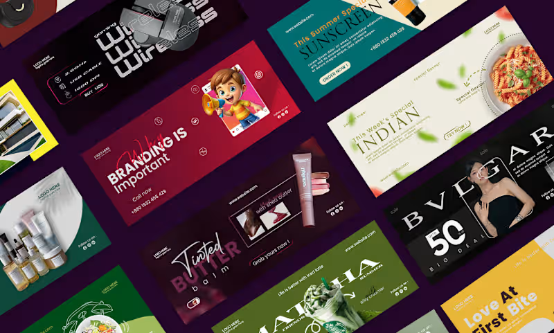
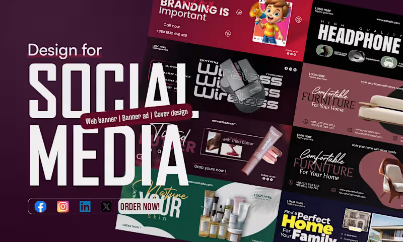
Just wrapped up this vibrant social media banner design, and I’m honestly so excited to share it! It’s a full showcase of web banners, banner ads, and cover designs made to grab attention instantly across Facebook, Instagram, LinkedIn, and X. You’ll see everything from playful kids’ branding with a cute cartoon character shouting, “Branding is Important,” to sleek high-quality headphone promos, gaming wireless mouse layouts, cozy furniture ads that scream “Comfortable for Your Home,” glowing skincare and beauty products (hello, tinted lip butter with shea butter!), and even dreamy real estate banners saying, “Find a Perfect Home For Your Family.” I went with bold, modern typography, rich color palettes, clean product shots, and strong call-to-action buttons like “Call Now” and “Order Now!” so every banner feels professional yet super approachable. Whether you’re selling tech, beauty, furniture, or homes, these designs are built to stop the scroll and spark action. What do you think? Ready to get your own custom banner that actually looks like YOUR brand? Drop me a message — I’d love to create something special for you! 💜
1
121
6
Brand name: Freelance academy. What do you think??? i can't decide myself which ver. is actually slayinggg. Drop your suggestions in the comments.
3
6
173
Web Banner Design
(5)
Follow
Message
Md Zahid Hasan Khan
Rajshahi Division, Bangladesh
I am a professional Brand Designer, I do all kind of Design
13
Followers
Follow
Message
I am a professional Brand Designer, I do all kind of Design
3
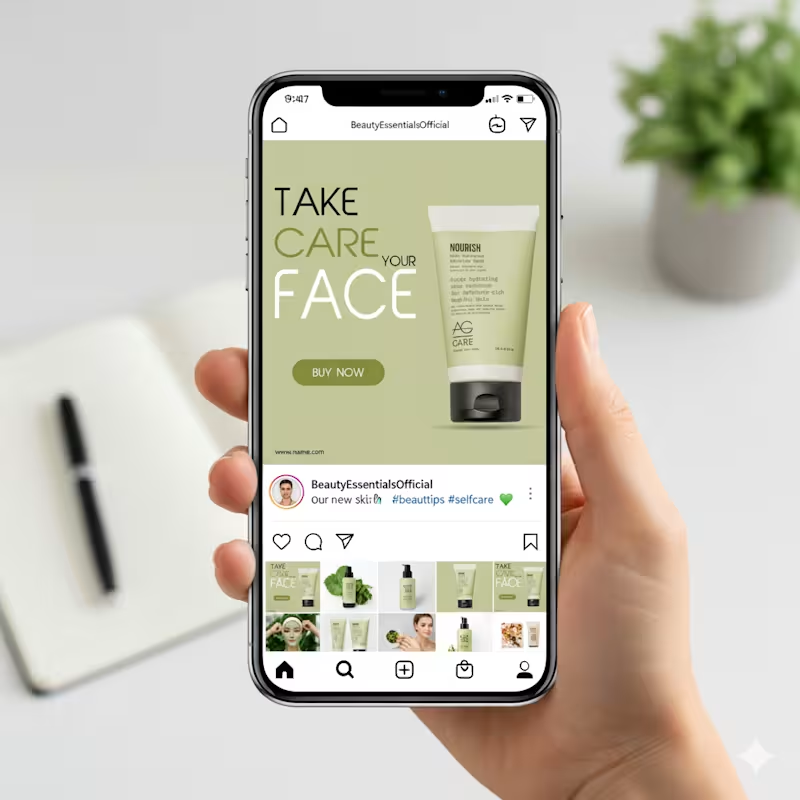
This design focuses on calm, care, and clarity, which fits perfectly with a skincare product. The soft green background immediately communicates freshness, nature, and hydration. It creates a soothing mood and helps the product feel gentle and trustworthy. Nothing feels loud or aggressive, which is important for beauty and self-care brands. The typography hierarchy is very intentional. “FACE” is large and bold to grab attention while scrolling. “TAKE CARE YOUR” stays lighter so it supports the message without overpowering it. This balance keeps the layout readable and visually clean. The product is placed on the right with plenty of breathing space. That negative space makes the packaging feel premium and keeps the focus exactly where it should be. The subtle shadow adds depth without making it look heavy or artificial.
3
71
2
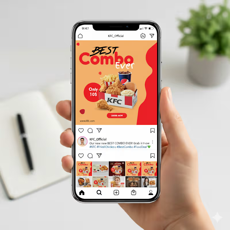
This Instagram post is built to grab attention fast. The layout uses a bold headline that highlights the offer right away, with “Best Combo Ever” placed prominently so viewers instantly understand the message. I used warm tones in the background to make the food look even more appetizing, and the red accents help guide the eye toward key details like the price and the call-to-action. The combo box sits at the center as the main focus, supported by clean shadows to give it depth. The “Only 10$” badge stands out clearly for quick scanning, and the “Order Now” button at the bottom creates a natural flow that nudges the viewer to take action. Overall, the design is simple, bright, and easy to understand within a second of scrolling.
2
2
60
1
Stays Worth Remembering Travel Company Logo Design 2026. The idea behind this logo was to create a visual identity that instantly communicates comfort, memorable experiences, and destination-based stays in a clean and meaningful way. The mountain element represents travel, adventure, peaceful escapes, and beautiful destinations. It gives the brand a sense of exploration and unforgettable journeys. The house placed in the center symbolizes comfort, hospitality, safety, and the feeling of being “at home” no matter where someone travels. The wave element was added to represent relaxation, premium vacation experiences, and destinations connected to nature, lakes, beaches, or peaceful environments. Together, the mountain, home, and wave create a complete story of travel and memorable stays. For the typography, I used a bold and clean font to make the brand look professional, trustworthy, and easy to recognize across both digital and physical platforms. The word “REMEMBERING” uses a softer gold tone to create a warm emotional feeling and reinforce the idea that these stays are not just accommodations, but experiences people will remember for a long time. The green color palette represents nature, growth, relaxation, and trust, while the blue wave adds freshness, calmness, and a travel-inspired feeling. Overall, the logo was designed to feel welcoming, modern, memorable, and versatile for signage, branding materials, business cards, websites, and mobile applications.
1
63
2
Indian Client Work Vitamin C 10% Face Serum Package Design. Here I have designed several packages of Vitamin C 10% Face Serum for my Indian client. From here, the client has finalized a design and is selling their product by printing that package. From here you can get your design ideas if you want and those who want to package such products can contact me. I am here for you. You (http://you.you/) can design labels for your products, and if you want, you can get your company's full branding done by me. If you want to get ideas about my designs, you can check out my entire portfolio, so if you need this service, be sure to contact me.
2
60
Web Banner Design
(2)
Follow
Message
Mimi Akter
Dhaka, Bangladesh
Grow my UX UI/web design abilities a little more each day
Follow
Message
Grow my UX UI/web design abilities a little more each day
4
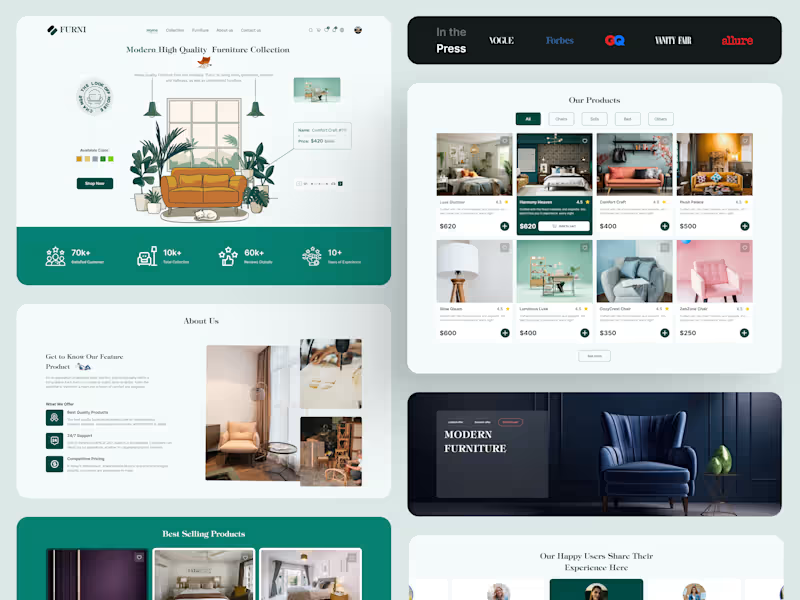
Minimal, Modern & Made to Last – Furniture UI Design
4
4
123
3
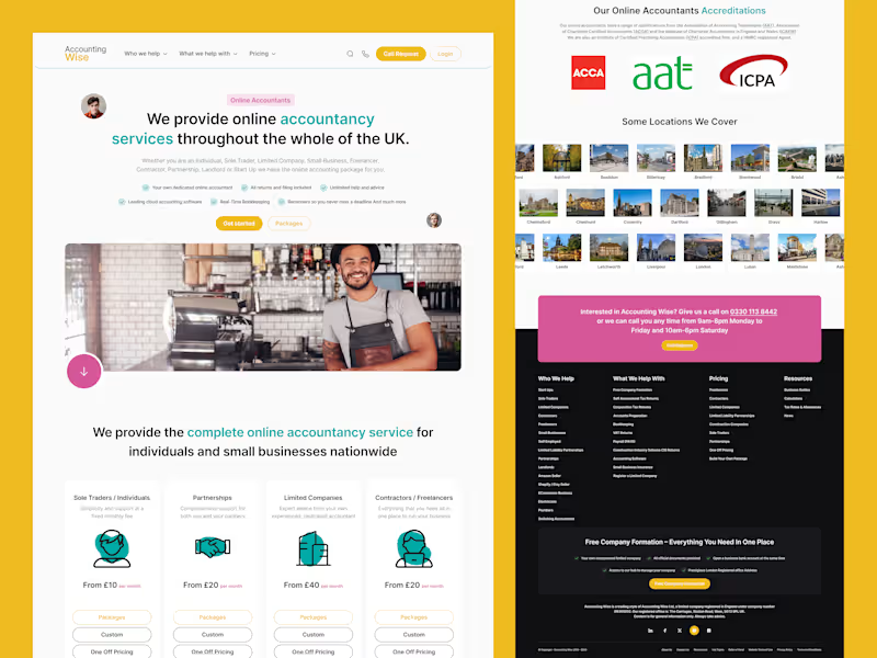
More Leads, Less Money Stress Accounting Wise asked me to redesign their main landing page to bring in more qualified leads from across the UK. Their challenge: many services, many audiences, but one crowded page. I simplified the story around three things who they help, what it costs, and why they’re trusted. One UX choice I loved: colour‑coded service blocks so each audience can find their section fast. Curious how a clearer story can make your site sell more? Message me and let’s explore your project.
3
96
1
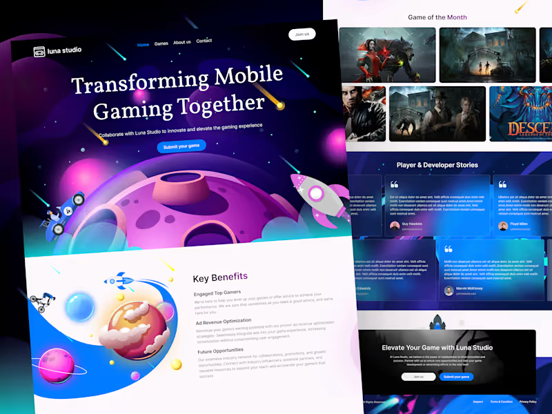
Luna Studio Landing Page — Problem to Solution UI/UX Luna Studio came to me with a clear problem: the page looked fun, but new visitors did not quickly understand the offer or what to do next. The solution was a simple, guided story. First, we made the main message clear: mobile gaming, together. Next, we focused on two actions only: “Join us” and “Submit your game.” Then we added quick value blocks (engaged gamers, ad revenue help, future opportunities) and trust sections (about, featured games, stories). This way, people can understand, trust, and take action fast. If you need a landing page like this for your studio or business,If you want a landing page that does the same, DM me for UI/UX.
1
84
4
Full Restaurant Website UIUX Design
4
4
139
Web Banner Design
(3)
Follow
Message
Motiur R. Munna
Habiganj, Bangladesh
Creative Director & Brand Strategist
10
Followers
Follow
Message
Creative Director & Brand Strategist
0
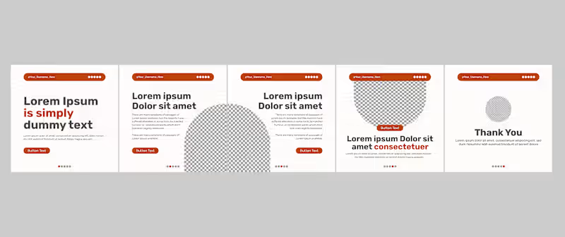
Modern Minimal Social Media Carousel Template
0
2
0
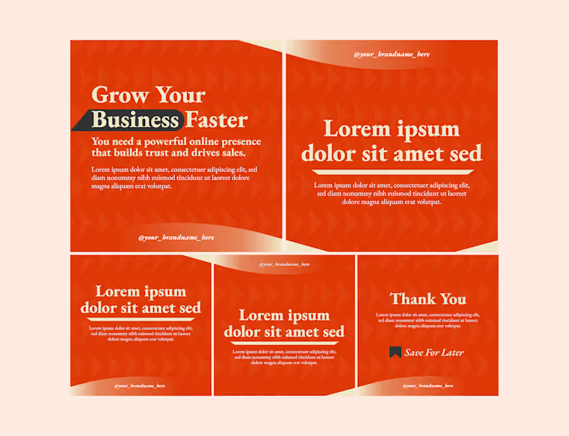
Corporate Carousel Poster Collection
0
4
0
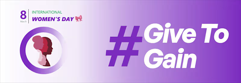
Women Day 2026 - Give To Gain | Cover, Banner Design
0
4
0
Corporate Social Media Carousel Post Design
0
2
Web Banner Design
(8)
Follow
Message
Latif Rahman
Bangladesh
Graphic Designer
Follow
Message
Graphic Designer
0
Beyond The Artists on Instagram: “Contact us for all your LOGO …
0
2
0
Beyond The Artists on Instagram: “Contact us for all your E-fly…
0
1
0
All Project.
0
1
0
Beyond The Artists on Instagram: “Contact us for all your socia…
0
1
Web Banner Design
(2)
Follow
Message
Md Mehdi Hasan
Noakhali, Bangladesh
UI UX designer | UI/UX Design | Webflow | Figma | Framer
5.0
Rating
135
Followers
Follow
Message
UI UX designer | UI/UX Design | Webflow | Figma | Framer
1
MKET Agency – B2B Sales & Marketing Website UI UX Design MKET Agency is a modern and conversion-focused website design created for a B2B lead generation and marketing service. The platform helps businesses maximize their sales and marketing performance with managed B2B lead data, enabling smarter targeting and better customer acquisition. The design features a clean corporate layout, strong call-to-actions, and a structured presentation of services, making it ideal for agencies focused on lead generation, data-driven marketing, and business growth solutions.
1
235
0
Our UGC Ad design project with ChatGPT and Google Flow for Nusafia: A Home Decor Agency in Bangladesh #ugcad #aiugc #googleflow #chatgpt
0
27
0
GreenRush – Modern Fast Food & Restaurant Website Template Description GreenRush is a modern and visually engaging fast food restaurant website template designed for burger shops, cafes, healthy food brands, and modern restaurants. Featuring a bold typography style, vibrant food visuals, customer reviews, menu showcases, and interactive sections, this template delivers a premium user experience that helps food businesses stand out online. Perfect for restaurants looking for a clean, conversion-focused, and development-ready design. Template Highlights Modern & Clean Restaurant UI Design Eye-Catching Hero Section Interactive Food Menu Layout Customer Testimonial Section Instagram Food Gallery Fully Responsive Structure Conversion-Focused CTA Buttons Perfect for Fast Food, Cafes & Restaurants 1920px Desktop Layout Organized Auto Layout & Components Easy to Customize in Figma Development Ready Design System
0
107
1
Logistics-Lion — Dark Logistics Website UI/UX Template Logistics-Lion is a modern dark-themed one-page logistics website template designed in Figma for cargo, freight, shipping, warehouse, and transportation businesses. Featuring a clean UI, bold typography, shipment tracking sections, responsive layouts, and conversion-focused design. Perfect for logistics startups and supply chain companies looking for a professional web presence. #logistics #darkui #webdesign #uidesign #uxdesign #figma #landingpage #shipping #cargo #transportation #supplychain #modernui #websiteinspiration #uiux #darktheme
1
144
Web Banner Design
(1)
Follow
Message
Badruddin Tasnim
Bangladesh
UI/UX Designer specializing in high-conversion designs
3x
Hired
4.7
Rating
3
Followers
Follow
Message
UI/UX Designer specializing in high-conversion designs
0
Website Design for a Speaker Brand 🔊
0
2
0
App UI design for a late-night navigation app for tipsy users to get home safely. I created this app for a design challenge. It has been a fun project to work on, and I designed two screens for it. The app can help drivers find safer options: - A sober driver - A taxi / ride service - Or the safest walking route https://dribbble.com/shots/26636592-App-UI-design-Ride-Sharing-App-for-Tipsy-Users
0
52
1
MVP UI Design for a Linkedin Post Creation & Management Tool
1
2
0
Website Hero Section Design🌿
0
1
Web Banner Design
(1)
Follow
Message
Explore people