The network for creativity
Join 1.25M professional creatives like you
Connect with clients, get discovered, and run your business 100% commission-free
Creatives on Contra have earned over $150M and we are just getting started
Back to feedPost

More Leads, Less Money Stress
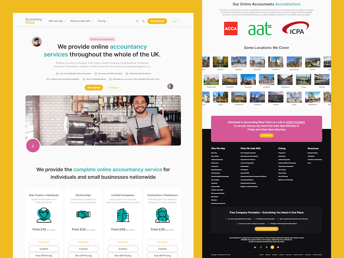
Accounting Wise asked me to redesign their main landing page to bring in more qualified leads from across the UK.
Their challenge: many services, many audiences, but one crowded page. I simplified the story around three things who they help, what it costs, and why they’re trusted.
One UX choice I loved: colour‑coded service blocks so each audience can find their section fast. Curious how a clearer story can make your site sell more?
Message me and let’s explore your project.


The network for creativity
Join 1.25M professional creatives like you
Connect with clients, get discovered, and run your business 100% commission-free
Creatives on Contra have earned over $150M and we are just getting started




Related posts

Still finding little moments from this project that I want to share
A few more favorites from the launch video 💜


great work..


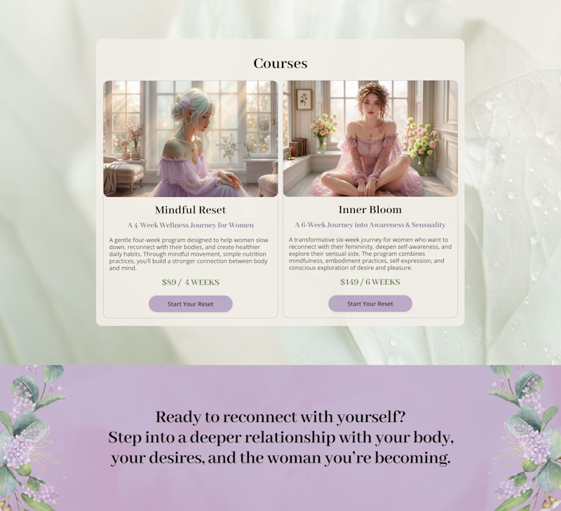
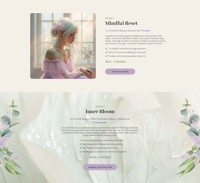
Cards or sections? How should you showcase courses on a Kajabi website?
It depends on what you want visitors to see first.
Course cards are great when you want to show the full picture at a glance – “Here are all the programs we offer.” They make the product range clear before visitors start scrolling.
Separate sections work better when each course needs more attention – its story, audience, benefits, and outcomes.
When we design Kajabi websites, we don’t use one layout for every course.
We choose the structure that makes the offer easier to understand – and easier to explore.

28 voted
65%
15 voted
35%
43 votes
Closed

Cards

Visual direction and hero section for a cybersecurity training platform. (Concept work, not a real project)


