Illustration Projects in BangladeshIllustration Projects in BangladeshSome creative projects start with a character. Ronin Neon started with a world.
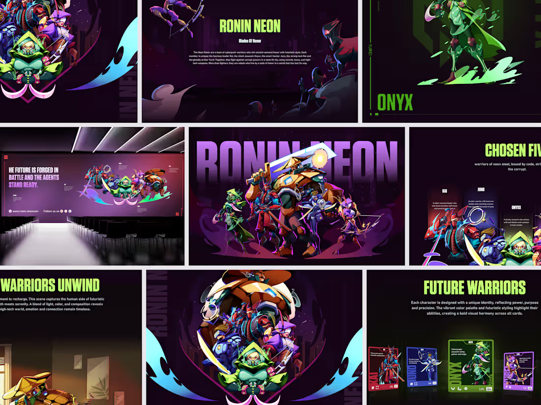
The brief was a cyberpunk warrior universe where ancient samurai honor meets neon-lit futurism a team of five rebels fighting corrupt powers in a city that lost its way. Kai the fearless leader. Onyx the silent assassin. Juno the smart hacker. Rai the strong tank. Yurei the ghostly archer. Each one distinct. All of them unmistakably Ronin Neon.
The world-building came first. The characters grew out of it. And the visual system deep purple atmospheres, electric green accents, explosive action compositions, and trading card UI was designed to hold the entire universe together across every format it lands in.
Billboards, character sheets, card sets, campaign pages, and a group hero shot that makes you want to know every backstory before you've read a word.
"The future is forged in battle and the agents stand ready." That line lives on the campaign wall and tells you everything about what Ronin Neon is a brand, a story, and a world worth fighting for.
This is concept art and IP development where the design does as much storytelling as the illustration.
Does this feel like a universe you'd want to play in? 👇
Designed by Orbix Studio
Tools: Illustrator , Figma
#ConceptArt #GameDesign #CharacterDesign #IllustrationArt #CyberpunkArt #ContraFreelance #GameIllustration #WorldBuilding Aura Aesthetic & Longevity Clinic — Exploration Concepts ✨🌿
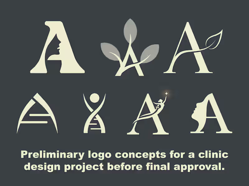
Here is a collection of preliminary logo concepts explored for Aura Aesthetic & Longevity Clinic before finalizing the core visual identity.
The primary challenge was to seamlessly combine the initial letter 'A' with elements representing facial aesthetics, natural rejuvenation, longevity, and clinical precision—all while maintaining a premium, high-end, and elegant appeal.
💡 Concept Breakdown & Design Rationale:
👤 Facial Profile & Negative Space: Monograms incorporating a sleek silhouette in negative space, signifying personalized cosmetic care and aesthetic transformation.
🍃 Botanical & Organic Elements: Stylized leaf accents flowing through the letterform to embody natural beauty, organic wellness, and longevity.
🧬 Scientific & DNA Helix Structure: A minimalist modern mark representing advanced medical technology, cellular regeneration, and clinical precision.
✨ Spark & Rejuvenation Figure: An ascending figure reaching for a glowing star, conveying confidence, radiance, and holistic wellness.
Design Approach:
Typography: Elegant serif typography mixed with sleek geometric structures to communicate luxury and trustworthiness.
Palette: Neutral, earthy tones designed for a calming and sophisticated aesthetic.
Which concept stands out to you the most? I’d love to hear your thoughts in the comments! 💬✨