Brand & Website Designer | AI Video | UI/UX


Brand & Website Designer | AI Video | UI/UX

Motion Designer/ Generative Visual Artist
- $10k+
- Earned
- 38x
- Hired
- 5.0
- Rating
- 143
- Followers
Motion Designer/ Generative Visual Artist


Product Designer & No-code Developer
Product Designer & No-code Developer


Brand identity & websites for premium, design-led brands
- $1k+
- Earned
- 1x
- Hired
- 5.0
- Rating
- 36
- Followers
Brand identity & websites for premium, design-led brands

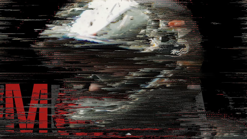
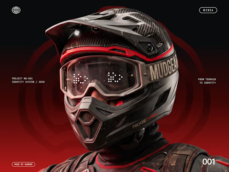
MUDGEAR, built for the dirt.
I created the brand identity and visual presentation for this off-road gear and accessories brand, drawing from protective equipment and the tracks riders leave behind.
Had a great time collaborating with Mamun, who brought the identity to life through his motion creative direction and showreel.
Brand Identity & Visual Presentation: Mehedi Islam
Motion Creative Direction & Showreel: Abdullah Al Mamun
Would love to hear what you think. 💪
1
3
165


SaaS Motion Designer| High-Converting Explainer, Demo Video
- 27
- Followers
SaaS Motion Designer| High-Converting Explainer, Demo Video
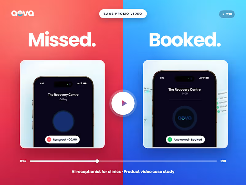
One Missed Call. One Patient Gone. SaaS Promo Video Case
This AI receptionist has no dashboard to show and nothing to unbox. It lives inside a phone call. So, I didn't start with the product. I started with the moment every clinic owner dreads.
Inside the case study:
→ The 5-beat story structure, built around the questions buyers actually ask
→ Real storyboard notes next to the final frames they became
→ The small details that make a SaaS video believable (and the one split screen I saved for the right moment)
→ A look inside the After Effects timeline
What I delivered: a 2:10 hero video (16:9), a 1:1 structure breakdown, a 9:16 behind-the-scenes reel, script, storyboard and UI animation.
Scroll through the full case study to see how one missed call became the whole story. (https://contra.com/p/3qX6qsse-saa-s-promo-video-case-study-ai-receptionist-for-clinic?r=shaon_design)👇
Building a SaaS or AI product that's hard to explain?
Let's talk. Hit "Hire me" or send me your brief.
2
4
344


Creative Director | Brand Identity & UI/UX
- $5k+
- Earned
- 1x
- Hired
- 5.0
- Rating
- 5
- Followers
Creative Director | Brand Identity & UI/UX



Brand identity for startups

Gamofy is a concept brand for a gaming coaching platform. I designed the logo from scratch.
The symbol is a folded green shape that points upward, like a wing or an arrowhead. The fold and its small shadow add depth and suggest movement, which fits the idea of a player leveling up with a coach behind them. The bright green stands out against the dark navy background, so the mark has the energy of a game interface without looking like a typical esports logo.
I customized the wordmark to match. The G has a sharp cut inside the curve, and the A has a curved crossbar instead of a flat one. The rest of the letters stay wide and clean, so the name is easy to read at small sizes.
1
121
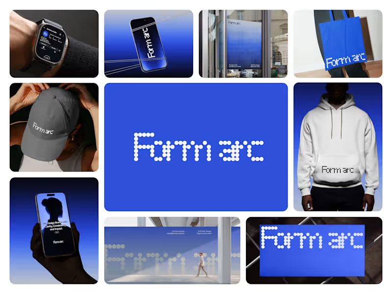
About Form Arc
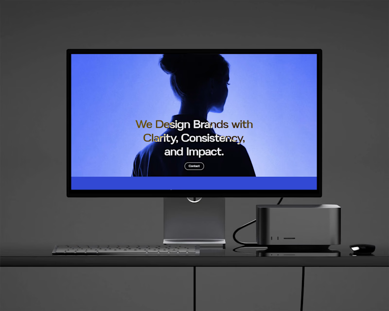
Form Arc is a multidisciplinary design studio committed to building meaningful brands through strategic clarity and contemporary visual expression.
The Challenge: To stand out in a sea of modern agencies, Form Arc needed a brand identity that made their authority, intention, and long-term focus clear at a glance.
The Solution: We crafted a clean, structured identity utilizing thoughtful typography, a controlled color palette, and organized layouts positioning Form Arc as a smart, trustworthy, and enduring creative partner.
Explore the full case study on my profile (https://contra.com/p/BRmqQqBM-form-arc-branding) or Behance (https://www.behance.net/gallery/243501903/Form-Arc-Branding) and let’s build your next branding project together on Contra! 🚀
Tags
#Brand Identity #Brand Strategy #Visual Design #Creative Studio
2
204