Rebranding works for Kopitera with Studio Dure, exciting project when i had to explore a simple brush illustration style.
Located in the heart of Bandung, Indonesia, Kopitera appears as a warm and familiar classic café. Since 2017, Kopitera has offered a soft and comfortable space where coffee and everyday life meet in quiet harmony.
#rebranding:
0
89
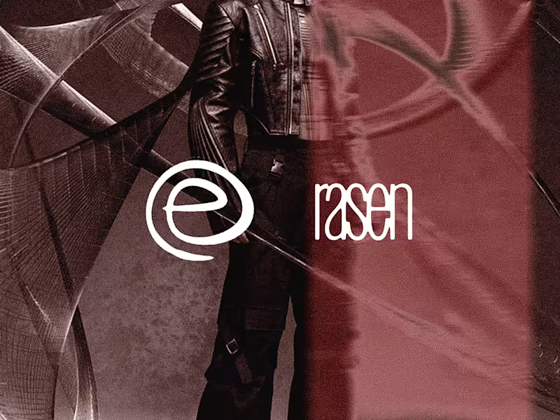
Rasen. Rebellious Streetwear Logo Identity and Visual Direction
Rasen is a streetwear brand built around the idea of breaking away from conventional patterns. Its name is derived from the Japanese word for spiral, a form that represents movement, repetition, and continuous progression. This became the starting point for a brand that challenges the routines and expectations that often shape everyday life.
Inspired by grunge, punk, and futuristic streetwear, Rasen speaks to individuals who refuse to be defined by the ordinary. It represents a mindset that questions conformity, embraces individuality, and encourages people to find their own way of expressing themselves. The brand's tagline, "Break from the Center," captures this philosophy, inviting people to step outside familiar patterns and explore an identity of their own.
The Challenge.
The challenge was to translate an abstract philosophy about individuality and breaking conventions into a recognizable streetwear identity. Rasen needed to communicate rebellion without relying on generic punk imagery, while bringing together the raw character of grunge and the forward looking attitude of futuristic fashion.
The Process.
Research and Exploration.
The project began with exploring the relationship between streetwear, subculture, and personal identity. Grunge and punk provided a foundation rooted in resistance and nonconformity, while futuristic fashion introduced a more experimental visual perspective. Alongside these references, the meaning of the spiral offered a conceptual connection to repetition, movement, and the desire to escape established patterns.
This exploration helped define the creative direction for Rasen, positioning the brand at the intersection of underground culture and unconventional self expression.
Brand Concept Development.
The central concept developed around the idea of breaking away from the center. Rather than treating the center as a literal location, it represented the established norms and repetitive routines that people are often expected to follow. Rasen was conceived as a brand for those who want to challenge these expectations and create their own paths.
The spiral became a meaningful conceptual reference for this idea. Its continuous movement could suggest repetition, but also the possibility of moving beyond a familiar cycle. This duality helped shape the brand's philosophy and connect its name with its attitude.
Visual Direction.
The visual direction combined the roughness of grunge, the rebellious energy of punk, and the experimental character of futuristic streetwear. The goal was to create an identity that felt unconventional and expressive rather than polished according to mainstream fashion standards.
This direction established the visual character of Rasen as a brand that embraces contrast, challenges expectations, and treats personal style as a form of self expression.
Identity Development.
I developed the logo and visual direction to translate the brand concept into a cohesive identity. The design approach focused on giving Rasen a recognizable visual character that aligned with its rebellious philosophy and alternative fashion influences.
The identity was intended to communicate the brand's attitude beyond its name alone, connecting the underlying concept with the visual language of its streetwear positioning.
The Result.
Rasen brings together a conceptual foundation and an alternative fashion aesthetic to create a streetwear identity centered on individuality and rebellion. Its name, philosophy, and visual direction work together to express a clear point of view, challenging the idea that personal identity must follow established patterns.
Through the concept of "Break from the Center," Rasen positions streetwear as more than clothing. It becomes a means of rejecting conformity, exploring personal identity, and expressing a different way of seeing the world.
0
54


Fast doesn’t mean good.
Most teams move fast.
Ship fast.
Break things faster.
But speed isn’t what makes a product last.
What matters is:
– how accurately it solves the problem
– how honest the scope is
– how maintainable it stays months after launch
That’s the idea behind this identity.
A visual tension between speed and precision.
Between moving fast — and moving right.
Because “fast” is easy to promise.
But “right” is something you have to stand by.
0
103