
OVERVIEW
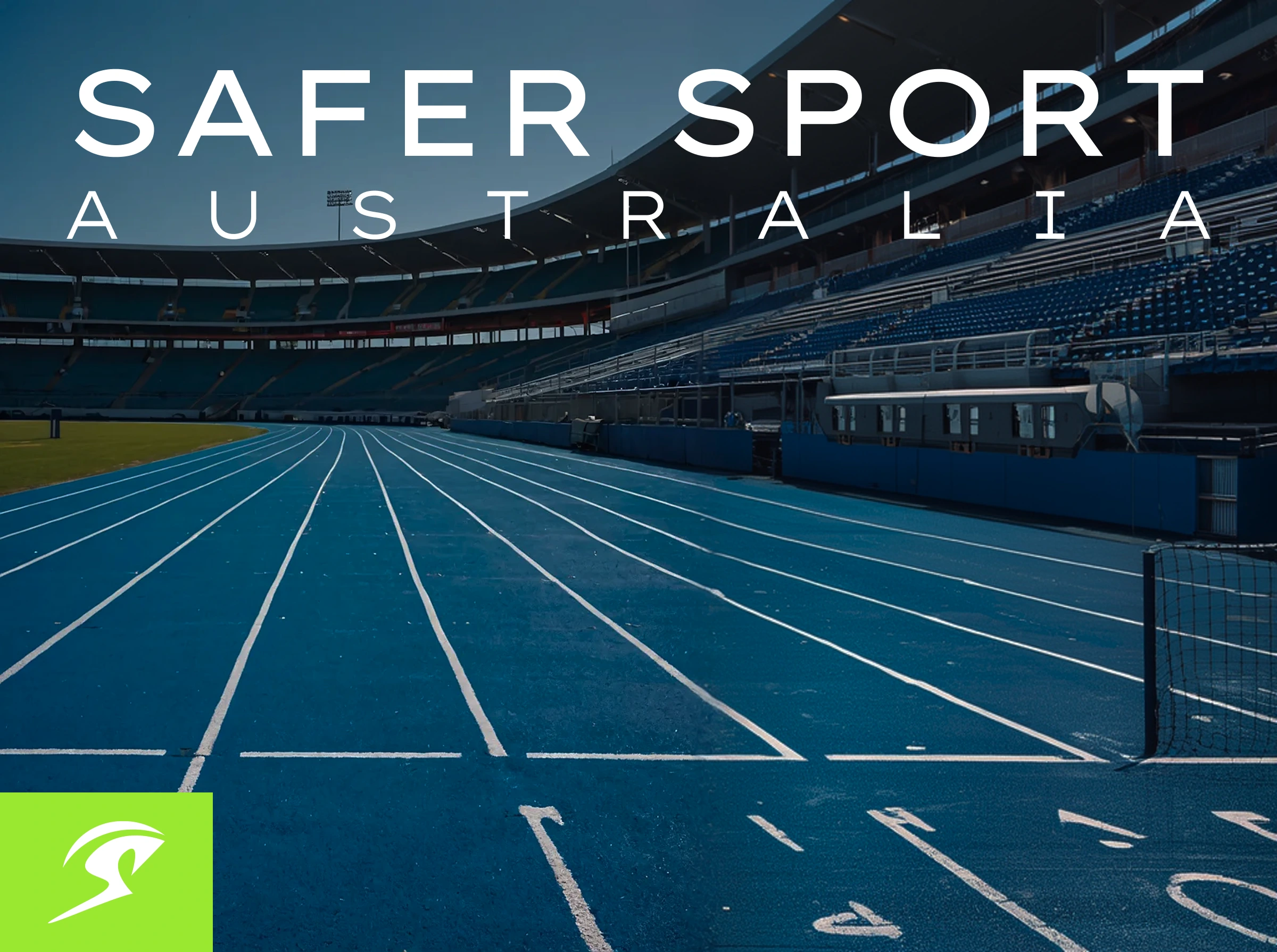
Safer Sports Australia is a professional education and training provider dedicated to equipping healthcare practitioners, primarily physiotherapists, with the skills to deliver emergency medical care in sporting environments.
CHALLENGE
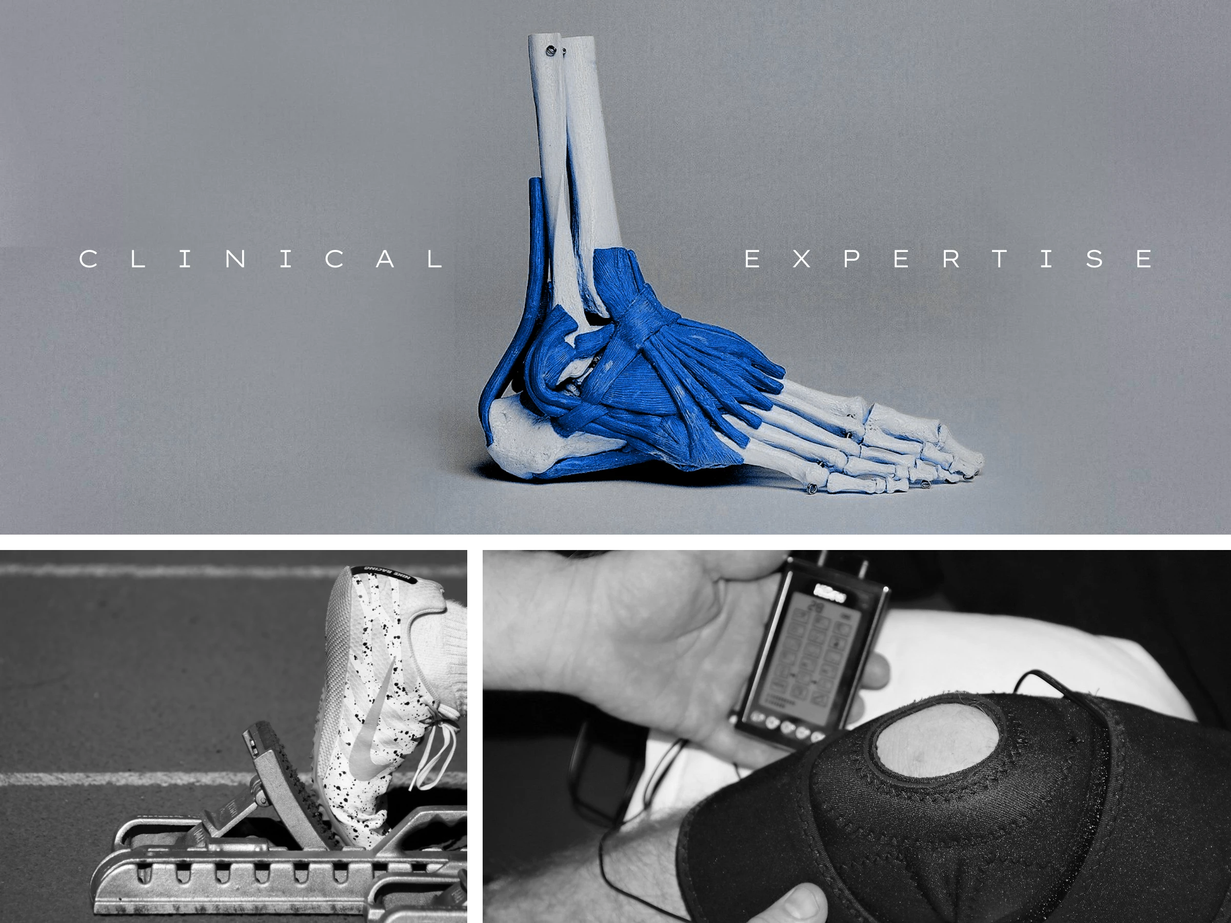
The key challenge was to create a logo that communicates medical credibility and athlete safety without relying on common healthcare clichés such as crosses, heart tracings, or geographic symbols.

SOLUTION
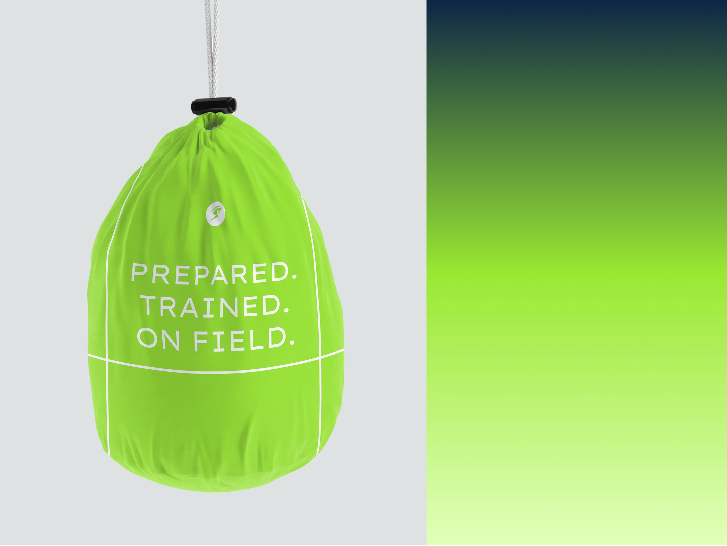
The final solution introduces a custom-built “S” symbol that simultaneously represents motion and protection. The form is shaped to suggest an athlete in forward movement, symbolizing performance and sport, while a sweeping arc subtly wraps around the figure, acting as a visual metaphor for care, prevention, and safeguarding.

0 likes · 9 views · Feb 2, 2026
Designed a unique logo for Safer Sports Australia focusing on medical credibility and safety.

