Premium Launch Videos for Startups


Premium Launch Videos for Startups


AI Design Engineer · Framer Pro Expert

AI Design Engineer · Framer Pro Expert


Branding for design-lead brands in interiors & construction

Branding for design-lead brands in interiors & construction


I love a good before and after.
This project was a full transformation for the Pan-American Equestrian Federation, spanning both branding and landing page design. Their previous identity and website felt dated and lacked the clarity and presence the organization truly holds.
This wasn’t just a visual upgrade.
We approached the landing page with a clear objective: communicate a large amount of information with precision and ease. That meant restructuring content, prioritizing what matters most, and creating a strong foundation the brand can continue to build on.
The result is a system that feels more aligned, more intentional, and far more effective.
Take a look at the before and after, and let me know what you think.
Check out the live landing page here: https://www.paecequestrian.com/
1
28
1.5K


Short-form video queen 👑

Short-form video queen 👑

Because not every fail is a complete fail 🤪
I'll be honest with you, the client I did this for didn't end up liking the final result, but call me crazy: I loved it! And other people I showed it too also really liked the designs.
And you know what?? It's work, and it's work that I did and that I'm proud of, and I'm going to share it in my portfolio ✨
Curious to know, and be brutally honest - what do you think about these?
PS: these were done as individual, static social media ads. I believe they were for Meta in the feed, but I could be mistaken since this was a few months ago already 😅
2
2
451
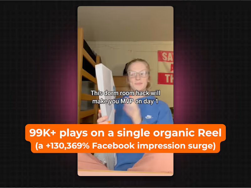
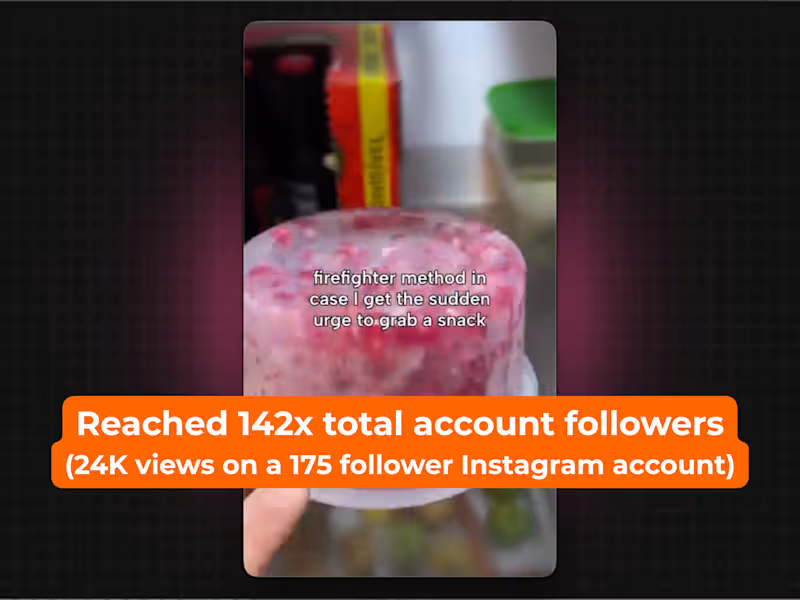

I'm recording a youtube video right now and talking about having a strong portfolio and how important it is to show your work made me remember mine has been dormant for a while 🫣
This is a pretty simple logo animation I did a while ago but for some reason I just love it - maybe it's the colors or just the simplicity of it?
Would love to hear your thoughts!
8
22
1.5K


Brand Systems & Visual Identity
Brand Systems & Visual Identity
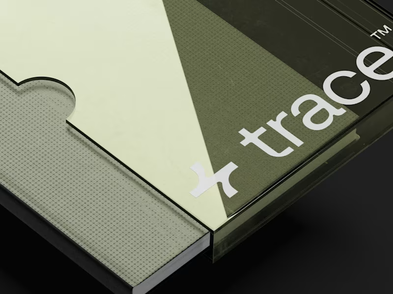
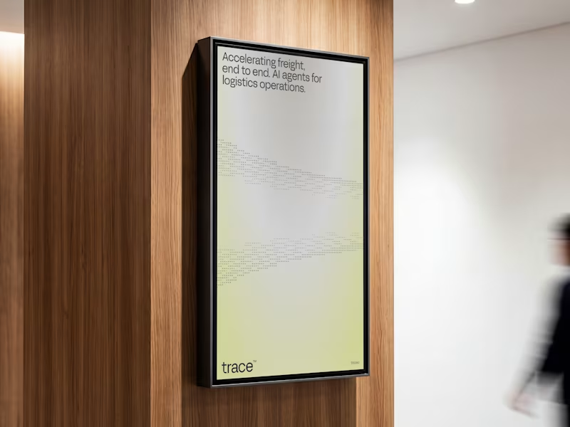
⁕ Full Brand Identity for Trace™
One of the project's greatest challenges was creating an identity that is instantly recognizable and inspires investor confidence, while balancing a futuristic aesthetic with the sense of reliability intrinsic to the brand's values.
The core concept draws inspiration from the cosmos and the brand's drive to transcend boundaries; no matter the distance, the delivery is guaranteed. We translated this visually through patterns forming paths that lead to a destination, a motif that extends to every corner of the visual language.
19
96
5.6K




Make your brand standout


Make your brand standout



Digital Marketing & Demand Generation | ex-Tesla, Handshake
- $50k+
- Earned
- 4x
- Hired
- 5.0
- Rating
- 294
- Followers
Digital Marketing & Demand Generation | ex-Tesla, Handshake