Iterating on some high-energy micro-interactions and interactive states. ⚡️
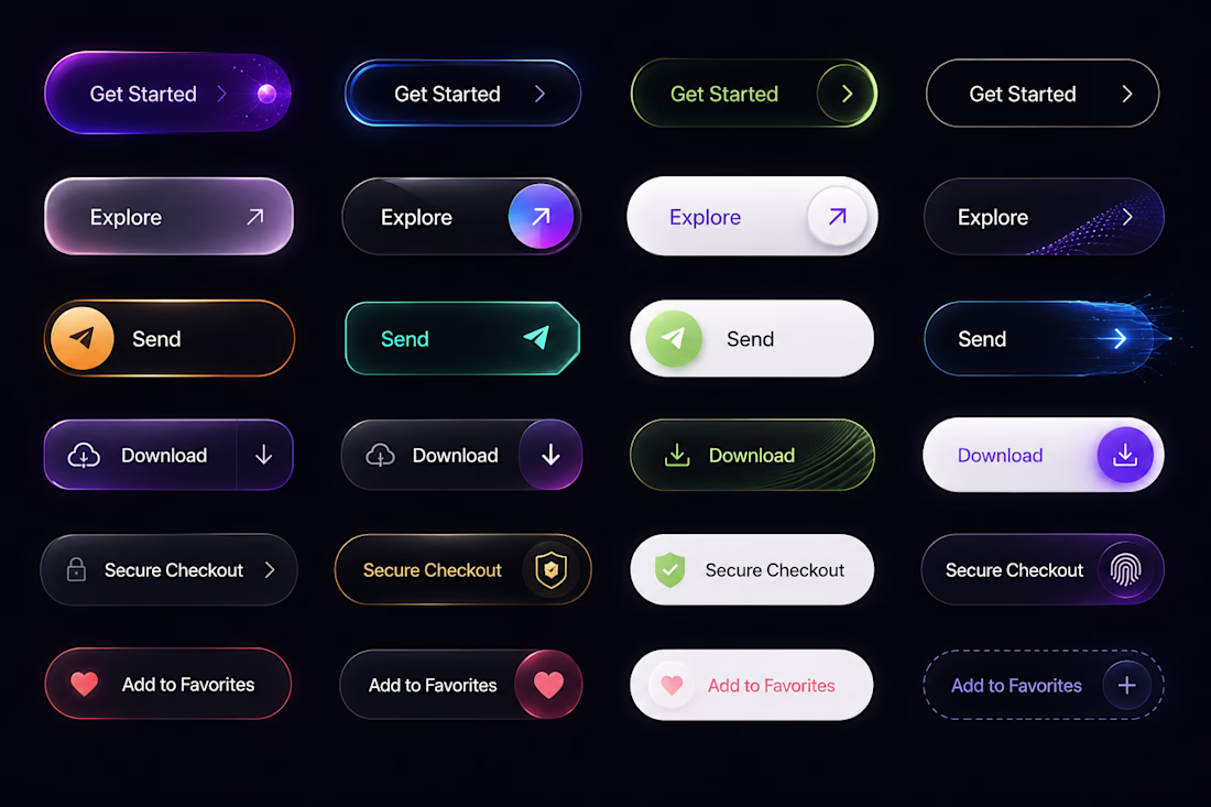
I'm building out a modern, dark-themed UI components system featuring intense neon accents, precise border gradients, and distinct interactive states (Default, Hover, Active, and Success).
The goal is to...
🚀 Shipping | Latest Dashboard UI
Currently breaking down a complex data landscape into a clean, scannable, high-contrast dark mode dashboard. The goal here is making massive amounts of analytics feel premium and instantly legible without causing data fatigue.
Building this out...
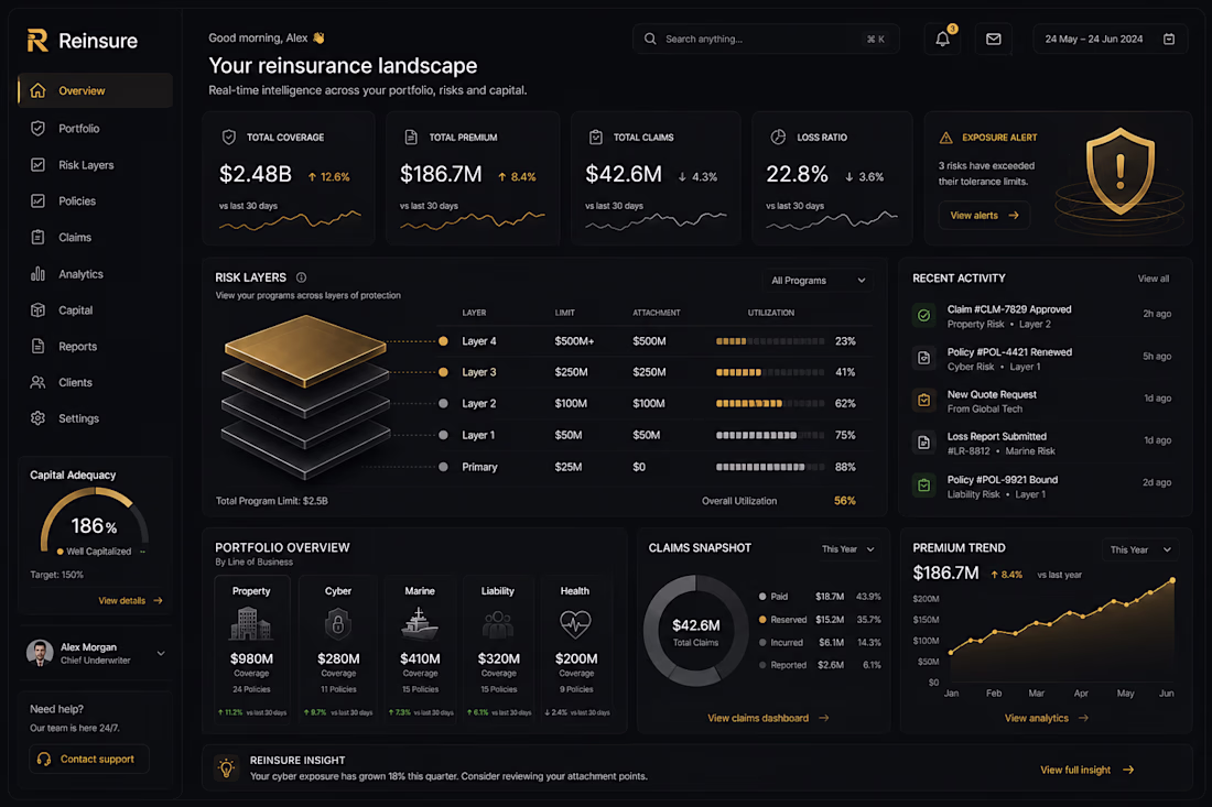
Been diving deep into the visual polish on this new layout. It’s wild how spending that extra 20% of time on the subtle lighting, shadows, and contrast completely shifts how premium a product feels.
What do you think makes or breaks a dark-mode interface like this? 👇
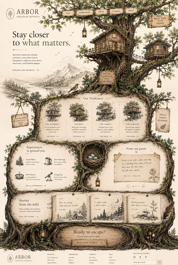
Immersive storytelling meets clean design. 🌿✨
I’ve been working on this concept for Arbor Treehouse Retreats, focusing on bringing that raw, organic, and secluded feeling directly onto the screen. Every layout choice was made to help users take a breath and feel like they are...