The network for creativity
Join 1.25M professional creatives like you
Connect with clients, get discovered, and run your business 100% commission-free
Creatives on Contra have earned over $150M and we are just getting started
Back to feedPost
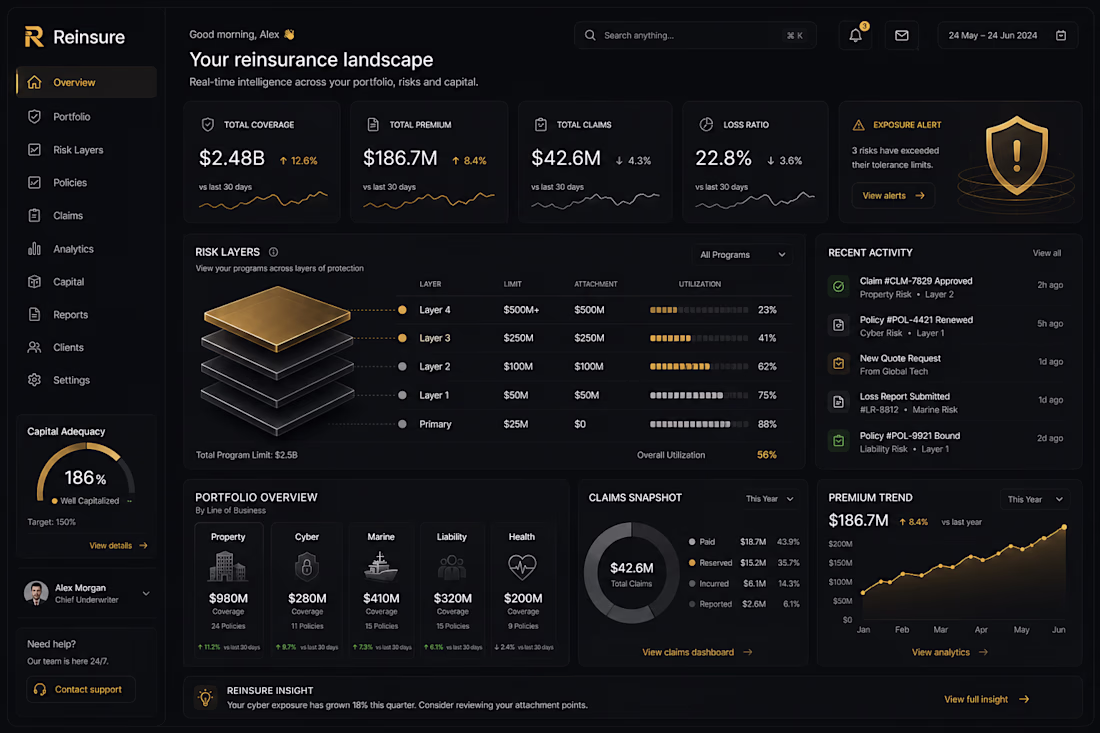
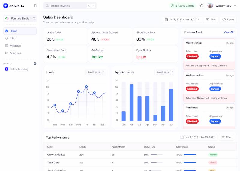
🚀 Shipping | Latest Dashboard UI
Currently breaking down a complex data landscape into a clean, scannable, high-contrast dark mode dashboard. The goal here is making massive amounts of analytics feel premium and instantly legible without causing data fatigue.
Building this out with a modular grid system to keep the layout incredibly tight across different viewports.
Before I lock in the final design system token values:
• How do you handle contrast ratios for micro-text in deep charcoal layouts (#121212 / #1A1A1A) to keep it accessible?
• Are you keeping it manual in Figma, or utilising Claude to stress-test your layout logic early?
Drop a critique or link your current WIP below, let’s level up together! 👇
The network for creativity
Join 1.25M professional creatives like you
Connect with clients, get discovered, and run your business 100% commission-free
Creatives on Contra have earned over $150M and we are just getting started
Related posts
Working on a new project and can't decide which services section works better.
☀️ Light or 🌙 Dark?
59 voted
27%
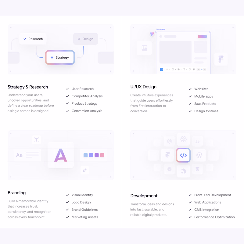
157 voted
73%
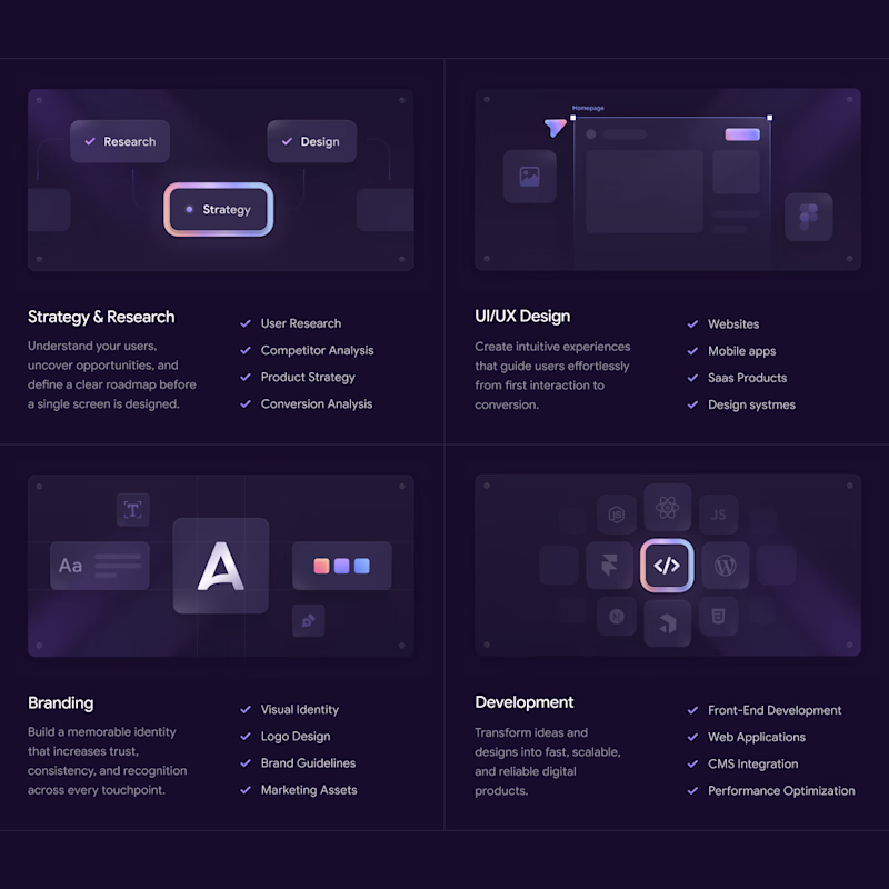
216 votes
Closed
The Dark section feels more responsive.
Redesigned this Lead Generation Dashboard in both Light and Dark modes.
👀 Which version would you prefer for daily use?
☀️ Light Mode
🌙 Dark Mode
I'd love to hear your thoughts and feedback!
2 voted
33%
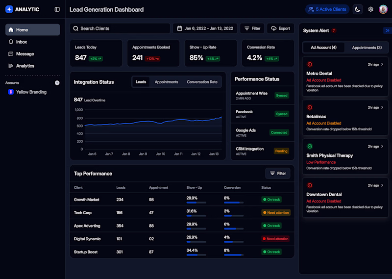
4 voted
67%
6 votes
Closed
Excellent UX work! The Dark Mode feels more modern and comfortable for long dashboard sessions.
When browsing a fashion collection, what do you prefer?
Option A - Sticky Card Layout
Option B - Traditional collection grid
2 voted
29%
5 voted
71%
7 votes
Closed
Clean, modern, and easy to follow. My inner designer is smiling right now 😄
Challenges
View allTrending
Claude
Claude has entered the design space. How are you using Claude Design?
Contra University
Learn from expert creatives how to earn more using next-gen AI tools.
creativeaiflow
Creative AI workflows are evolving. What tools do you use, and what are their strengths and weaknesses?
portfolioreview
The best portfolios tell a story, not just show a grid. Share yours for feedback.
freelancerlife
Freelancer life is wins, pivots, and everything in between. What’s yours right now?