
Dean Ogude
Multidisciplinary Creative Designer
New to Contra
Dean is building their profile!

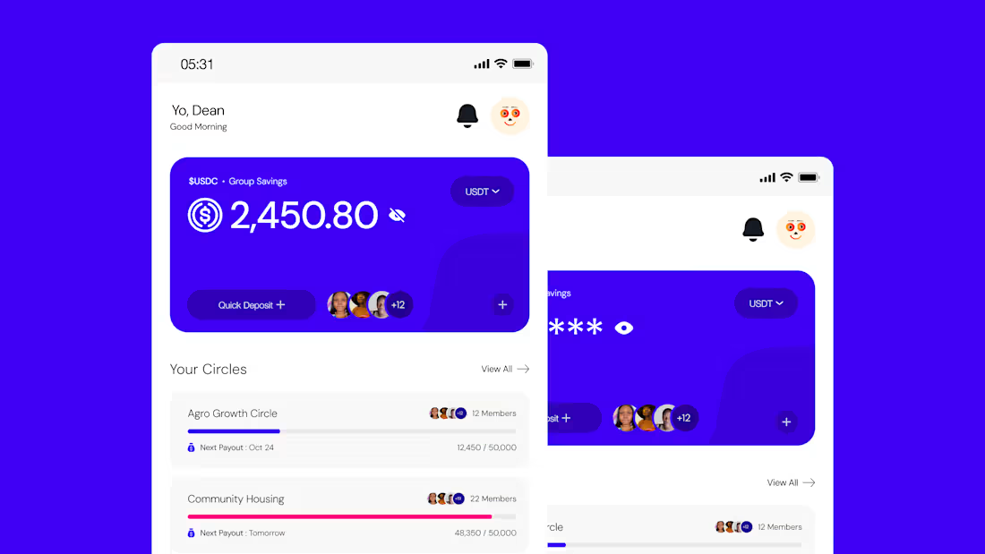
SAJI brings traditional community savings groups, known across West Africa as Ajo, Esusu, Susu, Adashe, and Chama, onto the Stellar blockchain. Instead of relying on a trusted coordinator to track contributions and manage payouts by hand, SAJI uses smart contracts to handle it automatically, transparently, and without a single point of failure.
I designed the complete UI/UX system for the platform, from first concept through a 120+ screen product covering the full member and group experience.
1
77
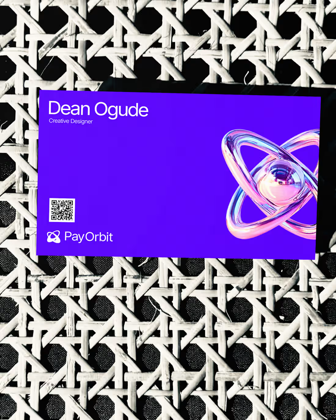
PayOrbit exists to make paying global teams feel effortless, even when the underlying infrastructure (multi-currency payroll, stablecoin settlement, compliance across borders) is anything but simple. The challenge was building a brand that could carry that complexity with confidence, without ever looking complicated. The identity leans into a controlled, high-contrast palette, deep purple, electric cyan, and magenta, paired with clean geometric typography to signal precision and trust. Every element was designed to feel deliberate: nothing decorative, nothing that doesn't earn its place. For a product handling people's salaries across countries, the brand had to communicate stability first and personality second. From logo and color system through typography, 3D assets, and social templates, the goal throughout was consistency without rigidity, a system flexible enough to stretch across touchpoints while still feeling unmistakably like one brand.
1
71
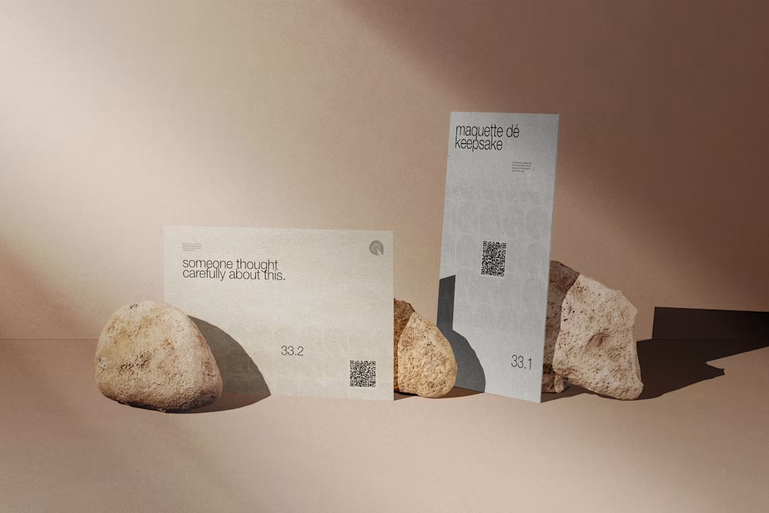
The Keepsake Smith is a personalized gifts brand built around a simple idea: some things are made to be kept, not just given. The brief called for an identity that felt heirloom rather than novelty, warm without tipping into sentimental, and refined enough to sit comfortably in the luxury gifting space. The direction leans into a quieter kind of luxury, restrained typography, rich neutral tones, and generous space that lets each piece feel considered rather than crowded. Every decision, from the wordmark to the packaging language, was made to reflect craftsmanship: the sense that something was made for you, not mass-produced for anyone. Building a brand for keepsakes means the visual identity has to earn permanence too. It needed to feel timeless enough to still make sense on a gift someone keeps for years, not just something that reads well in a single campaign.
1
77
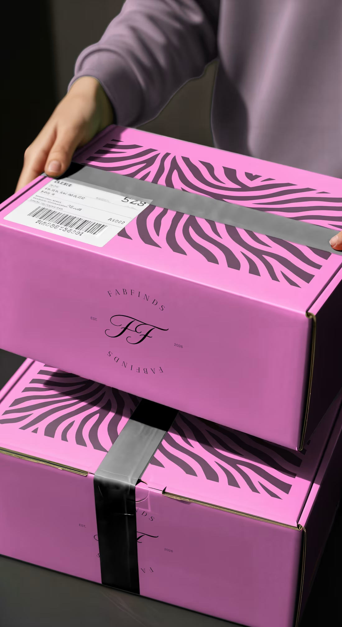
FabFinds is a fashion discovery brand built around a simple idea: everyone deserves to feel like they found something special. The challenge was translating that feeling into a mark that could sit comfortably on a shipping box, a woven garment label, and a social feed, without losing its identity across any of them
1
90