The network for creativity
Join 1.25M professional creatives like you
Connect with clients, get discovered, and run your business 100% commission-free
Creatives on Contra have earned over $150M and we are just getting started
Back to feedPost

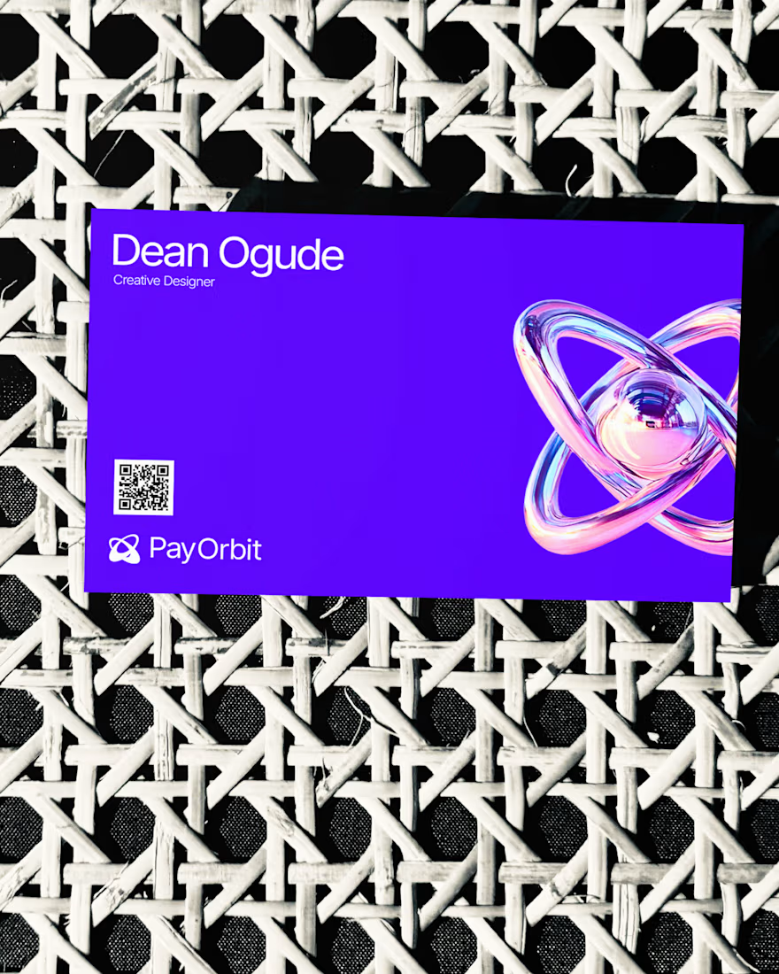
PayOrbit exists to make paying global teams feel effortless, even when the underlying infrastructure (multi-currency payroll, stablecoin settlement, compliance across borders) is anything but simple. The challenge was building a brand that could carry that complexity with confidence, without ever looking complicated. The identity leans into a controlled, high-contrast palette, deep purple, electric cyan, and magenta, paired with clean geometric typography to signal precision and trust. Every element was designed to feel deliberate: nothing decorative, nothing that doesn't earn its place. For a product handling people's salaries across countries, the brand had to communicate stability first and personality second. From logo and color system through typography, 3D assets, and social templates, the goal throughout was consistency without rigidity, a system flexible enough to stretch across touchpoints while still feeling unmistakably like one brand.


The network for creativity
Join 1.25M professional creatives like you
Connect with clients, get discovered, and run your business 100% commission-free
Creatives on Contra have earned over $150M and we are just getting started


Trending
retrofuturism
Share your favorite designs from the past exploring the distant future. Or your own take on the aesthetic 🚀
halftone
Dots. Texture. Grain. Let's see your designs using the halftone technique.

Midjourney
Creatives are showing off what they're making with Midjourney.
colorgrade
Video editors sound off: How do you enhance the mood of your video in color grading?
Related posts

A new digital direction for Unión Atlántica, designed to communicate their value with greater clarity, coherence, and confidence.


"Expanding your brand beyond borders" is a strong hook for what's clearly an international rebrand. Was clarity the main gap in Unión Atlántica's old identity, or was it more about looking credible outside their home market?


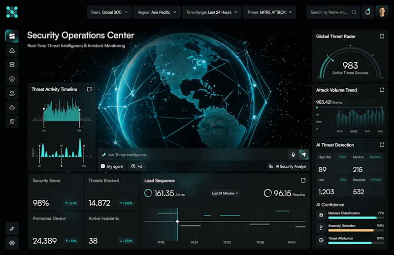
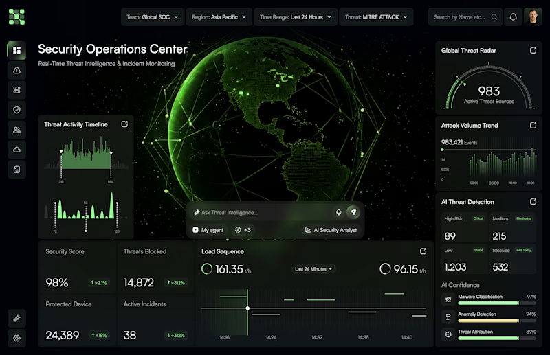


Brand identity isn’t just a logo. It’s how everything moves together. ⚡
A quick look at a branding exploration where we built a flexible visual system around energy, movement, and technology - from colour and typography to motion and digital applications.
The goal was simple: create a brand that doesn’t just look good, but feels alive across every touchpoint.
What’s your take on this visual direction? 👀
#BrandIdentity #Branding #VisualIdentity #MotionDesign #GraphicDesign #BrandDesign #CreativeDirection #DesignInspiration #Typography #LogoDesign