
David Dotimi
Web designer helping businesses scale with a website.
New to Contra
David is building their profile!

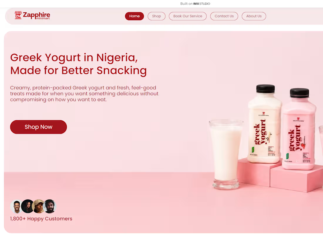
This is a website redesign of an old personal project I made, and I just recently concluded it (2 weeks ago) It's one befitting for a small food business, and I just wrapped it up.
Just as I would do for my clients, I conducted a deep study on the website's old look to spot the loopholes and issues holding it back from getting customers.
I found a couple of issues, and it was massive. To sum it up, the previous look:
- lacked a compelling copy and crucial info
- only emphasized on the flavours of their product
- had no convincing proof
- didn't represent the brand
So, I decided to change that. I conducted keyword and competitor research to:
- see what customers call their products
- understand the industry standard
- find relevant keywords
- discover what works and chances we can take advantage of.
Fast forward to the conclusion of the project, I had taken a poor website into an actual sales machine by:
- adding a compelling copy that talked about the flavour and value they bring
- redesigning the UI while keeping it navigational for a better user experience
- enhanced the hero section to include value + flavour + attention-worthy design.
- integrating the keywords and other SEO setups
- made the website responsive across all screens.
- optimized the homepage to flow with the conversion funnel
- adding FAQs, testimonials and customer count to build trust and authenticity
- made the site represent the brand in every way.
A website redesign isn't only about changing the UI; it's about enhancing and re-optimizing a website to bring in and convert more leads into paying customers. Looking at this one, I got it well done.
1
21
This is a website redesign that I made as a personal project, one befitting for a hair salon business.
The original look didn't really do justice in making sure that the overall content was made to convert, as the elements and details included weren't strong and authentic enough to convert or build trust within a visitor.
Looking at its redesign, it represents the brand even better by including images that reference to their target audience.
I made sure to:
- structure its content to reinforce the CTA improve user flow
- design each layout to have a purpose
- design its UI to be responsive
- include salon achievements (in the hero section)
- included testimonials to the homepage, with each one having an image of the customer, to build trust
- include FAQs to answer the probable questions that might hold customers back from booking
In a much more configurative setup, I made sure to implement the SEO best practices I learnt into it by:
- including keywords that'll help bring in traffic
- having structured data integrated for each page
- having internal linking between pages that relates to each other
- including title tags and meta descriptions to give customers and the search engine clarity of the page's content.
Implementing these things into the website, I have established it to be a converting tool for a hair salon business.
It's all about helping businesses grow and scale, and I'm definitely equipped to do the job.
1
84
This is a personal project that I worked on. It's for a business named Regal Threads, a men's corporate wears brand.
The main aim of the website was to convert site visitors into paying clients purchasing a product. With the target audience being businessmen with a taste for distinctive, corporate wears, I conducted competitor & UI research into other related brands to identify:
- industry terms (what's consistent)
- their positioning
- their layouts
- what could make us unique
What was found to be consistent, from competitor research, was how the positioning of most brands were about their product details rather than what their buyers could benefit from them; so that became an advantage I added to the site: adding the quality of the customer and the product, being positioned in the hero section to be the first thing users see and connect with, "Built to Lead, Designed to Last."
From UI research, I noticed that the homepage content of brands was mostly minimal and concise--less words, more product photos--so I went along with it.
I layered each section up in a way to flow well with the user by having a creative, eye-catching header with a compelling title, followed by categories of suits (since it is the brand's main selling point), a curated list of recommended types of suits, a display of the watches category, and then of their best seller suit.
An advantage I took a hold of was the website's responsiveness.
Other brands had an entirely, displaced responsiveness on the mobile screen (where most users would find them), so I took advantage of it by making sure all designs were responsive across all screens, giving users the same quality experience regardless of the screen size.
2
117
This is a sample project that I made befitting for a Nigerian Bridal Fashion Brand, named Style By JC.
The website had 2 core purposes: drive visitors/customers into booking an appointment or purchasing a ready-to-wear attire.
Having these aims established, and knowing that their target audiences are brides-to-be, my approach towards the overall layout leaned more on putting the brand's work on display, while pairing it up with compelling copywriting that reinforces the brand's expertise and quality.
It's simple, easy to navigate, and responsive across all screen types.
2
165