The network for creativity
Join 1.25M professional creatives like you
Connect with clients, get discovered, and run your business 100% commission-free
Creatives on Contra have earned over $150M and we are just getting started
Back to feedPost

This is a personal project that I worked on. It's for a business named Regal Threads, a men's corporate wears brand.
The main aim of the website was to convert site visitors into paying clients purchasing a product. With the target audience being businessmen with a taste for distinctive, corporate wears, I conducted competitor & UI research into other related brands to identify:
- industry terms (what's consistent)
- their positioning
- their layouts
- what could make us unique
What was found to be consistent, from competitor research, was how the positioning of most brands were about their product details rather than what their buyers could benefit from them; so that became an advantage I added to the site: adding the quality of the customer and the product, being positioned in the hero section to be the first thing users see and connect with, "Built to Lead, Designed to Last."
From UI research, I noticed that the homepage content of brands was mostly minimal and concise--less words, more product photos--so I went along with it.
I layered each section up in a way to flow well with the user by having a creative, eye-catching header with a compelling title, followed by categories of suits (since it is the brand's main selling point), a curated list of recommended types of suits, a display of the watches category, and then of their best seller suit.
An advantage I took a hold of was the website's responsiveness.
Other brands had an entirely, displaced responsiveness on the mobile screen (where most users would find them), so I took advantage of it by making sure all designs were responsive across all screens, giving users the same quality experience regardless of the screen size.


The network for creativity
Join 1.25M professional creatives like you
Connect with clients, get discovered, and run your business 100% commission-free
Creatives on Contra have earned over $150M and we are just getting started






Related posts

Meriot personal portfolio Website Homepage showcase
A portfolio website designed to turn personal expertise into a strong digital presence.
The goal was to create a website that communicates experience, personality, expertise, and credibility within the first few seconds.
I focused on:
Clear positioning and personal branding
Strong visual hierarchy
Editorial-style typography
Project-focused storytelling
UX/Product Design service presentation
Testimonials and social proof
Clear CTA for potential clients
Responsive, conversion-focused layouts
The visual direction combines minimal typography, bold imagery, dark/light sections, and subtle interactions to give the portfolio a distinctive personality without making it difficult to navigate.


Top notch execution

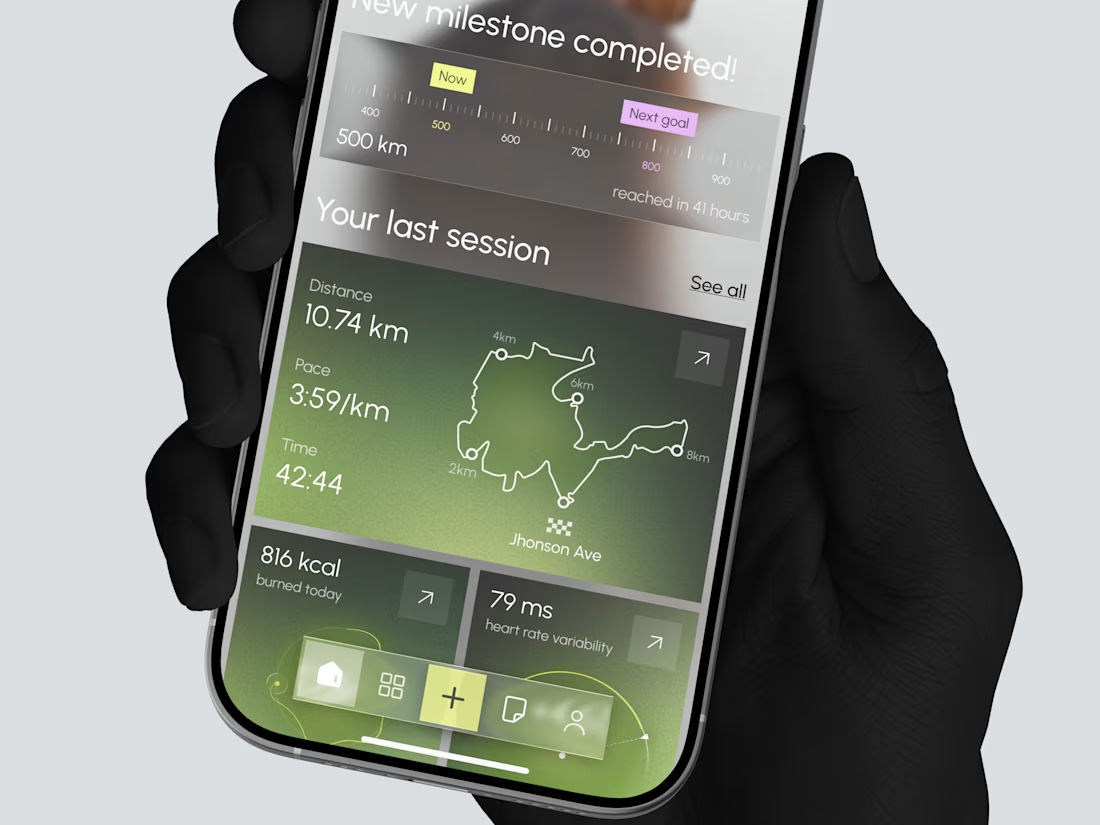
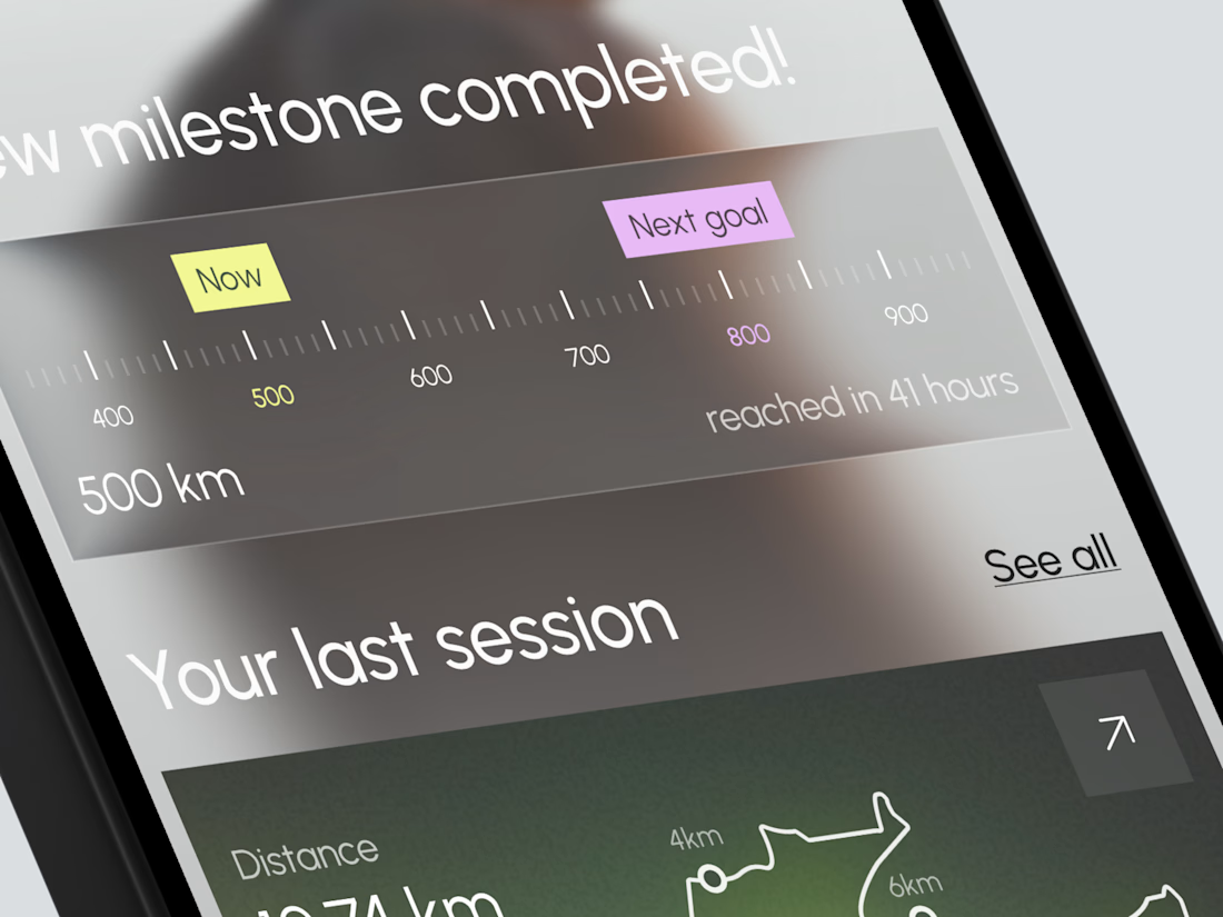
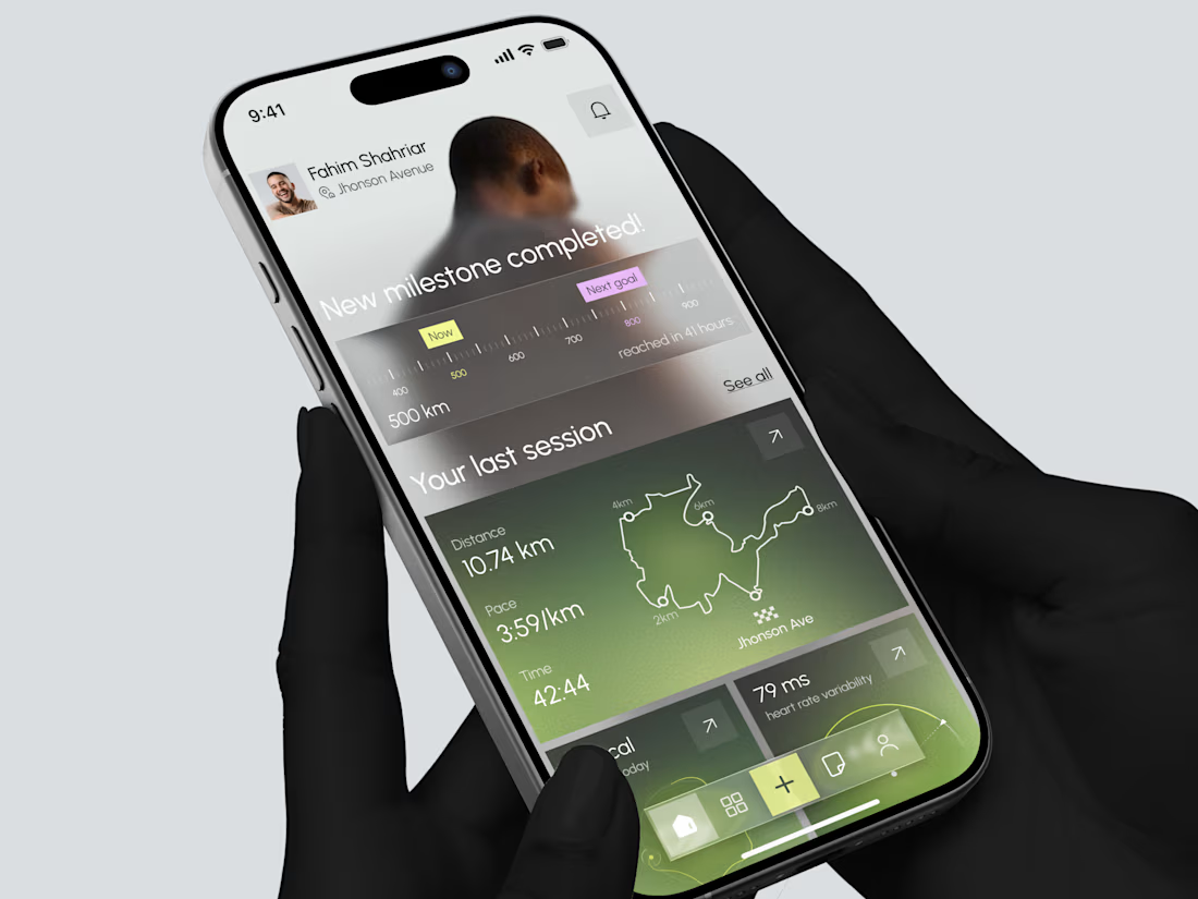
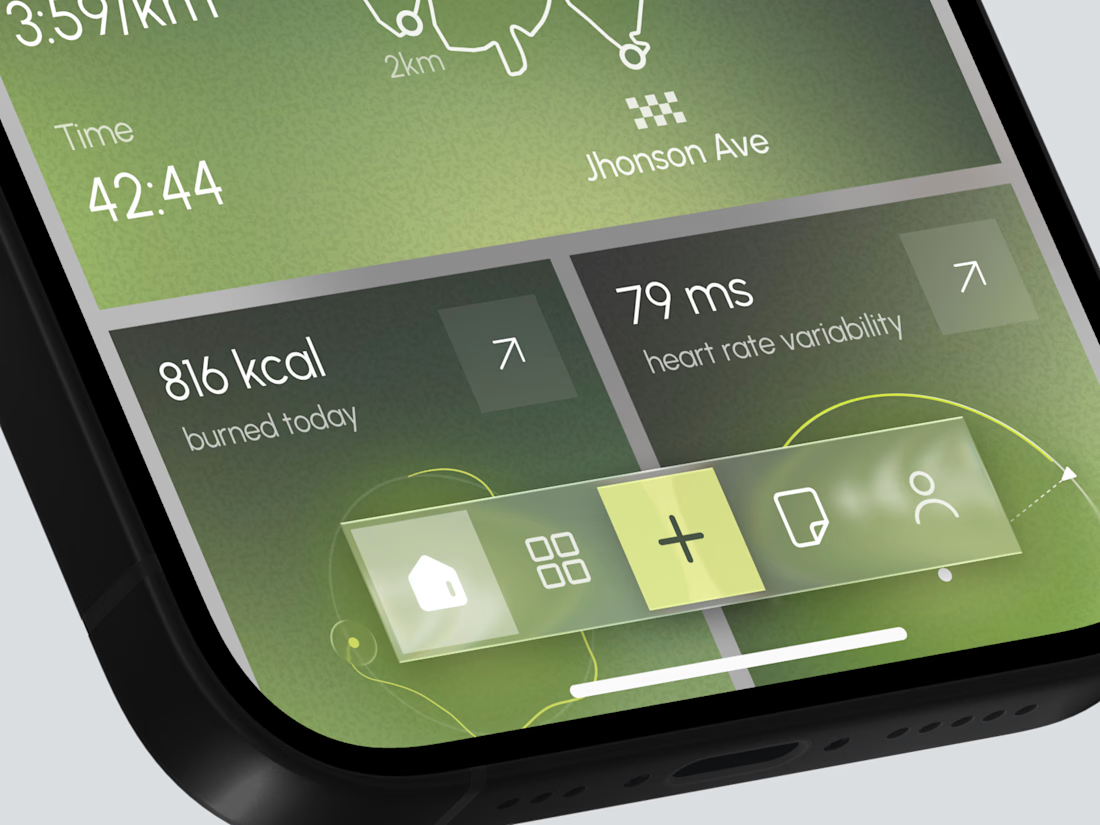
Designed a modern Fitness Tracking Mobile App.
Clean and motivational UI with milestone progress, last session map, distance, pace, calories, and heart rate insights for better running performance.

TOP!!

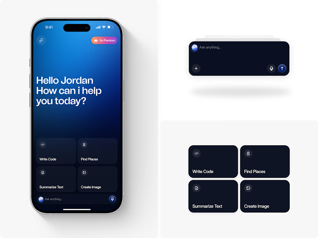
AI Assistant - Mobile App UI Design
Most AI chat apps look the same a text box, a send button, no personality. We designed something that felt premium and personal from the first screen: a warm greeting, quick-action cards that show what the AI can do, and a floating search bar with a glowing orb that gives it presence. The result feels less like a chatbot, more like an assistant.
Want an interface this polished for your own app? Let's talk.