
David Cregg
Graphic Designer | Branding, Logos & Visual Identity
New to Contra
David is ready for their next project!

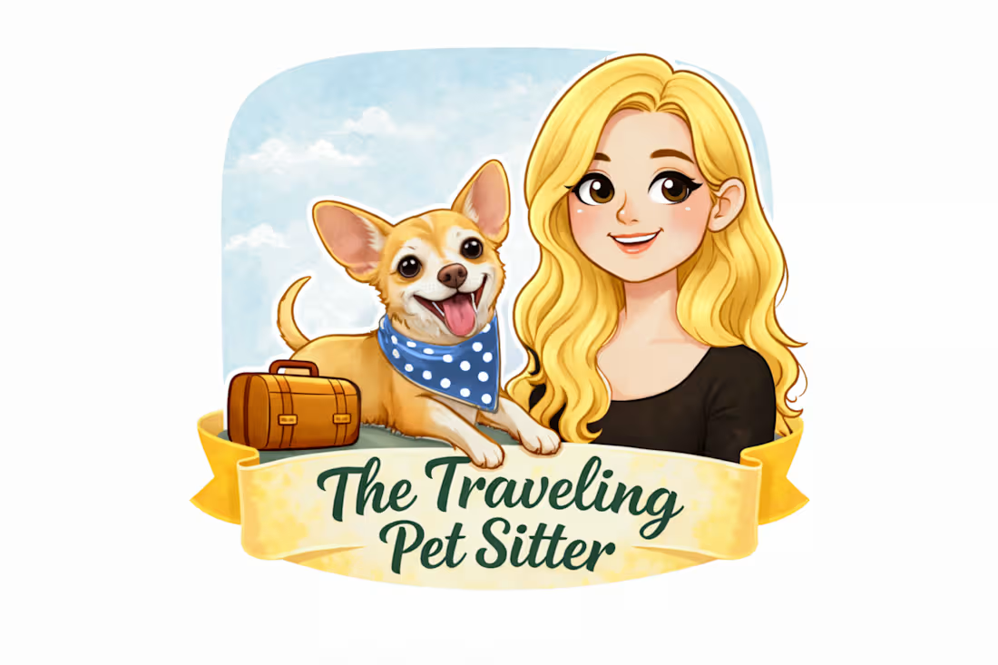
The Traveling Pet-Sitter was a commissioned logo project created for a small-business owner in Oxford, Massachusetts, who wanted a friendly and approachable identity for her pet-sitting service.
The project began with several different creative directions exploring the idea of travel, companionship, pet care, and a warm personal connection between sitter and animal. The concepts ranged from more detailed illustrated compositions to increasingly simplified logo treatments.
Throughout the process, I presented multiple iterations and refined the direction based on client feedback. Although some of the earlier concepts were more elaborate, the client ultimately preferred the most straightforward and compact solution—an illustrated woman and dog paired with the business name in a banner-style mark.
The project demonstrates an important part of real client work: developing several viable directions, responding to feedback, and recognizing that the most complex concept is not always the most appropriate final solution.
My role included: concept development, logo design, illustration direction, typography, composition, client revisions, and preparation of the selected final identity.
Commissioned work created by David Cregg.
1
6
I designed this four-year series of promotional posters for the Dudley Lions Club’s annual Yesteryear Car Show while I was an active member of the organization.
The work predates Critical Graffix and came from a much more personal connection to the Lions Club. My father was a lifelong Lions member and former club president, and I had been involved with Lions charitable activities from childhood. When the club needed promotional material for its annual car show, I volunteered my design work pro bono.
Each year’s poster was developed as a new original composition while maintaining continuity with the established event identity. The designs combined automotive imagery, mid-century and retro visual references, strong informational hierarchy, and the Lions Club’s recognizable branding. Public-domain clip art and available typefaces were incorporated where appropriate, while the overall layouts, compositions, visual treatments, and finished poster designs were created by me.
2011 — 17th Annual Yesteryear Car Show
The 2011 design uses a bold mid-century-inspired visual language, with overlapping geometric forms, atomic starbursts, warm automotive colors, and a classic Corvette as the central focal point.
The challenge was balancing a large amount of practical event information with an energetic visual style appropriate for a classic-car audience. Large concentric forms and directional geometry were used to pull the eye toward the vehicle while still creating clear zones for the date, location, admission information, activities, and contact details.
2012 — 18th Annual Yesteryear Car Show
For 2012, I developed a more unified automotive concept centered around a vintage dashboard and speedometer.
The vehicle is positioned directly within the instrument cluster, turning the central image into both an illustration and a structural element of the layout. Sweeping red and teal forms reinforce the sense of movement while the cream background and restrained color palette give the piece a more period-authentic appearance.
This design placed greater emphasis on visual hierarchy and integrated the theme more closely with the typography and event information.
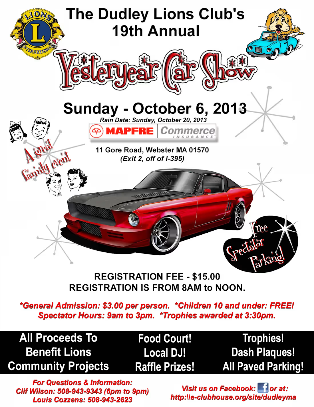
2013 — 19th Annual Yesteryear Car Show
The 2013 poster shifted toward a cleaner, more contemporary presentation while retaining retro automotive references.
A customized red-and-black Mustang became the dominant visual element, with the Yesteryear Car Show title treated as a distinctive event mark. Period-inspired family imagery, starburst graphics, and restrained red accents supported the classic-car theme without competing with the vehicle.
The layout also introduced stronger separation between the primary event message, registration information, event features, and contact details.
2014 — 20th Annual Yesteryear Car Show
The 20th-anniversary poster expanded the automotive focus to a two-car composition featuring contrasting classic vehicles.
The design uses scale, symmetry, and color contrast to establish the cars as the primary focal point while preserving the recognizable Yesteryear Car Show identity established in the preceding year. The anniversary milestone, event title, sponsor information, and practical details were organized into a straightforward vertical hierarchy for quick readability.
Taken together, the four posters show the evolution of a recurring community event campaign over several years, balancing consistency with a different visual approach for each annual edition.
Design contributions:
Original layout and composition • Event advertising • Typography and hierarchy • Automotive-themed visual development • Image integration • Print design • Multi-year campaign continuity
Created independently by David Cregg as pro-bono work for the Dudley Lions Club.
1
15
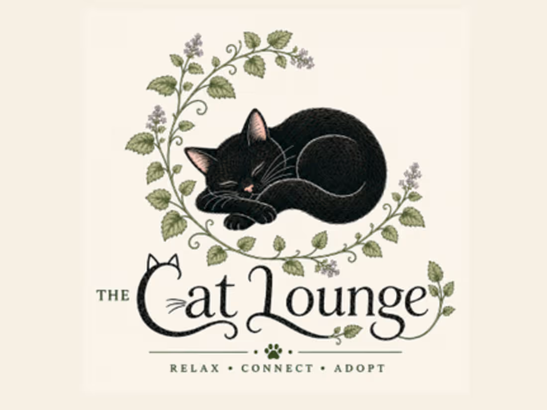
The Cat Lounge is a speculative brand identity developed for a warm, welcoming cat-lounge concept centered on relaxation, connection, and adoption.
The visual system combines a sleeping black cat with delicate botanical elements to create an identity that feels artistic, calming, whimsical, and approachable while remaining polished enough for signage, print, digital media, merchandise, and social applications.
The project includes a complete logo system with primary and secondary marks, a full-color icon, one-color variations, and compact icon treatments. A coordinated palette of deep forest green, botanical green, soft sage, warm cream, dusty rose, muted lavender, and near-black reinforces the natural, cozy character of the brand.
The identity was designed as a complete visual system rather than a single logo, demonstrating how a central concept can be extended consistently across multiple formats and applications.
0
23

Legal Learning, LLC commissioned this branding work in October 2025 to create a professional visual identity for its legal education and tutoring services.
The company works with prospective and current law students through individualized and small-group instruction. Its services include LSAT preparation, MPRE and Bar Exam tutoring, law-school coursework support, pre-law instruction in legal research and writing, study-skills development, admissions guidance, and personal-statement coaching.
The design needed to communicate professionalism, credibility, education, and accessibility without feeling overly institutional or intimidating. The resulting identity was developed to support a service that helps students navigate every stage of the law-school process, from admission preparation through professional examinations.
The project demonstrates my ability to translate a client's services and audience into a clear, polished visual identity suitable for a professional education business.
0
28