Daria Shiian
Award-winning Art Director and Brand Strategis
Ready for work
Daria is ready for their next project!
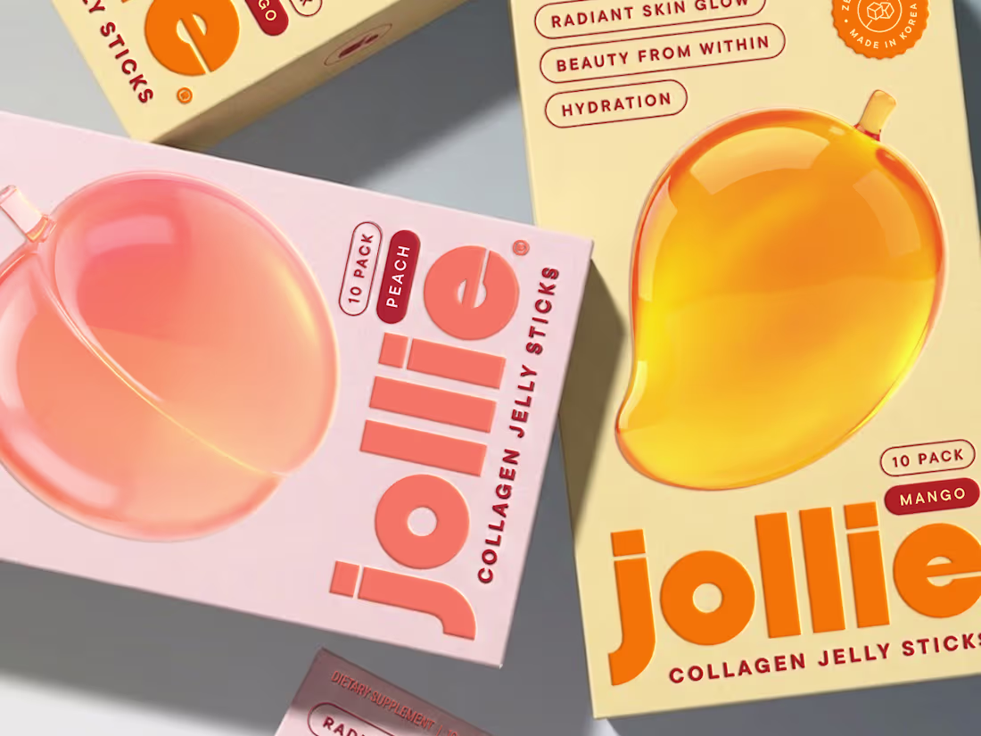
Jollie Collagen Packaging & Brand Identity
1
11
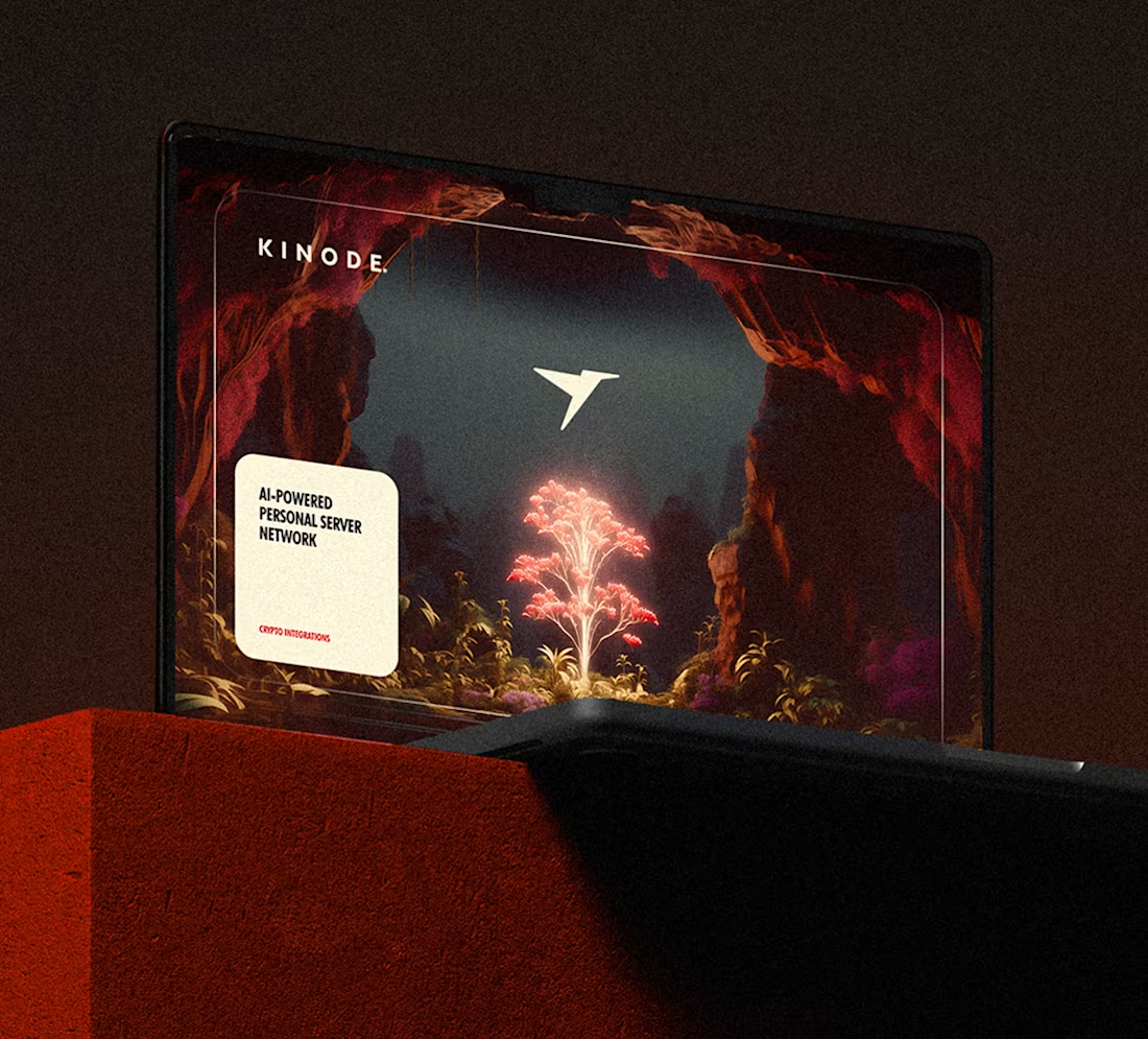
The brand identity of the Kinode project - a groundbreaking startup developing an AI-powered personal server network with crypto integrations - was crafted to center on a deep red palette and mysterious visuals, symbolizing the world of the future to be built together. Comprehensive brand guidelines were introduced to ensure consistency across all digital platforms. The logo draws inspiration from the hummingbird, with a geometry reminiscent of a mouse cursor.
35
84
810
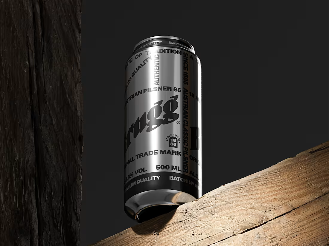
This packaging design marries traditional craftsmanship with modern aesthetics, revitalizing a historic brewery for the European craft beer market.
The design, a fusion of Fachwerk architecture and contemporary typography, honors the brewery's heritage while appealing to a new, younger audience. The original logo's subtle refinement, alongside a minimalist color scheme, highlights the half-timbered structure.
Sustainable practices, including recyclable materials and Revolution® UV printing, underscore this modern approach. With 5,000 units successfully launched in the EU, this design marks a pivotal moment in the brewery's enduring story.
3
27
451
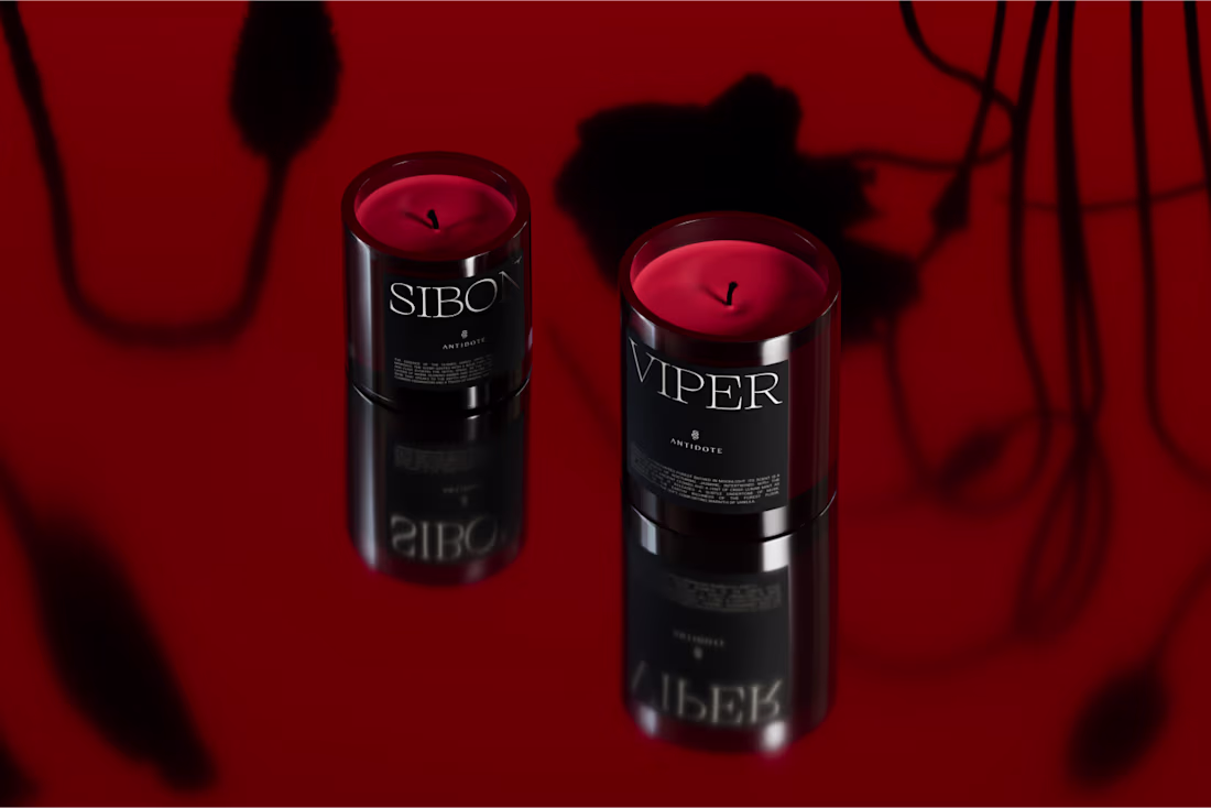
A unique design for the ANTIDOTE aromatic candle brand, drawing inspiration from the theme of alchemical experiments.
Antidote is not just a brand; it's a narrative woven with sophistication, mysteries, and the enduring light of legends. The brand's main symbol, a venomous snake, was chosen as the primary source of antidote, stemming from the idea that the poison itself is often the basis for creating its own cure.
The snake motif permeates the design at every level. For instance, the interior of the box features an ornament patterned after snake skin, subtly applied onto high-quality designer canvas paper.
Also, a nice detail on the packaging is two small holes on the lid that mimic the mark of a venomous snake's bite.
20
63
792
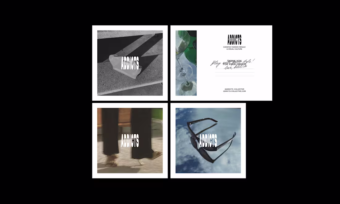
ADDICTS is for those who are passionate about art, fashion, design, modern culture, and the beauty that takes on countless forms. We believe in expressing individuality and inner essence through style, letting the outer world reflect who we truly are while empowering self-confidence. At ADDICTS, we celebrate quality, authenticity, and the timeless allure of Effortless Elegance.
4
12
389
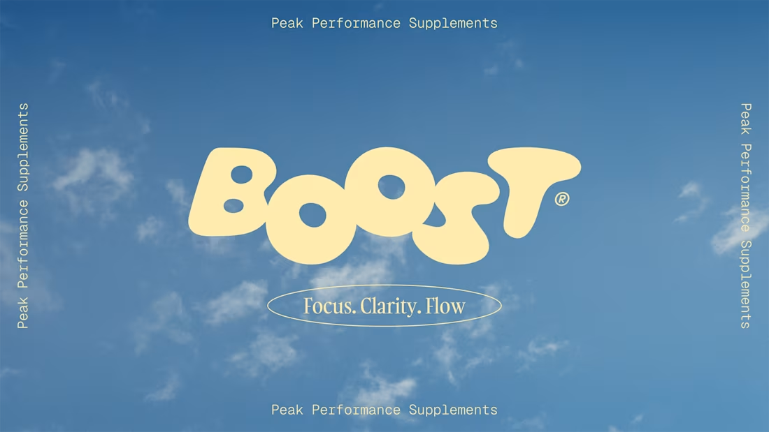
Introducing the revolutionary BOOST® Peak Performance Supplements – a cutting-edge line of superfood-based supplements designed to unleash your peak mental performance.
The brand identity is centered around the concept of mental freedom – the feeling of total clarity and focus, free from distractions. Just like the vast, clear blue sky, our products help your annoying thoughts float away, leaving you calm and fully present. With an airy, floating logo and an uplifting color palette, we capture the sensation of inspired, high spirit – reminiscent of the long-awaited summer days.
38
152
903
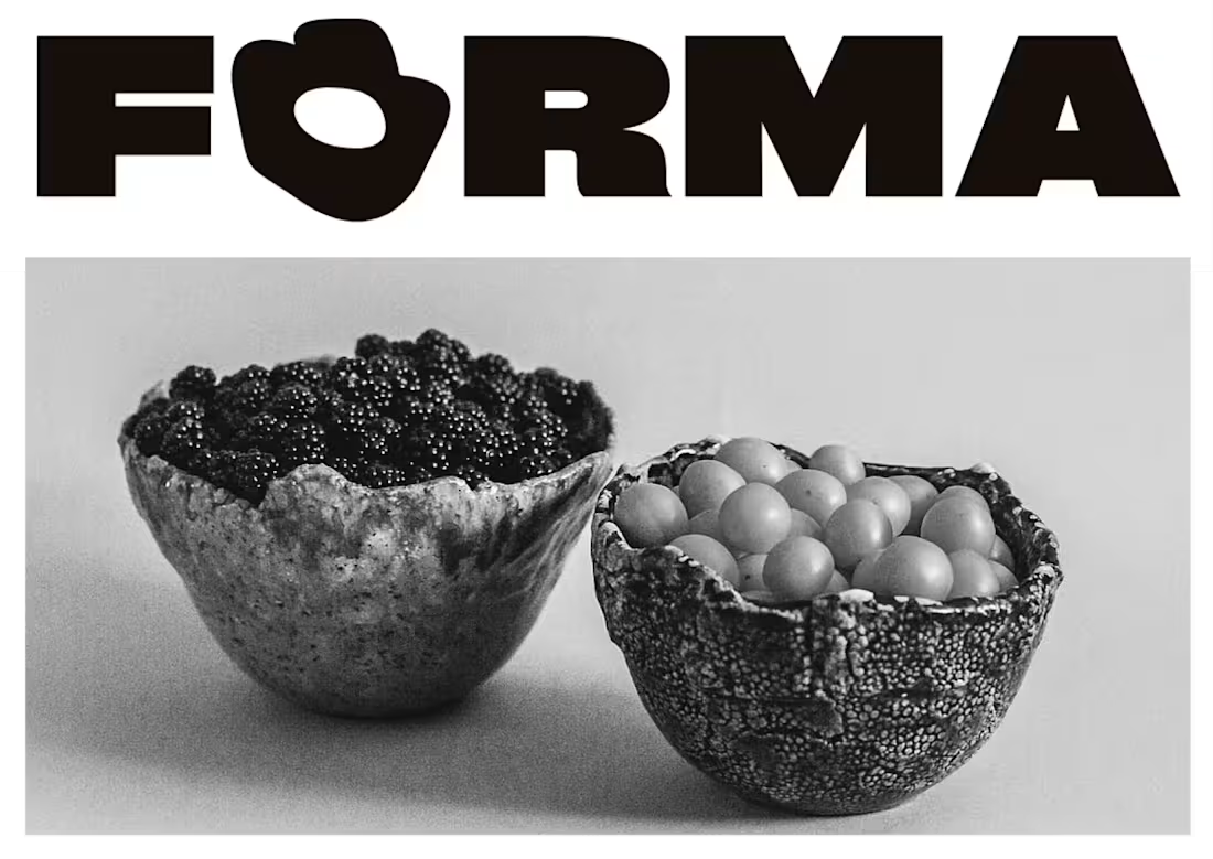
Visual identity for FORMA ceramics, a small handcraft studio based on Baltic sea selling contemporary ceramics & homeware.
The logo-mark is created to reflect the different shapes of the clay and organic curves of the ceramic objects. Today they are getting more popular and produce tableware for small cafes and bars.
20
73
573
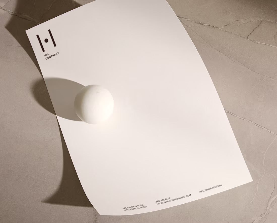
HPL Contract’s brand identity reflects the precision and sophistication of a premium office-furniture manufacturer. The minimalistic logo mark is rooted in modular architectural plans and blueprint geometry, emphasizing structure, functionality, and intelligent design. A mid-century modern–inspired color palette adds warmth and timeless character, balancing technical clarity with classic elegance.
4
20
289
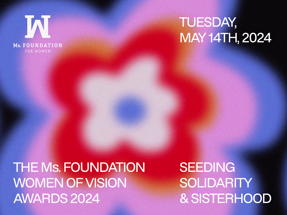
The Ms. Foundation Women of Vision Awards honors women, girls, and gender-expansive people who spark community transformation. This year’s theme, “Seeding Solidarity & Sisterhood,” calls for unity across identities. Inspired by the aesthetics of the 1970s, when this feminist movement gained momentum, the event’s visual identity features a vibrant, warming, colorful palette and radiant graphics, symbolizing communal unity and bonds that transcend gender.
10
45
807

The Real Estate Fund’s brand identity and web design convey discretion, stability, and long-term value: qualities aligned with its low-leverage strategy and proven track record across four funds.
The visual system uses a deep green palette that evokes heritage finance and quiet confidence, paired with an elegant old-money typeface that reflects experience and trustworthiness. Golden embossed accents introduce a sense of refinement and legacy, reinforcing the fund’s focus on delivering strong, consistent returns.
The website translates these elements into a clean, structured layout that highlights performance, expertise, and the fund’s disciplined approach to acquiring value-added multi-family properties.
2
15
219
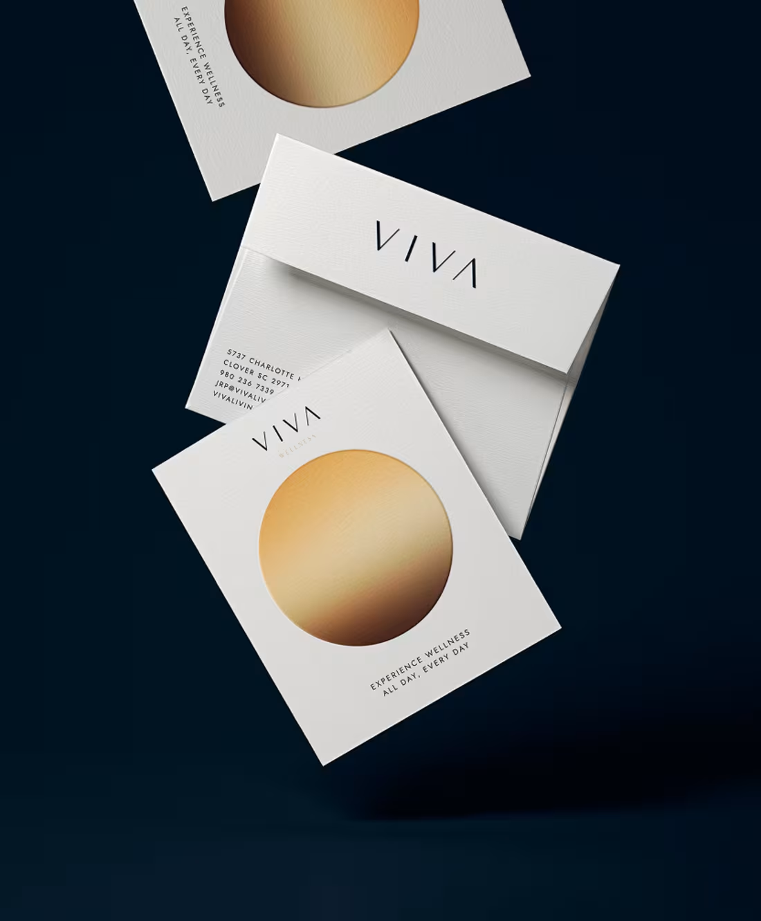
VIVA is a premium residential community whose identity blends elegant minimalism with the natural rhythm of solar cycles. Refined, architectural typography integrates seamlessly into interior environments, exterior wayfinding, and all physical touchpoints of the property.
1
151