pro
Daniya Siddiqui
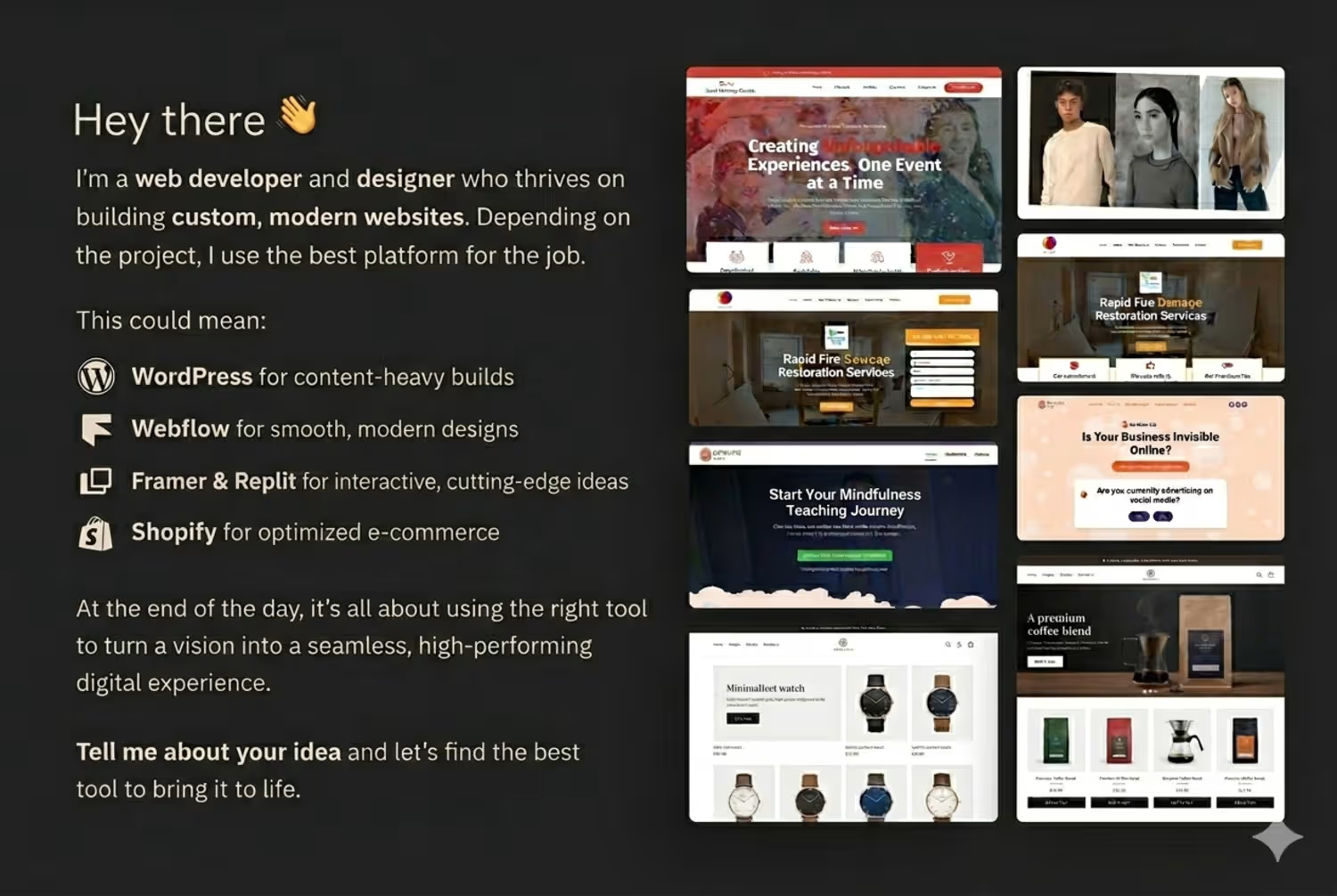
Web Expert building fast, modern, high-converting websites.
New to Contra
Daniya is ready for their next project!
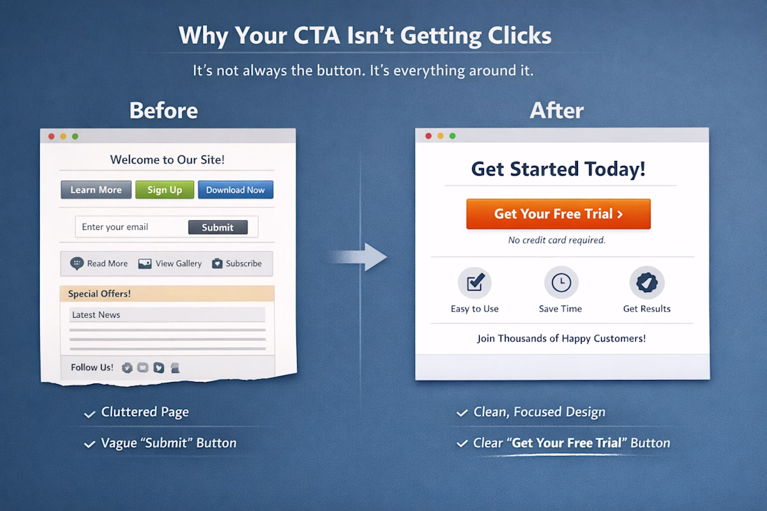
Why your CTA isn’t getting clicks:
It’s not always the button.
It’s everything around it.
Here’s what usually goes wrong:
– Weak hierarchy (CTA doesn’t stand out)
– Too many choices (users hesitate)
– Vague copy (“Submit” kills intent)
– Poor placement (users never reach it)
A...
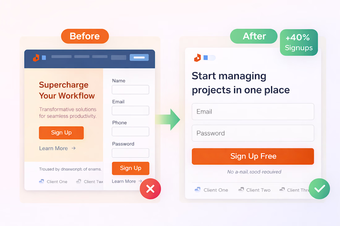
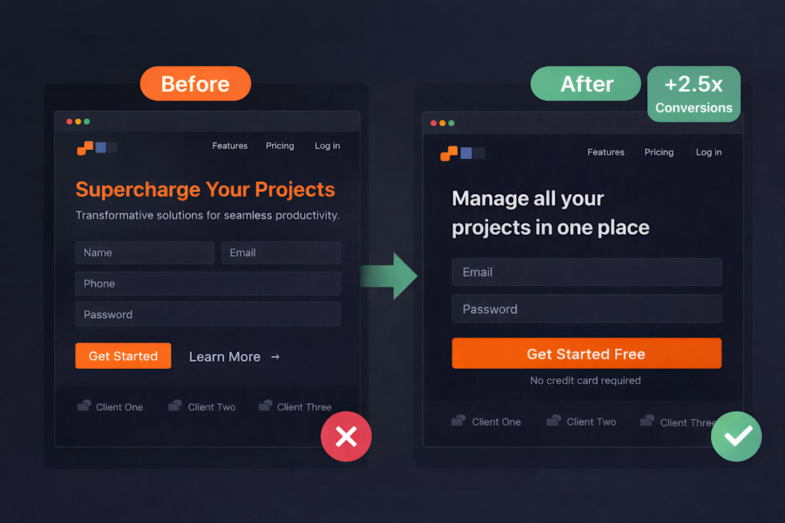
This landing page was losing conversions. Here’s what I changed:
– Simplified the layout (removed distractions)
– Fixed the headline (made the value clear in seconds)
– Reduced form fields (less friction, more action)
– Strengthened the CTA (one clear next step)
Same traffic. Same...
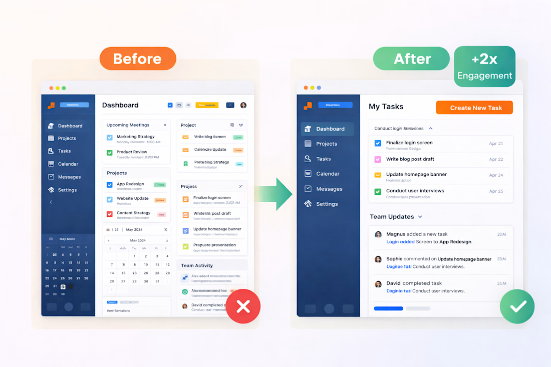
How a simple redesign boosted engagement by 2x
The problem wasn’t traffic.
It was confusion.
Here’s what changed:
– Simplified layout (less clutter, more focus)
– Clear visual hierarchy (users knew where to look)
– Stronger CTA placement (no more guessing what to do)
Same product....