The network for creativity
Join 1.25M professional creatives like you
Connect with clients, get discovered, and run your business 100% commission-free
Creatives on Contra have earned over $150M and we are just getting started
Back to feedPost

Prism Analytics — From Complex Data to Clear Decisions
PRISM ANALYTICS
From Complex Data to Clear Decisions.
The Problem
B2B teams often have plenty of data, but finding the right business signal quickly can be difficult.
The Solution
I designed a premium analytics dashboard that brings Revenue, Active Users, Conversion Rate, Average Order Value, Revenue Trends, Recent Sales, and User Engagement into one clear workspace.
My Approach
I focused on information hierarchy, data visualization, fast scanning, consistent components, and a clean responsive UI — turning complex metrics into an interface that feels simple to use.
The Result
A focused SaaS dashboard experience that helps founders, product teams, and decision-makers understand performance faster and move from data to action with less friction.
Designed for real-world B2B SaaS products — not just a visual concept.
UI/UX • Product Design • SaaS • Dashboard • Data Visualization
Live Prototype →
https://cycle-drop-04018066.figma.site/
Building a SaaS product and need a dashboard that makes complex data easier to understand?
Let’s work together →


Same three KPI cards and revenue chart repeated on laptop and dual monitors is the real test of a dashboard - if it still reads clearly at that density, the hierarchy is doing its job.
The network for creativity
Join 1.25M professional creatives like you
Connect with clients, get discovered, and run your business 100% commission-free
Creatives on Contra have earned over $150M and we are just getting started





Related posts

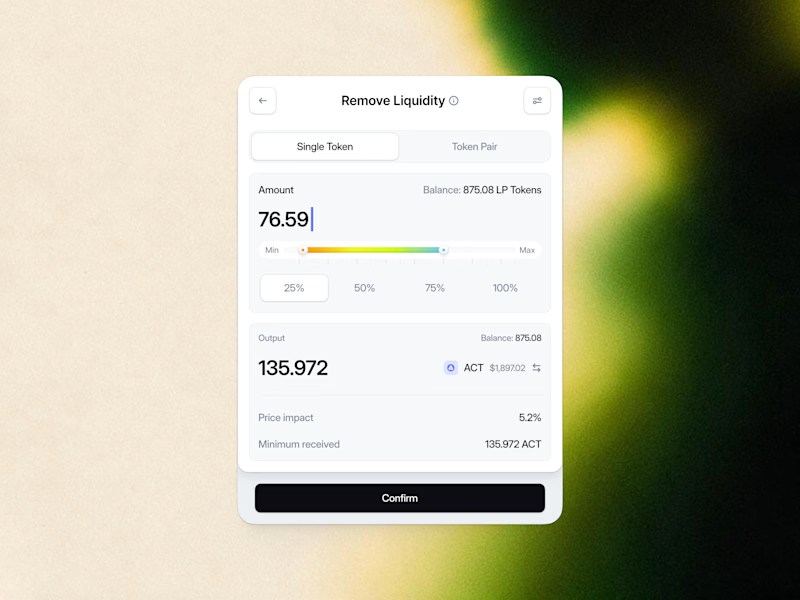
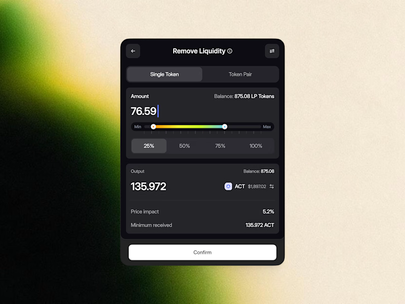
Remove Liquidity component cards for a recent Web3 design project—what would be the best direction for readability and focus? Dark Mode or Light Mode? ⚡️
12 voted
40%
18 voted
60%
30 votes
Closed

White one need bit more darker bg on elements to make them visible like the dark more does.

Meriot personal portfolio Website Homepage showcase
A portfolio website designed to turn personal expertise into a strong digital presence.
The goal was to create a website that communicates experience, personality, expertise, and credibility within the first few seconds.
I focused on:
Clear positioning and personal branding
Strong visual hierarchy
Editorial-style typography
Project-focused storytelling
UX/Product Design service presentation
Testimonials and social proof
Clear CTA for potential clients
Responsive, conversion-focused layouts
The visual direction combines minimal typography, bold imagery, dark/light sections, and subtle interactions to give the portfolio a distinctive personality without making it difficult to navigate.


Top notch execution

AI Assistant - Mobile App UI Design
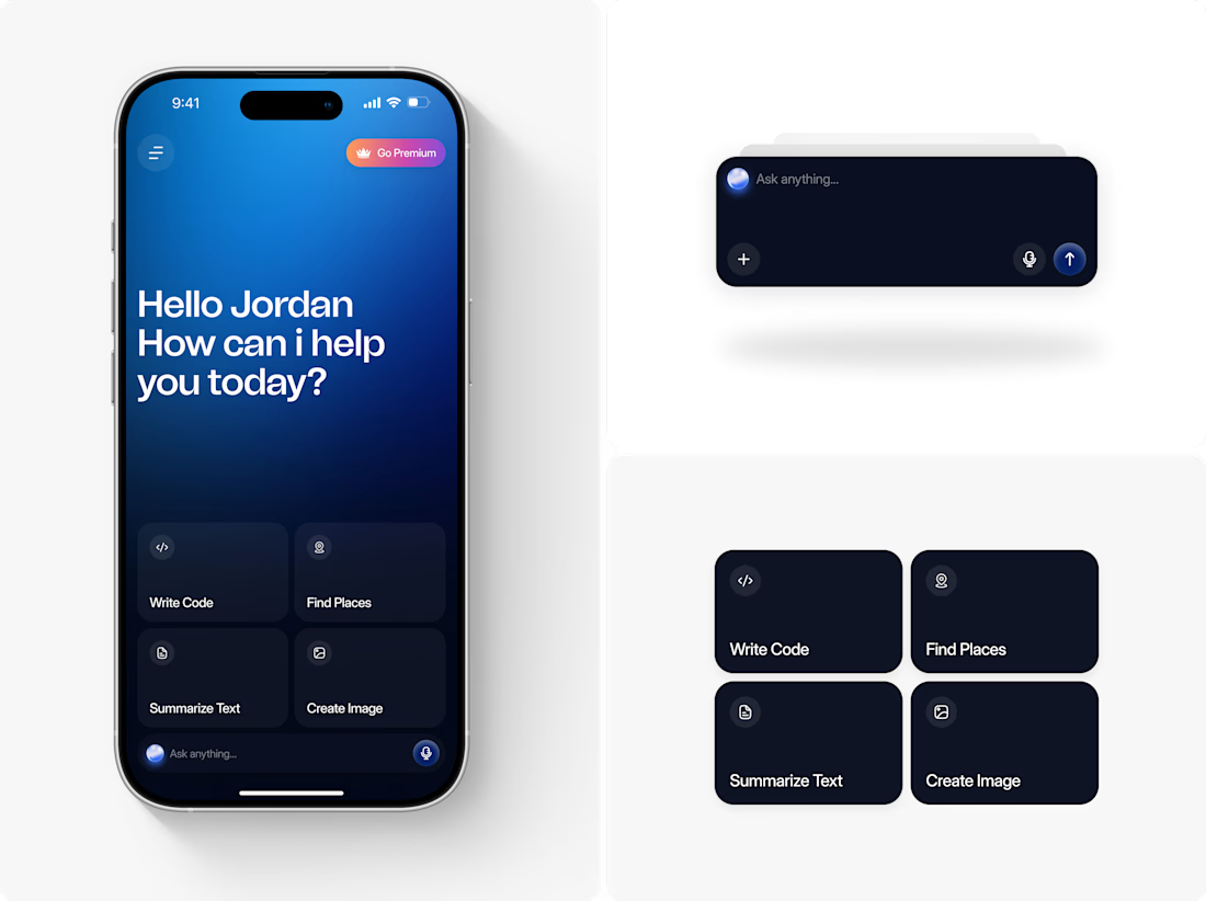
Most AI chat apps look the same a text box, a send button, no personality. We designed something that felt premium and personal from the first screen: a warm greeting, quick-action cards that show what the AI can do, and a floating search bar with a glowing orb that gives it presence. The result feels less like a chatbot, more like an assistant.
Want an interface this polished for your own app? Let's talk.