The network for creativity
Join 1.25M professional creatives like you
Connect with clients, get discovered, and run your business 100% commission-free
Creatives on Contra have earned over $150M and we are just getting started
Back to feedPost
Taste Test
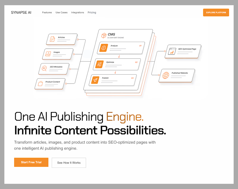
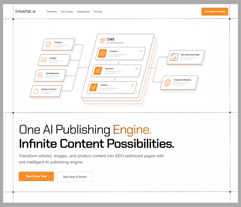
Exploring two hero directions for an AI publishing platform.
Both communicate the same product an AI engine that turns content into SEO-optimized pages but with different visual priorities.
Direction 1 leans into whitespace and restraint, giving the interface a more premium feel.
Direction 2 reduces the empty space and brings the workflow closer to the messaging, creating a tighter, more product-led composition.
Curious which one feels stronger.
Direction 1: premium, spacious, editorial
Direction 2: structured, compact, product-first
Which direction would you choose?

5 votes
Ends in 2h

Ohh it's tough I Like enterprise grid

Both directions feel too similar—the differences are more about spacing than concept. I'd push one direction to be much bolder so the balance is immediately obvious.

Thanks! That's fair feedback.
The network for creativity
Join 1.25M professional creatives like you
Connect with clients, get discovered, and run your business 100% commission-free
Creatives on Contra have earned over $150M and we are just getting started



Trending

Claude
Claude has entered the design space. How are you using it?

Contra University
Learn from expert creatives how to earn more using next-gen AI tools.
Brand Design
The best brand designers are on Contra. Scroll to see what's trending in brand design. What are you building?
creativeaiflow
Creative AI workflows are evolving. What tools do you use, and what are their strengths and weaknesses?
freelancerlife
Freelancer life is wins, pivots, and everything in between. What’s yours right now?
Related posts


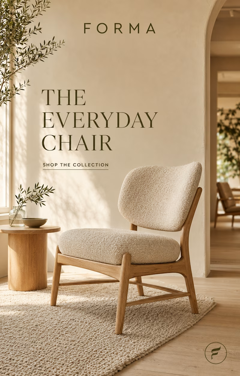
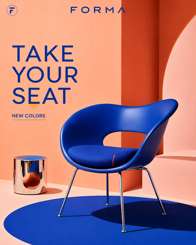
Same brand, two personalities.
One is calm — oak, bouclé, olive branches and warm plaster, sunlight moving slow across the floor. Furniture as quiet.
The other is loud — cobalt on coral, chrome legs, a sculpted shell against a bold arch.
Furniture as statement. Same logo, same category, opposite energy: one wants to disappear into your home, the other wants to be the first thing you see.
Quiet luxury or bold color — which Forma is yours? 👇
#furnituredesign #brandidentity #interiordesign
8 voted
38%
13 voted
62%
21 votes
Closed


I asked myself a simple question:
"When is human, human enough?"
And believe it or not, this challenge completely changed the way I think about creative thinking and AI assisted workflows.
Over the past few days, I have been sharing my journey here on @Contra and on X, asking people to contribute their thoughts on ideation, visual direction, and refinement. From classic pen and paper brainstorming to a fully realized product, every step happened within the limited timeline of the @Envato Challenge.
'Pause' is the brand I created for this challenge, it is the result of human creativity steering AI capabilities and the outcome goes far beyond simply generating visuals, it demonstrates what happens when intentional thinking guides powerful tools.
Using Envato's AI Suite, I built an entire brand from the logo and visual assets to the product campaign and even a motion design video. The experience exceeded every expectation I had.
The tagline, "PAUSE THE NOISE," was written by me. It does not just define the brand. It also reflects what I believe is the real message behind this challenge: pausing the noise around the idea that AI is here to replace creatives.
The human contribution was never just writing prompts. It was constantly questioning assumptions, pivoting from one idea to another, exploring different visual languages, selecting the strongest assets, directing the product campaign, shaping the motion design, and refining every output until it aligned with the vision. AI generated the assets. Human creativity gave them purpose.
I am so proud of the final result that I am now turning Pause into a detailed Contra case study.
My two cents:
AI is a tool. Like a sword, it is only as powerful as the person wielding it. In the hands of someone without vision, it loses its edge. In the hands of a creative thinker, it becomes a force multiplier. The future does not belong to AI alone. It belongs to people who know how to think, direct, and create with it.
Sound on 🔊
Scroll through the comments to explore all the visuals and the complete motion design videos.
Tools Used -
Envato
My own Vibe coded text behind video & Video editing apps
envatochallengebranddesigncreativeaiflowAI Video ProductionAI ArtAI VIsual DesignerProduct DesignEnvato

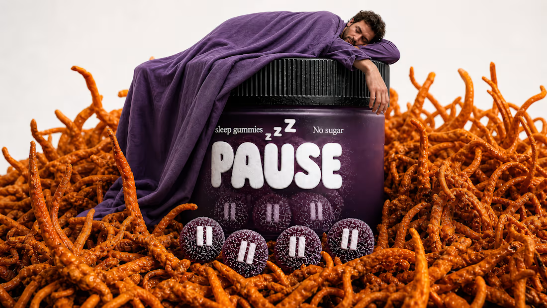
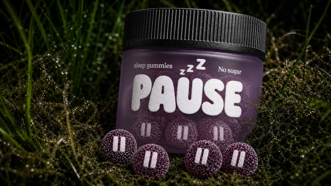
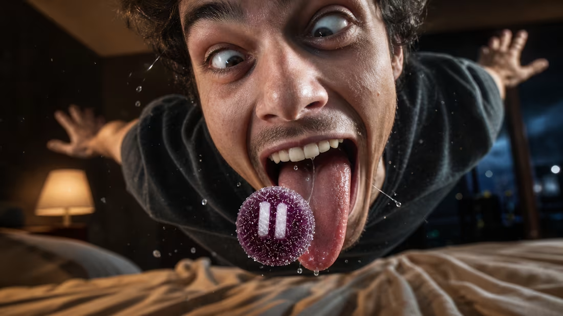
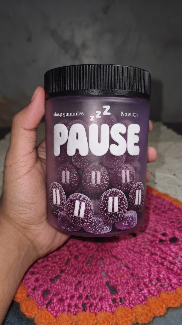

My entry for the Envato & Contra Challenge! ✨
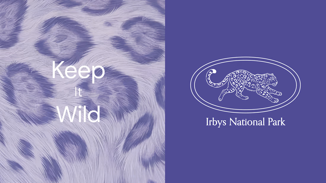
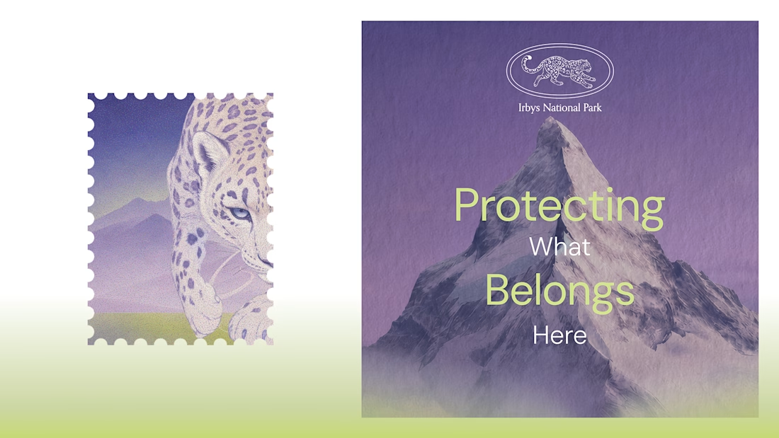
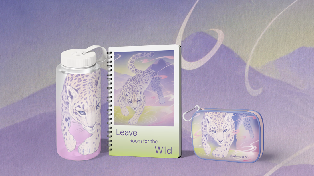
For this project, I imagined a visual identity for a national park dedicated to protecting the snow leopard or irbis, the traditional name for this rare mountain cat. It’s a species deeply connected to Central Asian culture and the place where I grew up.
I used Envato as an all-in-one creative toolkit to explore and bring the concept to life, including ImageGen, GraphicsGen, VideoGen, MusicGen, and Stock assets such as photos, videos, and graphics.
I've wanted to create something like this for a while, and this challenge gave me the perfect opportunity to finally explore the idea and tell an important story through design. 💜
#envatochallenge


Beautiful! 🤍