The network for creativity
Join 1.25M professional creatives like you
Connect with clients, get discovered, and run your business 100% commission-free
Creatives on Contra have earned over $150M and we are just getting started
Back to feedPost
Taste Test
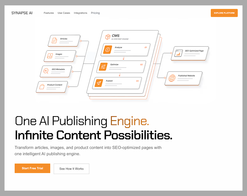
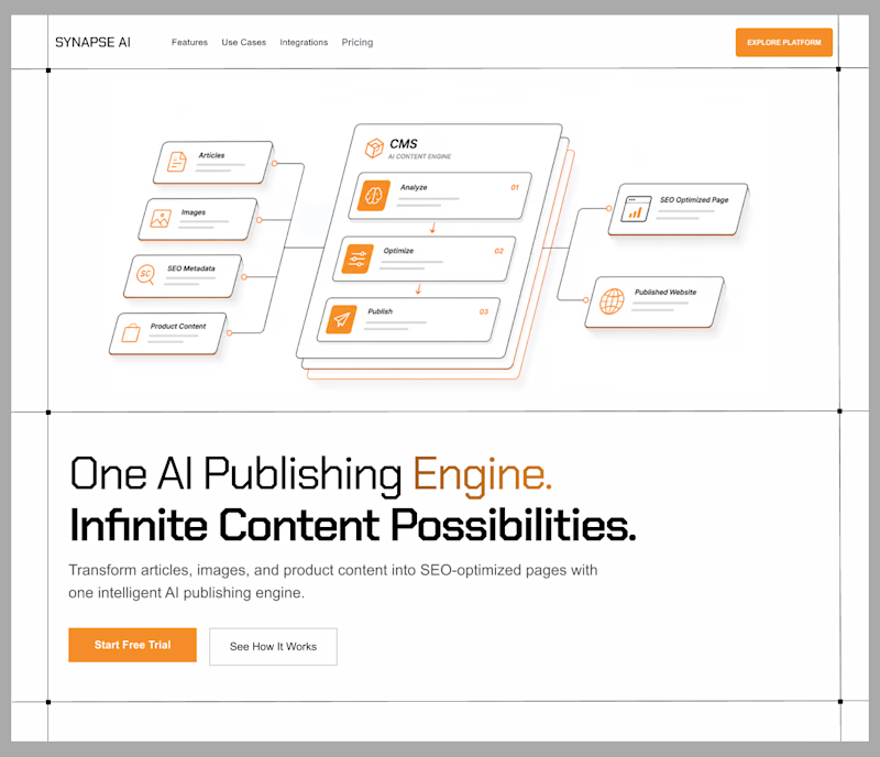
Exploring two hero directions for an AI publishing platform.
Both communicate the same product an AI engine that turns content into SEO-optimized pages but with different visual priorities.
Direction 1 leans into whitespace and restraint, giving the interface a more premium feel.
Direction 2 reduces the empty space and brings the workflow closer to the messaging, creating a tighter, more product-led composition.
Curious which one feels stronger.
Direction 1: premium, spacious, editorial
Direction 2: structured, compact, product-first
Which direction would you choose?

3 voted
60%
2 voted
40%
5 votes
Closed

Both directions feel too similar—the differences are more about spacing than concept. I'd push one direction to be much bolder so the balance is immediately obvious.

Thanks! That's fair feedback.

Ohh it's tough I Like enterprise grid
The network for creativity
Join 1.25M professional creatives like you
Connect with clients, get discovered, and run your business 100% commission-free
Creatives on Contra have earned over $150M and we are just getting started



Related posts

Exploring the listening state for an AI voice interface.
Which direction would you ship, A or B?
10 voted
29%
25 voted
71%
35 votes
Closed

The particle field looks more polished and beautiful🔥

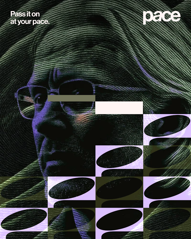
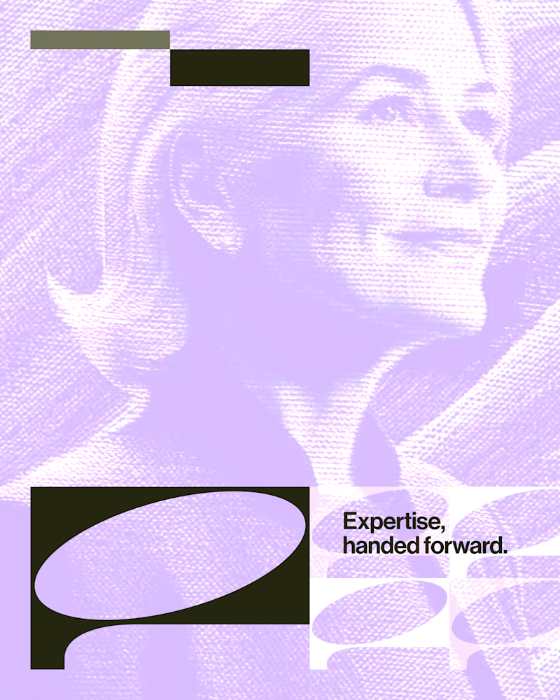
Experimental layouts for Pace. Which one do you like?
23 voted
52%
21 voted
48%
44 votes
Closed

Looks cool.

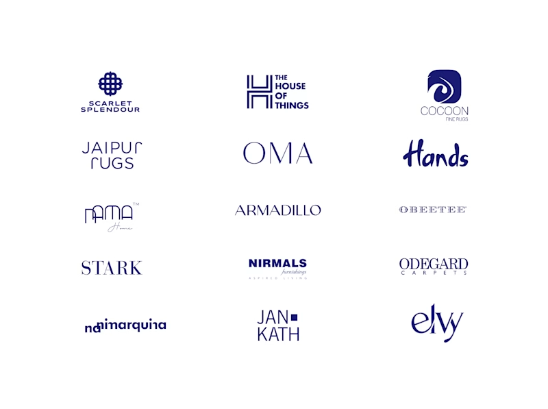
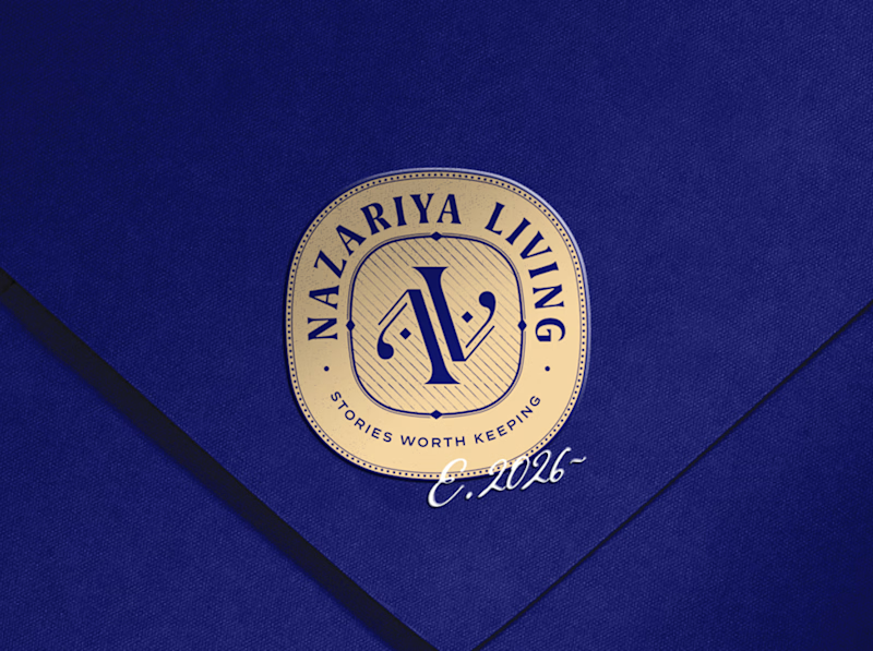
A little look at how Nazariya Living stands apart from its category.
On one side, familiar visual conventions. On the other, an identity with its own character, rooted in stories worth keeping.
We chose not to blend in. :)
Which side catches your eye?

3 voted
30%
7 voted
70%
10 votes
Closed

That side with all the competitor logos in one grid is the slide I'd steal for a client presentation. Nothing explains "why this direction" faster than showing the sea of sameness first. The navy seal wins easily after that.