The network for creativity
Join 1.25M professional creatives like you
Connect with clients, get discovered, and run your business 100% commission-free
Creatives on Contra have earned over $150M and we are just getting started
Back to feedPost
Check out the new Brand Redesign project in my profile!
https://contra.com/p/NQBqBXFZ-diverse-electronics-or-visual-identity-redesign?referralExperimentNid=DEFAULT_REFERRAL_PROGRAM&referrerUsername=chibimurk

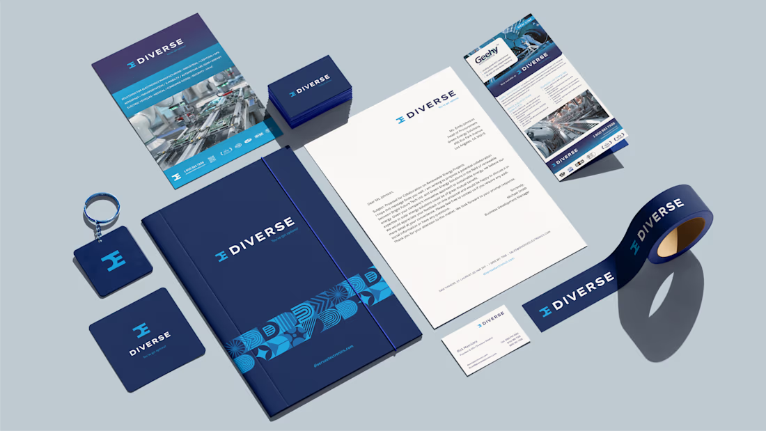


The Diverse Electronics redesign looks like a substantial identity reset. Which change made the biggest difference in how the brand now feels?

Thanks Maty! I’d say the biggest change was creating a cohesive identity system. Since Diverse Electronics has been around for over 30 years, the goal was to evolve the brand rather than reinvent it, making it feel more consistent and contemporary across all touchpoints.
The network for creativity
Join 1.25M professional creatives like you
Connect with clients, get discovered, and run your business 100% commission-free
Creatives on Contra have earned over $150M and we are just getting started





Related posts

Brand identity work for WesoftAI




Winder is a bold brand identity built around a geometric W-inspired symbol, combining sharp angles and forward movement to represent progress, speed, and direction.
The identity uses a striking red and deep burgundy palette, supported by clean typography and a consistent visual system across brand guidelines, digital applications, and product mockups.
Progress in Motion.



Great logo it feels it really has an identity 🎉🎉


New case study: motion product film for a mobile streaming app. Some shots filmed on camera, some AI generated, the rest built in After Effects
Check it out


This is only high end