The network for creativity
Join 1.25M professional creatives like you
Connect with clients, get discovered, and run your business 100% commission-free
Creatives on Contra have earned over $150M and we are just getting started
Back to feedPost

I’ve always felt that love is less about softness and more about the balance of tension.
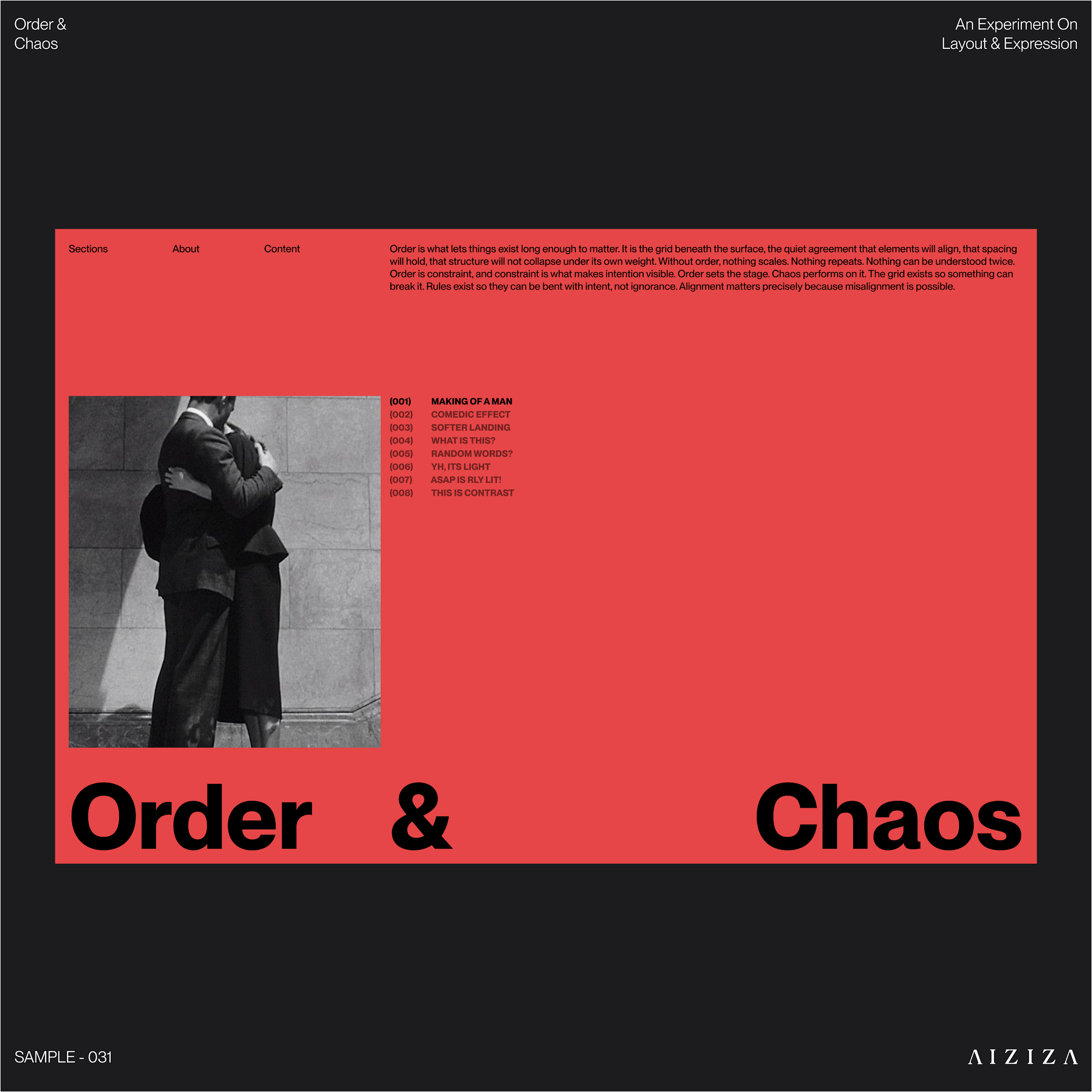
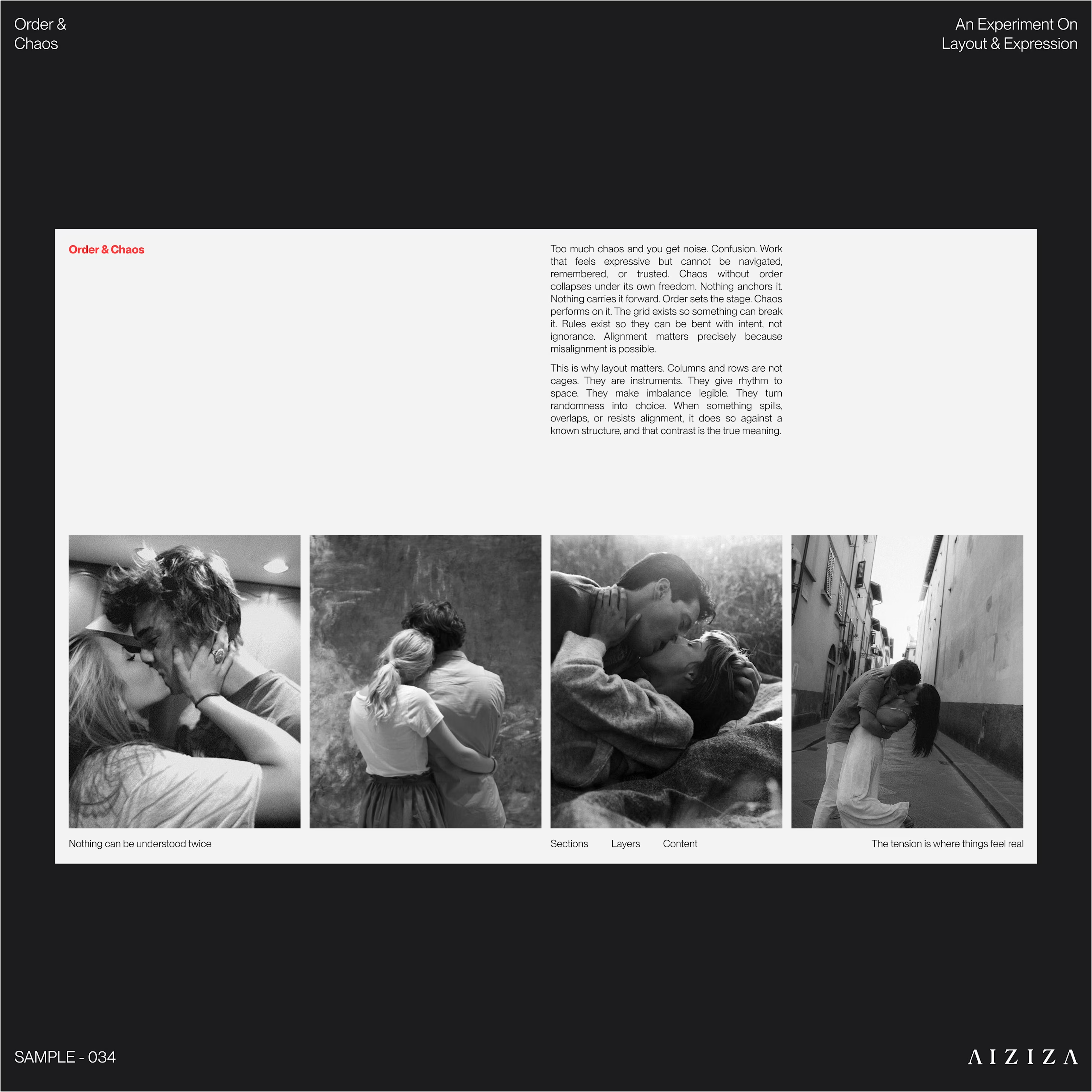
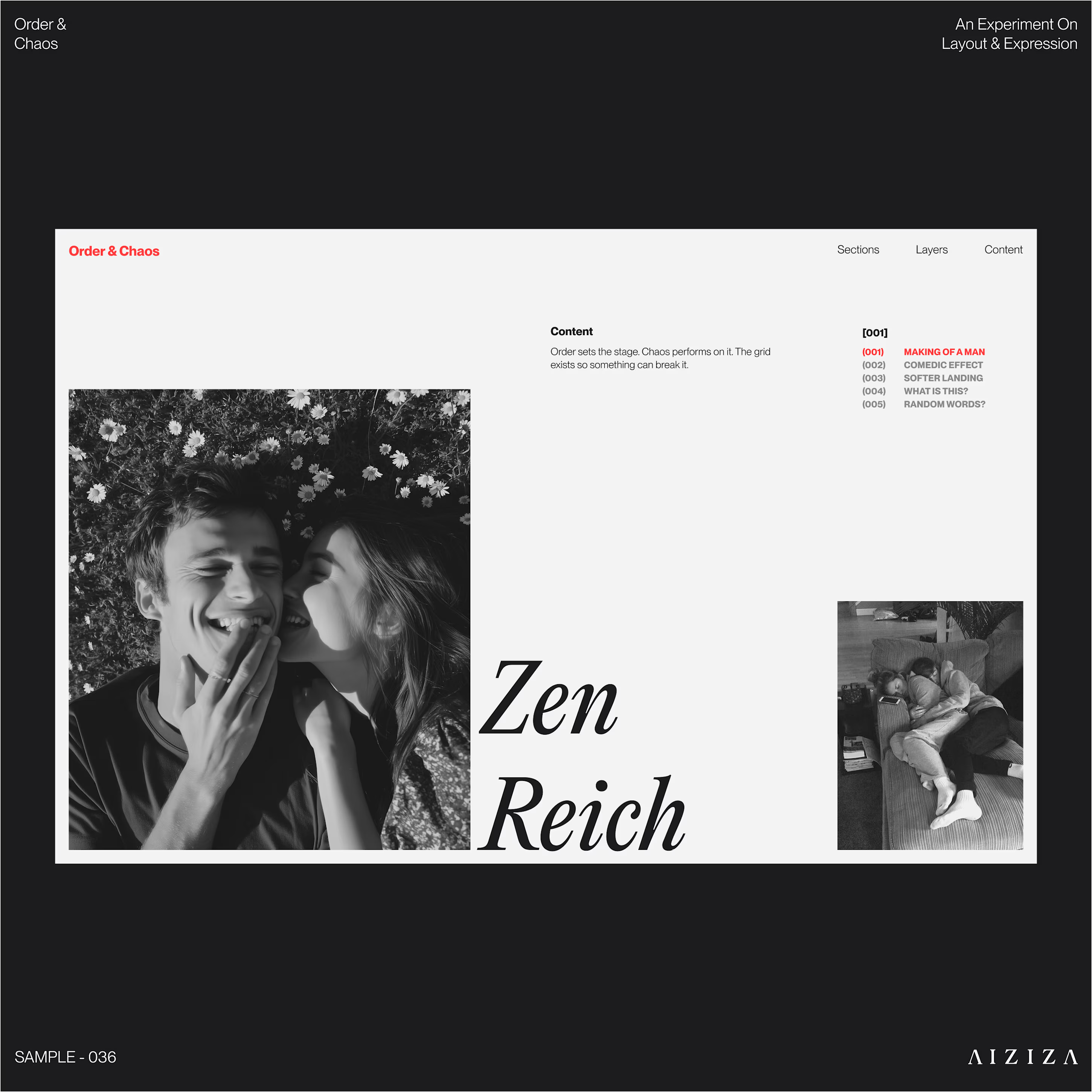
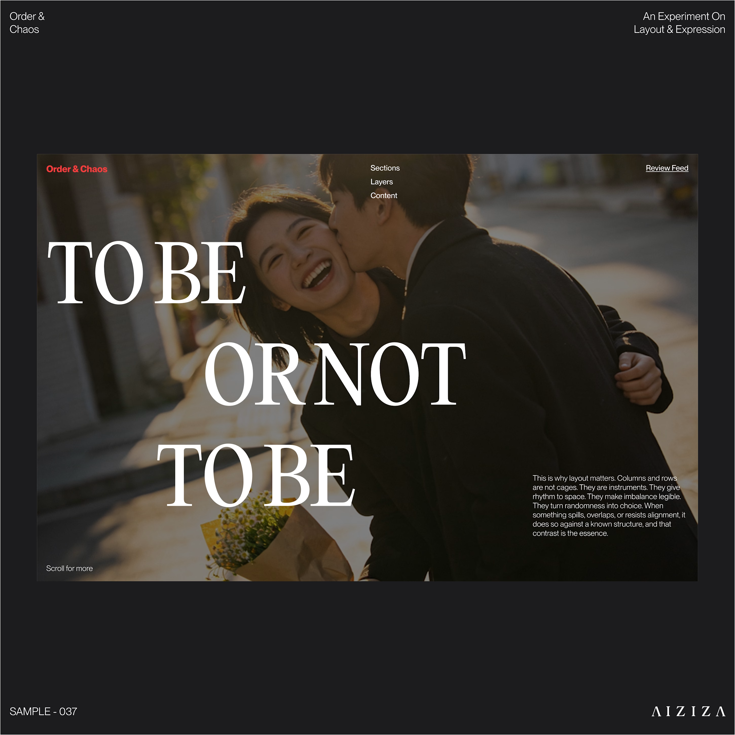
For the most recent Order & Chaos drop, I wanted to explore that through design rather than hearts and flowers. Because honestly? Great design and great relationships both require a mix of boundaries and total abandon.
I played with some heavy contrasts this time around—think precision alignment versus expressive scale, and sharp typography against grainy, intimate photos.
Order is the grid. Chaos is the kiss mid-laugh.
If you have too much order, the work feels dead. If you have too much chaos, it all collapses.
I'm curious for the founders and creatives following along: where is your brand sitting right now? Are you playing it too safe, or are things getting a little too scattered?


The network for creativity
Join 1.25M professional creatives like you
Connect with clients, get discovered, and run your business 100% commission-free
Creatives on Contra have earned over $150M and we are just getting started





Related posts

Which hero visual feels right for this brand?
While working on the homepage for Halfspace, a website design and SEO agency, I explored two different hero visuals for the same headline and layout. Same message, same structure, just a different visual metaphor and mood.
Option 1 - Rocket Launch. Bold, literal, and energetic, visually reinforcing the "launch your business" message with motion and fire.
Option 2 - Glass Cube. Abstract, sleek, and premium, giving a more refined, tech-forward feel without relying on a literal metaphor.
Would love your honest UX/UI take, which direction feels more impactful, memorable, and aligned with a web design/SEO brand, and why?
11 voted
41%
16 voted
59%
27 votes
Closed

Both design are great; it's hard to choose one




Option B feels nothing but premium


