The network for creativity
Join 1.25M professional creatives like you
Connect with clients, get discovered, and run your business 100% commission-free
Creatives on Contra have earned over $150M and we are just getting started
Back to feedPost

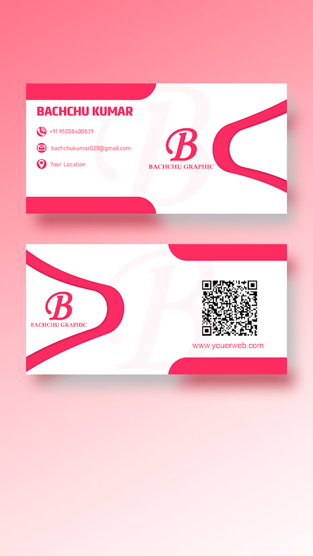
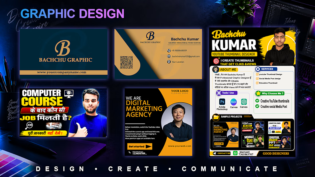
“I designed professional business cards and digital marketing graphics with a clean, modern, and eye-catching visual style. I focused on strong layouts, typography, branding, and clear visual communication.”


The network for creativity
Join 1.25M professional creatives like you
Connect with clients, get discovered, and run your business 100% commission-free
Creatives on Contra have earned over $150M and we are just getting started

Challenges
View all


Related posts

Seasonal identity for Beat Film Festival. The challenge: create a concept where cinema helps audiences process a turbulent cultural and historical moment — staying relevant and resonant rather than offering escape from it.
The identity metaphor for BFF is a shared journey —
audience and festival alike searching for solid ground.
"Get on Board" is an invitation to hop into the same boat, riding together the waves of emotion sparked by film and shaped by the turbulence around us. Beat becomes the lighthouse in that storm — a sense of safety, belonging, and a moment worth sharing.


The gradient makes the whole identity special, what do you think?

A food poster has a simple challenge: get attention, create appetite and make the brand memorable.
For this concept, we built the composition around the food itself, using strong visual hierarchy to guide the viewer from the product to the message and supporting brand elements.
The design keeps the communication direct while giving the imagery enough space to do the selling.
Services: Food Poster Design · Graphic Design · Food Advertising · Restaurant Branding · Print Design
The goal was not to fill the poster with information.
It was to create a visual that could catch attention quickly and leave the food as the thing people remember.
Designed by WaxyWeb.
Brand DesignGraphic DesignVisual ArtsAdobe IllustratorAdobe PhotoshopFigmafoodposterdesignrestaurantbrandingwaxyweb


great one

ENDURX — Smartwatch & Fitness Tech Landing Page ⌚🔥
ENDURX is a landing page concept for a performance-focused smartwatch built around endurance, health tracking, and active everyday lifestyles.
The goal was to make the product feel powerful and energetic from the first screen while keeping the experience premium and product-focused. A bold orange palette, oversized typography, and a large smartwatch visual create a strong sense of movement and performance.
Special attention was given to:
• a product-first hero composition that makes the smartwatch the main visual focus ⌚;
• oversized “ENDURANCE” typography to communicate strength and performance;
• an intense orange gradient that gives the brand a distinctive, energetic identity 🟠;
• supporting product details around health metrics, activity tracking, battery life, and comfort;
• a clear “Get Started” CTA positioned close to the main product;
• additional product imagery that highlights the strap and all-day comfort;
• clean navigation around Features, Health, Reviews, and Contact;
• responsive mobile layouts that preserve the visual impact while simplifying the information hierarchy 📱;
• a compact mobile menu with social touchpoints and easy access to key sections.
The result is a bold digital experience that positions ENDURX as a modern wearable for people who want technology that keeps up with an active lifestyle.
Looking to launch a wearable, fitness product, or consumer tech brand?
Let’s create a product experience built to perform 🚀


Ohh my god what an a inspirational. I am not getting the perfect words explain this work.
Now it will be my dream design 😍