The network for creativity
Join 1.25M professional creatives like you
Connect with clients, get discovered, and run your business 100% commission-free
Creatives on Contra have earned over $150M and we are just getting started
Back to feedPost

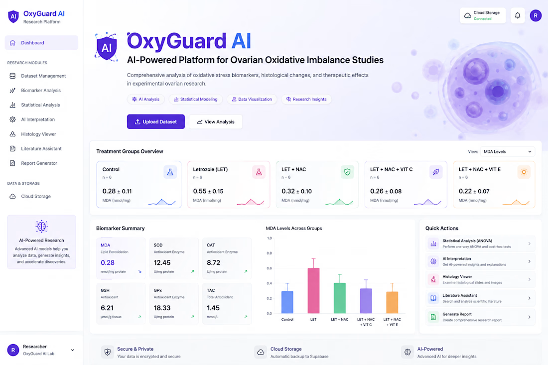
Built an AI-powered research platform for analyzing experimental datasets, visualizing oxidative-stress biomarkers, running statistical analysis, and generating scientific reports.
Key features:
Dataset Management
Biomarker Dashboard
AI Interpretation
Statistical Analysis
Histology Viewer
Literature Assistant
Report Generator
Secure Cloud Storage
Tech focus:
AI Web Development • Data Visualization • Scientific Software • Dashboard Development • Supabase • AI Integration



This is great!
The network for creativity
Join 1.25M professional creatives like you
Connect with clients, get discovered, and run your business 100% commission-free
Creatives on Contra have earned over $150M and we are just getting started







Related posts

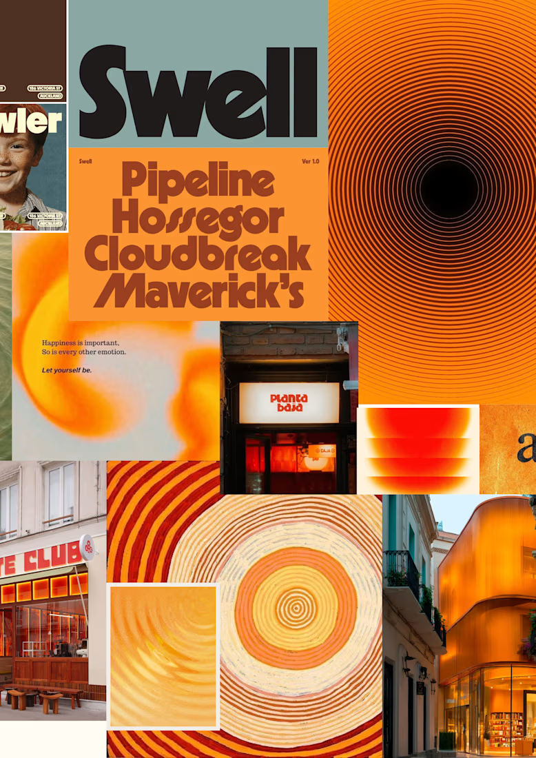
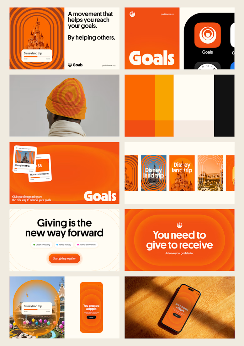
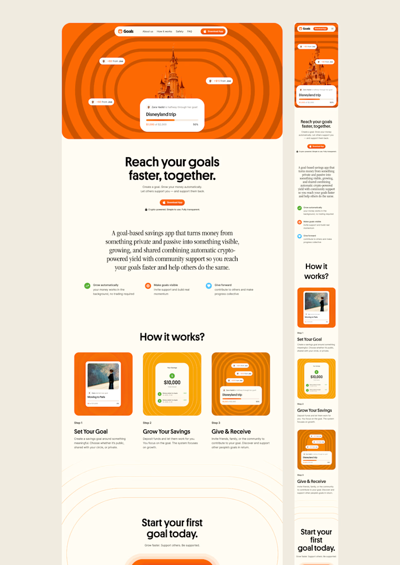
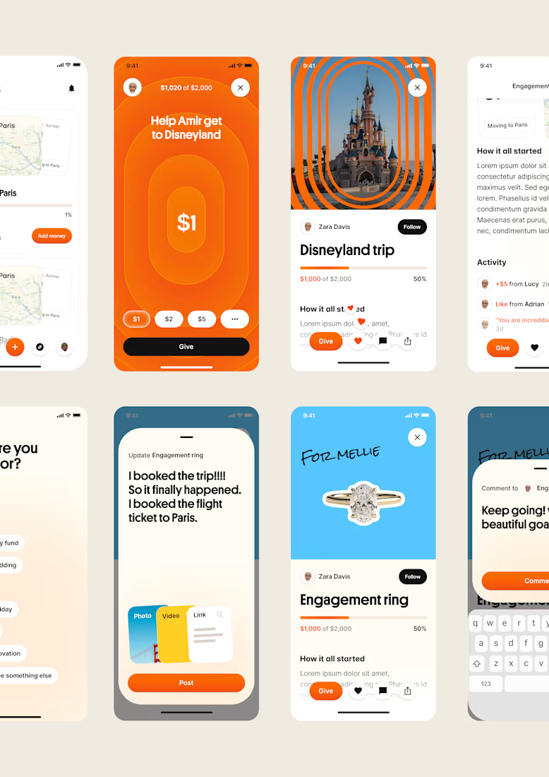
one of my favourite things about running a one-person studio is that nothing gets lost in translation.
the idea behind the brand is the same idea that shapes the website and the product.
no handovers, no starting from scratch, no trying to explain the vision to someone new.
a little look at how that came together for goals, from the first moodboard to the app ↓

Love it!

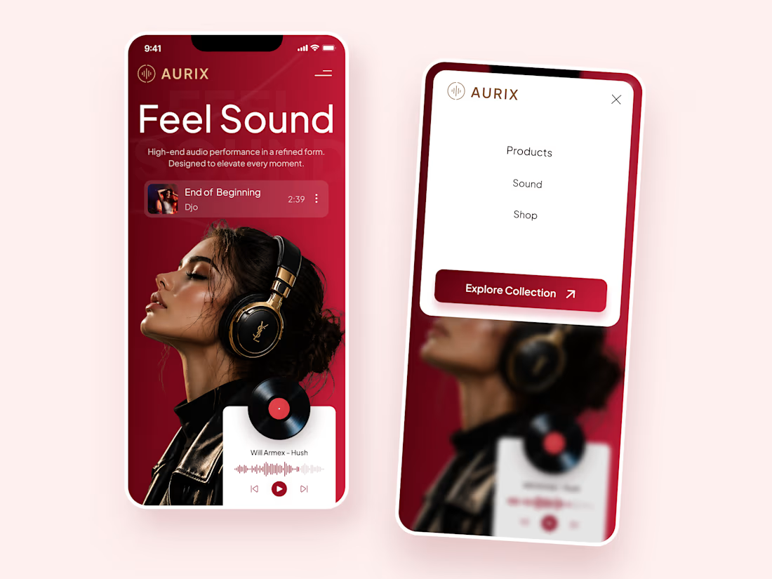
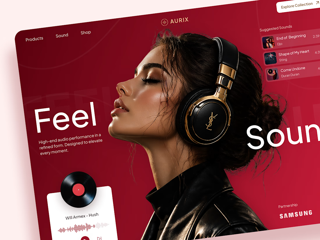
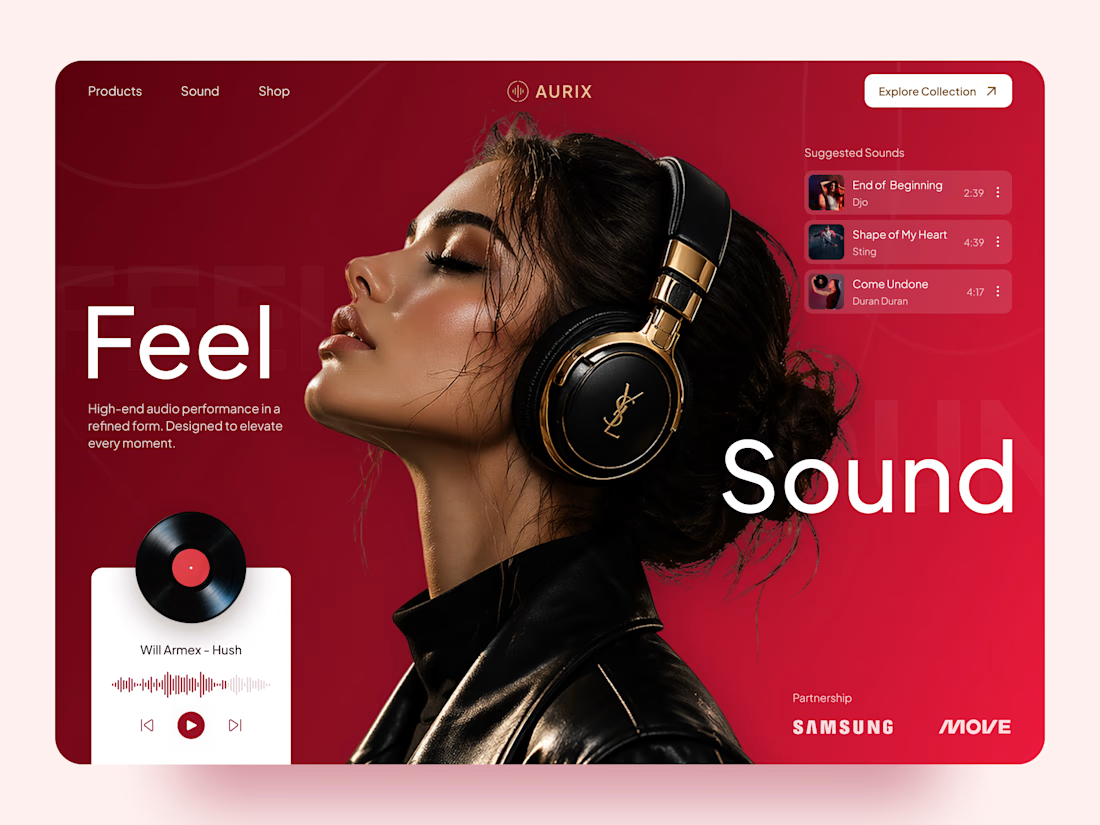
AURIX — Premium Headphones Landing Page 🎧❤️
A bold landing page concept for a premium audio brand, combining luxury headphones, music, and a strong lifestyle aesthetic
The design brings together deep red tones, elegant black and gold details, oversized typography, and immersive lifestyle imagery to create a modern, fashion-inspired experience
Special attention was given to:
• Bold lifestyle-focused hero composition
• Rich red and gold color palette
• Clean, oversized typography
• Music player and suggested tracks
• Premium product presentation
• Responsive mobile experience
• Minimal navigation and clear CTA
The result is a stylish, immersive landing page that connects premium audio with fashion, music, and everyday lifestyle ✨



Love the style!

Pick a car. Hit the handbrake. Turn the horde into combo points. 🚗💨
Play free: www.animattor.co/zombie-drift (live leaderboard, beat me!)
Desktop (keyboard or gamepad), mobile (gyroscope).
🏆 Top 3 on October 18 get 1 year of Rive Cadet from me. Post a screenshot in comment of your score on X, LinkedIn or here and tag me and Rive.
🚙 Real drift physics. Every car handles differently and is fun in its own way
🔓 Monster truck unlocks once you pass 500,000 points
💨 Drifting to stack combos
🛞 Ramps with slowmo its something, fix your car in repair garage
I started building it right before the weekend. By Sunday I was already beating my own high scores.
Built in Rive with the Rive CLI and Claude. Zombies are animated vectors, the cars are custom vector designs, and the HUD runs on data binding [+ GPU Canvas / Luau]. The whole game is just 2.37 MB.
Drop your score below 👇
Got feedback or something's not working? Let me know.


@Rive @Matt Jedrzejewski very fun game! Frames really get low with a lot of zombies on the screen!