The network for creativity
Join 1.25M professional creatives like you
Connect with clients, get discovered, and run your business 100% commission-free
Creatives on Contra have earned over $150M and we are just getting started
Back to feedPost
Taste Test
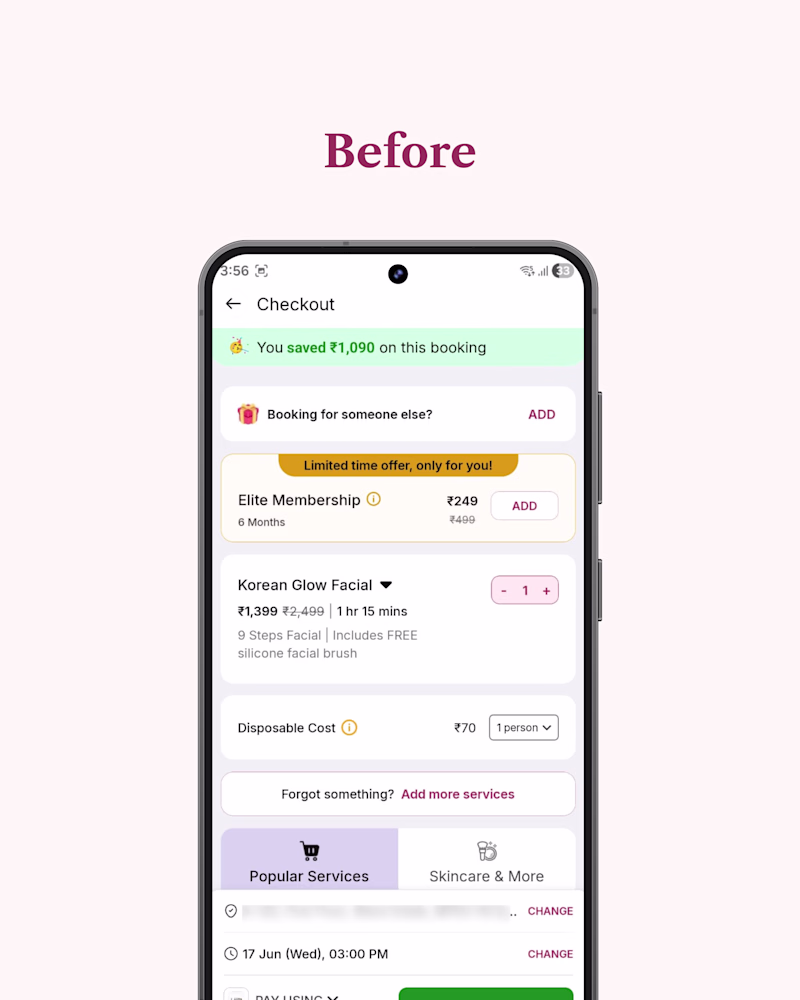
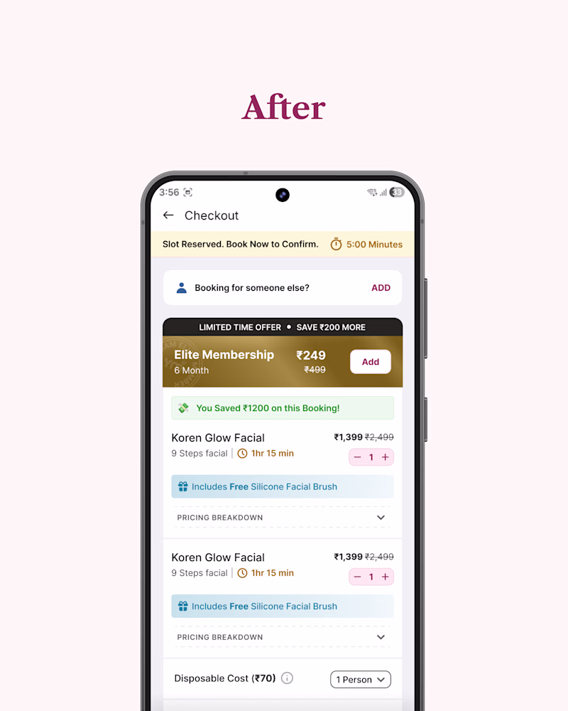
A booking app changed my appointment time without telling me, I found out 3 days later.
As a designer, that's not just a bad day. It's a sign the checkout flow is broken.
I mapped the existing flow, found where it was failing silently, and redesigned the cart screen around one idea:Before you pay, you should know what you're getting, what you might lose, and how much time you have.
The original screen was silent on all three. Mine isn't a live slot timer, a free item that actually looks free, pricing detail that's there when you want it and gone when you don't.
This is what I look for on every project not just how a screen looks, but where it quietly breaks trust.
Full breakdown link in comment. If your product has a flow that feels "fine" but underperforms, that's usually where I'd start.
3 votes
Ends in 1d
Going with the after look
The network for creativity
Join 1.25M professional creatives like you
Connect with clients, get discovered, and run your business 100% commission-free
Creatives on Contra have earned over $150M and we are just getting started
Related posts
You're in charge of the design. the tool's in charge of the execution.
said that in a tutorial i recorded for contra university and it's the most honest thing i know about where this work is going.
took a figma design, dropped it on the canvas, spun three variants off one client note, published a live clickable site. what used to be four or five revision rounds took about five minutes.
so when execution gets that cheap, it stops being the thing you sell. a client can get a polished working page out of one sentence now. what they still can't get is the call under it. who it's for. what it says. what it refuses to say.
I'm not nervous about teaching designers to move this fast, the faster everyone executes the more obvious it gets who can actually decide.
woooo it's live!
I built a product from scratch while raising a baby in Berlin.
Designed in Figma. Built with Claude Code. Deployed on Vercel. No engineers, no agency, no sprints.
ElternPop is a free resource for international families navigating Germany's parental benefit system. It has an Elterngeld calculator built on official government formulas, step-by-step guides, and a Berlin activity map for kids.
Day one: 150+ visits, no paid ads.
Day five: 161 daily unique users, 82% mobile.
A user found a €10 calculator bug. Fixed and deployed the same afternoon.
I'm a Senior Product Designer with 15+ years across B2B SaaS, AI products, and founding roles. I've built design systems, led research across international markets, and designed features that moved real metrics.
ElternPop is what that experience looks like when one person owns the whole thing.
If you're looking for a designer who can think in systems and ship, I'm available!
elternpop.com
Elternpop | Guide for expat parents in Berlin
Guides and tools for international parents in Berlin. Elterngeld calculator, bureaucracy checklists, health check-up tracker, and a community map — all in one place.
this is such an awesome project to show not only a huge milestone for you personally when it comes to the story behind your 'why', but also so powerful in showcasing the drive to create, innovate, & lend a hand to others where you're able. nice work!
New case study is live.
A principal product designer had a set of polished Figma designs and recorded app videos, but needed them turned into a short reel that felt cohesive, intentional, and portfolio-ready.
I built the full motion piece in Jitter: trimming and cropping recordings, sequencing product screens, creating transitions, and shaping the pacing into a 50-second 4K showreel.
The work was less about adding flashy animation and more about giving the product design the right rhythm, flow, and presentation quality.
From scattered source files to one polished reel.
jitter has a lot of way to make something feel alive
nice work
Challenges
View allTrending
Claude
Claude has entered the design space. How are you using Claude Design?
Contra University
Learn from expert creatives how to earn more using next-gen AI tools.
MagicPath
The canvas is infinite, and exploration is becoming the workflow. How are you using MagicPath?
creativeaiflow
Creative AI workflows are evolving. What tools do you use, and what are their strengths and weaknesses?
freelancerlife
Freelancer life is wins, pivots, and everything in between. What’s yours right now?
