The network for creativity
Join 1.25M professional creatives like you
Connect with clients, get discovered, and run your business 100% commission-free
Creatives on Contra have earned over $150M and we are just getting started
Back to feedPost


this might be the best landing page i've found yet


The network for creativity
Join 1.25M professional creatives like you
Connect with clients, get discovered, and run your business 100% commission-free
Creatives on Contra have earned over $150M and we are just getting started





Related posts

What if your landing page looked better, loaded faster, and scored 100 across every Lighthouse metric? 🚀
That was the goal behind this redesign.
I rebuilt the landing page with Astro, leveraging its lightweight architecture and minimal JavaScript by default to deliver faster loading, smoother interactions, and a better user experience.
The result? A cleaner design, improved performance, and 100/100 across all Lighthouse metrics.


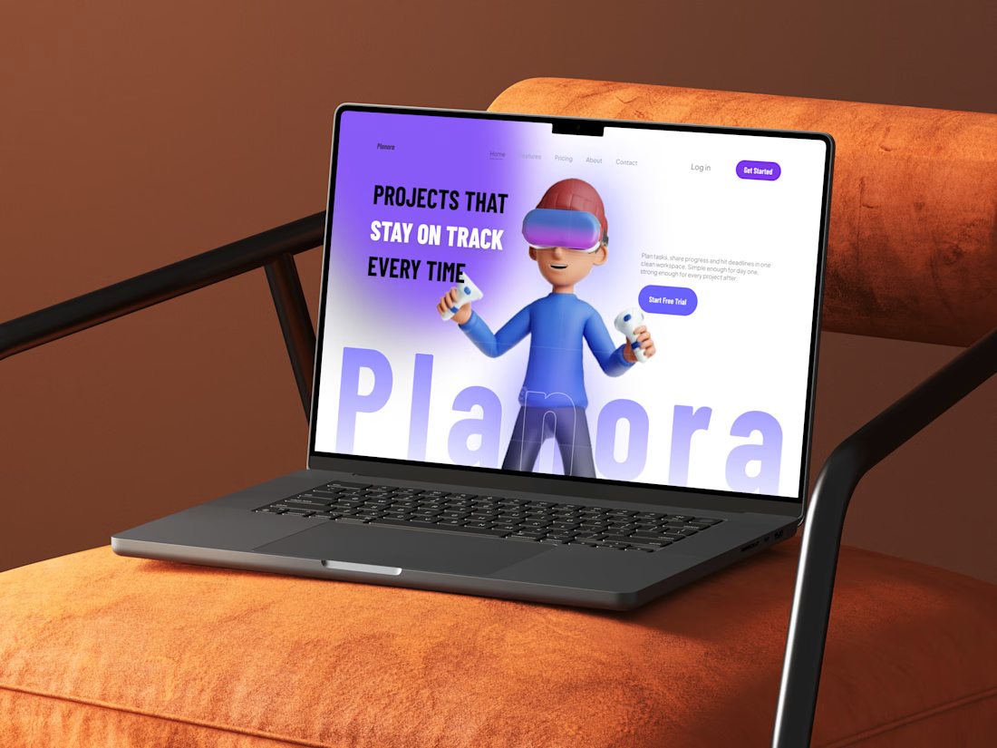
Planora is a landing page design for a project management platform built for small and growing teams. I designed it in Figma to make a crowded product category feel simple, clear and approachable.
The goal
Project management tools often feel crowded and hard to start using. The page needed to explain the product quickly, build trust and lead visitors to one clear action: start a free trial.
My process
Structured the page so each section answers one question: what it is, what it does, who it’s for, how to start and what it costs
Alternated light, dark and gradient sections to keep a long page easy to scan
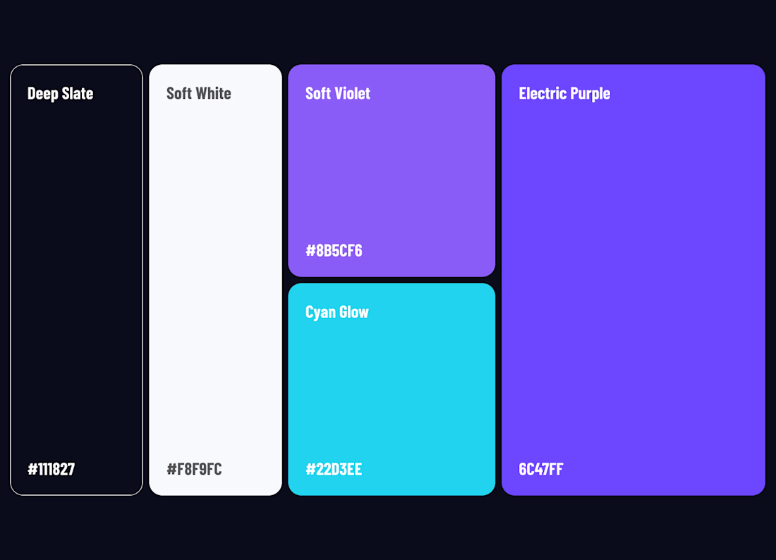
Used glossy 3D visuals and a purple accent system to make the brand feel modern and premium
Built icon cards for features, use cases and setup steps, so visitors can scan instead of read
Repeated one primary call to action in the hero, mid-page banners, pricing and the final section
The result
A complete SaaS landing page, from hero to footer, with a consistent visual system and a clear path from first impression to free trial.
Tools: Figma, Phosphor Icons

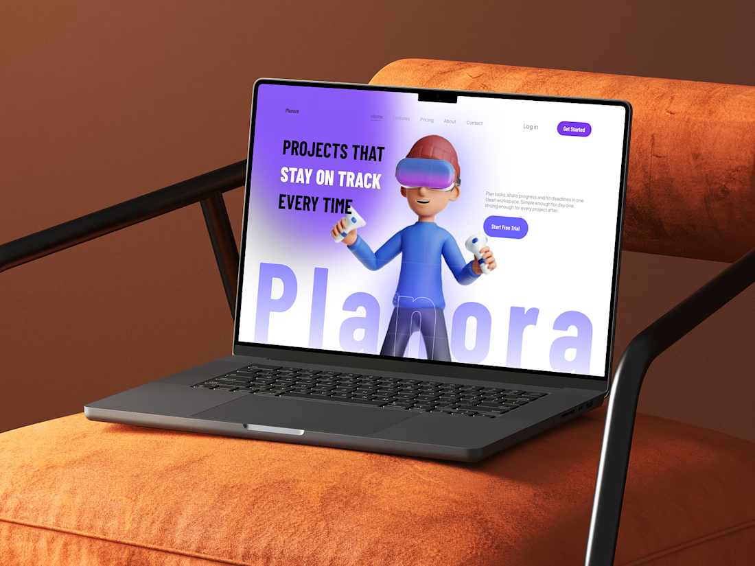

Planora: SaaS Landing Page Design
A clean landing page for a project management app, designed to explain the product in seconds and lead visitors to a free trial.
Project tools often feel crowded and hard to start with, so I focused on:
One clear message per section
Alternating light and dark sections to keep a long page easy to scan
Glossy 3D visuals and a purple accent system for a modern, premium feel
Icon cards for features, use cases and setup steps
One main action, Start Free Trial, repeated across the page
Designed in Figma, from hero to footer, with a full case study.
Looking for a landing page or dashboard UI for your SaaS product? Message me.