The network for creativity
Join 1.25M professional creatives like you
Connect with clients, get discovered, and run your business 100% commission-free
Creatives on Contra have earned over $150M and we are just getting started
Back to feedPost

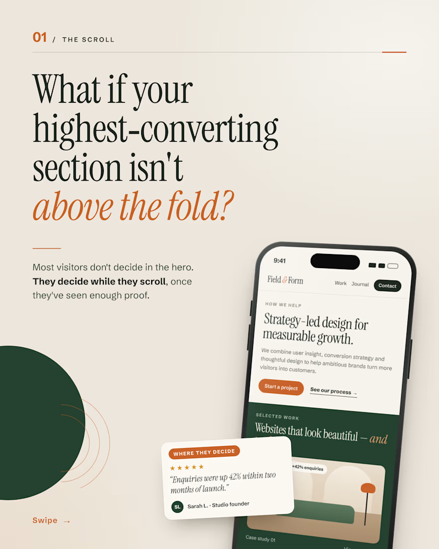
Your hero gets the first look. But most visitors don’t decide there.
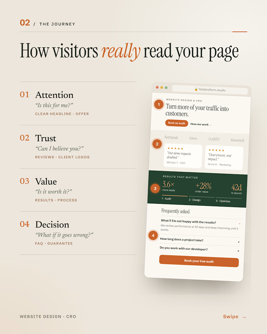
They scroll and question you: Is this for me? Can I trust you? Is it worth it? What if it goes wrong?
The sections that answer those (reviews, real results, a clear process, an honest FAQ) are often the ones doing the selling.
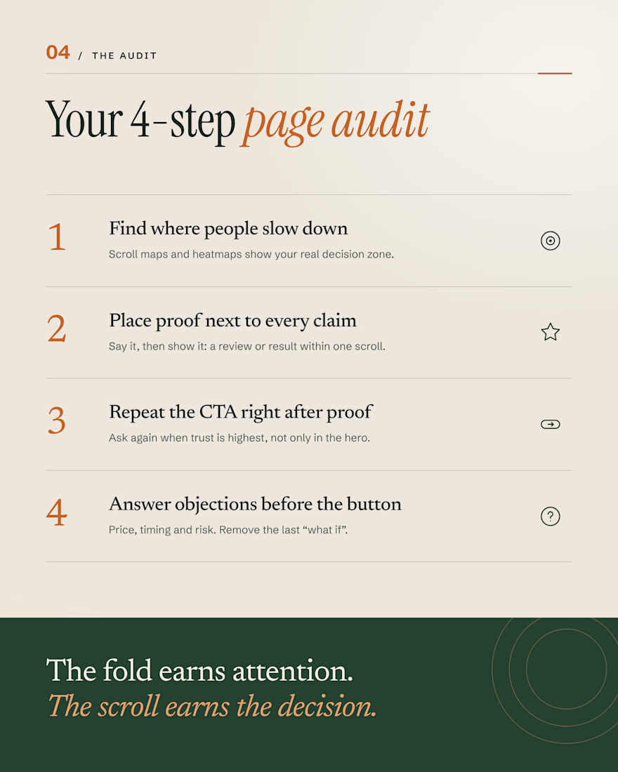
The fold earns attention. The scroll earns the decision.
#WebDesign #CRO #ConversionRateOptimization #LandingPages #UXDesign
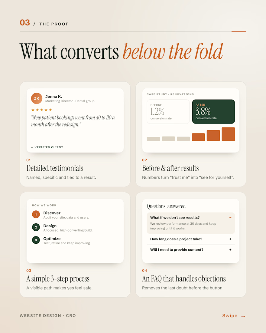

Framing each section as an answer to a visitor's question is a great way to plan a landing page. Most of the doubt shows up right after the hero, so reviews and real results need to sit close to it.
Exactly! The closer the proof is to the promise, the stronger the trust.
"The scroll earns the decision" is a great way to put it. An honest FAQ right above the final CTA often does more than another feature grid.
Absolutely! Removing doubts at the right moment makes all the difference.
The network for creativity
Join 1.25M professional creatives like you
Connect with clients, get discovered, and run your business 100% commission-free
Creatives on Contra have earned over $150M and we are just getting started

Related posts


Does your coaching program look like a method, or like a list?
A client of ours teaches a three-stage method for course creators. In the first draft it lived in a bullet list, and nobody remembered it.
So we gave it a shape:
One line connects the stages. A visible path tells the reader there is an order, and that they are somewhere on it.
The middle stage gets the weight. Stage two is where the real work happens, so it's the only dark card. The eye lands there first.
Every stage is a verb. Map, Build, Launch. A method people can repeat is a method people buy.
A list explains. A path promises progress.
How do you show a method on a sales page?

Same company, two different concepts for an AI storytelling platform. Which one suits better?
31 voted
86%
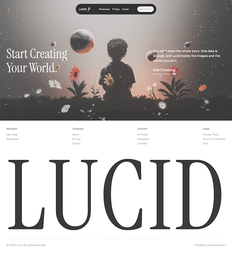
5 voted
14%
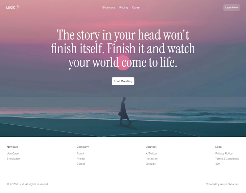
36 votes
Closed

Left!

I've spent years obsessing over the stuff nobody notices on a website. Until it's missing.
AI can now build a whole site in an afternoon. I think that's great.
But it still can't decide what feels right.
I don't think AI is the problem. It just stops at "it works". The last part, the spacing, the type, the way things move when you scroll, still needs someone who cares about it.
That's the part I've always loved doing. So I made a small thing around it: you bring the site AI built, I finish it in Webflow.
It's called Verdikt https://verdikt.studio


Agreed. AI gets you a working layout fast, but spacing and type rhythm are where it still feels off. I'd add forms and mobile checks to that list too. What's the most common fix people bring you?