The network for creativity
Join 1.25M professional creatives like you
Connect with clients, get discovered, and run your business 100% commission-free
Creatives on Contra have earned over $150M and we are just getting started
Back to feedPost
Taste Test



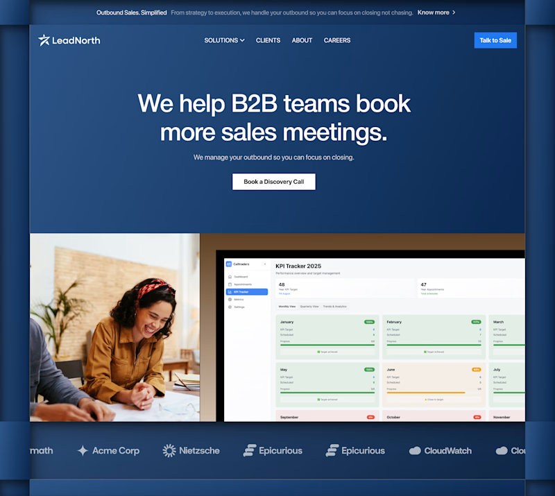
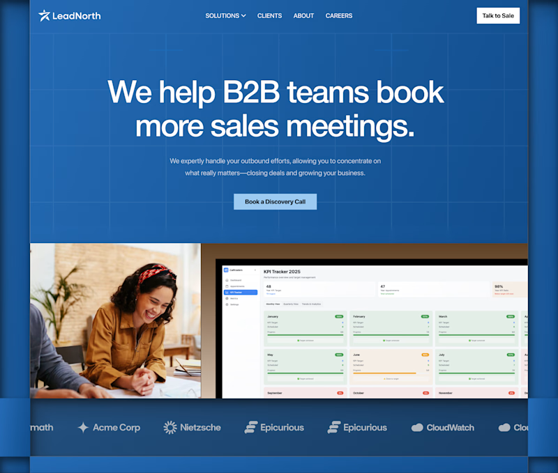


The visual polish on Hero 1 really stands out, but I'm wondering about the practical differences. Do you find one layout performs better for actual user workflows, or is it purely an aesthetic choice at this point?


Both looks good bro

Voted Hero 2, it drops the top banner and badge so the headline and CTA are the first thing you see. Hero 1's award badge could help credibility but it competes with the headline for attention above the fold.


Hero 2

Hero 1

Hero 1 looks much cleaner. The subtle gradient feels a bit more modern and premium than the heavy grid lines in Hero 2.

Ofc. Hero 2

version 2 goes well

Hero 1 for me

Hero 2 looks way better @Anush | Foundrline

hero 1 for me
The network for creativity
Join 1.25M professional creatives like you
Connect with clients, get discovered, and run your business 100% commission-free
Creatives on Contra have earned over $150M and we are just getting started
Related posts


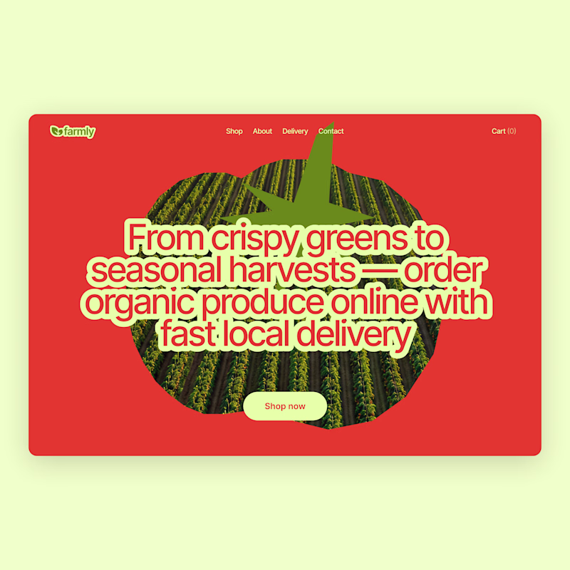
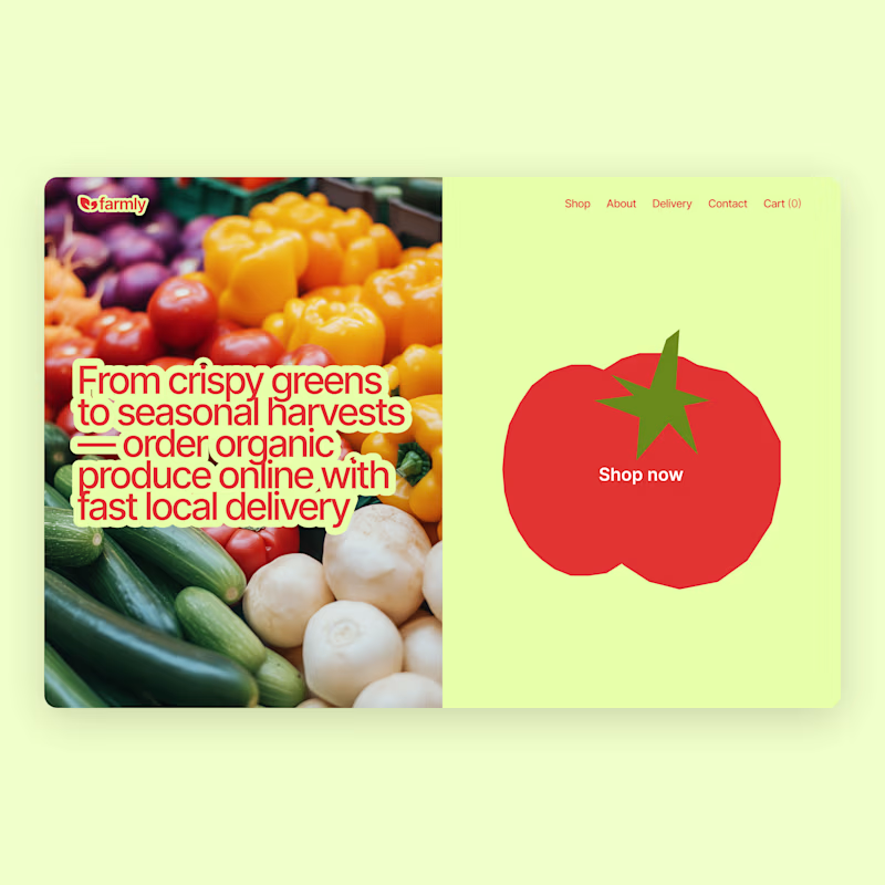
I already shared the first concept a few days ago, but I couldn’t stop exploring 😅
So here’s an alternative direction.
Which one would you pick?
Vote below 👇
75 voted
63%
45 voted
37%
120 votes
Closed



New resource: Auria AI Rebuild Prompt ✦
I turned the complete Auria homepage into one detailed prompt for Codex and Claude Code.
Auria is a luminous Framer template created for modern service businesses, wellness brands, and productized offers.
Usually $19. Free for anyone who supports Auria on its Framer Marketplace page.
Get the prompt:
https://startfrom.co/templates/auria
Created with Framer, Midjourney, Claude Code, and Codex.

Rebuilding a whole landing page with just one prompt is such a cool experiment, Alex! Did Claude Code manage to handle the Framer-specific layout structure well on the first try?


We built an immersive website for the web3 venture studio. ☯️
Particle interactions. Ambient sound. Bagua-inspired digital structures - Daoist philosophy translated into something that feels native to web3.
👉 Check it out: https://daoism.systems
Sound on. Rate it 1-10 👇✨
Creative DirectionInteraction DesignWeb DesignFigmathree.jsWebflowweb3creativewebsiteinteractivedesign



Love the scifi world you create here, the vibe reminds me a bit of the cinematics from the game Hitman, not sure if you are familiar with it, but that's a huge compliment!
Just started following you too, can't wait to see more of your work! 😍












Trending

Claude
Claude has entered the design space. How are you using Claude Design?

Contra University
Learn from expert creatives how to earn more using next-gen AI tools.
creativeaiflow
Creative AI workflows are evolving. What tools do you use, and what are their strengths and weaknesses?
freelancerlife
Freelancer life is wins, pivots, and everything in between. What’s yours right now?